Apple needs to see this.
Link: http://www.theverge.com/2012/10/4/3451322/rethinking-the-app-switcher-for-the-iphone-5-mockups
Link: http://www.theverge.com/2012/10/4/3451322/rethinking-the-app-switcher-for-the-iphone-5-mockups
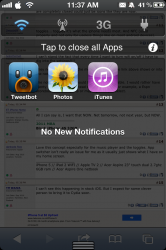
 . They don't do exactly what the link shows, but they're halfway there.