Don't know if it's just the picture, but your glossy TV is so over-contrasted that details are lost in the shadows (and presumably the highlights, though there aren't really any in that scene). That's the other BIG thing matte screens had over glossy screens in the previous generations of MBP: color accuracy. I can't speak for the retina display, but all the glossy MBP screens are over-saturated. Fine for normal use, but no good for anything where even the slightest amount of color accuracy is required.
I think that's probably just the photograph, though Samsung displays can be quite bad for that. What it illustrates though, is how the overall image is lower contrast, and with direct reflections from bright light sources, the matte display is actually
worse affected than the glossy one. The reflection itself is somewhat dimmer, but it results in a lot of glare around that area and reduced contrast over the entire display. Sharp's LCDs are actually
higher contrast than Samsung's, but you would never know it from those photos.
Sometimes the only solution is to move the display, and a having matte/glossy screen won't make a difference as far as reflections are concerned.
And I disagree about color accuracy. When calibrated, a glossy display is no more or less accurate than a matte display. Actually, that's not entirely true—a glossy display's accuracy will be less affected by the environment around it compared to the matte display which diffuses any light hitting it across the surface of the display.
A glossy or matte finish has no bearing on the display's saturation. That is determined by the LCD panel technology (color filters used etc.) and the backlight source. Measure any matte/glossy MacBook displays with a spectrophotometer and you will find that they are almost identical. (note: colorimeters are not suitable for this task)
None of the MacBook displays are oversaturated—in fact it's only in the last couple of years that they've even been able to meet the sRGB spec, prior to that, they have been woefully
undersaturated. And if you're talking about graphics monitors, rather than just something to browse the web with etc. you really want something that meets the Adobe RGB spec rather than sRGB.
Matte displays can
appear to be less saturated due to the loss of contrast in the display however. That Sharp TV with the matte finish is actually a Quattron model, which is
more saturated than the Samsung display, but due to the loss of contrast in a bright room, it looks less saturated under those lighting conditions. (in this case, that also looks more natural, but that's a calibration issue)
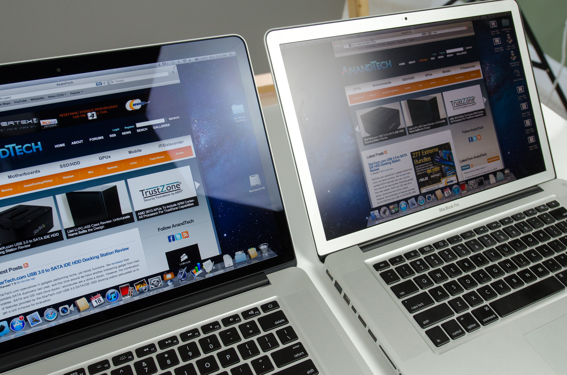
And here are the numbers from Anandtech:
The matte 2011 MacBook Pro display is actually
more saturated than any of the other MacBook displays, including the Retina one.
I will add my 3 cents: went to BB and test drove it and no way does it beat my 17" anti glare screen. I'll pass.
Is your home lit up like the BB (best buy?) store? Did you compare your MacBook Pro under the same lighting conditions?
I'm not making the argument that a glossy screen beats a matte one in every single scenario, but in most common ones, it does look better if you actually compare the two machines, rather than just looking at one and saying "well obviously it's better/worse than the other here."
I have to disagree. For me, the most significant advantage of a matte display is that it eliminates distracting low-intensity reflections. For example, on my Air right now in my office I clearly see a reflection of recessed circular fluorescent lights that are in the hallway. The intensity of those reflections is very low--not enough to have any noticeable wash-out effect on a matte display because they're far away and not directly shining on the screen--but the reflection is clearly visible on the Air's glossy (but not glassy) display and are very distracting.
Again, I think it's important to actually do the comparison here. It's very easy to say "the glossy screen is bothering me here, a matte one would be better" but I think it would surprise a lot of people how the matte display may actually look in the same conditions.
Especially with the larger notebooks (I had a 17" Powerbook, MacBook Pro, and then downsized to a 15") I found reflections to be an issue regardless of whether they were matte or glossy. With the matte ones, reflections resulted in a lot of glare, whereas the glossy screens (mostly) just required that I reposition the notebook, or the reflection was contained to a small area of the display and wasn't an issue.
I really think that the Anandtech comparison is one of the best examples of this:
If you just looked at the Retina MacBook Pro (or Air, in your case) you might say "well a matte screen would be better here" but then when you look at the matte display, it's actually a lot worse. As I said before, try reading the menu bar on each display.
The reflection on the matte display may have less intensity, but it has a far more destructive impact on the image itself.
Assuming this is all true, why would Eizo choose to make their monitors matte instead of glossy? They clearly do so for a reason, but if contrast during proofing would have to be reduced even with a matte display, and if the reflectivity of a glossy display could be neutralized with monitor hoods, what is the reason?
Because a lot of people are set in their ways and think it couldn't possibly be a "professional screen" if it isn't a matte display (but then why are Sony not making their $23,400 monitor matte?) and when you are going to be reducing the contrast of an 800:1 LCD for print anyway, the contrast loss from having a matte display doesn't matter at all.
And these days, I don't know how much you should pay attention to Eizo. Perhaps they've gone back on their decision now, but a couple of years ago they started switching from using IPS displays to Samsung S-PVA panels, which are totally unsuitable for use in a graphics monitor. (terrible color & gamma shifts with slight viewing angle changes, but high contrast specs on paper)