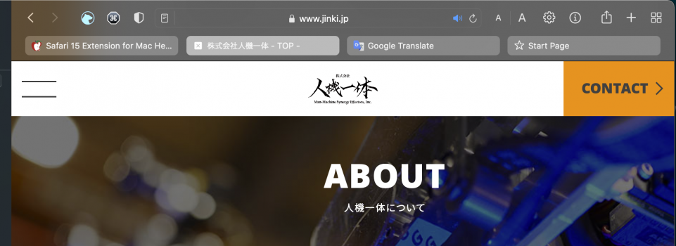
Comon. Look at the screendump at the top of the article. Which tab had the most contrast to the background? The active one - yes. so no - they are not doing the oposite.They're actually doing the opposite: in light mode, the active tab has a dark grey background and black text. An inactive tab has a light grey background and black text. Which has more contrast? The inactive tab. Makes no sense. The tab itself has less contrast within itself, which makes it look "disabled" or inactive.
Also having 2 tabs is quite common if you don't hoard tabs.
Add the fact that your eyes only see clearly towards the center of the field of vision, you are only ever seeing a handful of tabs at once, if your screen is big enough. Always having to glance over at the other tabs and think "so which type of tab color do I have more of?" is not really intuitive.
Then add the fact that if you hover the mouse over any tab it changes color to match the active tab. So now you have two tabs that look identical, which one is active?
I know, I know, with some logic and strategical thinking, you can always figure it out. But these things should be automatic and take no time, or as some say they should be "intuitive". The current design is not intuitive.
Got a tip for us?
Let us know
Become a MacRumors Supporter for $50/year with no ads, ability to filter front page stories, and private forums.
Safari 15 Extension for Mac Helps You Tell Which Tab Is Active
- Thread starter MacRumors
- Start date
- Sort by reaction score
You are using an out of date browser. It may not display this or other websites correctly.
You should upgrade or use an alternative browser.
You should upgrade or use an alternative browser.
emdub
macrumors member
I can deal with the active tab thing, I would, however, pay more than 1.99 to have the tab bar below the favourites bar!
xObeyThePanda
macrumors member
Cool. Though I think I better solution would be to add a thin outline around the active tab.
contacos
macrumors 603
Comon. Look at the screendump at the top of the article. Which tab had the most contrast to the background? The active one - yes. so no - they are not doing the oposite.
From that screenshot on the first page I actually thought the 2nd tab is active at the moment
edit: how the F do you quote here if you edit your post?
From that screenshot on the first page I actually thought the 2nd tab is active at the moment
edit: how the F do you quote here if you edit your post?
Last edited:
Unregistered 4U
macrumors G5
I think the problem being defined is an edge case where there’s a person that knows about tabs, knows how to USE tabs, but, most of the time, ONLY has two tabs open. 🙂 That’s the only situation that MAY cause some confusion, but once you have more than two tabs open it’s like “one of these things is not like the ooooootherrrrr”, your brain clicks and learns the new interaction.$1.99 for something I don't need, I don't seem to have a problem with it, see below screenshot.
Highlighted enough.
I am OK with the inverted state.
Dark mode
View attachment 1858043
Light mode
View attachment 1858049
Safari 15 usability nightmare
Having used almost every version of Safari since the beta on Jaguar almost 19 years ago, this is the biggest blunder Apple has made in Safari development. Sure, they've made some mistakes or removed some nice features but this is so visually painful and unintuitive that it will make me completely abandon Safari once and for all once the upgrade to Monterey is complete. Unlike Jaguar and many earlier versions of OS X, no downgrade path will be possible anymore.
Apple seems to have a habit these days of ruining its core apps; one of their greatest appeals in the past. This makes me glad I don't use the current OS for personal matters, only software development.
MJaP
macrumors 6502
It's just going to take a little while to get used to it that's all, if you've got more than two tabs open then the one that doesn't look like the rest is the active one, it's just a learning experience.
I'm just waiting for the "Apple is removing all user abilities to alter the look or function of Mac UI elements as we feel it could cause confusion for the user, distracting from the user experience and tarnishing Apple's reputation, in addition this will prevent the potential for malicious code to be run."
I'm just waiting for the "Apple is removing all user abilities to alter the look or function of Mac UI elements as we feel it could cause confusion for the user, distracting from the user experience and tarnishing Apple's reputation, in addition this will prevent the potential for malicious code to be run."
ActiveTab doesn't work well if you use the Favourites Bar - it puts the highlight underneath the Favourites Bar.
Uninstalled and refund requested.
Uninstalled and refund requested.
tcgjeukens
macrumors regular
And 15-30% of small business revenue goes to ...I’d urge everyone to stop hating on Apple. They’re just doing their part to help small businesses earn a living via the extensions 😉
Spectrum
macrumors 68000
Dark mode is awful (in my opinion). I find everything in the UI, in general, harder to discern with dark mode. Most jarringly, most of the content I use is bright (tables, documents, PDFs, graphs), making the Finder and everything else too dim by comparison. Maybe it is Ok for photoshop work...but then that has a dark mode anyway...Don't most people run dark mode? Well, I do and my safari looks fine. The active tab is lighter than the inactive ones, just as you'd expect.
Spectrum
macrumors 68000
So the favourites bar is now under the active tab indicator?!?! That is crazy. Do you have a screenshot showing this?ActiveTab doesn't work well if you use the Favourites Bar - it puts the highlight underneath the Favourites Bar.
Uninstalled and refund requested.
nmakk44
macrumors newbie
If you switch in Safari Preferences / Tabs to Compact view, the active tab will be wider, even with 20+ tabs open. That makes it much more visible.
TmszLBMrv
macrumors newbie
My god, people are really overreacting with this. The new single bar design is just fine. It ditn't take that much time to get used to it. We wouldn't even have this problem if people could just try to use new thing instead of crying and hating everything that is different from what they're used to. Same with iOS version. Why the hell would anyone prefer using address bar on top of a 6-inch touch screen? Yeah, it's a weird placement at first, but really, one/two days and I cannot imagine address bar on top. It's so much easier and quicker to use.
Personally, I don't like Apple becoming less aggressive on changes and how they started to hesitate so much. When you give users too many options, the system becomes a mess. Their 'our way is better, get used to it' approach was not for everyone, but that was what made them different from Google or Microsoft. And usually, in the end they were right.
Personally, I don't like Apple becoming less aggressive on changes and how they started to hesitate so much. When you give users too many options, the system becomes a mess. Their 'our way is better, get used to it' approach was not for everyone, but that was what made them different from Google or Microsoft. And usually, in the end they were right.
SilverWalker
macrumors regular
The same browser, dark mode, switching tabs. Light is current, dark is current, black is current. Looks pretty, but usability sucks. I guess we will all just get used to it. The same way the lack of contrast in light mode in Big Sur has taken time to adjust to (still makes my eyes more tired that Catalina did).


SilverWalker
macrumors regular
Pop quiz - which is the current tab?
...
The long one! Thanks to nmakk44 for the suggestions of compact tabs. Only because the long tab indicates to me that that is the current tab can I understand what the current tab is. Otherwise, I would have sworn the first tab was the current one. Come time to clean up tabs, I would have closed the current page by accident - it's happened enough to become irritating. I'll stop here.

Stridr69
macrumors 6502
Another over-engineered design change by Apple. Makes me wonder if that Reality Distortion field covering the campus needs to be adjusted. There's the Apple way and the logical way. I don't use Safari as my main browser so I'm not affected that much by it. But, jeese, what a poor design.
Kuckuckstein
macrumors regular
Stridr69
macrumors 6502
There was no need.“See a need - fill a need”
No, the active tab indicator is under the Favourites Bar:So the favourites bar is now under the active tab indicator?!?! That is crazy. Do you have a screenshot showing this?
mimeArtist
macrumors regular
The fact that people are explaining which tab is which on here, tells you just how broken it really is.
Sasparilla
macrumors 68020
The new ones behave like buttons, not tabs. Unfortunately we all know they're tabs and Apple should roll back the UI design to the prior tab UI (or offer to folks who want to roll it back).
I'm okay with the new UI, but would roll the tab UI back if given the option. Firefox's tab metaphor uses something like buttons as well, although the focused tab is quite bright (the opposite of Safari's with the light UI screen).
I'm okay with the new UI, but would roll the tab UI back if given the option. Firefox's tab metaphor uses something like buttons as well, although the focused tab is quite bright (the opposite of Safari's with the light UI screen).
Seriously? Do people find it that hard to realise which one is the active tab?
I mean you have multiple tabs open and only one of them is shaded. Why is that so hard to grasp?
I mean you have multiple tabs open and only one of them is shaded. Why is that so hard to grasp?
Register on MacRumors! This sidebar will go away, and you'll see fewer ads.

