Become a MacRumors Supporter for $50/year with no ads, ability to filter front page stories, and private forums.
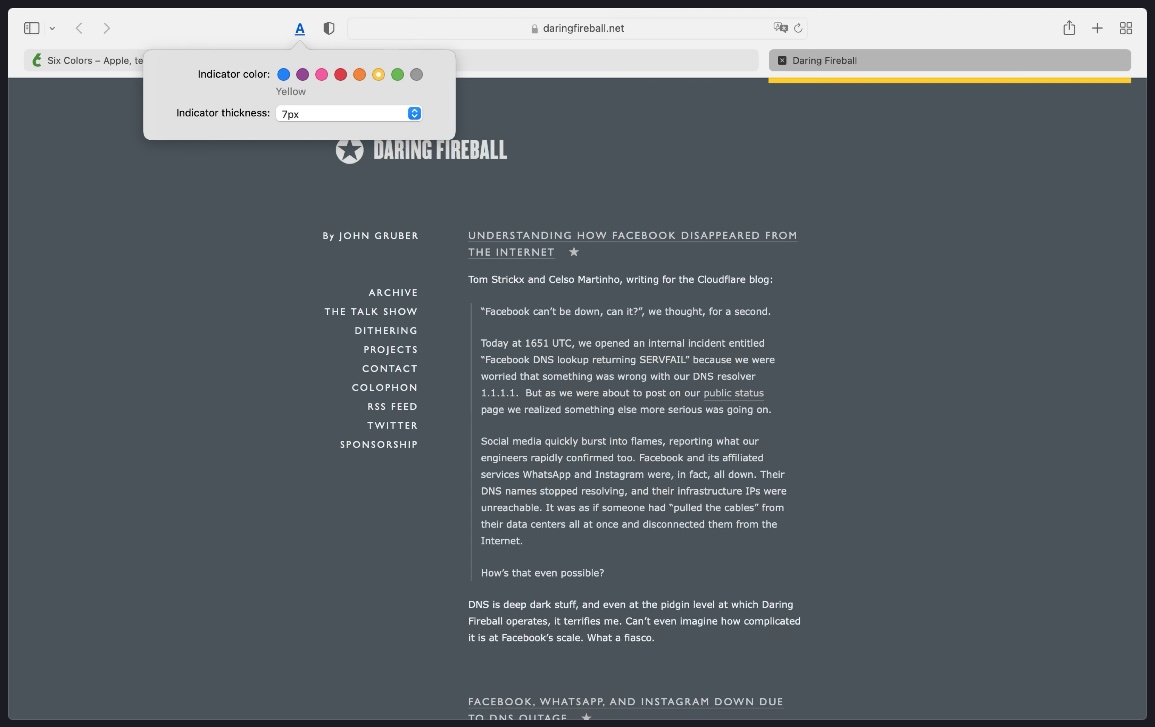
Tried the extension and removed it within 5 minutes. didn't realize two things:
1)It draws the colored line in the content area of the window, not the toolbat
2)It doesn't work at all in Compact mode, it doesn't even really try to. The bars just don't line up with anything meaningful.

Apple just needs to fix this mess. There's some good idea in the new UI but it should not have been released like this.


Safari 15 has faced a barrage of complaints about its controversial new design, and while Apple has listened to user feedback and reversed some changes or made them optional, many users still struggle to discern an active tab from a background tab on the Mac browser because of the inverted shading.

safari-15-tabs.jpg

Unfortunately for users who do not like the new design, Apple has not made any changes to the shading of tabs in either the Safari 15.1 beta or the latest version of the experimental Safari Technology Preview browser.

Fortunately however, developer Zhenyi Tan was inspired by John Gruber's Daring Fireball article about the issue and has since come up with a simple Safari extension called ActiveTab that provides a solution.

ActiveTab simply makes it easier to spot the active tab in Safari on Mac by drawing a line underneath it. There are eight colors to choose from, and the line below the tab can be customized to be between 1 and 7 pixels wide.

active-tabs.jpg

As Zhenyi notes, the extension works best with the "Separate" tab layout selected and "Show color in tab bar" disabled in the Tab section of Safari's Preferences. Zhenyi also cautions that ActiveTab will not work reliably if you have so many tabs in a window that the tab bar becomes scrollable.

ActiveTab is available for $1.99 on the Mac App Store, with no in-app purchases, no ads, and no tracking.

(H/T MacStories.)

Article Link: Safari 15 Extension for Mac Helps You Tell Which Tab Is Active
I'm seeing the same function/visualization in beta 15.1 of Safari
 
Tabs in safari have always been highlighted by the matching the tone of the address bar with the active tab name, so the rest of the tabs get greyed out. Apple flipped a decade of UI colour training for the sake of the tab being a pill shape rather than … a tab.

The compact mode is frustrating because the difference between the active and inactive tab is that it’s only a couple of cm longer than the inactive tab. Also the address bar being the tab means the address bar is never in a consistent location.

I wish I never updated safari.
 
  • Love
Reactions: turbineseaplane
Tabs in safari have always been highlighted by the matching the tone of the address bar with the active tab name, so the rest of the tabs get greyed out. Apple flipped a decade of UI colour training for the sake of the tab being a pill shape rather than … a tab.

The compact mode is frustrating because the difference between the active and inactive tab is that it’s only a couple of cm longer than the inactive tab. Also the address bar being the tab means the address bar is never in a consistent location.

I wish I never updated safari.
This update is excellent. I was waiting for such functionality for years.
 
I like how the icon for this UI-disambiguating extension looks like it's a shortcut for text formatting.

Screen Shot 2021-10-06 at 8.46.13 AM.png
 
Am I over-reacting?

For extension to work, you must approve its use for all web sites AND let the extension "read and alter sensitive information on webpages, including passwords, phone numbers, and credit cards, and see your browsing history"

2021-10-06_08-43-52.png


Also, it is sluggish in getting the bar below the tab..
 
Errh. Yes.... looking at a pitch black page right now... Active tab is light grey and all the others a dark grey
Interesting. It seems to switch around, but not sure exactly when / why.
Sorry I missed your comment earlier.
I actually posted some images in two posts on page 2 of this thread (about half way down) that show the darker tabs in the first post. The second post is about how it is difficult to discern the currently selected tab on colour alone.
 
I hope Apple will fix Safari in macOS 12.x soon, because it is really bad.
 
I've closed out of so many tabs by accident because of this stupid "change". I've been a longtime safari user/defender for years but if this stays for the foreseeable future, I'm off to chrome land
Yep, I switched browsers just because of this. But when I go back to Safari, I now never use the mouse to close a tab, it is always command-w, so I get the correct window.
 
The other major issue is that if you only have one tab open it looks like the navbar. I kept pressing the one tab thinking I was in the right place to write a URL. I did it dozens of times never getting used to it. So I had to switch the compact view which I also hate.
 
Interesting. It seems to switch around, but not sure exactly when / why.
Sorry I missed your comment earlier.
I actually posted some images in two posts on page 2 of this thread (about half way down) that show the darker tabs in the first post. The second post is about how it is difficult to discern the currently selected tab on colour alone.

OK, so I had a play with the settings in Safari > Preferences > Tabs

If you have tabs flip flopping (as I did) from light to dark depending on what page you are viewing, and causing confusion about the current tab - check that you don't have "show colour in tab bar" turned on. Turning this off solved the issue of the current tab being black on one page and being light grey on another. It's now light for the current tab, dark for the others.

I don't know when this got turned on in my browser - perhaps when the new version started up it asked me? Some vague memory on that.
They really should have implemented this better.
 
OK so in 2021 I need an independent developer (thanks Zhenyi!) to fix Safari.

No, in 2021, as in all years in the past, you need independent developers to customize Safari (or other browsers) to your individual taste, since Apple is never going to provide you with every customization imaginable and be able to please everyone.
 
This is all rather sad. The fix provided by the extension looks rather ugly IMO but the fault here lies with Apple for sticking with bad design. Being able to quickly tell the active tab is a key feature, particularly for people with bad eyesight such as myself. This is why I am sticking with Firefox for now. I hate some of their recent design choices too but at least they allow for easy (and sometimes not so easy) customization.
I modified what my tabs look like including the active one using UserChrome.css. Wish this level of customization was available on Safari but knowing Apple they will never allow it.
Screen Shot 2021-10-06 at 9.25.33 AM.png
 
Why would that matter? Here, see for yourself - the active tab is still lighter, even when the page is pure black:

View attachment 1858194
First, thanks for your comment!

I posted some images on page two of this thread that showed exactly what I was talking about. It later transpired that I had "show colour in tab bar" turned on in Tab settings - which I noted in a post on page 3 of this thread. With the option turned off, it looks the same as your screen shot.
 
More proof that employee #10638, Mr. Ewen McGregor (not the actor) was hired solely to throw a spanner in the works.
Safari for iPad too has been tweaked stupidly, eg. dismissing the Bookmark drawer.
 
  • Like
Reactions: SilverWalker
Ummm...that active tab has the "X" at the left of that tab and color or light/dark mode does not change that. Not sure how hard that is?????
 
Register on MacRumors! This sidebar will go away, and you'll see fewer ads.