Thanks for the link to the Samsung iPhone v S review document.
It's no surprise to anyone who's actually worked in a large corporation, that a comparision review was done. I'd suspect that they could find reports doing comparisons to Windows Phones, WebOS, etc as well.
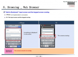
The important part is to read the "Directions for Improvement" at the bottom of each page. That's where any evidence of mass copying would be. As it turns out, those directions are pretty much what any software designer would come up with. For examples:
EMAIL - Samsung notes that the iPhone has both Previous and Next buttons to move between emails, while they only an Older button. Recommendation: add a Next button as well.
EMAIL - When showing a message, the keyboard always pops up on the S1. On the iPhone, it doesn't. Recommendation: don't show the keyboard.
WIFI - The setup is done on one screen in the iPhone, vs two in the Samsung. Recommendation: do it on one screen.
And so forth. Doesn't seem to be any earth shattering copying going on. It's mostly about adding similar functionality, without copying the screens themselves.
In fact, one of the notes at the end is about the choice of adding a rounded rectangle backdrop behind the icons on the App drawer screen. It points out that this design decision could give the impression of copying, which they don't want to do. Recommendation: "Remove a feeling that iPhone's menu icons are copied, by differentiating design."
In other words, the review recommended NOT looking so much like the iPhone.
Prior to the arrival of the iPhone, one would expect to see Samsung similarly deconstructing other smartphone market leaders, and in similar detail.
Singular and exceptional cases tend to be damning, whether "hair on fire" memo's or the document under discussion.