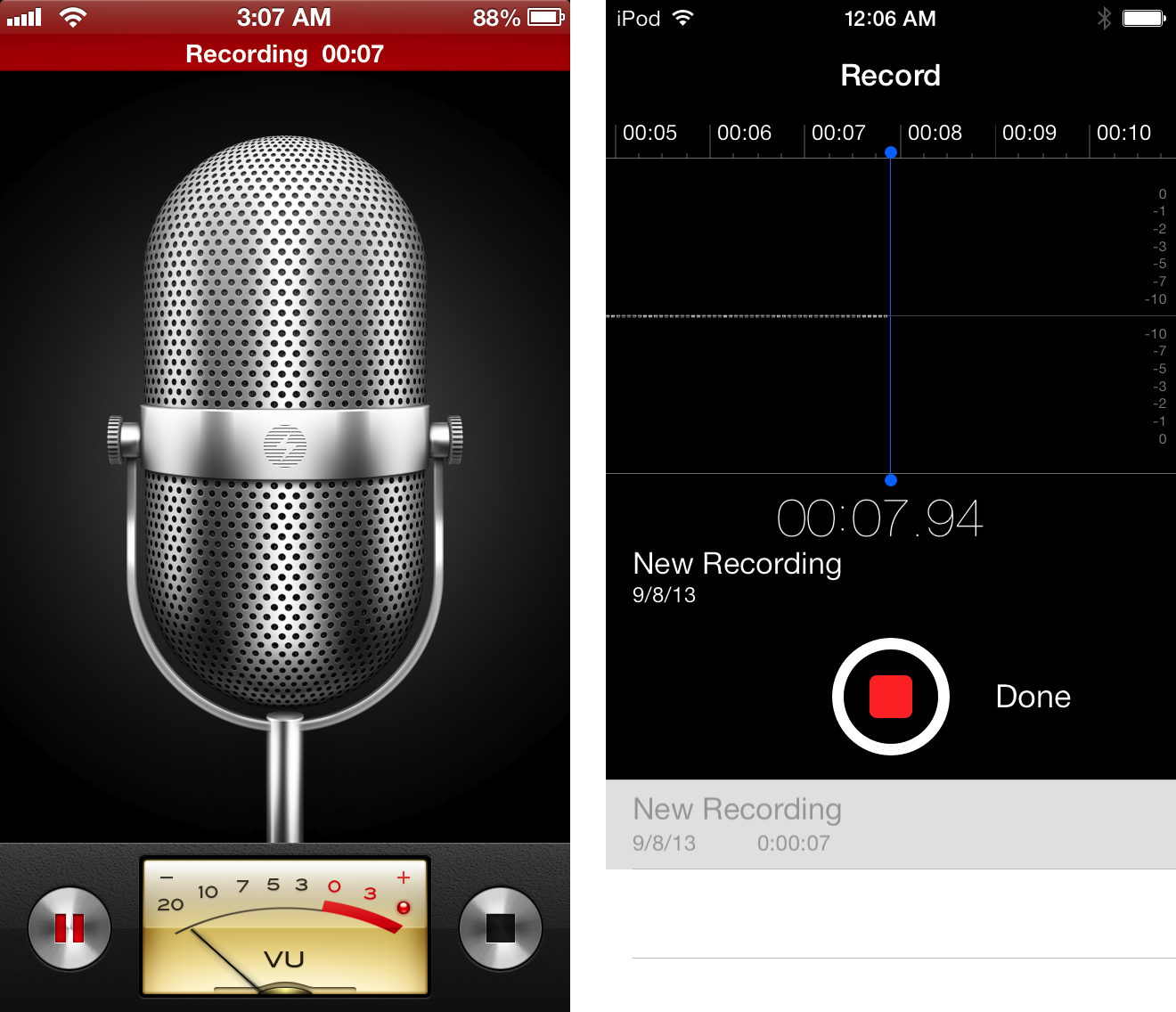
Just because shadows exist in real life it doesn't mean that their use in software is skeuomorphic...that's the point. Text exists in real life, borders between objects exist in real life, so their use in software is skeuomorphic? If so, then pretty much everything in software is skeuomorphic.Image
So you're one of those who really believes that a widget on the screen is casting a shadow. Fascinating.
Got a tip for us?
Let us know
Become a MacRumors Supporter for $50/year with no ads, ability to filter front page stories, and private forums.
Skeuomorphism still present
- Thread starter IT Troll
- Start date
- Sort by reaction score
You are using an out of date browser. It may not display this or other websites correctly.
You should upgrade or use an alternative browser.
You should upgrade or use an alternative browser.
Bottomline, Apple / Jony was on the rush and did a piss poor job of completing iOS7. As a Marketing Comms Manager (which I was for a different org. obviously), I would have either lost my job or had to put my team on the chopping block. We are not talking about Timmy's coffee shop redecoration, this is Apple, a Company based on perfection of design. The result was sloppy and it shows. I am okay with the kiddy colors, yet trendy (which I can understand) but atleast maintain the consistency. It is obvious that the separate app teams did not coordinate to make one single structure.
I am not so sure how well this reflects on Jony Ive's image of being such a strong thinker and the great deal of care he puts into his designs.
Though I am sure Forstall is laughing at the makeover but he is also wondering how Apple managed to feed it to masses without any backlash.
I am not so sure how well this reflects on Jony Ive's image of being such a strong thinker and the great deal of care he puts into his designs.
Though I am sure Forstall is laughing at the makeover but he is also wondering how Apple managed to feed it to masses without any backlash.
Last edited:
Image
So you're one of those who really believes that a widget on the screen is casting a shadow. Fascinating.
No, because the drop shadows are not designed to have the dialogue box become anthropomorphized or objectified and emulate a real life object.
The weather app has vector drawings of suns and clouds, is that skeuomorphism?
There's an Apple on the back of my phone, is that skeuomorphism?
Hint: neither of those are skeuomorphism because they aren't designed to simulate real life.
I didn't say that drop shadows can't establish hierarchy. If you understand the definition of skeuomorphism then you understand that drop shadows are skeuomorphic. You DO understand what skeuomorphic is, right?
Skeumorphism is a term that refers to digital ornamentation modeled on real-word objects. Leather stitching may evoke a feeling a comfort with an unfamiliar user, but its value to the overall design is questionable (especially when it's conspicuous). Drop shadows are not ornamentation. They have a real utility and are essential to main principles of visual design. To say that drop shadows are skeumorphic is like saying buttons are skeumorphic.
The term has swelled and taken so many new meanings. It's stretched really thin. Soon people are going to complain the keyboard is skeumorphic because it's based on a typewriter, or the bubbles in Game Center are too skeumorphic, or the sounds, or the icons, or everything. Because when you boil down every design, it's based on something familiar; it has to be. Whether that something has a primarily real-world identity or not, it should make no difference. Everyone needs to drop the word skeumorphism from their amateur design vocabulary, or at least drop its negative connotation.
You must not have seen the threads complaining pretty much about every one of those on this very forum. It's kind of sad.Skeumorphism is a term that refers to digital ornamentation modeled on real-word objects. Leather stitching may evoke a feeling a comfort with an unfamiliar user, but its value to the overall design is questionable (especially when it's conspicuous). Drop shadows are not ornamentation. They have a real utility and are essential to main principles of visual design. To say that drop shadows are skeumorphic is like saying buttons are skeumorphic.
The term has swelled and taken so many new meanings. It's stretched really thin. Soon people are going to complain the keyboard is skeumorphic because it's based on a typewriter, or the bubbles in Game Center are too skeumorphic, or the sounds, or the icons, or everything. Because when you boil down every design, it's based on something familiar; it has to be. Whether that something has a primarily real-world identity or not, it should make no difference. Everyone needs to drop the word skeumorphism from their amateur design vocabulary, or at least drop its negative connotation.
Drop shadows are skeuomorphisms, just as emboss or gloss or whatever. It's the illusion that elements in the UI casts shadows like real objects to give the user a sense of spatiality and orientation. It's probably one of the most reduced kinds of skeuomorphisms, but it is one. It depends on the definition though. I guess you could say it's not, because the UI elements don't resemble a real object. I don't know, there is no real strict definition out there, but saying it's a very reduced skeuomorphism makes the most sense to me.No, because the drop shadows are not designed to have the dialogue box become anthropomorphized or objectified and emulate a real life object.
The weather app has vector drawings of suns and clouds, is that skeuomorphism?
There's an Apple on the back of my phone, is that skeuomorphism?
Hint: neither of those are skeuomorphism because they aren't designed to simulate real life.
I agree that the use of grainy paper in notes end reminders is kind of unnecessary though. I have no idea why they did this.
Why is it that Notes and Reminders have a paper texture whilst Contacts and Calendar do not.
Has anyone actually stopped to realize this is actually a complaint? lol
Well... because... um...


Way better. I don't like either Game Center designs.
Drop shadows are skeuomorphisms, just as emboss or gloss or whatever. It's the illusion that elements in the UI casts shadows like real objects to give the user a sense of spatiality and orientation. It's probably one of the most reduced kinds of skeuomorphisms, but it is one. It depends on the definition though. I guess you could say it's not, because the UI elements don't resemble a real object. I don't know, there is no real strict definition out there, but saying it's a very reduced skeuomorphism makes the most sense to me.
I agree that the use of grainy paper in notes end reminders is kind of unnecessary though. I have no idea why they did this.
Skeuomorphism is used to refer to things that are intended to literally simulate real life textures or objects. For instance, the iPhone's phone icon isn't skeuomorphic because while it is in the shape of a phone, it's not a realistic representation. If they had made the icon a realistic looking phone with a realistic dial pad and everything, then it would be skeuomorphic.
The same logic is applied to drop shadows. The drop shadows do add a shadow, but they aren't a direct realistic interpretations of shadows, with the intent to completely emulate shadows.
Of course, like all design principles, the idea of skeuomorphism is more interpretive, but going so far as to say drop shadows are an embodiment of skeuomorphism is drastic. There are skeuomorphic parts no doubt, but it doesn't really fit the bill of skeuomorphism.
Drop shadows are skeuomorphisms, just as emboss or gloss or whatever. It's the illusion that elements in the UI casts shadows like real objects to give the user a sense of spatiality and orientation. It's probably one of the most reduced kinds of skeuomorphisms, but it is one. It depends on the definition though. I guess you could say it's not, because the UI elements don't resemble a real object. I don't know, there is no real strict definition out there, but saying it's a very reduced skeuomorphism makes the most sense to me.
I agree that the use of grainy paper in notes end reminders is kind of unnecessary though. I have no idea why they did this.
You don't get it...there are plenty of dictionary apps....get one.
A "digital phone icon" is not a real thing in the 3d world. The fact that they may add a shadow or gloss to make it stand out from the page or even because the designer thinks it just looks nicer or "more real" does not make it skeumorphic.
If the icons on th iPhone were shaped like an old Bell touch tone phone button with shadows, texture (or not!) that would be skeumorphic because they took a real OBJECT and placed in the digital world to make it familiar to you.
Just because "gloss" and "shadows" exist in the real world does not make those design cues skeumorphic if used in a digital design.
I have just noticed that whilst most built-in apps now use Trash instead of delete, the Messages app still uses Delete. Putting aside that Trash is a skeuomorphic concept, this again points to a lack of consistency with the new apps and a feeling that this was indeed a rush job.Bottomline, Apple / Jony was on the rush and did a piss poor job of completing iOS7.
Register on MacRumors! This sidebar will go away, and you'll see fewer ads.


