Become a MacRumors Supporter for $50/year with no ads, ability to filter front page stories, and private forums.


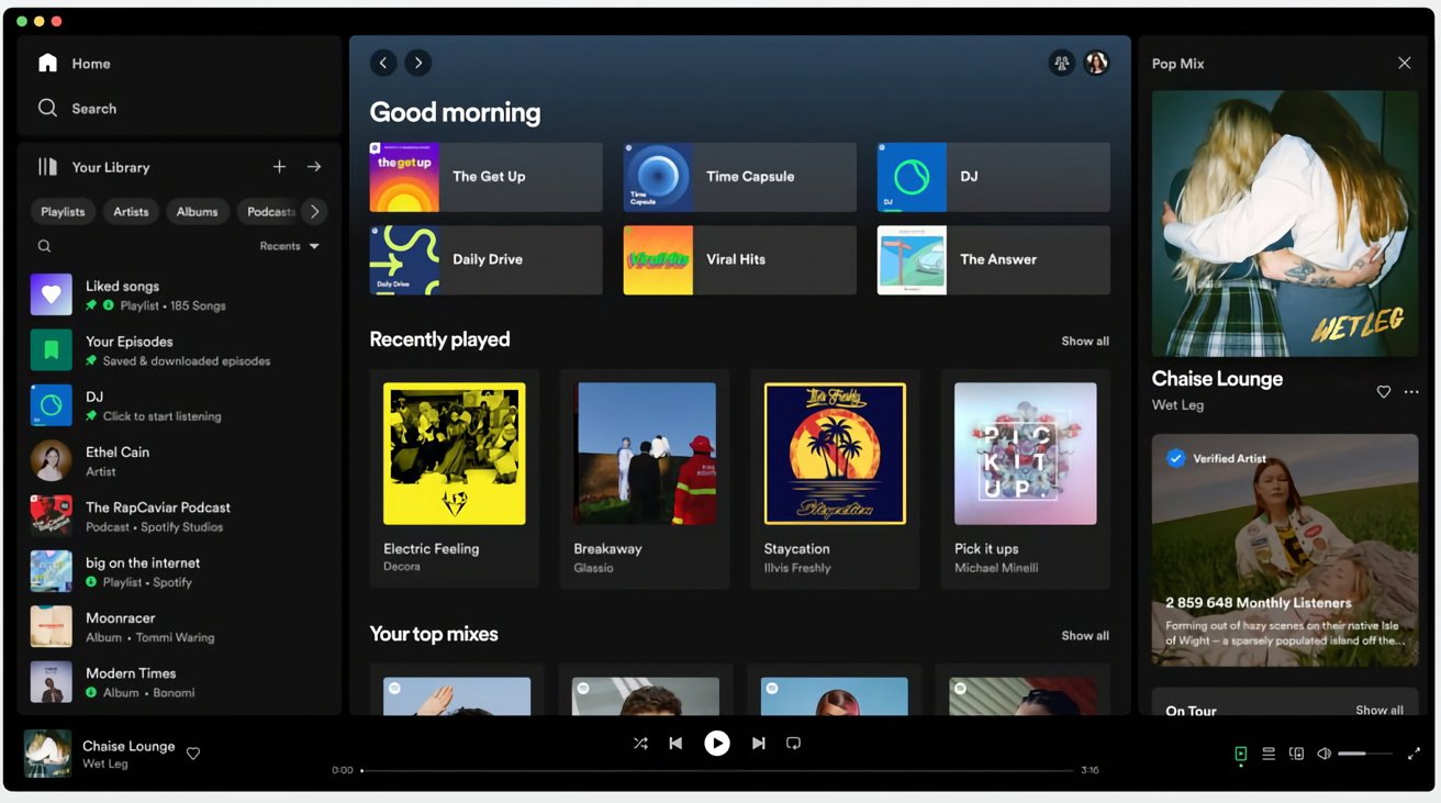
If you open up Spotify's desktop app on a Mac or PC today, things should look a lot more "mobile." That's because the company has redesigned the "Your Library" and "Now Playing" interfaces to make them more aligned with Spotify's smartphone app.

spotify-desktop-redesign.jpg

"Your Library" is now located in the sidebar to let you access saved music and podcasts. Spotify says its research has shown that the new library helps users save time by providing a better overview, while making it easier to switch between playlists. Users can also now move and pin the playlists in the Library, as well as drop songs into the editable listed playlists.

Elsewhere, the "Now Playing" view takes up the right-hand side of the app, showing the currently playing song or podcast. According to Spotify, "You can even find more information about the song and artist here, as well as information on tour dates and merch — making it easier to connect with your favorite artists and discover more about them. For select podcasts, you can even follow transcripts as you listen."

By default, Friend Activity is now hidden, but easily accessible via a new Friends icon beside the user profile icon in the top-right corner of the window. You can also now hide the library by clicking "Your Library" for a more compact layout.

Previously, the only way to find playlists was through the search bar, where users had to trawl through not only their own content, but results from the entire Spotify catalog. Now, when it’s expanded, the new Library design allows users to toggle through their dedicated music, podcast, and audiobook feeds and search Your Library exclusively.

Spotify says the desktop app revamp began rolling out on Tuesday and will eventually make its way to all users over the next week.

Article Link: Spotify Desktop App Updated With Redesigned 'Your Library' and 'Now Playing' Views

Finally you can sort playlists alphabetically
 
  • Like
Reactions: diggy33
I've had the library thing for the last few weeks. The Now Playing on the side was a nice touch though.

Is there a way to get the notifications of what is new on the desktop app, or is that only a mobile thing?
 
Spotify for macOS still has that stupid problem where when pressing “back” in the search panel, it temporarily says “no results found for [previous search]” before loading them. It seems like a memory issue. Either way, it makes it feel like I’m using dial-up for a bit there.(The same thing happens on the PC version, so it’s not a Mac problem).
👍
Thank god I am not the only one who gets this error!

Drives me nuts…
 
  • Like
Reactions: KaiFiMacFan
My issue was that it wasn’t consistent. It should have been EVERYWHERE. They should have released an external keyboard with it and it should have been on iPad keyboards.

By not making an external keyboard with it - it meant that I could never allow myself to truly get used to / rely on it… because I plug my laptop into a dock for a lot of my day.

I thought it was good - it just needed a push. They also messed up and went too far too quickly… and tied it to the worst keyboard ever (butterfly switch) and the worst MBP ever (they were expensive, slow, hot, lost hdmi and SDCard, etc.).

If they would have rolled it out universally, without changing the rest of the MBP, and without removing the escape and power buttons - it would not have been so bad. As it was - they tied an interesting new feature to a turd redesign of the MBP… and the whole thing flopped.

BTW: since it sounds like you still don’t have an M1/2 laptop: you really should! They are FANTASTIC… you won’t miss the touchbar because of how great the laptop is.
Naaah, still missing.
 
This new UI is absolutely horrible!! My whole library is now limited to only shoe in that little box on the left, It feels claustrophobic! I want the sidebar to only contain my pinned playlist, and let me see library expanded on the left, This is another reason I’m considering trying Apple Music again.
 
This new UI is absolutely horrible!! My whole library is now limited to only shoe in that little box on the left, It feels claustrophobic! I want the sidebar to only contain my pinned playlist, and let me see library expanded on the left, This is another reason I’m considering trying Apple Music again.
You tried using that arrow to the right of "Your library"? It expands it and allows you to make it even bigger by dragging using that black space between sections.
 
My issue was that it wasn’t consistent. It should have been EVERYWHERE. They should have released an external keyboard with it and it should have been on iPad keyboards.

By not making an external keyboard with it - it meant that I could never allow myself to truly get used to / rely on it… because I plug my laptop into a dock for a lot of my day.

I thought it was good - it just needed a push. They also messed up and went too far too quickly… and tied it to the worst keyboard ever (butterfly switch) and the worst MBP ever (they were expensive, slow, hot, lost hdmi and SDCard, etc.).

If they would have rolled it out universally, without changing the rest of the MBP, and without removing the escape and power buttons - it would not have been so bad. As it was - they tied an interesting new feature to a turd redesign of the MBP… and the whole thing flopped.

BTW: since it sounds like you still don’t have an M1/2 laptop: you really should! They are FANTASTIC… you won’t miss the touchbar because of how great the laptop is.

I simply don't think (though I am now changing that to "didn't think") Touch Bar was afforded enough time to evolve as the uproar was so instant, so loud and, IMHO, so short-sighted. But @friedmud nailed it. Thanks! I hadn't yet tied TB's seemingly poor reception (at least in these forums) to what was actually a massive rebuke of a pretty significant/bold MBP redesign. Until your post, I always saw TB's condemnation through a solitary lens when, in fact, it may have been more of a casualty of a much larger communal gripe.

Regardless, it was a super interesting concept - much more so than physical Function keys. It's possible TB was eventually leading to an all-screen MacBook. 😜

I actually do have access an 13" MBA M2 in the house, have used it several times, and have sung its praises many times in these forums. Upon receiving our launch-day unit, I called it Apple's most perfect laptop - the culmination of decades of R&D, success, failures. As the rumored 15" began to heat up, ut was no stretch to see where that machine will definitely wind up Apples most popular laptop ever. The ONLY issue I have discovered, is the lack of dual external monitors - which is a bonafide bummer. Otherwise, a truly incredible machine. And yes, I'd be ok if it had Touch Bar. 🤪
 
  • Like
Reactions: friedmud
Anyone else get this update like 6 weeks ago?

It appears that they don't release updates and new features at the same time for everyone. I am not dev, but it looks like they have some kind of progressive deployment within different groups of users (by type of users, countries, …)

I got the new desktop UI 2 months ago. I find real improvements, but also some downsides or perhaps it's a matter of getting used to it.

For me the most disturbing aspect is that you don't have your playlist constantly shown in the sidebar, therefor it's often more complicated to quickly add new tracks in it. On the other hand I really enjoy the new options with the sidebar: different views, modifiable size, folder creation, search field more accessible

To me it's a real improvement in term of ui the real deal is avoiding to offend users with drastic changes. Users don't like change.
 
You tried using that arrow to the right of "Your library"? It expands it and allows you to make it even bigger by dragging using that black space between sections.
But that makes a "split view" which I'm not a fan of. The sidebar should be used as such, and the info should show on the right
 
Register on MacRumors! This sidebar will go away, and you'll see fewer ads.