Become a MacRumors Supporter for $50/year with no ads, ability to filter front page stories, and private forums.

MacRumors

macrumors bot
Original poster
Apr 12, 2001
68,108
38,862


Spotify today announced that it has overhauled its desktop app and web player with an "improved look and feel" that offers design parity and also makes both the app and the web experience easier to use.

spotify-redesign-desktop.jpg

According to Spotify, it took "months" of tests, research, and user feedback to develop the new, cleaner design that's simpler while also offering all of the useful features from the desktop app.

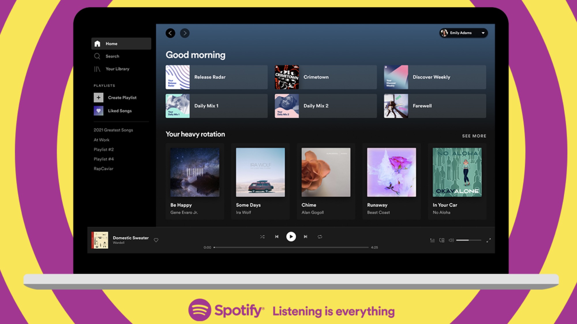
Using the desktop app and then switching to the web player will feel like a seamless experience now that the two share the same general design. There's a redesigned Home experience, search has been relocated to the left side of the navigation page, and listener profile pages feature top artists and tracks. Users can now start a radio session for any song or artist using the "..." menu.

It's easier than ever to edit and customize playlists, and there's a new embedded search bar for quickly locating new songs and podcast episodes to add. With a new dropdown menu in the top-right corner, Spotify desktop app users can edit Queue and view Recently played.

Spotify users on Mac can download the new Spotify app for desktop from the Spotify website or use Spotify in the browser through open.spotify.com.

Article Link: Spotify Launches New Design for Desktop App and Web Player
 
Looks like a revised iTunes Player, took months of testing and research Spotify says, hmm.
 
  • Like
Reactions: XXPP
Yeah - this is certainly what Spotify needs.
Nobody wants useful stuff like Apple Watch offline files - or a useful app on the watch.
 
Ugh, 300 MB for a music player. Probably because it embeds Chromium.

Also why is it using a dark theme when I don't have that selected in preferences.
 
Apple music needs to get their act together with the software. It’s slow, tons of network latency, buggy, and the interface works like microsoft from the early 2000’s. Does anyone at Apple actually use this software and like it?

The playlists at Spotify stink compared with apple. they both have huge catalogs. Just get the software right Apple.
 
Looks like they removed the ability to add an album to your Library by hovering over album art and clicking the heart icon. Have to right click now and choose "Add..." from menu.

Another example of dumbing down desktop apps for web parity sake??
 
  • Like
Reactions: swrobel
Every music or movie app should just look like Steam but with Netflix style roll over previews.
 
For those people that don’t want to wait for the official rollout.

The new UI is in the past 30 versions of Spotify already and can be activated by adding the follow line to your Prefs file

ui.experience_override="xpui"

Make sure Spotify is closed when adding this line.
 
Looks nearly identical to the old version. Definitely seems more “design tweaks” than “redesign”
 
  • Like
Reactions: skadd
Months of tests and user feedback and no-one figured out how to fix the idiotic video player?

Or do they have a bunch of dolts in their focus groups that think it is a great idea to have the only two choices be 'postage stamp sized video that covers up part of the UI' and 'Full screen video'
 
Apple music needs to get their act together with the software. It’s slow, tons of network latency, buggy, and the interface works like microsoft from the early 2000’s. Does anyone at Apple actually use this software and like it?

The playlists at Spotify stink compared with apple. they both have huge catalogs. Just get the software right Apple.
Agree. Sometimes I have to even click twice on something to start playing. The only thing that I like better about Apple Music in comparison with other services is a superior library management a real-time lyrics.
 
  • Like
Reactions: twistedpixel8
Register on MacRumors! This sidebar will go away, and you'll see fewer ads.