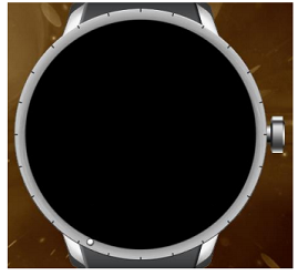
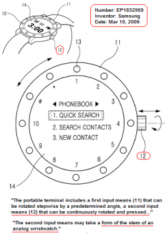
Bigger input device = possibly easier, finer control inputs. Plus usable with gloves on, which is a big deal in a lot of the country.
For myself, I have always wanted an electronic watch with a rotating bezel input, because of the possibilities of making aviation apps that mimic the traditional round E6B flight computer (slide rule), but with bigger numbers and better visualizations.
As a private pilot myself, that's an interesting idea. The digital crown on the Apple Watch could be used in a similar fashion. ForeFlight is already exploring uses for the AW. I use Sporty's E6B on my iPad Mini in flight, and entering numbers in turbulence on a touch screen can be a challenge, but it sure is a better interface that the old-school E6B slide rule, which I think only hangs around as a rite of passage, sort of like decoding METARs and TAFs.
Sure. Everyone knows it's just opinions. If someone prefers square to round, that's fine. And vice versa.
Besides, this is nothing. Wait until Apple offers a round version in a year or two. Yikes! Just imagine the forum arguments that will occur amongst Apple Watch owners! It'll make the just-as-bogus bigger screen debates look like child's play

Rounded rectangles made them rich, so that's what they stick to.
This thread is hilarious. It's like watching people debate which regional sport franchise is the best... or worse, which religion to ascribe to.
Yeah, sticks out like it was designed in the 1980s. My opinion, of course. Also applies to any square Android watches.
Not that round watches look like they were designed in the 1890's... touché, my friend.

In all seriousness, I have both the Apple Watch and a Moto 360. For me, I prefer the fit and look of the Apple Watch. I have narrow wrists, and the Moto 360 looks like a strapped a clock or Boy Scout's compass to my wrist. The Moto 360 is actually too wide in both directions and causes discomfort when I bend my wrist backwards such that the pushbutton then contacts the back of my hand and I feel pressure. Someone with larger wrists would likely not have this issue.
Beyond that, for fans of analog watch faces, it's hard to beat the round screen on the Moto 360. The flat tire needs to go away, but it was a necessary evil to accommodate the ambient light sensor, which I would not want to be without. Flying or driving at night and having a non-light-sensitive watch light up to full brightness is a major distraction (and battery hog). I've seen that problem on other Android Wear/Tizen watches.
For digital watch faces, the rectangular display is fine. Information is organized with no wasted space or cut off text as on my Moto 360.
All this bickering about Apple intentionally adding a bezel for stylistic effect or not is moot. We have what we have. These are giant corporations making tough decisions that we only can guess at. I suspect the bezel on the Apple Watch is a necessary compromise, for now. At least the ambient light sensor is underneath the display, not in the bezel, so the potential is there, someday, to have a full-bleed display, assuming the curved edges of the crystal don't distort the resulting image.
By "avoiding the edges" in the UI, which means a black background, circular and rounded-rectangle elements, the black frame/bezel is indistinguishable and provides breathing space around the UI content. Thus the developer guidelines to put your text right up to the edge - the "black space" is built into the watch. Black backgrounds also use less power on an OLED screen. Two birds with one stone.
Undoubtedly Apple had many working/non-working prototypes of the Watch. They worked on it for three years, and it was probably being brainstormed well before then. Round, square, rectangular, and who knows how many size variations. Ultimately, what we have now won out, for now. Who knows what they are working on already.


