Become a MacRumors Supporter for $50/year with no ads, ability to filter front page stories, and private forums.
Yes, I agree. The digital crown doesn't harm the UI, and arguably makes it easier to use. Round design creates lot of empty space when displaying text.


It's just your subjective opinion which skeuomorphism is more "blatant" than the other. To me they seem both about equally "blatant." I'm sure some people would say that the round face is the more egregious.

If I'm being honest, and not going with my personal likes or dislikes.
Just being 100% impartial here, and as I say totally honest.

I would have to say "THE BIGGEST", and I suppose one could way worst/strongest example of skeuomorphism would have to be a watch face with hands moving around it on a screen.

That's way way up there, along with fake stitching and leather on a screen.

Those hands are there due to being on the end of a gear on a mechanical movement.

You have to learn to tell the time on a dial with hands.
Having the time on a screen in numerical digits or words is how people read the time and say the time.

Fake hands going round a fake dial is simply the worst.

However.............

Saying that, and admitting the above is true.
Personally I like the look of hands and a dial, even fake ones, as, being "old school" that looks like a watch :)

I'm big enough to admit it's stupid though for a computer screen.
 
Point is, don't lump everyone who is anti-circular as a fanboy, its too sweeping of a generalisation.

Yes, exactly. I do find myself agreeing with Apple a lot of the time, but that's because Apple thinks things through before making a decision. Like for instance, the aspect ratio of the iPad. I find that the current iPad aspect ratio is great for reading text, but as many people complain, it's not good for watching wide-screen videos. I agree with Apple because most of what I do on the iPad is read various forms of text, including webpages. But the iPhone 6 plus is narrower, and that doesn't work for me -- I find myself wishing it was a smaller iPad instead of a big iPhone. The iPhone 6 works, just barely, because I can grasp it with one hand. 6 plus is too big to fit my hand, and once I need two hands to support the device, I want it to be a tablet, not a phone. So there. One instance where I don't like what Apple did! ;)
 
Funny how people forget that one of the most popular iWatch concepts was this one:

View attachment 534952


View attachment 534953
View attachment 534954
View attachment 534956

And yes, it looks GREAT with watch faces as a timepiece. Which of course, is what Apple claims their Watch is first, and foremost. (Not a wrist computer.)

View attachment 534955

That said, most "round" watches aren't completely round, either. The band is usually connected to a standard-sized lug. http://us.burberry.com/womens-watches/


That's why the Moto 360 and other "round" watches look a little odd. Others like LG have added the lugs, but then it makes the watch look even bigger. I think what Apple (or someone else) could do to make it more "natural" is to use an octagonal or hexagonal shape that allows for a bezel, but which can be make more decorative. If Apple does change the shape from rectangular I'd think they would go in that direction.
 
Those hands are there due to being on the end of a gear on a mechanical movement.

You have to learn to tell the time on a dial with hands.
Having the time on a screen in numerical digits or words is how people read the time and say the time.

Fake hands going round a fake dial is simply the worst.

However.............

Saying that, and admitting the above is true.
Personally I like the look of hands and a dial, even fake ones, as, being "old school" that looks like a watch :)

I'm big enough to admit it's stupid though for a computer screen.

I think that people like analog watch hands because it visualizes time.

Like you say, you have to learn how to read analog hands, and it's significantly easier to read "11:00" than to look at the angles of the hands on an analog watch and figure out what it's showing.

But there' something about watching the hands move in circles and seeing time passing. And to point to a spot in the circle and think, when the hand gets here, then a certain time has passed.

So I really like this face.
solar.png


It shows time in digital format, but visualizes time by showing the position of the sun. To me, that's the best of both worlds.
 
I read this on a NY Article about Jony Ive. This is what he said about this matter.

"When a huge part of the function is lists'—of names, or appointments—'a circle doesn’t make any sense,' Ive said."
 
But there' something about watching the hands move in circles and seeing time passing. And to point to a spot in the circle and think, when the hand gets here, then a certain time has passed.


.

Yes, I like that.
It's perhaps a little plain, and I'd hope it "did something" from time to time to make the image a little more interesting :)

But yes, it's a good face.

It shows time in digital format, but visualizes time by showing the position of the sun. To me, that's the best of both worlds
 
I think the square screen is perfectly fine, only thing that that would be reaaallyy nice in the future would be a display that goes from edge to edge and wouldn't have such a large black frame.

This is my issue with most smart/super watches. Take the Fitbit Surge, for example. There's as much frame surface area as the actual screen, if not more.
 
This is my issue with most smart/super watches. Take the Fitbit Surge, for example. There's as much frame surface area as the actual screen, if not more.

I feel there are two reasons why this is the case, and this goes for Apple also.

1: It's easier to make a screen with a large bezel.
2: It's cheaper to make a screen with a large bezel.

Once they can solve both those issues, bezels get smaller.
Look how small they are on TV's now.
Computer monitors and gradually improving also.

With a Phone, or a Tablet, there is of course an argument to be had about holding the device and fingers on the screen.

Though to be honest, Borders are still larger than they really need to be to hold onto them.

None of this applies to a watch.

My worry is, Apple are generally lazy, and cheap and have some love of borders, so I'm not expecting miracles to come from them very fast.

Certainly it's a aspect that screen makers are working on, and I would suggest it's perfectly possible NOW to do a Moto360 with no screen driver area at the bottom.

It's more a case of how easy and at what cost.
 
a woman would never wear that round design. If the ladies aren't buying as well, this would be a worthless venture.
 
Hate to quote myself, but I already explained why a round display is a terrible idea (unless you're planning to use a UI that doesn't have any button or list at all, which is obviously not very practical).

Just for the record. This is what happens when you try to fit text in three different displays: the first one, a square display; the second one, a rounded display of the same size (let's say both are 2" displays); and the third one a smaller, rectangular display (let's say 1,5").

C0FRNoZ.jpg


The rounded display is the worst. So let's try with buttons, another extremely common UI object.

4T5eYdB.jpg


Doesn't get any better. You can only fit three buttons (instead of four) and you have to make them shorter than in both the square display of the same size and the rectangular (smaller display). Of course, you can make the button in the middle longer, but why would you want one of the buttons to be bigger than the others?

Let's try with a list. You'll need a list at some point right? IE, when you need to select a song from an album you want to listen.

NdrEGfi.jpg


Ew. Doesn't look good at all.


Yes, you can design new interfaces, but I doubt you can make one without buttons, text or lists usable. You'll need to display text. One of the main features is that it displays a notification (with text) when you get it on your iPhone. So why would them choose the option that displays LESS text from all the options available?


Sorry if my reply sounds harsh, but I find your photoshoped images very unfair. You not only used a taller shape (the diameter of the circle is longer than the height of the rectangle) but you also removed the bezels in the round version! That makes the comparison completely irrelevant, because you're comparing the size of the entire watch with a display without any bezel.
 
Hate to quote myself, but I already explained why a round display is a terrible idea (unless you're planning to use a UI that doesn't have any button or list at all, which is obviously not very practical).


Sorry if my reply sounds harsh, but I find your photoshoped images very unfair. You not only used a taller shape (the diameter of the circle is longer than the height of the rectangle) but you also removed the bezels in the round version! That makes the comparison completely irrelevant, because you're comparing the size of the entire watch with a display without any bezel.

This is a fantastic explanation of why a circular screen doesn't work. I remember reading this back in September and really enjoyed reading it again.
 
Hate to quote myself, but I already explained why a round display is a terrible idea (unless you're planning to use a UI that doesn't have any button or list at all, which is obviously not very practical).


Sorry if my reply sounds harsh, but I find your photoshoped images very unfair. You not only used a taller shape (the diameter of the circle is longer than the height of the rectangle) but you also removed the bezels in the round version! That makes the comparison completely irrelevant, because you're comparing the size of the entire watch with a display without any bezel.

The problem is, you are a glass if half empty person, not half full.

It's the same negative viewpoint when it comes to widescreen displays.
I think positive when I see a widescreen.
What I see is a normal screen, with the ADDITION of extra display on either side to make it wider.
You may be one of the people who can only see negative, and you see a widescreen as removing the top and bottom of a 4:3 display

It's the way you choose to see it.

To me, making it a circle is adding on extra to a square. = positive viewpoint.
You are again only seeing it as a negative and are removing the corners of a square to make a circle.

If you can only see it this way, nothing I can do can change it I'm afraid :(

There is never any need to chop anything off of show any less.
It's simply a matter of displaying things within the space provided at the correct scale.

A silly example would be making the iPad Round for example. Not that I'm suggesting that would be a good idea.

You could see it as adding screen on, and being better, displaying more then before.
Or, as you have demonstrated above, I fear you would see it as removing the corners and seeing less.

And re the bezels, yes indeed.
The bezels I chose to show a round version are roughly that same size bezels/surround that is on the moto 360 which was designed a year ago.

Given a year of advancement, and Apple trying their best. I gave Apple the benefit of the doubt in their skills, and assumed Apple would at very least be able to match, if not better what Motorola was able to make a year earlier.

I think that was fair of me, unless you feel Apple cannot match Motorola for their ability to make a round screen at least as good.

The only "licence" I took was to remove the display driver area at the bottom of the Moto360 screen, as again, given Apple's skills and technical expertise, I gave them the benefit of being able to overcome that hurdle.

I feel given the above I was fair and reasonable in my expectations from Apple, don't you?
 
To me, making it a circle is adding on extra to a square. = positive viewpoint.
You are again only seeing it as a negative and are removing the corners of a square to make a circle.

The only problem is that if you take a square and add to it to make a circle, you're making the screen, and therefore the watch, that much larger. So if you want to accurately compare a square screen and a circle screen and keep the watch size similar, you would have to remove the corners of the square to create the circle.

That's not negativity, it's just about the size comparison.

Believe me, I'm not a negative person. I believe that if Apple chose to make a circular watch it would've been fantastic. I was actually hoping that Apple Watch would be circular, but I realized after seeing the Apple Watch that the rectangular screen really is better and uses the screen's space more wisely. That's just my opinion.

Most watches are traditionally circular, so I think we have to assume that Apple did their research on making a circular watch, and they decided that a circular design wasn't the best way to view information on such a small screen.

That doesn't mean it's going to be the right answer for everyone. But, as we all know, when Apple makes these design decisions, they will tell us not only that it is the best way, but that it is the only way. And a lot of us will end up agreeing with them, because they have a lot of reasons and examples backing up those design choices. Some of us won't like it, and unfortunately that's just the way it is.

Also, I think the watch bands probably factored into their choice. Having such easily interchangeable watchbands could have been done with a circular watch, but I don't know if it could have been done in as simple and as elegant a way as with the rectangular watch. Because the rectangular watch has flat sides, the bands can slide right in and out with ease.
 
Last edited:
a woman would never wear that round design. If the ladies aren't buying as well, this would be a worthless venture.

Quite true. Even though Apple has comparatively few women executives, they do seem to be aware that women are a majority of the population and have at least taken some steps to appeal to women's tastes. You can't really say that about the rest of the industry.
 
The picture makes an excellent case for why the Apple Watch isn't round. A lot of un-natural empty space in the round one. I have the same problem w/ my Garmin 620, but that one only gets worn during runs so I don't really care. It serves my purpose.

No, it makes an excellent case for showing why you can't slap a UI designed for a rectangle screen onto a round screen.

This comparison is awful, to think that the design considerations for a round screen would result in the exact same design is foolish.*

*Note I am not saying round is better and that an optimal UI could be achieved, but this comparison surely does nothing to prove that it cannot be done.

I understand what you are saying about round screen needing a customized UI.

But really, rectangle is the most natural design for displaying text. Books, newspapers, magazines, computer screens -- they've all been rectangles. Nobody even attempts to make a circular computer monitor, because we al know that'do be stupid. The only reason circle is being considered for smartwatches is because of analog watches, as someone else pointed out. If we stop thinking of it as a watch, and think of it as a wrist-worn computer, then of course a rectangle makes most sense.
 
I'd just like to ask the OP to provide a circular UI design of a scrolling text field.

That is all.
 
The problem is, you are a glass if half empty person, not half full.

It's the same negative viewpoint when it comes to widescreen displays.
I think positive when I see a widescreen.
What I see is a normal screen, with the ADDITION of extra display on either side to make it wider.
You may be one of the people who can only see negative, and you see a widescreen as removing the top and bottom of a 4:3 display

It's the way you choose to see it.

To me, making it a circle is adding on extra to a square. = positive viewpoint.
You are again only seeing it as a negative and are removing the corners of a square to make a circle.

If you can only see it this way, nothing I can do can change it I'm afraid :(

There is never any need to chop anything off of show any less.
It's simply a matter of displaying things within the space provided at the correct scale.

A silly example would be making the iPad Round for example. Not that I'm suggesting that would be a good idea.

You could see it as adding screen on, and being better, displaying more then before.
Or, as you have demonstrated above, I fear you would see it as removing the corners and seeing less.

And re the bezels, yes indeed.
The bezels I chose to show a round version are roughly that same size bezels/surround that is on the moto 360 which was designed a year ago.

Given a year of advancement, and Apple trying their best. I gave Apple the benefit of the doubt in their skills, and assumed Apple would at very least be able to match, if not better what Motorola was able to make a year earlier.

I think that was fair of me, unless you feel Apple cannot match Motorola for their ability to make a round screen at least as good.

The only "licence" I took was to remove the display driver area at the bottom of the Moto360 screen, as again, given Apple's skills and technical expertise, I gave them the benefit of being able to overcome that hurdle.

I feel given the above I was fair and reasonable in my expectations from Apple, don't you?
This is like saying we should make a big round TV with a widescreen rectangular TV viewable space in the middle. You're unnecessarily making the device much larger just so you can have a round face.
 
Anyone who's paying attention knows that a huge number of forum members will hate on anything new that didn't come from Apple.

Then when Apple does introduce it, they quickly change and proclaim it's Apple's best ever.

If Apple released a round watch, suddenly the haters would change their position. It's an amazing display of followers

There's thousands upon thousands of posts here in the archives, iPhone users that spewed all kinds of hate towards Android phone makers offering 5" or larger screens. For years they bashed Google, Samsung, HTC, and others.

Then Apple released the iPhone 6 Plus and suddenly it was the best phone ever. Wishy washy is the way of the Apple hypocrisy team. Thousands of them. It's a laugh a minute. :)
 
I read this on a NY Article about Jony Ive. This is what he said about this matter.

"When a huge part of the function is lists'—of names, or appointments—'a circle doesn’t make any sense,' Ive said."

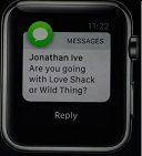
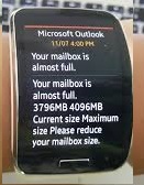
If a "huge part" is displaying lists or long pieces of data, then Samsung did it even better :)

apple_text.jpg

gear_email.jpg

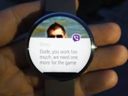
As for being able to see info on a round screen, for the majority of cases, it actually works just fine, as the info is contained in the middle. As you can see, it shows just as much as the Apple example above.

moto_text3.jpg

The upshot is, for those of us with both styles, there really isn't much difference except that a round watch gets far more oohs and ahhs. To me, square is boringly 1990s and geekish. Round is like retro-futuristic and yet familiar.

It's all up to your personal taste. Well, actually not, since Apple gives us no choice in display style. This is similar to the debates over larger screens. It would be quite telling if there were two Apple Watch models. I highly suspect that most people would choose round.

But since they don't offer a choice, this thread's friendly debate is kind of moot. At least, until/unless Android Wear becomes available for iOS.

Regards.
 
Last edited:
Round or square , they both have pros and cons.

The biggest limitation is watch faces, personally I find round ones much more appealing than square ones. Though if people intend to use this watch to communicate all the time, square if better. For me it would be watch first and computer second.

----------

If a "huge part" is displaying lists or long pieces of data, then Samsung did it even better :)

View attachment 535179

View attachment 535176

As for being able to see info on a round screen, for the majority of cases, it actually works just fine, as the info is contained in the middle. As you can see, it shows just as much as the Apple example above.

View attachment 535174

The upshot is, for those of us with both styles, there really isn't much difference except that a round watch gets far more oohs and ahhs. To me, square is boringly 1990s and geekish. Round is like retro-futuristic and yet familiar.

It's all up to your personal taste. Well, actually not, since Apple gives us no choice in display style. This is similar to the debates over larger screens. It would be quite telling if there were two Apple Watch models. I highly suspect that most people would choose round.

But since they don't offer a choice, this thread's friendly debate is kind of moot. At least, until/unless Android Wear becomes available for iOS.

Regards.

Great post.
 
Hate to quote myself, but I already explained why a round display is a terrible idea (unless you're planning to use a UI that doesn't have any button or list at all, which is obviously not very practical).


Sorry if my reply sounds harsh, but I find your photoshoped images very unfair. You not only used a taller shape (the diameter of the circle is longer than the height of the rectangle) but you also removed the bezels in the round version! That makes the comparison completely irrelevant, because you're comparing the size of the entire watch with a display without any bezel.

Lets add to that.

  • 42mm circle has a surface area of 1385sq mm
  • 42mmx33.6mm rectangle has a surface area of 1512sq mm
So not only does the rectangle do a much better job at displaying text and most info, it has a LOT more area to work with.:eek:

Now bring on the inefficient round iPad, iMacs and TVs.

Screen%20Shot%202015-03-16%20at%208.11.48%20AM_zpsf0o8wu4o.jpg
 
If a "huge part" is displaying lists or long pieces of data, then Samsung did it even better :)
Yes, if you subscribe to the school of thought that bigger = better, then sure, because that Samsung thing is gigantic. If Apple had chosen that path they'd been laughed out of town instead of ending up on the cover of Vogue magazine.

As for being able to see info on a round screen, for the majority of cases, it actually works just fine, as the info is contained in the middle.
It's inefficient use of screen real-estate. You have a potentially wider screen, but it's hard to use due to the curved nature of the display. The only reason we have round watches is because of analog dials and their associated mechanically driven hands, but a smartwatch isn't mechanical, it doesn't have a movement, it doesn't have rotating hands. There's no credible reason it should be round. Instead, form should follow function, and round displays aren't as functional when it comes to displaying text and information.

It's all up to your personal taste. Well, actually not, since Apple gives us no choice in display style.
You can't buy round iPhones either, you gonna complain about that too now? The investment in time and effort to create the current :apple:Watch is obviously extremely major. To duplicate that and create a round-faced version as well... Obviously unrealistic. You'd have to push the reset button on the entire user interface as well, as many of the current layouts don't work as effectively on a round display, not to mention having to duplicate and run in very very expensive manufacturing lines.

You think they never discussed round watches over at Cupertino HQ? It would be extremely unlikely if they never did, and yet they still picked a rectangular casing. There's obviously a reason for that (and reason is not that Apple's stupid, or don't understand what people really want, because it's their job to find that out, so they can sell lots of crap to people and make mountains of money - which they are, by the way.)
 
Funny how people forget that one of the most popular iWatch concepts was this one:

View attachment 534952


View attachment 534953
View attachment 534954
View attachment 534956

And yes, it looks GREAT with watch faces as a timepiece. Which of course, is what Apple claims their Watch is first, and foremost. (Not a wrist computer.)

View attachment 534955

Indeed, I remember it well.
I also remember all the Phablets like Samsung make are so dumb, Apples 4" is the perfect size.
I also remember, tablets smaller than 10" are dumb and unusable.

The thing that makes me smile the most is thinking, all the people in this thread, who are saying round watches are dumb, wrong and stupid.

If we rewind the clock back a few months, and Apple had revealed their round Apple Watch.

Makes me smile as would I expect these same people to now, on this very forums to be saying how wrong apple was, and their round watch is dumb, wrong and stupid?

No of course not, they would be saying how amazing it looks, and how right Apple was to go with this shape, when almost all other makers have no imagination and just gone with a dumb square look.

Of course, they will never admit to this. :)

As I say, I'm happy for both forms to exist.
We all have our preferences.
The Moto 360 probably has THE strongest following at the moment, and, for people who like that look, and there are many, I hope Motorola, and/or others continue with that design so that people have the widest choice possible.

Free choice for people, is all I have ever advocated.
Not telling people this is how it must be, if you don't like it, tough luck, we are offering you nothing else.

----------


I do agree with you there.

If you look at the many many screens of the current watch, so many things look like they were built for a round screen, and then at the last minute modified.


I remember hating that concept image immensely, and wondering why Macrumors kept using it.
 
So no one here feels that the round elements in the Apple Watch are silly and shouldn't exist, because square?

Seems lopsided. Why does the friends button produce a circular interface instead of a list (wasn't a list shown initially?). The Activity Screen has a circular display of information that seems like a waste of space, so why do it?
 
Register on MacRumors! This sidebar will go away, and you'll see fewer ads.