Got a tip for us?
Let us know
Become a MacRumors Supporter for $50/year with no ads, ability to filter front page stories, and private forums.
Taiwanese Star Jimmy Lin Gaining Attention for iPhone 6 Mockup Photos
- Thread starter MacRumors
- Start date
- Sort by reaction score
You are using an out of date browser. It may not display this or other websites correctly.
You should upgrade or use an alternative browser.
You should upgrade or use an alternative browser.
Where did the photo showing him holding it in his hand come from? There are only 3 images in the original article and a reverse image search on google isn't turning up anything. I ask because that's the only one that seems extra-fishy to me (because of the lack of apple logo).
I was definitely guilty of being one of those people that didn't like the look of iPhone 4 in leaked pictures, but the moment I felt it, I realised I was totally wrong. It felt and looked beautiful.
I'm really hoping it's the case again here, because those bands don't look brilliant. Plus there's the never changing front.
But what's the alternative? Not interested in Android, so hoping my perceptions change when the thing is finally released.
I'm really hoping it's the case again here, because those bands don't look brilliant. Plus there's the never changing front.
But what's the alternative? Not interested in Android, so hoping my perceptions change when the thing is finally released.
Where did the photo showing him holding it in his hand come from? There are only 3 images in the original article and a reverse image search on google isn't turning up anything. I ask because that's the only one that seems extra-fishy to me (because of the lack of apple logo).
Sorry just saw where those were from a different article. Makes me think Jimmy's pics are legit.
The white 5c is the best looking Apple product of the decade.At least it makes the 5c look really classy in comparison.
Definitely their ugliest phone yet. Those thick a$s lines.
This reminds me so much of the iPhone 4 leak. Granted, I agree this time...
iOS 7 and now this. Jony is showing Steve really was indispensable when it came to Apple design. At least it makes the 5c look really classy in comparison.
iOS 7 and now this. Jony is really showing how indispensable he is when it comes to marrying elegant, minimal software with elegant, minimal hardware.
Where did the photo showing him holding it in his hand come from? There are only 3 images in the original article and a reverse image search on google isn't turning up anything. I ask because that's the only one that seems extra-fishy to me (because of the lack of apple logo).
I thought the device was a mockup anyway? So potentially it wouldn't have a logo?
The white 5c is the best looking Apple product of the decade.
I don't know about the decade, but its definitely a very under rated product. The 5C looks and feels great. The biggest issue is that it was labeled as a "cheap" phone long before it was released. By and large Apple doesn't get involved in rumors and that's a good thing, but with the 5C Apple should have stepped in and changed the narrative. They let the media decide that the 5C was a "cheap" product instead of taking control. Even to this day, and on these forums, the "cheap" label has been tough to get rid of.
On topic, the back of that iPhone 6 mockup looks awful IMO. The thick breaks are especially bad. The rounded corners are nice though. Either way, I hope that this isn't the real look.
Last edited:
iOS 7 and now this. Jony is really showing how indispensable he is when it comes to marrying elegant, minimal software with elegant, minimal hardware.
The functionality of iOS7 was much improved, but the design elements were superfluous and a classic example of design over function. The garish colors, ineligible fonts and buttons and half ass icons. We could have done with more minimalist elegance than what we actually got.
The bands on the back of this mockup that circle around the top and bottom are nothing even comparable to elegance.
I will say that OS X Yosemite is gorgeous and a step back in the right direction.
??? iPhone 6 ???
I was sooooo happy when Apple got away from the rounded edges we found in iphone 3....3G....3GS....
Then there was the 4...4S with the glass on glass with the "flat edges", now that was nice..!!!
Then 5...5S... Absolutely LOVE IT...!!!!
NOW ??? Iphone 6 ???? With Rounded Edges Again COME ON APPLE!!!
What the F???
I Have Big Hands Not to Mention There A Little Dry At Times And Like The Iphone 3...3G...3GS... They All Slipped Out Of My Hands From the Rounded Edges...I'm Soooo Happy With The 5S....
But I Suppose I Have To Except Change.... Or Is IT????
Lets See How It Goes I Guess???
Thanks For Listening To My Rant...Lol...
I was sooooo happy when Apple got away from the rounded edges we found in iphone 3....3G....3GS....
Then there was the 4...4S with the glass on glass with the "flat edges", now that was nice..!!!
Then 5...5S... Absolutely LOVE IT...!!!!
NOW ??? Iphone 6 ???? With Rounded Edges Again
COME ON APPLE!!!What the F???
I Have Big Hands Not to Mention There A Little Dry At Times And Like The Iphone 3...3G...3GS... They All Slipped Out Of My Hands From the Rounded Edges...I'm Soooo Happy With The 5S....
But I Suppose I Have To Except Change.... Or Is IT????
Lets See How It Goes I Guess???
Thanks For Listening To My Rant...Lol...
The functionality of iOS7 was much improved, but the design elements were superfluous and a classic example of design over function. The garish colors, ineligible fonts and buttons and half ass icons. We could have done with more minimalist elegance than what we actually got.
The bands on the back of this mockup that circle around the top and bottom are nothing even comparable to elegance.
I will say that OS X Yosemite is gorgeous and a step back in the right direction.
I'm not saying that iOS7 is perfect but when I look at iOS6 now it looks like it belongs in another era. The icons are a mere trifle when you consider how iOS 7 looks, feels and behaves. iOS 8 takes this even further.
The fonts aren't illegible to me and if I want to embolden them or enlarge them, I can.
And yes, Yosemite is gorgeous.
I'll reserve judgment on the iPhone 6 until we've seen the real thing but I see nothing that makes me fear that Jony I've has suddenly lost his touch.
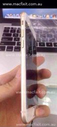
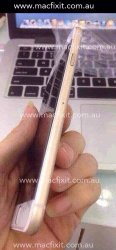
These fully assembled pictures from macfixit look pretty legit, and the thick lines are there. Looks a lot of people here are going to have to learn to live with those
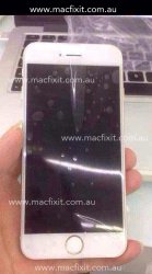
Questioned it in another thread as well but, where is the FaceTime camera?
Wait... Was that a phone?
It was a working prototype for a phone, but never got released. I think it was built to drive interest in Intel's Moorestown platform.

I don't think the thick lines are *bad* necessarily, but it's going to come down to the specific details and fit and finish. These are mockups, so they might be missing a little of the specific flair that the final will have. We knew what the 5 was going to look like, more or less, but the final had an extra special polish that took it from clunky to classy.
The white 5c is the best looking Apple product of the decade.
It would have looked much better if it had a white faceplate to match the white plastic.
Instead, Apple simply slapped on a black faceplate and it just looks odd to me.
Register on MacRumors! This sidebar will go away, and you'll see fewer ads.