What good is it without the time?I wear a 38mm Rolex Oyster Perpetual. It is not "dainty" for my wrist size, it is a classic vintage, timeless size.

What good is it without the time?I wear a 38mm Rolex Oyster Perpetual. It is not "dainty" for my wrist size, it is a classic vintage, timeless size.
Bone apple tea.The Pixel watch is a Fitbit to all intense and purposes
Simple answer no
For me, I still primarily buy on price. If the Pixel Watch is $200 or less (doubt it though), or if it discounts to that point later on (probably wait a year or 2), then I'm in! It's a main reason I stuck with Android (that, and I genuinely do like to use Android). However, I will admit buying a new phone has gotten better since I upped my budget from $300 to $500. Ditto with my iPad... I was in the market for a new tablet, figured I'd get an iPad since I still have a lot of apps I purchased on my previous iPad (Air, 1st gen from 2013) and iPod Touches (3rd to 5th gens), but mainly I could get one in new condition, and latest gen (9th) for just $300 (no way I'm paying more than that for a tablet).Why does Google (or anyone else) have to beat Apple (or another company)? As long as a company offers a solid product that people want and buy, that's enough to keep other companies on their toes to try to improve and innovate.
That's how we got the Apple Watch Ultra. People (i.e. serious athletes) were buying Garmin watches like the Fenix because the regular Apple Watch didn't offer what Garmin had.
Fitness+ still requires a subscription doesn't it? It's $10/month, or $80 per year, or part of Apple One premier. Unless you were referring to more basics, in which case, perhaps elaboration may be in order.$80 a year for advanced fitness features? No thanks.
I know it does more than Apple offers, but at least Apple gives you all their fitness stuff for the purchase of the watch.
I can get on board for "a little more money". We're talking an extra few hundred $'s for a phone. However, when it's more than double (+$500), that's when I tap out.I've learned in life never to buy something solely for price. In this case, the Apple Ecosystem is so refined, it is worth a little more money for the better experience.
I wear a 38mm Rolex Oyster Perpetual. It is not "dainty" for my wrist size, it is a classic vintage, timeless size.
Swipe left, right, up and down are all possible with a circle or square.round screens for UI is just hard, not saying impossible but you have to change up the general way people interact with information. information layout favors squares
Simple answer, yes.Simple answer no
Fitness+ is literally just workout videos that have your metrics on the screen. It's not like Fitbit Premium where it literally locks functionality of the device behind a paywall.Fitness+ still requires a subscription doesn't it? It's $10/month, or $80 per year, or part of Apple One premier. Unless you were referring to more basics, in which case, perhaps elaboration may be in order.
I can get on board for "a little more money". We're talking an extra few hundred $'s for a phone. However, when it's more than double (+$500), that's when I tap out.
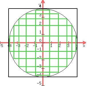
Take a square and inscribe a circle within it; then, inscribe a square within the circle. It will look like this. The inner square represents roughly the area on a round watch where text information can be displayed, while the outer square is the area of a square watch. It turns out that the inner square has half the area of the outer square, meaning that an Apple Watch can display twice as much information onscreen as a Pixel watch of the same dimensions. Yes, that's no big deal if your needs are simple, but Apple Watch apps will always have the advantage over Pixel apps because they have double the screen real estate to work with.Not sure why round faces get such push back. A lot of people like them, WearOS was designed to accommodate both styles, and if you primarily use your watch with round face optimized apps its really not a big deal.
Take a square and inscribe a circle within it; then, inscribe a square within the circle. It will look like this. The inner square represents roughly the area on a round watch where text information can be displayed, while the outer square is the area of a square watch. It turns out that the inner square has half the area of the outer square, meaning that an Apple Watch can display twice as much information onscreen as a Pixel watch of the same dimensions. Yes, that's no big deal if your needs are simple, but Apple Watch apps will always have the advantage over Pixel apps because they have double the screen real estate to work with.
From my post you responded to:Take a square and inscribe a circle within it; then, inscribe a square within the circle. It will look like this. The inner square represents roughly the area on a round watch where text information can be displayed, while the outer square is the area of a square watch. It turns out that the inner square has half the area of the outer square, meaning that an Apple Watch can display twice as much information onscreen as a Pixel watch of the same dimensions. Yes, that's no big deal if your needs are simple, but Apple Watch apps will always have the advantage over Pixel apps because they have double the screen real estate to work with.
From my post you responded to:
"...and if you primarily use your watch with round face optimized apps, or Google Assistant which is better than Siri, it's really not a big deal."
).I addressed that. I wrote: "Yes, that's no big deal if your needs are simple… ."From my post you responded to:
"...and if you primarily use your watch with round face optimized apps, or Google Assistant which is better than Siri, it's really not a big deal."
Sure if reading blocks of text is what you mainly do on a watch, square is better. But claiming the AW can display twice as much info on the screen is just plain hyperbole. A round screen needs a different layout but most info that you use on a watch is max 3 words and mostly it’s a couple numbers. The layout for that kind of data is way more flexible and round can end up being better case by case.Take a square and inscribe a circle within it; then, inscribe a square within the circle. It will look like this. The inner square represents roughly the area on a round watch where text information can be displayed, while the outer square is the area of a square watch. It turns out that the inner square has half the area of the outer square, meaning that an Apple Watch can display twice as much information onscreen as a Pixel watch of the same dimensions. Yes, that's no big deal if your needs are simple, but Apple Watch apps will always have the advantage over Pixel apps because they have double the screen real estate to work with.
I was talking about text information, but even so, an Apple Watch can display 27% more map information than the Garmin. Care to illustrate how a Garmin looks displaying lists?When I look at me Garmin Fenix, the area for display looks more like this: and maps will fill the entire circle.