Become a MacRumors Supporter for $50/year with no ads, ability to filter front page stories, and private forums.

The new HEADINGS in apps are...


  • Total voters
    87

Relax.wealthy.enchant

macrumors newbie
Original poster
Aug 25, 2017
24
48
Anyone else find the Music-app-inspired titles of apps in the app a complete waste of space in iOS11?

In the Music app it makes sense, as they are actual subheadings indicating where you currently are in the app.

But having 7% of a sidebar taken up by a giant Messages or Settings heading (especially on a smaller iPhone screen) when I already know I’m in Messages or Settings seems completely redundant, distracting, and a little absurd.

Thoughts?

499B2129-F83C-4244-AAEA-848326381B3C.jpeg
 
Last edited:
I like the new headings for the simple fact that they look less dated. This seems to be the design language that many apps are incorporating as well. You do get less real estate, which can stink, and I do suppose they could stand being smaller on smaller devices.

I like them on my 7, but the UI is less compacted than on an SE or 5S.
 
  • Like
Reactions: jhall8
Wasted space <-------> White space

Got to stop somewhere but I doubt Apple are concerned about small sized screens when a vast majority are between 4.7" and 12.9".

Agree with you that the heading should be somewhat more relevant to what you're doing although I haven't given iOS 11 a go yet to be fully able to comment on it.
 
  • Like
Reactions: MartinAppleGuy
At least the headings such as the aforementioned Messages and Settings are collapsible when scrolling. I think they make more sense on bigger (than 4-inch) devices. Maybe they'll accommodate the new iPhone better?
 
It’s also super-inconsistent. For example in Mail app, it shows the Inbox when you’re in Inbox. But doesn’t show the heading when you’re in Drafts. But shows it in Sent if you scroll down.
 
I like them - it is more in keeping with the updated design language I suppose... I can certainly see where they take up a lot of space on smaller devices, but since I don't have one it doesn't affect me - seems that it may be more intended for the new iPhone as well, perhaps we'll see more about why it is that way in the near future.
 
My Reply

Ok so after thinking about this more, I wanted to articulate clearly why this bugs me so much:

Above, you already know this is a reply on a page with replies to an original post. Imagine seeing My Reply as a massive heading above every single reply on MacRumors forums, wouldn’t it be ridiculous?

From a UI design perspective, everything should have a functional purpose (otherwise, it’s clutter). One can certainly have a totally subjective opinion on whether the new design language is visually appealing. But here’s the thing:

This is visually the heaviest, loudest, element on the screen and thus your eyes involuntarily jump to it and read that text — it just screams “read me”. If I’m looking down at my phone 300 times a day, that’s 300 times my eyes scanned that heading reflexively, and my brain went: “Oh wait, that’s a useless heading, disregard”. At some point, that in it of itself becomes annoying.

I’m pretty sure for 99.9% of users, they know what app they are in already, they just clicked on it, so what exactly is the purpose of it?

In the Music app, it’s a legit dynamic heading that indicates what you’re currently looking at, so it makes total sense as it serves as a “breadcrumb” — it serves a valid purpose. (Though I still find it super-distracting because the font weight and size are so large relative to other content).

But in the other apps, it literally is just a static piece of text that is redundant since I already clearly see I’m in Messages or Settings apps.

So it feels pretty random to have this dramatic heading element that behaves inconsistently across apps and doesn’t actually have a purpose — if I’m reading a magazine, I like it. If I’m using an app, I just want to get my sh*t done.
 
Last edited:
Absolutely love them - how else would I know what app I just opened? /s

At this point I just give up caring - Apple seems to be on "lets make everything bigger and bolder" and doesn't seem to be stopping anytime soon. Hopefully one day they'll allow us to change this - I get that some people might need bigger fonts etc - but let us choose...

Already moved music apps, guess I might have to start looking for more replacements soon.
 
Many design choices in iOS10 are amateur at best. I've seen better design cohesion in high school projects, especially the brain-dead-hamster choices that went into the new Music app. Song times no longer visible on album lists? Can't just tap the album name to play? Utter, utter idiocy.

I hate saying it but Microsoft's Metro language is easier to understand.
 
Last edited:
Could be that it's a change that makes sense with the new iPhones. Like the Edit or Back buttons, that look off/weird now, being moved to the bottom/function are of the iPhone 8. Apple being Apple naturally forces said new design language onto older devices too, even though they do not have a function area cause "consistency".

I actually don't mind the big/bold titles, I kind of like the new design language they try to aim for. Hope they push out an update for the iTunes store soonish too.
 
Donald Trump Resigns

Just kidding. But here’s some content that’s actually important that you totally didn’t look at first, which is why you’re actually reading this right?
 
Last edited:
  • Like
Reactions: Shirasaki
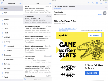
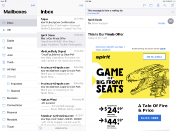
9206312F-E26A-40E9-AB12-F7D75614C6CF.png AFFDD387-4FF2-4924-A642-1F205D2A431C.png

Ok guys, look at these two screenshots I took of my inbox (yes I’m aware some of my personal info shows up here. Yes I fly with Spirit Airlines and will burn in hell).

But seriously.

Isn’t the first screenshot on the left far cleaner, less obnoxious/obtrusive, yet still conveys clearly what I’m looking at while being easier on the eyes? I just don’t get the need for the giant Mailboxes and Inbox text.

[doublepost=1503945330][/doublepost]
573F28BD-DFB7-4255-9175-4489E899A9EA.jpeg


Then you wind up with stuff like this, where you have like 5 font sizes and weights in one screen. Like as a designer, this is absurd. This completely messes with my sense of hierarchy of what’s important on this screen.
 
Last edited:
Register on MacRumors! This sidebar will go away, and you'll see fewer ads.