Become a MacRumors Supporter for $50/year with no ads, ability to filter front page stories, and private forums.

The new HEADINGS in apps are...


  • Total voters
    87
View attachment 714883 View attachment 714884

Ok guys, look at these two screenshots I took of my inbox (yes I’m aware some of my personal info shows up here. Yes I fly with Spirit Airlines and will burn in hell).

But seriously.

Isn’t the first screenshot on the left far cleaner, less obnoxious/obtrusive, yet still conveys clearly what I’m looking at while being easier on the eyes? I just don’t get the need for the giant Mailboxes and Inbox text.

Common. Who’s with me? Anyone? Anyone at all? :)
[doublepost=1503945330][/doublepost]View attachment 714885


Then you wind up with stuff like this, where you have like 5 font sizes and weights in one screen. Like as a designer, this is absurd.

In this case, iOS 11 looks better.
 
Anyone think this new design language looks very similar to Three's? (UK phone network)
 
D55F4454-7EDB-4173-994F-0480A2656CE0.jpeg 8E77DDC1-0D56-4CAC-B72A-D17829E7C53F.jpeg C96B864A-9504-476E-85F3-D72B7F95A50F.jpeg DBDF5E16-E3A4-40C7-82AF-447A901F39C6.jpeg
Probably not. I am glad you took the time to tell me the correct thing then.
It’s in the original post you quoted, I think you just need to read it a few more times :D

Here are some pics showing inconsistent headers in Mail. Yes in all pics the list is scrolled to the top
 
  • Like
Reactions: deuxani
I completely agree with you! It's hideous. It looked so good when it was aligned with the "back" button on top. The new font looks like a 12 year old just discovering Microsoft FrontPage 2003
 
If anything they aren't big enough! I can't wait until iOS 12 when Messages takes up two line spaces!

Mess
-ages ftw

Haha!

I do wonder what they are thinking by making this font so huge? Is it the same for all languages? If so you may already have a beta user in another country looking at a full screen with the word "Messages" on it. Totally absurd.
 
In a few months you’ll be used to it and think it looks good and the old way looks old fashioned, i guarantee it.
 
  • Like
Reactions: Feenician
Thank god the German word for settings is “Einstellungen”, and not “Einverhitlerhitlerhitlerstellungen” Like all those other German words, or Apple would really be screwed.
 
In a few months you’ll be used to it and think it looks good and the old way looks old fashioned, i guarantee it.

Absolutely right. 50%+ of the design complaints threads in beta are knee-jerk reactions to change and then a massive analysis paralysis over the seismic impacts of small changes. Rinse and repeat annually.
[doublepost=1504056243][/doublepost]
Thank god the German word for settings is “Einstellungen”, and not “Einverhitlerhitlerhitlerstellungen” Like all those other German words, or Apple would really be screwed.

Or they'd, you know, use a different word.
 
I also think there will be a shift towards appreciating the new UI elements, or at the very least acceptance. There is some shock value to the headings because they were sudden changes, and not frog-in-hot-water. As other apps follow suit, things will normalize.
 
Eh, yes and no. While I agree there’s definitely some “shock” when you see something new, there is a valid reason why some things make you go “oh woah, that is so much better!” And others that make you go “ugh, why did we change this?”

You can’t just dismiss all design criticism as a knee-jerk reaction. There are objectively good and bad design decisions.

That’s like saying if I added a giant gorilla GIF into every iOS screen, you not liking it is just a knee-jerk reaction to “change”. No, it’s because you wouldn’tunderstand why that Gorilla is there, and would try to at least rationally figure out what the designers were thinking. :)

In this case, I don’t get the rational behind this particular design decision, other than “hey let’s change it for the sake of making you feel like we changed something”.

There’s a million and one ways to improve iOS with changes that aren’t superfluous and redundant headings in apps you already know and use thousands of times a day that waste space and behave inconsistently just seem like a bad design decision.
 
Last edited:
  • Like
Reactions: TouchedByAl
You can’t just dismiss all design criticism as a knee-jerk reaction. There are objectively good and bad design decisions.

That’s like saying if I added a giant gorilla GIF into every iOS screen, you not liking it is just a knee-jerk reaction to “change”. No, it’s because you wouldn’tunderstand why that Gorilla is there, and would try to at least rationally figure out what the designers were thinking.

I actually didn’t dismiss it all as knee-jerk. I agree that objectively gorilla gifs would be bad but it’s a strawman argument since Apple have never done anything quite so egregious. The designs and design elements they do choose in the end may be subjectively disliked but that’s a different proposition and, often, it is simply a reaction to change. Nothing especially wrong with that; some people don’t do well with change and that’s life, but, lets not pretend our opinions are objective.
 
There aren't really any objective rules about design either. And the design that major tech companies introduce plays a big role in directing trends that others respond to. It's all very fluid.

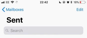
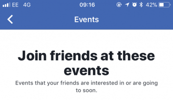
Btw, three apps I've noticed incorporate bigger and bolder headers: Facebook, Skype, Twitter. Maybe not on the same level as Apple's app headers, but loosely it seems to be the way things are going from all corners. Couple of quick examples attached.
IMG_5895.PNG IMG_5896.PNG
 
  • Like
Reactions: TouchedByAl
To make my point clear: I’m not arguing that big and bold fonts are bad, like at all, I feel like a lot of people misinterpreted my comments as a shallow complaint about the aesthetic. However, my actual point is that if you have such a loud, bold heading at the top, it should have a purpose and not just be there “because why not”.

@GreyOS Your own examples above are making my very point — when it’s a dynamic header in an app, it totally makes sense, because then it’s an important piece of info you aught to read, right?

For example, the name of an event, or “here’s a blurb on what this screen is about” so you know what your next step is, is a dynamic heading that changes based on context right? Or that you are currently in the “Off Topic” screen with the arrow ← to the left of it is essentially making this a bread-crumb element. These both serve a clear and functional purpose.

On the flip side, Having a giant heading with Messages or Settings in apps where I already see I’m in Messages or Settings doesn’t do anything to inform you — it’s just wasted space. Whether it was there or not, it wouldn’t make one iota of difference in terms of how you use the app right?
 
  • Like
Reactions: TouchedByAl
On the flip side, Having a giant heading with Messages or Settings in apps where I already see I’m in Messages or Settings doesn’t do anything to inform you — it’s just wasted space. Whether it was there or not, it wouldn’t make one iota of difference in terms of how you use the app right?

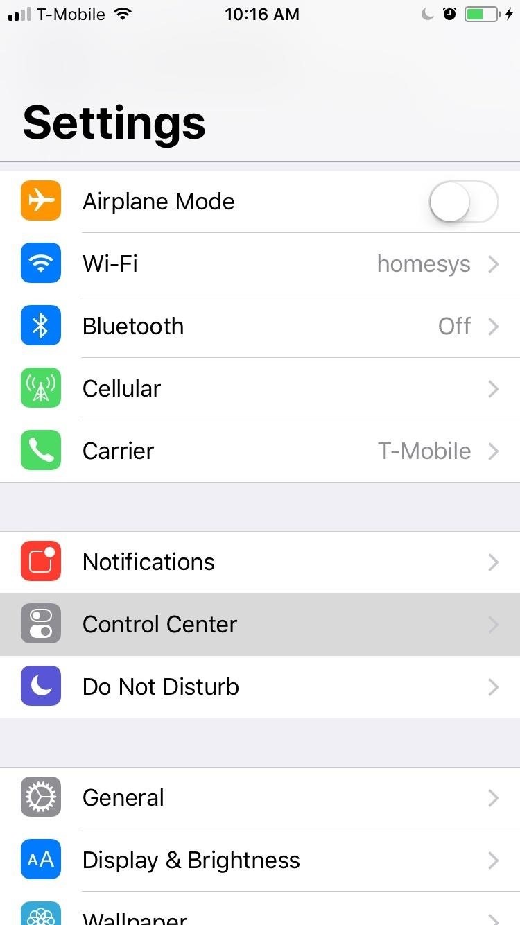
At least in Messages there is an Edit and a New Message button above the giant header. In Settings there is just..... nothing..... just an empty sea of nothingness.

record-your-iphones-screen-with-audio-ios-11-no-jailbreak-computer-needed.w1456.jpg


It totally doesn't make any sense. And the inconsistencies are even worse (some screens do and some don't have the huge headers). I think it was a very bad design decision.
 
Register on MacRumors! This sidebar will go away, and you'll see fewer ads.