Become a MacRumors Supporter for $50/year with no ads, ability to filter front page stories, and private forums.
As others have indicated, a traditional watch has every reason to be round, but it makes no sense for a smartwatch.

totally wrong and such silly arguments are easily refuted.

digital quartz watches are more accurate and more foolproof battery/runtime wise than automatic watches that must be wound or they lose time (and they all lose 5-30 secs a day anyway). It's faster to read the time on a digital casio. Makes no sense to make beautiful traditional mechanical watches. Yet those are the ones a lot of people want, and in the space apple is competing in, it's the majority of watches. So, the makers are making something that doesn't make sense...I'm sure their billions of profit makes plenty of sense to the swiss watch makers.

beauty and fashion is more important to drive sales for such a needless device than its actual functionality (as the iPhone will do every task better than the watch). When jobs introduced the ipad he noted that netbooks don't do anything better than laptops. The watch doesn't do anything better, either. If it's gonna sell it's gonna be because it's fashionable, and a miniaturized iPhone is lame and boring and cannot mimic classic desirable watchfaces.
 
Just for the record. This is what happens when you try to fit text in three different displays: the first one, a square display; the second one, a rounded display of the same size (let's say both are 2" displays); and the third one a smaller, rectangular display (let's say 1,5").

Image

The rounded display is the worst. So let's try with buttons, another extremely common UI object.

Image

Doesn't get any better. You can only fit three buttons (instead of four) and you have to make them shorter than in both the square display of the same size and the rectangular (smaller display). Of course, you can make the button in the middle longer, but why would you want one of the buttons to be bigger than the others?

Let's try with a list. You'll need a list at some point right? IE, when you need to select a song from an album you want to listen.

Image

Ew. Doesn't look good at all.


Yes, you can design new interfaces, but I doubt you can make one without buttons, text or lists usable. You'll need to display text. One of the main features is that it displays a notification (with text) when you get it on your iPhone. So why would them choose the option that displays LESS text from all the options available?

If you think it's possible to solve this problems, please explain me how.

I gotta bookmark this. Good observations.
 
I agree, and I think square or rectangle is equally as stunning as circle. The Cartier Tank watch is a very popular watch in the mid to high end market.

----------


The Moto 360 shows the trade off of round, since you can't fit as much text. Silly large size that looks like a hockey puck on the wrist. I'd pick the smaller rectangle of the Apple Watch easily.

Beauty is in the eye of the beholder. I don't really like that 80s Casio calculator watch look, even if its wrapped in aluminum and sapphire. Although functionally and buildwise I suspect the moto 360 is far inferior to the apple watch, aesthetically it is exponentially more beautiful. At this point I would buy neither as the Moto is beautiful to the eye, but flimsy to the hand and lacking in functionality, where the apple watch has a high quality feel to it and functionality, but is displeasing to the eye.

Watches have always been more form over function, why would people spend 10k or more on a watch simply to tell time? Sure a very small subset of them are pilots, divers, etc., but the vast majority of those consumers are just Joe schmoes with money. I'm NOT saying a smartwatch needs to be more form over function, but form does have a VERY important role to play here if the smartwatch is to win over hundreds of years of why humans would strap a clock onto their wrist.
 
totally wrong and such silly arguments are easily refuted.

digital quartz watches are more accurate and more foolproof battery/runtime wise than automatic watches that must be wound or they lose time (and they all lose 5-30 secs a day anyway). It's faster to read the time on a digital casio. Makes no sense to make beautiful traditional mechanical watches. Yet those are the ones a lot of people want, and in the space apple is competing in, it's the majority of watches. So, the makers are making something that doesn't make sense...I'm sure their billions of profit makes plenty of sense to the swiss watch makers.

beauty and fashion is more important to drive sales for such a needless device than its actual functionality (as the iPhone will do every task better than the watch). When jobs introduced the ipad he noted that netbooks don't do anything better than laptops. The watch doesn't do anything better, either. If it's gonna sell it's gonna be because it's fashionable, and a miniaturized iPhone is lame and boring and cannot mimic classic desirable watchfaces.

I'm afraid your argument faltered rather quickly.
The smartwatch handles an array of bite-sized tasks that house the simplicity of it's purpose. The problem is, people are thinking about what this device could do for them today, rather what they should be thinking about is what it could do for them tomorrow.

Modern generations have no need for a traditional watch. Clocks are all around them. So to say that watches and smartwatches occupy the same space in terms of reason and cause is an unimaginative argument.

And yes, when Jobs introduced the iPad he argued that netbooks didn't do anything truly beneficial to fit their purpose. But that didn't mean they couldn't. So now we have the MacBook Air.
 
A round display is the form over function for something like this. Which is bad design.

It works for a watch, because all watch does is tell time. Why would it work for something that does so much more than that? It's insane to ask or expect that a watch that does so much, be round.
 
Just for the record. This is what happens when you try to fit text in three different displays: the first one, a square display; the second one, a rounded display of the same size (let's say both are 2" displays); and the third one a smaller, rectangular display (let's say 1,5").

Image

The rounded display is the worst. So let's try with buttons, another extremely common UI object.

Image

Doesn't get any better. You can only fit three buttons (instead of four) and you have to make them shorter than in both the square display of the same size and the rectangular (smaller display). Of course, you can make the button in the middle longer, but why would you want one of the buttons to be bigger than the others?

Let's try with a list. You'll need a list at some point right? IE, when you need to select a song from an album you want to listen.

Image

Ew. Doesn't look good at all.


Yes, you can design new interfaces, but I doubt you can make one without buttons, text or lists usable. You'll need to display text. One of the main features is that it displays a notification (with text) when you get it on your iPhone. So why would them choose the option that displays LESS text from all the options available?

If you think it's possible to solve this problems, please explain me how.

I agree with you that you can fit more text on a square screen. However maybe a watch doesn't need that much text. I still think that Apple needs to be smarter with the way that they utilise screen real estate, and I hope they don't end up flooding the screen with small images and fine text. IMO Apple should have created a brilliant round watch even if it meant less real estate.
 
If I want a round watch that looks like a traditional timepiece then I'll just buy a traditional analog watch. Yeah the Moto Almost 360 is round but it doesn't remind me of a traditional watch it reminds me of a big, thick aluminum tire with a leather strap attached to it. And they had to make the watch face rather large to accommodate text and even still some text gets cut off at the edges.
 
I agree with you that you can fit more text on a square screen. However maybe a watch doesn't need that much text. I still think that Apple needs to be smarter with the way that they utilise screen real estate, and I hope they don't end up flooding the screen with small images and fine text. IMO Apple should have created a brilliant round watch even if it meant less real estate.

Do you REALLY think Apple will flood the screen with small images and small text?! REALLY?

I'm just asking.....
 
"What if the Apple Watch were round" No, thank you

Bildschirmfoto%202014-09-14%20um%2000.18.36.png
 
Just for the record. This is what happens when you try to fit text in three different displays: the first one, a square display; the second one, a rounded display of the same size (let's say both are 2" displays); and the third one a smaller, rectangular display (let's say 1,5").

Image

The rounded display is the worst. So let's try with buttons, another extremely common UI object.

Image

Doesn't get any better. You can only fit three buttons (instead of four) and you have to make them shorter than in both the square display of the same size and the rectangular (smaller display). Of course, you can make the button in the middle longer, but why would you want one of the buttons to be bigger than the others?

Let's try with a list. You'll need a list at some point right? IE, when you need to select a song from an album you want to listen.

Image

Ew. Doesn't look good at all.


Yes, you can design new interfaces, but I doubt you can make one without buttons, text or lists usable. You'll need to display text. One of the main features is that it displays a notification (with text) when you get it on your iPhone. So why would them choose the option that displays LESS text from all the options available?

If you think it's possible to solve this problems, please explain me how.

Now compare equal inch shapes, the circle wins.
 

Attachments

  • apple.png
    apple.png
    4 KB · Views: 342
Last edited:
Now compare equal inch shapes, the circle wins.

Not real sure how that Walmart course in geometry is structured but let me offer a little help.:eek:

ScreenShot2014-09-23at53756PM_zps40fb5232.jpg


42mm circle = 1385 square mm (1.4 square cm)

42mm x 35.7mm = 1499 square mm (1.5 square cm)

Also a square is much more efficient in displaying text info.

A circle is more effect in displaying an analog watch dial.
 
Last edited:
Not real sure how that Walmart course in geometry is structured but let me offer a little help.:eek:

Image


42mm circle = 1385 square mm (1.4 square cm)

42mm x 35.7mm = 1499 square mm (1.5 square cm)

Also a square is much more efficient in displaying text info.

A circle is more effect in displaying an analog watch dial.

What I'm trying to say is that an x" circular display can view at least as much text as the x" square display and also have better analog and digital. watchfaces.
 
What I'm trying to say is that an x" circular display can view at least as much text as the x" square display and also have better analog and digital. watchfaces.

Apples and oranges and 'you can't fit a square peg in a round hole' unless you draw it. :D

You are just drawing an arbitrarily larger circle. Your circle is 55mm in diameter (if using a 42mm aWatch for comparison) and has a 2376 square mm (2.4 square cm). Again you are trying to compare apples and oranges.

EDIT: Just to add the aspect ratio of the aWatch is 1:0.85 and not 1:1 as in your illustration.
 
Last edited:
Now compare equal inch shapes, the circle wins.

I tested out your idea.

If the face was round and just covered each corner, this is what we'd have. I have no idea how large that would be, but it looks massive. Looks pretty good as a watch though. But what's missing? The corners offer convenient functionality that would be lost with a round display. How would you get those options? Add it to the menu after a force touch? Or would you not blow out the watch face and still have the options in the same place? But then the content is still square.

Roundwatch_zps69b296a7.jpg


And here are some other faces that would only work with a round display if major compromises are made. Again, removing the corner areas would remove the options there. The bottom faces are shown as ones that would either have to be adapted to a round display in a very messy way, or left as a square within the circle, wasting a ton of space.

watches_zpse4299b1d.jpg


And what about a list? If you make the circle as large as the square is at it's largest, it can show just as much content as the square without clipping anything off, as your example shows. But now you have a ton of wasted space. That looks terrible. What can you do with it? If you try to widen the content out the edge to fill the space, the original clipping problem is back.

roundvssquare_zpseb7e6577.jpg
 
I tested out your idea.


If the face was round and just covered each corner, this is what we'd have. I have no idea how large that would be, but it looks massive. Looks pretty good as a watch though. But what's missing? The corners offer convenient functionality that would be lost with a round display. How would you get those options? Add it to the menu after a force touch? Or would you not blow out the watch face and still have the options in the same place? But then the content is still square.


Image


And here are some other faces that would only work with a round display if major compromises are made. Again, removing the corner areas would remove the options there. The bottom faces are shown as ones that would either have to be adapted to a round display in a very messy way, or left as a square within the circle, wasting a ton of space.


Image


And what about a list? If you make the circle as large as the square is at it's largest, it can show just as much content as the square without clipping anything off, as your example shows. But now you have a ton of wasted space. That looks terrible. What can you do with it? If you try to widen the content out the edge to fill the space, the original clipping problem is back.


Image


Yeah

The corners could be used as hot corner buttons or something.
Either way the conventional UIs cannot work with circles.
I'm also thinking that the long text like a list cannot look good on any circle.
Even for function, I don't want to read small font texts on my wrist.
 
I tested out your idea.

If the face was round and just covered each corner, this is what we'd have. I have no idea how large that would be, but it looks massive....

I already calculated it at 55mm diameter using the 42mm x 35.7mm aWatch's diagonal measurement.
 
Apples and oranges and 'you can't fit a square peg in a round hole' unless you draw it. :D

You are just drawing an arbitrarily larger circle. Your circle is 55mm in diameter (if using a 42mm aWatch for comparison) and has a 2376 square mm (2.4 square cm). Again you are trying to compare apples and oranges.

EDIT: Just to add the aspect ratio of the aWatch is 1:0.85 and not 1:1 as in your illustration.

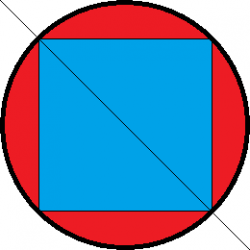
The diameter of my circle is the same as my squares diagonal. That means that the diameter of the circle would be 55mm sand the diagonal of the square would be 55mm. The circle is larger because that’s what circles are.
It’s not apples and oranges, it’s comparing equal inch screens to see which one is better.

And it doesn’t matter if I draw the display as 1:1 or 1:0.85 since a circle would still have more screen area per inch.

The other comparison basically says that a screen that’s smaller than an other screen can view less content, even though if you do it correctly and compare two equal size screens the circle displays a lot more content.

Also my picture is not a comparison of Iwatch to anything. I’m just comparing displays of the same inch.
 
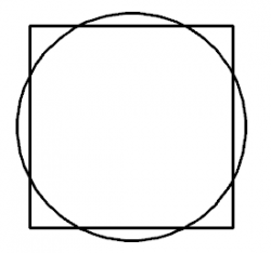
Here's a comparison between a square and a circle with equal areas. It's a fair way to compare the two as if they were the same "size". I think a circular UI could be very effective and beautiful, but obviously you'd have to design for it. A square UI is certainly the easier solution.

Watch face.PNG
 
....I’m just comparing displays of the same inch.

So what is this "same inch" you keep saying? In order to be the same "inch" they both must have the same surface area (apples to apples). The circle you drew is over 45% larger than the aWatch face.

Apple Watch 42mm x 35.7mm = 1499 square mm (1.5 square cm)

Your circle 55mm diameter = 2376 square mm (2.4 square cm)


So you are comparing '1 inch to 1½ inch' and not "same inch".

Look at ESO post. That shows them both with the "same inch", although his the aspect ratio is 1:1. My previous illustration was fairly close at 1.4 square cm to 1.5 square cm (7.8%), but you are WAY off (over 45%).
 
Last edited:
So what is this "same inch" you keep saying? In order to be the same "inch" they both must have the same surface area (apples to apples). The circle you drew is over 45% larger than the aWatch face.

Apple Watch 42mm x 35.7mm = 1499 square mm (1.5 square cm)

Your circle 55mm diameter = 2376 square mm (2.4 square cm)


So you are comparing '1 inch to 1½ inch' and not "same inch".

Look at ESO post. That shows them both with the "same inch", although his the aspect ratio is 1:1. My previous illustration was fairly close at 1.4 square cm to 1.5 square cm (7.8%), but you are WAY off (over 45%).
both my circle an my square are x" displays, x being the diagonal of the square. The reason the circle has more screen is because its a circle.
 
both my circle an my square are x" displays, x being the diagonal of the square. The reason the circle has more screen is because its a circle.

But what everyone is trying to point out is “they both have a X” display” doesn’t work as a method of comparison if one is square and one is a circle. You are creating a physically larger display, then saying its larger while having the same size display, which is physically impossible. If the width of the display equals the diameter of the circle, the circle will always have a smaller surface area. It’s seventh-grade geometry.
 
But what everyone is trying to point out is “they both have a X” display” doesn’t work as a method of comparison if one is square and one is a circle. You are creating a physically larger display, then saying its larger while having the same size display, which is physically impossible. If the width of the display equals the diameter of the circle, the circle will always have a smaller surface area. It’s seventh-grade geometry.

A 20" 1:1 display is physically larger than a 20" 16:9 display am I right? Then a 20" circular display is physically larger than a 20" 1:1 display
 
A 20" 1:1 display is physically larger than a 20" 16:9 display am I right? Then a 20" circular display is physically larger than a 20" 1:1 display

You are using numbers without any reference. I know what you reference numbers are (and they are unrelated and therefor wrong) on each but you don't. They could be on the rectangle: hight, width, parameter or diagonal. On the circle it could be: radius, circumference or diameter.

FACT: The only way to compare the "same inch" of a circle and a rectangle is to have the same area.

Did you have 8th grade geometry? This is VERY basic stuff.

Just for kicks here is the answer to your questions.

20" 1:1 diagonal square has an area of 202.35 square inches
20" 1:1 hight square has an area of 400 square inches
20" 1:1.78 diagonal square has an area of 175.5 square inches
20" 1:1.78 hight square has an area of 720 square inches
20" circumference circle has an area of 31 square inches
20" diameter circle has an area of 314.16 square inches
20" radius circle has an area of 1257 square inches


They are all the "same inch" but yet each has a different area. So you can't just 'make up' definition of what you think is the same.
 
Last edited:
May I point out none of this 'I can prove it with maths' means a toss..

Some people prefer the look of a round faced watch.

That's the ONLY issue to accept, and it does not matter what you think you can prove using any formula's.

The Round dial on the Apple watch, looks to me far worse than if that same round dial was on a round faced watch.

Perhaps many people like round, as round is natural.
Planets are round, flowers are round, balls are round, wheels are round, it's the shape nature uses to get the most in any given space.
Faces are round-ish.

Perhaps it's simply more naturally human to see a round shape as more natural and comfortable than a square/oblong, even one with rounded corners like the Apple watch.

Sure, squares have historically been good for computers as computers work with X and Y chunky pixels in the past, now we are past that point and we can do smooth shapes without seeing nasty jaggies.

A round user interface is an interesting concept.
I'd like to see the CIRCLE being used for maximum effect, and I'm sure you could come up with a very interesting way of interacting with something like a watch based on circles.

One lovely think about a circular watch, no one has mentioned of done, is that, depending on any angle you viewed the watch, you could rotate the on screen display to be correct which would be really good also :)

I'd like to see someone do this. But I don't think it will be Apple. They have locked their path in place I'd imagine now, for many years.

We're not arguing about the aesthetics, we're arguing the fact that given the same dimensions, a circular display will display less than a rectangular one, and given our alphabet it's far less suited to readable text.

There's a lot done about the golden ratio in nature, but the ratio doesn't only apply to circles. "Nature does it" is in general a poor argument to apply to engineering. Birds and bats fly by flapping their wings; human airplanes do not. Trying to mimc nature has not gotten us far.

The Moto 360 is round not because it is useful for the device, but because it's trying to emulate an analog watch. And the reason it's trying to do that is… because it wants to pretend to be a watch. Okay, fine, if that's your idea go for it, but frankly I think the idea of an object not trying to pretend to be something it's not is a more successful strategy. My iPhone doesn't look like a rotary telephone, and that's because mobile phone designers along the way realized there was no need to be shackled to standards that didn't apply.

In other words: the short of it is beauty is in the eye of the beholder, but if you're going to present stuff as facts, yeah, you'd best back up arguments.
 
Register on MacRumors! This sidebar will go away, and you'll see fewer ads.