Yes, quite a Herculean labor of judging with so many photos this time! Wow!
VirtualRain, you posed your question to gnd, and I'm sure he'll be happy to share thoughts of his own, but I can offer a few answers to your question. Three things come to mind for me:
1) Wait for a boat to enter the frame and serve as a focal point. Of course, it might happen that no boat appears within the 10 minutes or so that the sunset is most interesting.
2) Reposition yourself so that something on the land gets silhouetted in the foreground and serves as a focal point: a tree, a lamp post, an interesting rock, a building, etc. If for some reason repositioning yourself ruins the perspective of the background, then this won't work either.
3) The one option that always works: put someone, perhaps yourself, in the foreground to appear as a small, but distinct silhouette, gazing out to the sunset or striking whatever pose works for you.
If you want more emphasis on the person/object, then you can introduce some off-camera flash, but even just having a silhouette to anchor the image can do wonders for it.
Some lovely entries in this contest. Congrats to the winners!
Imagine a boat in the straight between the land on the right and the left, where the sea is the brightest. Or maybe a bird sailing past in the bright orange part of the sky (preferably on the right side facing left or vice versa). The setting is perfect, it just needs a subject. I know you can't control that but that's just how it is, more often than not you are forced to walk away with a photo, that is 90% there.
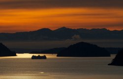
Interesting... Moments before, a ferry passed through the straight (see below), however, I wasn't as happy with the lighting on the water nor the wider perspective (a narrower field of view such as the submitted photo might have been overwhelmed by the vessel). I actually prefer the image I submitted vs the one with the boat as I feel the ferry detracts from the image the same way a car might if parked in front of a monument. I like the tranquility, lighting, and layers without the boat, but that's just my taste I suppose.
We're (I'm?) probably over analyzing this (certainly neither photo is outstanding), but I enjoy the discussion. Any further thoughts you or others have are welcome and encouraged.

Submitted photo for reference...

")