Got a tip for us?
Let us know
Become a MacRumors Supporter for $50/year with no ads, ability to filter front page stories, and private forums.
Weekly Photo Contest: Jan 20 - Jan 27 - MINIMALISM
- Thread starter JDDavis
- Start date
- Sort by reaction score
You are using an out of date browser. It may not display this or other websites correctly.
You should upgrade or use an alternative browser.
You should upgrade or use an alternative browser.

Apple fanboy
macrumors Ivy Bridge
I'll apologize for the short comments up front. Last second trip three timezones away has me mixed up. I questioned if it was worth it or not but I like trying to comment on each because it makes you look at each one more intently. Any way, it was a great group of shots this week and congrats to everyone that submitted.
truettray - Love the color and the composition. I'm unsure if the slight wrinkle in the tablecloth adds to the image or takes away from it.
acearchie - Great idea but it's actually too minimal for me. I like the idea of the boat in the fog I just need to see a little bit more of the boat.
imac wannabe - Nice shot. At first I thought Mars wasnt't isolated but then I wiped the dust off my screen and realized how black the rest of the sky is. Great job on exposure.
Indydenny - Nice composure and I like it in B&W. I think i'd like to see the top of the tree in the frame to emphasize it more as the subject. Needs to be a little less going on in the frame for minimilism.
oblomow - That's a take on minimilist that works too. Cool. My critique is it's just a picture of a room (but a unique take on the theme). I wonder if you could've filled the frame with the theme while still implying "minimal"?
Parkin Pig - Nice composition and I like the minimilist type sculpture as your subject. Black and white helps for this weeks contest but the stone wall takes a bit away from the "minimalist" feel.
themumu - The soft colors and gradiation is really nice. I'm assuming this was taken through an aircraft window so get job on getting a nice image. Though the horizon looks straight there's something that makes me thing I'm leaning right...probably the clouds.
sim667 - Cool idea and an interesting process to get the image. I like the framing that the glue gave. The fly is a little blown out but I imagine that was hard to control.
zObsidian - Unique image. I guess macro is minimal by nature. I like how the background makes it seem suspended. Is it suspended somehow?
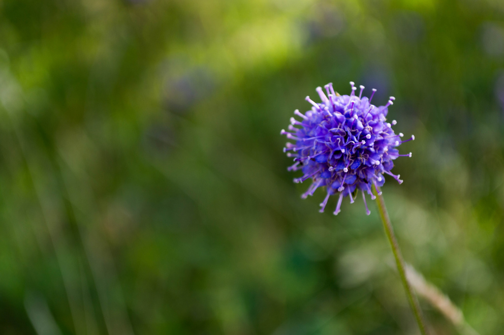
Berlepsch - Another good macro shot. Very nice DOF on the flower. As a macro it's not quite what I was looking for with minimilism.
pukifloyd - Cool idea for a shot. Nice job on the DOF, it's hard to tell that it's upside down.
nitromac - Another cool one. Nice capture and I love the tone of the pic. Would like to get rid of that tree.
Cyclops62 - Hmmmm, interesting. I think I'd go with abstract over minimalist for that one.
Jabbot - Nice job on isolating that light and getting the black so black. The centered composition doesn't really work for me but I'm not sure how else you'd do it.
someoldguy - Nice moody picture. Just enough of a view in the fog to make it work.
Ish - Nice. The smoke really makes it and it's quite film noir-ish (is that a word?)
Firedept - Looks like fun. Not really what I was looking for in the theme.
Charpi - Nice shot. Black and white really makes this one.
AlexH - Nice landscape and black and white works well for this one as well. Well done.
NeGrit0 - Like the color. I'm not sure if it works for minimalism though.
Alexander.Of.Oz - Intersting idea but there is just too much of the bark for me.
gaswerks - Nicely done image. Nicely composed and I like the sepia.
Illuminated - Love the color and the black. I like the hands and the lights.
MacRy - Love the colors. Simply done and yet it's quite sophisticated.
fireman32 - Beautiful night sky. Good job on the tree line, it's in just the right spot,
Apple fanboy - Still a nice shot.
needfx - Great job on the depth of field and an interesting idea
And the winners....
3rd Place - Imac Wannabe
2nd Place - MacRy
1st Place - truettray
Congrats to truettray and on to the next one!
truettray - Love the color and the composition. I'm unsure if the slight wrinkle in the tablecloth adds to the image or takes away from it.
acearchie - Great idea but it's actually too minimal for me. I like the idea of the boat in the fog I just need to see a little bit more of the boat.
imac wannabe - Nice shot. At first I thought Mars wasnt't isolated but then I wiped the dust off my screen and realized how black the rest of the sky is. Great job on exposure.
Indydenny - Nice composure and I like it in B&W. I think i'd like to see the top of the tree in the frame to emphasize it more as the subject. Needs to be a little less going on in the frame for minimilism.
oblomow - That's a take on minimilist that works too. Cool. My critique is it's just a picture of a room (but a unique take on the theme). I wonder if you could've filled the frame with the theme while still implying "minimal"?
Parkin Pig - Nice composition and I like the minimilist type sculpture as your subject. Black and white helps for this weeks contest but the stone wall takes a bit away from the "minimalist" feel.
themumu - The soft colors and gradiation is really nice. I'm assuming this was taken through an aircraft window so get job on getting a nice image. Though the horizon looks straight there's something that makes me thing I'm leaning right...probably the clouds.
sim667 - Cool idea and an interesting process to get the image. I like the framing that the glue gave. The fly is a little blown out but I imagine that was hard to control.
zObsidian - Unique image. I guess macro is minimal by nature. I like how the background makes it seem suspended. Is it suspended somehow?
Berlepsch - Another good macro shot. Very nice DOF on the flower. As a macro it's not quite what I was looking for with minimilism.
pukifloyd - Cool idea for a shot. Nice job on the DOF, it's hard to tell that it's upside down.
nitromac - Another cool one. Nice capture and I love the tone of the pic. Would like to get rid of that tree.
Cyclops62 - Hmmmm, interesting. I think I'd go with abstract over minimalist for that one.
Jabbot - Nice job on isolating that light and getting the black so black. The centered composition doesn't really work for me but I'm not sure how else you'd do it.
someoldguy - Nice moody picture. Just enough of a view in the fog to make it work.
Ish - Nice. The smoke really makes it and it's quite film noir-ish (is that a word?)
Firedept - Looks like fun. Not really what I was looking for in the theme.
Charpi - Nice shot. Black and white really makes this one.
AlexH - Nice landscape and black and white works well for this one as well. Well done.
NeGrit0 - Like the color. I'm not sure if it works for minimalism though.
Alexander.Of.Oz - Intersting idea but there is just too much of the bark for me.
gaswerks - Nicely done image. Nicely composed and I like the sepia.
Illuminated - Love the color and the black. I like the hands and the lights.
MacRy - Love the colors. Simply done and yet it's quite sophisticated.
fireman32 - Beautiful night sky. Good job on the tree line, it's in just the right spot,
Apple fanboy - Still a nice shot.
needfx - Great job on the depth of field and an interesting idea
And the winners....
3rd Place - Imac Wannabe
2nd Place - MacRy
1st Place - truettray
Congrats to truettray and on to the next one!
Ish
macrumors 68020
Congratulations truettray! You really kicked everything off to a high standard 🙂 Well done everyone, lots of entries this week!
I think it adds to it. To me it just adds that something that lifts the photo from being stark into being attractive.
Dependsis that "it's quite film noir-ish" or "it's quite film noir, Ish" 🙂 ?
truettray - Love the color and the composition. I'm unsure if the slight wrinkle in the tablecloth adds to the image or takes away from it.
I think it adds to it. To me it just adds that something that lifts the photo from being stark into being attractive.
Ish - Nice. The smoke really makes it and it's quite film noir-ish (is that a word?)
Dependsis that "it's quite film noir-ish" or "it's quite film noir, Ish" 🙂 ?
Parkin Pig
macrumors 6502a
Good stuff
Got to say when I saw truttray's entry up first I felt the rest of us would be just entering to get second place at best.
Another good contest and some great photos and interpretations of the theme.
Thanks for the comments JDDavis as it's always good to see another person's perspective on images.
Looking forward to the next one.
imac wannabe
macrumors regular
Great photos this week! I like everyone knew I was entering for second place! Nice shot truettray!
Paul
Paul
Apple fanboy
macrumors Ivy Bridge
Lots of great work this week guys. Hopefully I'll do some actual shooting for the next one.
Congrats to the winners.
Congrats to the winners.
NeGRit0
macrumors 6502a
NeGrit0 - Like the color. I'm not sure if it works for minimalism though.
And the winners....
3rd Place - Imac Wannabe
2nd Place - MacRy
1st Place - truettray
Congrats to truettray and on to the next one!
Congrats to the top 3, as usual some amazing images submitted. 😀
@JDDavis if at all possible could you expand upon my comment? I'm very curious why you would say it doesn't fit. Not sure if there are criteria or rules I don't know about, or just your opinion.
Alexander.Of.Oz
macrumors 68040
Thanks JDDavis for the feedback. Congrat's truettray on a fine image. Another week with great diversity amongst all of the entrants.
zObsidian - Unique image. I guess macro is minimal by nature. I like how the background makes it seem suspended. Is it suspended somehow?
It was shot on glass from below with a white card backdrop lit by just about every movable light I could find in the house.