Become a MacRumors Supporter for $50/year with no ads, ability to filter front page stories, and private forums.
I want to start by saying this is NOT a bashing thread. Just wondering what people don't like about it.

Obviously, I'll start, but before I do, overall I'm really liking it, and I didn't think I would.

So here it goes, and just a disclaimer, these are mostly nitpicking items, I haven't found anything that's a dealbreaker.

1) I don't like how the screen fades in when I press the lock button. I typically have my phone in the cup holder in my car and I'm used to tapping the button and taking a very quick glace, this quick glance takes about 3x as long now. Not a huge deal, but would like it to be instantaneous like it was before.

2) The animations are cool, but take too long. I find myself tapping on an icon I want to launch before the icon becomes "tap-able"

That's all I have for now...


iBooks do not work
The Phone app
The Calendar App
 
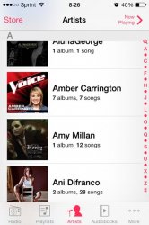
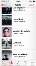
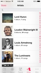
3. Removal of alphabet quick select on the music app on iPhone in the artists view. This was just plain stupidity from Apple.

This is still there only it only shows the letters for artists that you have in your library.

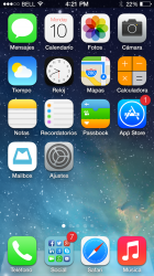
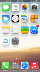
The only thing I don't really like about iOS7 is that they don't make wallpaper stretch to fit the screen anymore. Before my wallpaper would fit nicely but now it scales oddly and the entire thing doesn't fit.
 
I'm truly regretting updating my mini to 7. My wife is having the same experience with her iPhone 5. As others have stated, less responsive, animations are not good and overall it just seems like a knee-jerk reaction to the prior iOS being perceived as long in the tooth. The flat look is exactly that.

I've noticed several elements of the ui that are blatent copies of Android. i.e. killing running apps by the swipe away. Glad my phone is an S4.

I'm sure it will get better in time, but if I could go back to iOS 6 on my mini I would.

I could close apps twice as fast in iOS 6.
 
I lost yet another Bluetooth device that will no longer control the music on my phone. It will only connect. Apple dropped some Bluetooth support with iOS 6. Rather than improving with iOS 7, they dropped even more Bluetooth devices supported by iOS.
 
The new UI took (and continues) some getting used too, but overall, I like what iOS7 has to offer. Its not perfect but then nothing is.
 
1.)ICONS
2.)3d DOCK IS GONE
3.)ANIMATION
4.)SYMBOLS
5.)3 DIFFERENT KEYBOARD COLORS(if im correct)
6.)PASTEL COLORS
7.)WALLPAPERS

Reason I like apple product is because of the simplicity and stability of the os, now it seems like they`re following the trend with adroid and the rest. But what it is is what it is, Im still sticking with apple. :apple:
 
This is still there only it only shows the letters for artists that you have in your library.

The only thing I don't really like about iOS7 is that they don't make wallpaper stretch to fit the screen anymore. Before my wallpaper would fit nicely but now it scales oddly and the entire thing doesn't fit.

Plenty of artists in my library, no a-z available.

Also:-
7. Shift on the keyboard is no longer obvious. Previously the shift arrow would turn blue or the key would turn blue depending on single lock or full lock. Now it just turns to a solid grey arrow, at first I wasn't sure if shift lock was on or off.
 
Can't swipe to delete messages like I used to
Battery drain (worse on iPhone than iPad mini)
The folders. I just....dont like the look. maybe if they were transparent?
The folders again. 3x3....really? I used to be able to view everything in one of My folders, now I have to swipe a few times to see everything. Kinda hating that.

A lot of my apps got "reset", not a big deal, more of a nuisance.

If you are referring to swiping to delete emails, then it's now swipe right to left.
 
I feel like i'm one of the few that doesn't really feel that ios7 has been annoying to deal with. Although i've had tons of hands on with Android UIs, BB playbook, Win8 RT and Win8 Pro tablets, HP Touchpads, etc.

I feel that iOS7 took a lot of cues from Android, Win8, and the Playbook. I don't think it's a bad thing though.. I do think Apple should provide us toggles for the animations to allow the folks that have zero tolerance for the new "pretty" stuff and need to click an icon the moment the press the Home button.

Aside from various bugs we've all discussed, I think it's a solid iOS so far. Just needs more customization tweaks to appease the crowd and it will be a home run.

Edit: I want to point out that iOS7 flows with Mavericks OSX much better than pre-iOS7 does.. they felt like completely different things from different companies to me. Now iOS7 feels like a true mobileOS version of OSX overall. Again, just needs more toggles for the pretty-light show.
 
(1)Personally, I find that iOS 6 was a little more attractive than iOS 7.

That's just one stupid user's opinion, of course.

(2)There are too many opportunities to consume battery life, and these opportunities are *enabled* by default.

(3)There is still no way to restrict incoming calls to numbers in your Contact List and send the rest to voice mail. This is the single reason that I have continued to jailbreak since the iPhone 3G, my first iPhone.

I'll do the old workaround for now, configuring the default ringer as silent and using setting voice mail to kick in at a short ring count.

But it'd sure be nice to have this functionality in a 2013 iPhone, the same functionality that I had with a cheap Motorola over 10 years ago!!

Still an Apple guy, though, despite this. One ongoing big flaw, but it's still the best thing out there.
 

Attachments

  • IMG_0928.jpg
    IMG_0928.jpg
    43.6 KB · Views: 111
I don't like the Springboard in general. I miss the shadows and I don't want that ugly dock.

Maybe with something like this...

I know, I know... Just dreaming :rolleyes:
 

Attachments

  • ios7sombrasi51.png
    ios7sombrasi51.png
    2.8 MB · Views: 186
  • ios7sombrasi52.png
    ios7sombrasi52.png
    2.8 MB · Views: 181
Last edited:
Plenty of artists in my library, no a-z available.

Also:-
7. Shift on the keyboard is no longer obvious. Previously the shift arrow would turn blue or the key would turn blue depending on single lock or full lock. Now it just turns to a solid grey arrow, at first I wasn't sure if shift lock was on or off.

I definitely have the A-Z in artists as well. Not sure why it's not showing up for you. Only reason it has ever not worked for me is when I didn't have many artists.
 
I definitely have the A-Z in artists as well. Not sure why it's not showing up for you. Only reason it has ever not worked for me is when I didn't have many artists.

Not on mine, plenty of artists. It showed on iOS6 and I haven't removed or added any tracks since the upgrade.

attachment.php
 

Attachments

  • photo.PNG
    photo.PNG
    571.9 KB · Views: 1,583
the behavior of the multitasking panel and the control center should be switched, i switch betweens apps far more often than changing volume for example. i feel like my home button is gonna break from pushing it so much

and i will never understand the difference between "all" and "missed" in the notification center
 
Not on mine, plenty of artists. It showed on iOS6 and I haven't removed or added any tracks since the upgrade.

Image

Hmm, not sure what to tell you. I've attached my screenshot. Maybe try a hard reset? (Hold home and power together until screen turns black, keep holding until Apple logo appears), then check?

How many artists do you have?
 

Attachments

  • image.jpg
    image.jpg
    155.8 KB · Views: 119
the behavior of the multitasking panel and the control center should be switched, i switch betweens apps far more often than changing volume for example. i feel like my home button is gonna break from pushing it so much

and i will never understand the difference between "all" and "missed" in the notification center

Missed are notifications that came through when the phone was locked. All is all notifications.
 
My only iOS 7 complaint is that there's no quick reply to texts.

Other than that I have no issues with it. The Animations are fine.
 
The really big thing that is making my head hurt is Messages and the way it looks. It A- Needs to be customizable to it doesn't look like a box of crayons exploded and B- Customizable so it doesn't look like a box of crayons exploded. ;)
 
Hmm, not sure what to tell you. I've attached my screenshot. Maybe try a hard reset? (Hold home and power together until screen turns black, keep holding until Apple logo appears), then check?

How many artists do you have?

32 artists. It shouldn't matter really, anything over 10 artists and it should show, unless they all start with the same letter.

I manage my music manually, only adding the music I listen to frequently to keep the storage usage down.
 
32 artists. It shouldn't matter really, anything over 10 artists and it should show, unless they all start with the same letter.

I manage my music manually, only adding the music I listen to frequently to keep the storage usage down.

You definitely need more than 32. I think it's at least 50, but not sure. Keep adding some to see what the threshold is.

I know it's not ideal, but as of now it's the way it works.
 
I used to like seeing the rating, but now I have to double tab and then tap on the specific song to be able to see it... too

You're taking the long way around. Simply tap on the song title/artist in the main view, the rating toggle displays. It's a single tap exercise. Much easier than ios 6.
 
Register on MacRumors! This sidebar will go away, and you'll see fewer ads.