Become a MacRumors Supporter for $50/year with no ads, ability to filter front page stories, and private forums.
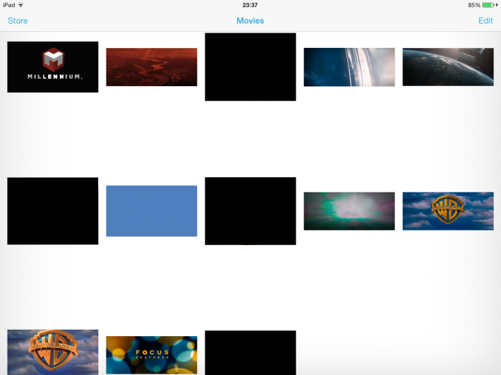
Filenames and time lengths no longer appear for videos. I have about 50 videos on my iPad and I have not the slightest idea which is which, or how long they are.


Folders now only show 9 items, prior release was 12 (on iphone5).

Loss of lines in Notepad.

Cannot see events for the day in calendar month view.

This functionality was there in prior IOS releases.

Restore iPad to factory settings. Does not really restore to factory settings. Restores to currently shipping settings.

So much white is racist.
 
Last edited:
Visually it is harder to navigate. The lack of visual buttons makes it hard to distinguish between buttons and text.

With very little contrast, it is harder to see things with your peripheral vision. I find myself actually having to move my eyes to different parts of the screen (more so on iPad).

I don't like the new tab view in Safari on the iPhone. I get lost when I go to it.
Why is the '+' (new tab) not on the same line as the tabs. I'm sure I will get used to it, but it is not where I think to go to add a tab.

I miss the '.com' button. I realize I can hold the period button, but just takes longer.

Animations are horrible. The wait for the lock screen to fully appear is awful.

Command center is nice, but overshadowed by everything else.

Overall, not very happy with it, but I am confident Apple will fix it. I just hope it doesn't' take them too long. My prediction is that at the keynote for iOS9, they will be making fun of the 'flat' design like they did with the green felt type stuff.
 
1. When I want to close apps I want to close them fast. On IOS 7, the animations take too long and it makes it slower for me to close my apps.

2. I think there's too much white in the messages app. It hurts my eyes. I know there's an invert option but it inverts EVERYTHING.
 
I definitely got the form over function vibe. Its growing on me though....
-I like the new ringtones and stand in images for contacts/songs without photos/art.
-dynamic UI colors from wallpapers is pretty cool
-Control center is good
-notification center is actually kind of useful now.
-camera app is easier to use
-live clock is pretty cool

Things that aren't great
-3x3 icon grid in folders? No reason for that. Now I have pages within folders!
-can't resize non-included wallpapers? Thats a simple bug that shouldn't have been missed
-I have a harder time hitting buttons for some reason...maybe its just me though,
-the new keyboard is getting worse appearing as time goes on.
-lots of white; I keep my iphone pretty dim, so its ok, but if you keep it at full its like staring at a lightbulb
-animations for no reason....why am I zooming around my iphone?
-photos are organized weird. Why can't they just be in albums? Why do they have to be in a timeline?
-game center throws up a bright full length white bar whenever I enter a game as opposed to the subtle notification in iOS6. Because, you know, I HAVE to know I am logged into game center.
-round faces for contacts? I feel like I am on a boat and all my friends are looking through portholes
-It just chews through batter for some reason. Last night I went from 20% to dead in about 20 minutes...and I have background updating off.
 
Has anyone closed an app with the multitouch gesture? The home screen zooming in around the closing app looks really weird for some reason. I am pretty sure it was similar before iOS7, but the huge app icons flying in just look weird and cheap.
 
I don't like the look of the stock apps (except for weather). They look like they were put together at the last minute, and they look unfinished. I don't like the color scheme of the apps or the icons. I like the look of everything else in iOS 7 except for that. If they could just improve the look of the default apps I'd be 100% happy.
 
Much the same as everyone else.
-First and foremost for me, it's hideous. I've used it since the betas and it's never grown on me. The stock apps on the inside and out. They're all hideous. I've gone back to iOS 6 and personally, it's much more attractive and intuitive. I don't care what the common consensus suddenly became on skeuomorphism; it makes it intuitive. The perfect example is the current iBooks app.
-The animations. From the lock screen coming and fading, to apps opening and closing. Unnecessary and waaay too long.

The only thing I like is the new lock screen design. Slide to unlock and it all goes downhill for me.
 
Seems like the Photo Booth app icon should be the Photo app icon. What is the Photo icon?

The thing I don't like about the color scheme and look is that it makes third party apps look out of place. I don't expect other companies to adopt these colors, so they will always stand out. It doesn't look professional.

If this is truly a good design, would you want Mac OS to look and function like this?
 
i don't like the arbitrary replacement of graphical skeuomorphism with dynamic skeuomorphism (things no longer represent real-life objects, but still interact as though they are real-life objects e.g. bouncing, elastic, parallax). the problem is that shadows, to name an example, are both graphically and dynamically skeuomorphic.

the overall aim should be to make software as easy as possible to use, and this can be helped by mimicking real-world dynamics. but arbitrarily choosing parallax (a great feature in my eyes) instead of - rather than in addition to - shadows (also a great feature) seems careless.

skeuomorphism is the best way to design intuitive software, because all of us have evolved to interact with a physical, not digital, world. we're equipped to understand parallax, shadows, depth, etc. this isn't going to change. no amount of becoming familiar with software will replace this set of hardwired abilities. the reason people are turned off skeuomorphism is because it can feel patronising when it's done to excess. we don't like to be 'deceived' into thinking digital x is a real x. we want digital x to resemble key parts of physical x that help us understand how to interact with it, and its uses.
 
The biggest issue I see is most of what is bad, is not a bug but a design decision. They actually thought these changes were better.

Witness the lack of filenames for videos I posted above. Someone actually thought deleting them was an improvement over prior IOS. Imagine if they decided to do the same for music songs. 2000 song library and you have no idea what the title of a given song is.
 
I'm loving it. It's taking me some time to get used to some of the new controls (such as the new multitasking way to close apps). The only things I don't like are that it's draining the battery on my 4S a lot, that there's no transit option for Apple Maps (though I do use Google Maps for transit, it'd be nice if Apple Maps included it too), and the new calendar layout. Otherwise, I pretty much love iOS 7. It's so much better than iOS 6
 
I honestly love ios7 but, on the ipad, I hate the fact that the grid for icons is 3x3. I understand why it was done (it's the same icons as you see in the home screen icon) but I just think it's a ton of wasted real estate.

I also hate the wallpapers cause I can't seem to set one without it being completely zoomed in...that looks like it's a glitch though so i'm assuming we'll be getting a patch.

----------

How do you scale your wallpaper on the new IPhone ios7? It won't let me. (I have Iphone 4s)

Yeah that seems like it's a bug. It's not just you. Everyone (me included) are experiencing that problem.
 
How do you scale your wallpaper on the new IPhone ios7? It won't let me. (I have Iphone 4s)

it doesn't allow you to scale wallpapers in ios 7 to preserve the parallax feature (also, i suspect, to reduce the number of phones with tiny wallpapers with big black bars at the top and bottom - apple doesn't like any iphones looking bad)
 
I don't like the way the big lock screen keypad advertises my PIN via oversized flashing buttons.
 
I want to start by saying this is NOT a bashing thread. Just wondering what people don't like about it.

Obviously, I'll start, but before I do, overall I'm really liking it, and I didn't think I would.

So here it goes, and just a disclaimer, these are mostly nitpicking items, I haven't found anything that's a dealbreaker.

1) I don't like how the screen fades in when I press the lock button. I typically have my phone in the cup holder in my car and I'm used to tapping the button and taking a very quick glace, this quick glance takes about 3x as long now. Not a huge deal, but would like it to be instantaneous like it was before.

2) The animations are cool, but take too long. I find myself tapping on an icon I want to launch before the icon becomes "tap-able"

That's all I have for now...

Maybe, just maybe if downloading the iOS 7 update caused no trouble to everyone, it could be a sure hit. But since they started the update with tons of issues, it is impossible for everyone to like this update.
 
Nice to read a thread full of thoughtful, reasoned responses.

I like iOS7. Most of the suggestions I see here seem to be relatively minor issues that affect some and not others.

Both my devices feel refreshed. I'm one of those folks who doesn't see the "whiteness" that others don't like.

The only change I can't adjust to is Calendar, which in liked in iOS6. Too hard to read in a hurry. Had to find a replacement. Calendar 5 is much better, cost $6. Looks like iOS7 is good business for Readdle.
 
IPad-only gestures like 4-finger-swipe to open active apps or 5-fingers to go back to main screen have no updated animations. There is a disconnection between what you do and what you see happen.
For example, in iOS6 when you used 4-finger-swipe from the button, the screen would move up, now the new active apps visuals just appear. With the 5-fingers gesture you can directly see that new animations are supposed to take more time: When you perform the gesture, the current app is minimized to the center of the screen and the apps of the main screen fly in. The animation still takes the same amount of time as in iOS6, but at the end of this time it is not finished and the screen directly jumps to the end. Reason: movement in pixels / time has been reduced, but the animation time for this gesture has not been increased.

Other than that I have to say it works fine on my iPad mini. Now, I only hope that most of my apps will be updated to have new icons. Because right now, there is an ugly mix of old and new icons - even for Apple apps; like iBooks!
 
Don't like that you can't use an old iPhone without SIM card as iPod touch. Before I could skip activation; now jot. I need a SIM to finish the setup. Recycling gets difficult; specially if no SIM is at hand.

Else I struggle a bit with the UI changes in Safari; my muscle memory not yet adopted to the new bookmark position.

And as others no swipe-delete for mails
 
iOS7 annoyances

Annoyance 1:
I noticed that I have to enter my password for each appstore download, even the free apps and apps I already purchased, I thought they removed this in iOS 6.

Annoyance 2:
Apps that use location services are constantly sending a message saying i can improve accuracy by turning on wifi. Hey apple, if im in a taxi or out and about, which is when i tend to use location services, i dont have access to wifi! I dont know why they dont make it so that the app tells you once, and once you click ok, it never tells you again.

Anyone else notice things that really bug them?
 
I have not updated yet...and may not after reading this thread.

From what i have read here, Apple has Devolved the OS to a more 'one size fits all' approach...very Un-Apple.
I like the legal pad look of Notes. It has character and is visually better at organizing a page of notes!
I don't want to look at round ID photos as if I was a 12 year old girl making a family tree project for school.
And i don't like wasting screen space or being blinded by overly white screens.
The idea of not being able to scale and customize wallpaper is a big turn off, especially for my wife who is an artist and uses her photos to make amazing wallpapers that i am always jealous of.

All I wanted was a quicker way to go between apps.
This would never have happened if Jobs were still alive.
Apple fixed what was not broken and now they have to fix the fix.

I'll wait on the side to see how this plays out before updating.
 
All those were in iOS 6 as well. Only now, in iOS 7, it's much easier to turn wifi on/off.
 
Annoyance 1:
I noticed that I have to enter my password for each appstore download, even the free apps and apps I already purchased, I thought they removed this in iOS 6.

Annoyance 2:
Apps that use location services are constantly sending a message saying i can improve accuracy by turning on wifi. Hey apple, if im in a taxi or out and about, which is when i tend to use location services, i dont have access to wifi! I dont know why they dont make it so that the app tells you once, and once you click ok, it never tells you again.

Anyone else notice things that really bug them?

Annoyance 1: They did change it in iOS 6.1, but I'm not sure why you're having that problem.

Annoyance 2: The reason why your iPhone asks you to turn WiFi on to use location services is because your iPhone can then use WiFi hotspots (even if you are not physically connected) as crowd-sourced information to accurately find your location.
 
for 1, thats my point, it seems to be back. maybe its just me for some reason?

for 2, i understand, but i have no interest in providing data for crowd source and GPS is accurate enough....
 
Annoyance 1:
I noticed that I have to enter my password for each appstore download, even the free apps and apps I already purchased, I thought they removed this in iOS 6.

Annoyance 2:
Apps that use location services are constantly sending a message saying i can improve accuracy by turning on wifi. Hey apple, if im in a taxi or out and about, which is when i tend to use location services, i dont have access to wifi! I dont know why they dont make it so that the app tells you once, and once you click ok, it never tells you again.

Anyone else notice things that really bug them?

#1 happened to me during the first beta. If you close the app store, maybe restart your device it should work as expected.
 
Register on MacRumors! This sidebar will go away, and you'll see fewer ads.