Become a MacRumors Supporter for $50/year with no ads, ability to filter front page stories, and private forums.
Another thing I don't like, is the God awful loud DONG noise it now makes everytime I plug it in to charge, which is now more frequent!

I think I am heading towards the decision of getting a Sony Xperia Mini for my phone, If Sony make it and it has that excellent camera.

I'll keep my Mac life to their computers, well until they screw Mac OS up as much as iOS that is!

Unfotunately it means I'll have to use iOS7 for a while yet. blaahhh
 
Last edited:
I am with many people here that have stated their issues. I now only have iPad, so can't comment on the iPhone, but there are def a few things that bug me. Mainly:

- Wasted real estate on the iPad screen
- Those 3x3 tiles in the folders
- Battery drain
- Slow response to a few things (not bad for me tho)
- And for me, the MOST annoying issue, that control screen that pops up from the bottom of the screen! Its nice but I am constantly sliding that thing up almost every time I am just trying to do normal scrolling! Why cant they have made that where you slide it up from lower down or directly in the middle or something?!
 
THE CAMERA APP:

1) I hate the burst "feature". In iOS6, I could have my finger on the shutter button, and when I lifted my finger up, the photo would take. Now, if I keep my finger held over the button I get a bunch of photos by accident that I did not want to take.

2) The Video/Photo/Square/Pano slider is way to close to the shutter button. I have captured some photos by mistake just trying to change from photo to video. Who really wants "square" anyway? Whenever I shoot something for Instagram I much rather have the original full size photo anyway, and then just crop it in Instagram....

3) The flash button. When I press it, the options (auto, on, off) come up in white text overtop the screen. Today, I was shooting outside and the sky showed up as bright white at the top of the screen, where these buttons are when you tap it. They blend in. I couldn't even see the words. I had to point the camera at the ground, just so I could see the text and change my flash option!


NOTIFICATIONS:

4) in iOS6, when a notification such as a text came through, the banner would be at the top of the screen where the time/battery/etc. are. Now, it seems that the height of the banner is much taller, taking up more than just the time/battery/signal strip at the top. This covers up some buttons in some apps and I have to wait for the banner notification to disappear before doing anything again... wasn't this the whole point of banner notifications?

5) The weather does not always show up up in my notifications. Most of the time there is no text. And I miss the 7 day forecast with numbers and icons. Why just have text?

6) Why all the wasted space under calendar on the notifications if there are no events scheduled?

7) I don't understand the point of "All" and "Missed". Combine the two.

8) The Today/All/Missed bar at the top is not centered! I just find this sloppy....


OTHERS:

9) Fading in from a lock screen takes too long, if you are only quick checking the time.

10) The delay when going back to the home screen after tapping the home button.

11) Control Center is nice, but I wish we had the option to pick the apps at the bottom.

12) Auto-update apps should have "on wi-fi" only option. Otherwise, it's OFF

13) I wish in text messages, you didn't have to tap "load earlier messages" each time when you want to scroll back in time. Just load them auto when you scroll up to the top.
 
THE CAMERA APP:

2) The Video/Photo/Square/Pano slider is way to close to the shutter button. I have captured some photos by mistake just trying to change from photo to video. Who really wants "square" anyway? Whenever I shoot something for Instagram I much rather have the original full size photo anyway, and then just crop it in Instagram....

3) The flash button. When I press it, the options (auto, on, off) come up in white text overtop the screen. Today, I was shooting outside and the sky showed up as bright white at the top of the screen, where these buttons are when you tap it. They blend in. I couldn't even see the words. I had to point the camera at the ground, just so I could see the text and change my flash option!

Fixes for this:

1. You can just swipe the actual camera image to switch between the video/camera/square/pano options, you don't have to touch the text.

2. I have no idea what the problem is here because the flash toggle is on top of a black bar when I'm using the camera app. I can see it perfectly when taking a bright photo.


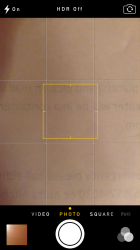
This is what my camera UI looks like for reference.
 

Attachments

  • IMG_2189.PNG
    IMG_2189.PNG
    1.1 MB · Views: 100
THE CAMERA APP:

1) I hate the burst "feature". In iOS6, I could have my finger on the shutter button, and when I lifted my finger up, the photo would take. Now, if I keep my finger held over the button I get a bunch of photos by accident that I did not want to take.

NOTIFICATIONS:

4) in iOS6, when a notification such as a text came through, the banner would be at the top of the screen where the time/battery/etc. are. Now, it seems that the height of the banner is much taller, taking up more than just the time/battery/signal strip at the top. This covers up some buttons in some apps and I have to wait for the banner notification to disappear before doing anything again... wasn't this the whole point of banner notifications?


1) Agreed

4) Actually it works much better now. You can swipe it up and out of the way, whereas before, you HAD to wait for it to clear before you could access buttons that were at the top of the screen.
 
Can't swipe to delete messages like I used to
Battery drain (worse on iPhone than iPad mini)
The folders. I just....dont like the look. maybe if they were transparent?
The folders again. 3x3....really? I used to be able to view everything in one of My folders, now I have to swipe a few times to see everything. Kinda hating that.

A lot of my apps got "reset", not a big deal, more of a nuisance.

You have to swipe to the left now. then u can delete it

----------

----------

1. i dont like how the caller id picture is blurry when making a call.

2. Cant adjust size of custom wallpaper picture.

3. Passcode and fingerprint require passcode timeout gives only the "immediately" option. Should have 1 min, 2 min, etc...

4. I dont like how theres no more battery animation when charging phone.

5. There should be an option to just have the fingerprint scanner to open phone and not both the numerical and finger scanner.
 
Control Center - I don't like that there are not more options in control center like location toggle, brightness, personal hotspot, etc. I got use to boss prefs.

Safari - The damn swipe from left to right in safari to bring up the previous page. I keep doing this on accident when zoomed in and sliding to the right to see the text on that side.

Safari - not sure I prefer the new tabs 3d view over the old way. Sure it looks better but instead of just clicking on a tab up at the to to get to the page, I have to click on the icon at the bottom right, scroll thru to find the tab and click the tab to open.

- some icons are ugly.

- wish folders had some kind of outline around the icon. Depending on the wallpaper you have the folder icons can look really bad. I had to choose a darker wallpaper because of this.

Not the end if the world but some items that bug me. I didn't care for os7 at first but it has grown on me.
 
Why, Why, Why?

Why did Apple have to butcher the UI? What was so wrong with the iOS 6 UI? Sure, do away with the skumorphisms or tone them down but gee, why no contrast, text instead of "buttons", etc. It just seems discombobulated to me. Like Apple has an identity crisis. Android is laughing at Cupertino.
 
Fixes for this:

1. You can just swipe the actual camera image to switch between the video/camera/square/pano options, you don't have to touch the text.

2. I have no idea what the problem is here because the flash toggle is on top of a black bar when I'm using the camera app. I can see it perfectly when taking a bright photo.


This is what my camera UI looks like for reference.

Turn the camera sideways and you'll see what I mean. I never take photos vertically.

----------

Fixes for this:

1. You can just swipe the actual camera image to switch between the video/camera/square/pano options, you don't have to touch the text.

2. I have no idea what the problem is here because the flash toggle is on top of a black bar when I'm using the camera app. I can see it perfectly when taking a bright photo.


This is what my camera UI looks like for reference.

PS- 1) did not know that. Thanks for this
 
I don't like being required to double tap the top of the screen in safari to quickly scroll to the top of the page.
 
I don't like the fact that only a few days after the release of 7.0, I can no longer downgrade to 6.1.3 because Apple stopped signing it. Had I known, I would never have updated.

I hate texting colors/keyboard

I hate that on most backgrounds I can't make out my folders

Too much white... very hard on the eyes

Control Center is a good idea however, why isn't Cellular Data there? I switch between that and WiFi constantly. Better yet, why not make Control Center user customizable so each individual can add the short-cuts to the things THEY use most?

I can go on, but I won't
 
- And for me, the MOST annoying issue, that control screen that pops up from the bottom of the screen! Its nice but I am constantly sliding that thing up almost every time I am just trying to do normal scrolling! Why cant they have made that where you slide it up from lower down or directly in the middle or something?!

You can disable the control panel from functioning in apps in the settings menu.
 
It's amazing how picky people can be about the first release of a major redesign... Obviously, things will get cleaned up!
 
Did you guys try swiping from right to left to delete your messages?

It works for me.

It works in the list view for deleting all messages from a given person, but not for swiping on a particular message.

Another thing I don't like - the photo viewer app keeps on freezing when I try to swipe between photos.
 
Lock Screen?

Is it me, or is there no longer any way on initiating the ’Lock Screen’ in os7?

I liked being able to initiate it using the On/Off button (top button)

This also enabled me to lock the screen during a call (ensuring no accidental ‘ear related’ screen navigation)
 
1) Agreed

4) Actually it works much better now. You can swipe it up and out of the way, whereas before, you HAD to wait for it to clear before you could access buttons that were at the top of the screen.

Not true. You could swipe it away on iOS 6 aswell by swiping from to right to left.
 
Is it me, or is there no longer any way on initiating the ’Lock Screen’ in os7?

I liked being able to initiate it using the On/Off button (top button)

This also enabled me to lock the screen during a call (ensuring no accidental ‘ear related’ screen navigation)

I still do this all the time, not sure why it does not work for you.
 
"Today" is largely useless. As a supposed answer to Google Now, it is not even close.
 
Last edited:
I still do this all the time, not sure why it does not work for you.

So if you have Passcode Lock (in General Settings) set as something other than 'Immediately', you are able to initiate the Lock Screen using the Top Button?

Whenever i try to initiate Lock Screen it just turns the screen off....and during a call, it terminates the call. (where as before it would just lock the screen)

Perhaps its annoying me because its different. But i found the 'old way' useful.
 
One big thing I feel is missing from iOS7 is a "close all" option when in task manager

There is a big empty space at the top of the screen where this option could easily be placed
I hope it gets added in a patch soon :apple:
 
I wish some of the animations were a bit quicker or could be reduced. And some of the icons look a little cheap, imho.
 
Register on MacRumors! This sidebar will go away, and you'll see fewer ads.