Got a tip for us?
Let us know
Become a MacRumors Supporter for $50/year with no ads, ability to filter front page stories, and private forums.
What face are you using?
- Thread starter viachicago22
- Start date
- Sort by reaction score
You are using an out of date browser. It may not display this or other websites correctly.
You should upgrade or use an alternative browser.
You should upgrade or use an alternative browser.
I think Chrono LOOKS sharp, but after trying it on my 38 decided it's too complex to be efficient and effective for a small screen. Maybe it's different on the 42, I can't say.
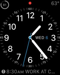
I switched to Utility with only hour numbers -- no outer band of seconds ticks or numbers. This face is very readable on a 38 at a quick glance and still looks like the face of a nice business watch.
It's curious though that all the analog watches are round. Why no rectangle faces? Lots of wasted space IMHO. There are rectangle watches that have complications like day/date.
Utility most of the time, with most of the numbers removed. It's a nice, clean, easy to read look that gives me access to my most used complications.
Once in a while Modular with the timer prominent. That's mostly for the gym but gets used occasionally other times when I want to see more info.
I really love Solar but the inability to add any complications limits its usefulness for me.
I use the most simplified version of Simple once in a while when I want to be really unobstrusive.
I like the look of the Chronograph but I agree with the other poster that it's a bit hard to use on the 38mm face.
Modular would be so much better if within the app face we could scroll down with the digital crown in order to see other calendar events beyond the one thats showing now..
I know clicking the event will bring me to calendar, but it just seems like an extra step when the digital crown is right there. Unactive on the watch face.
I know clicking the event will bring me to calendar, but it just seems like an extra step when the digital crown is right there. Unactive on the watch face.
Modular is my usual. I change the color to match my outfit. I am at the stage where I'm compulsively monitoring the battery even though I never run low on power. I'm also monitoring my activity.
I like Astronomy for fun.
For some reason I find myself avoiding the analog faces. Weird. I think I'm going to change that right now and try Utility.
I like Astronomy for fun.
For some reason I find myself avoiding the analog faces. Weird. I think I'm going to change that right now and try Utility.
When I had my watch - I used modular (white color, with weather info) and jellyfish.
I'll have my newer watch, soon!
Btw: what happened to the faces with the city (London?) w/ movement and the mountains that had stars moving? Those faces were shown at the conference in Sept....
I'll have my newer watch, soon!
Btw: what happened to the faces with the city (London?) w/ movement and the mountains that had stars moving? Those faces were shown at the conference in Sept....
I wanted "Utility", but found the numbers of the clockface to be oversized and crowded so settled on "Simple" with complications in all four corners.
you can customize it and make it less crowded
----------
Modular is my usual. I change the color to match my outfit. I am at the stage where I'm compulsively monitoring the battery even though I never run low on power. I'm also monitoring my activity.
I thought I would obsess over battery life, but it is such a non-issue. Probably my happiest surprise with the watch. Battery life is simply never an issue. I am not sure I could run out of battery in a day if I tried.
you can customize it and make it less crowded
Thanks, I actually did end up settling on "Utility" after all, once dialing the clockface numbers back to just 12, 3, 6 and 9. I wish there was simple watchface that had all 12 digits, but at the size they appear in "Chronograph".
I know. It's been a complete non issue for me, too. In fact I could possibly get two days off of my typical usage. People who do fitness tracking seem to run their batteries down, though.you can customize it and make it less crowded
----------
I thought I would obsess over battery life, but it is such a non-issue. Probably my happiest surprise with the watch. Battery life is simply never an issue. I am not sure I could run out of battery in a day if I tried.
I think I'm just used to seeing battery level indicator on my IPhone at all times. So I feel a bit odd not knowing at a glance where I stand in terms of battery usage in the Watch. It will take a little effort to break that habit and embrace the other watch faces. But I'm flexible, so it will happen.
Wow, I'm really liking the Utility face. I'm glad this thread came up and prompted me out of the rut I'd fallen into.
My only issue with the Jellyfish is that it's slow to appear and the digits on that face are huge. It's pretty, otherwise.
Yea I use jellyfish mostly and modular sometimes. But I agree it annoys me the jellyfish isn't there right when it lights up. I enjoy seeing it as I check the time!!
I flick between Utility (definitely my most used), Chronograph and occasionally Motion as it looks pretty cool, but unfortunately can't add complications and it's only digital.
I did use the extremely simple version of Simple for a bit, but just found it too confusing without any markings to show where the hands are pointing!
Hope more faces are added in future updates!
I did use the extremely simple version of Simple for a bit, but just found it too confusing without any markings to show where the hands are pointing!
Hope more faces are added in future updates!
I love modular, because I eventually realized that most of the stuff I was looking for in Glances could be displayed on the modular face. So now I kind of have a hierarchy of where I get my info:
1. Modular face for time, date, weather, fitness, date, and battery all in one quick look.
2. Glances for more details on all of the above.
3. Apps for when I REALLY need more functionality than all the of the above, which is extremely rare.
1. Modular face for time, date, weather, fitness, date, and battery all in one quick look.
2. Glances for more details on all of the above.
3. Apps for when I REALLY need more functionality than all the of the above, which is extremely rare.
I switch between Utility and Color. I feel like the Color face took a little longer to get used to for some reason, but I like it now.
But I'm about to go on a vacation, and I plan to use Solar. The reason is that I will be in a different timezone at a different latitude, and it's sometimes hard to understand where in the day/night you really are in an unfamiliar area. 8PM can be dark as midnight or complete daylight in various places at different times of year. It will be really nice to know how much daylight is left at a quick glance.
But I'm about to go on a vacation, and I plan to use Solar. The reason is that I will be in a different timezone at a different latitude, and it's sometimes hard to understand where in the day/night you really are in an unfamiliar area. 8PM can be dark as midnight or complete daylight in various places at different times of year. It will be really nice to know how much daylight is left at a quick glance.
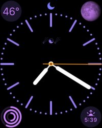
Not many seem to like the Color Face. I think violet makes a good low-key face that goes well with the space gray sports watch. I was just playing around with special characters for the monogram that's a yinyang with two comets.
How did you do that with symbols? It doesn't let me type emojis in there.
I use Modular the most because I can fit MORE information on the screen for a quick glance.
I really love the COLOR face, but I wish I could add the numbers for the hour... I like having 1-12 numbered for a quicker glance at work and wish they would add that as an option.
I really love the COLOR face, but I wish I could add the numbers for the hour... I like having 1-12 numbered for a quicker glance at work and wish they would add that as an option.
I use Modular the most because I can fit MORE information on the screen for a quick glance.
I really love the COLOR face, but I wish I could add the numbers for the hour... I like having 1-12 numbered for a quicker glance at work and wish they would add that as an option.
Yes!! Wish color face would let you add numbers and change color of the second hand.
How did you do that with symbols? It doesn't let me type emojis in there.
For anyone interested no emojis. Use unicode characters. Paste the unicode character in.
Register on MacRumors! This sidebar will go away, and you'll see fewer ads.


