Become a MacRumors Supporter for $50/year with no ads, ability to filter front page stories, and private forums.

Which dialer do you prefer?

  • Number 1

    Votes: 19 54.3%
  • Number 2

    Votes: 16 45.7%

  • Total voters
    35

ttinc

macrumors regular
Original poster
Sep 12, 2013
126
0
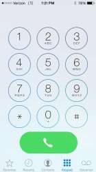
I used someone's screen capture from here to modify the dialer...what do guys think?

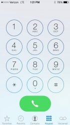
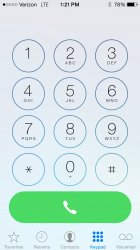
Edit: I made new versions based on comments below...don't know how to edit or delete the poll though.
 

Attachments

  • dialer 1.jpg
    dialer 1.jpg
    2.2 MB · Views: 10,379
  • dialer 3.jpg
    dialer 3.jpg
    246.2 KB · Views: 530
  • dialer 4.jpg
    dialer 4.jpg
    239.4 KB · Views: 567
Last edited:
Why does it matter of it's an oval or a circle (beta 3)?

Because a circle looks just like the number buttons, thus making it less significant and also it leaves a lot of unnecessary "dead space" on the sides.
 
Maybe they plan on adding more buttons
That, or maybe they did it at least partially to decrease the number of accidental dials or hangups that people were experiencing with iOS 7 (I don't know if that was an issue for more people, but it could have been and could have been part of what prompted the change). That and/or simply a move to circular (not just rounded) buttons across the UI in general.
 
The small circle to call is ... dumb, to put it mildly. I like pressing anywhere on the green button when I want to make a call. Why must I be confined to a smaller space? :confused:
 
The small circle to call is ... dumb, to put it mildly. I like pressing anywhere on the green button when I want to make a call. Why must I be confined to a smaller space? :confused:
Maybe many others are accidentally tapping on the much larger button when they don't intend to do it, so this would resolve that issue for them. That's likely seen as more important as far as user experience than simply liking to tap anywhere on the screen. Basically a smaller sacrifice for a bigger gain in the general sense (although for individuals it can certainly differ).
 
Maybe many others are accidentally tapping on the much larger button when they don't intend to do it, so this would resolve that issue for them. That's likely seen as more important as far as user experience than simply liking to tap anywhere on the screen. Basically a smaller sacrifice for a bigger gain in the general sense (although for individuals it can certainly differ).

How is this for a compromise?
 

Attachments

  • dialer 3.jpg
    dialer 3.jpg
    246.2 KB · Views: 493
Why'd you need a button that big, jeez.

The circle is beautiful
 
This is the smallest I think the button should be whilst not being another circle as to differentiate from the dial pad.
 

Attachments

  • dialer 4.jpg
    dialer 4.jpg
    239.4 KB · Views: 444
The smaller call button goes back to the days of pre iOS 7. The iOS 7 button was fairly wide and you could hit it by mistake if using the phone with one hand and trying to reach numbers at the top.

I think the circular look is more playful, yet modern. I imagine a lot of Android OEMs will move to this look soon just like how they changed from square on/off toggles to circular ones shortly Apple did.
 
less is more
if your finger can easily press the number button, it can press the current button just fine.
its no more important than the number button.
 
Oh boy, you should really read some design tutorials before throwing away with ideas which have so many things wrong. You should begin with grids and things that don't disturb the eye.

I don't know what some of you guys have problems with the smaller dial button. Have you ever seen the dial button on an Android phone or used an older Nokia from pre-smartphone times? Dial buttons where small as **** and it still worked good for most people.

Design tutorials? Lol :rolleyes:

And why are you comparing a physical keyboard to a digital interface?
 
Maybe they plan on adding more buttons

If they go back to a style like this, then it would make sense.

217_iphone_dialer.jpg


I know it's a beta, but that's sort of an odd thing to just get left out.

----------

less is more
if your finger can easily press the number button, it can press the current button just fine.
its no more important than the number button.

Oh but it is...you see, dialing numbers is just foreplay :p
 
none of them, sorry.

I think the beta 3 dialer is much better, would minimize mis-touch.
and I believe the size is the same as an app icon. so wouldn't make much problem for most people.
 
Does the delete button appear in beta 3 next to the circular call button instead of at the top next to the numbers in 7.0.4?
 
Apple 7.1. b3 dialer is a bad joke. What is even worse is call answer slider and buttons(for unlocked incomming call).

First ugly icons, then this, why? I need to actually USE my phone, not just look at it.
 
I don't see a reason why they should change what is is now. How is a "Call" confusing? The little round button looks out of place.
 
Register on MacRumors! This sidebar will go away, and you'll see fewer ads.