Become a MacRumors Supporter for $50/year with no ads, ability to filter front page stories, and private forums.

Which dialer do you prefer?

  • Number 1

    Votes: 19 54.3%
  • Number 2

    Votes: 16 45.7%

  • Total voters
    35
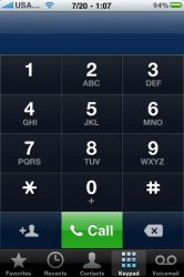
If they go back to a style like this, then it would make sense.

Image

I know it's a beta, but that's sort of an odd thing to just get left out.

----------


Oh but it is...you see, dialing numbers is just foreplay :p
Yeah, I don't understand why the number display is smaller now. It's harder to copy/paste numbers from that area.

Is Apple trying to drive away people with poor eyesight?
 
Because a circle looks just like the number buttons, thus making it less significant and also it leaves a lot of unnecessary "dead space" on the sides.

But you're not filling the dead space with anything, just more of that one button.

With the phone icon in the center of the button that's where you're going to aim regardless of its overall width, so "filling" the space with more green button doesn't do anything useful. If anything, the uniformity of the circular button is better aesthetically.
 
Yeah, I don't understand why the number display is smaller now. It's harder to copy/paste numbers from that area.

Is Apple trying to drive away people with poor eyesight?

It's almost as if the call button isn't a completely different colour that's outside of the grid of numbers.
 
Not at all.

Settings -> Accessability -> Zoom and then just triple click and there you go. ;) :)

Sure, but this is a step backwards in functionality.

----------

It's almost as if the call button isn't a completely different colour that's outside of the grid of numbers.

What does this have to do with anything? I like the call button.

The point being made here is the numbers in the dial box are much smaller than the numbers in the dial pad.

What a stupid UI decision.
 
I used someone's screen capture from here to modify the dialer...what do guys think?

Edit: I made new versions based on comments below...don't know how to edit or delete the poll though.

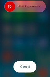
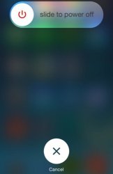
Could you use the third screenshot style and change the white round with and X of the new beta 3 power off screen with a white button of the same size that the green one in the third screenshot with the word 'Cancel' in it??

I think the X round button with the word 'cancel' below is ugly

Thx
 
Because a circle looks just like the number buttons, thus making it less significant and also it leaves a lot of unnecessary "dead space" on the sides.

So filling it up the dead space with a green color makes a difference? Dont think so. That being said i like youre revision but i dont see this as a major issue or concern.
 

iOS 5's dialer was the best, utilize the entire space and looks super fresh.

As for the tweaked iOS 7.1 B3 dialers, sorry to tell you none of them would work.


Best solution for a circular dial buttons is to round the corners of rectangle like 7.0.4.

I don't know what's up Jony Ives, but that guy has a fetish for cheesy circles. It's almost impossible to make a bunch of circles look good with rectangular screen.
 

Attachments

  • 217_iphone_dialer.jpg
    217_iphone_dialer.jpg
    35.2 KB · Views: 232
This is the smallest I think the button should be whilst not being another circle as to differentiate from the dial pad.

So the fact that its solid green doesn't differentiate it? :D

Man these engineers have the hardest job in the world,,,,,try and please everyone. Too big, too small, too round, too square, too green, not green enough. Seriously its probably due to matching the rest of the OS plus most folks finger tips are round and just about the size of the new circle they created, hmmm.
 
iOS 5's dialer was the best, utilize the entire space and looks super fresh.

As for the tweaked iOS 7.1 B3 dialers, sorry to tell you none of them would work.


Best solution for a circular dial buttons is to round the corners of rectangle like 7.0.4.

I don't know what's up Jony Ives, but that guy has a fetish for cheesy circles. It's almost impossible to make a bunch of circles look good with rectangular screen.

My god that looks like Android circa 2010.
 
Could you use the third screenshot style and change the white round with and X of the new beta 3 power off screen with a white button of the same size that the green one in the third screenshot with the word 'Cancel' in it??

I think the X round button with the word 'cancel' below is ugly

Thx

Derp
 

Attachments

  • power off.jpg
    power off.jpg
    79.4 KB · Views: 233
  • slidetopoweroff.jpg
    slidetopoweroff.jpg
    31.6 KB · Views: 221
Last edited:
Yeah it's really easy to miss the effing FLUORESCENT GREEN CALL BUTTON.

And people complaining about it being the same shape....

It was exactly like that in iOS 6.

If you actually had this on your phone you would literally get used to it in like six seconds.

Jesus, people.
 
I would rather have the call text than the old school phone logo.

Ya, I'd made one with the text instead of the logo, but it disappeared somewhere along with the poll that I couldn't find out how to edit.

You're the guy that made the custom tones a little while back, no? I made a few myself in garageband thanks to your idea and wanted to share, but I couldn't reach you via PM so you can post them in the thread and I forgot about it.
 
Register on MacRumors! This sidebar will go away, and you'll see fewer ads.