Become a MacRumors Supporter for $50/year with no ads, ability to filter front page stories, and private forums.
Speaking strictly aesthetics and not practical improvements, I'd say it's a bit of a wash? The one thing I deem in favor of the M2 Air is that it doesn't feature any speaker grills, as I don't particularly like the look of them.

I understand from here that for some the wedge shape was iconic but I don't really mind them foregoing it at this point when they can make the machine slim all-over anyway.
 
  • Like
Reactions: Spaceboi Scaphandre
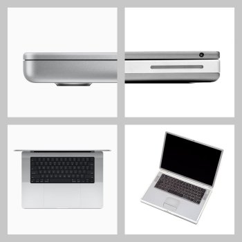
Personally, I do like that Apple has rekindled the design language of the TiBook. I feel the industry wasn't mature enough to handle how advanced the Titanium G4 was at the time and that has only recently changed. I doubt the PowerBook looked like the concept art due to limitations in tech and manufacturing. Looking at my 16" MacBook Pro, I get the feeling that this is the Mac they would have made if they only could. It's similar to looking at the stop-motion tests for Jurassic Park. Stop-motion was not mature enough for what Jurassic Park unleashed on cinema.

I got the M1 MacBook Air after the M2 was released because I had to have the wedge. Will I be OK with the new design in ten-years if the wedge is long gone and it's no longer practical to rock an M1? Of course. But given the choice, I just like the comfort of the tapered base.

The M2 certainly looks more advanced in its overall shape. The wedge sort of gives the false impression of thinness. The M2 design delivers thinness. I'll say again: the most appealing aspect of modern Apple portables is that they embody what the TiTanium PowerBook (formerly the peak of design, in my opinion) would have been if Apple had the means at the time.
1366_2000.jpeg

Is it because Jony Ive has left?

Yes and no.

Every industry is "going to the kids."

Look at TV in the 1950's. Every reporter and host was over 30-years-old. The media was represented with the face of wisdom and experience.

Look at the same things in the 70's and (shudders) the 80's. The media is represented by the uneducated, inexperienced, bleeding heart ditzes. I have yet to find one single author for a major publication that could pass a sixth-grade English grammar test and that includes MacRumors' authors.

How about Star Wars? It was created and realized by a man who wanted nothing more than to be a story-teller. Though his autism hindered his ability to construct the story in a cohesive manner that would connect with the majority of audiences, the spirit of his story prevailed. Against all odds, George Lucas founded an empire and redefined cinema.

Now the Star Wars IP is soiled by kids playing with the artifacts their "father" left behind. They have no reason to respect it or show any reverence. Just like a kid finding his grandfather's war medals and wearing them on their jacket next to their Sex Pistols pin, my generation has done nothing but dismantle what previous generations strived for.

Jony understands things that we can't begin to describe without serious formal discipline. It's like a musician explaining why Aaron Copland represents something truly unique and refined. (Not in my opinion. Come at me.)

Any person can, and many do, take Jony's "aesthetic" and apply it to fantastical approximations of what could be. There have been fan-made G5 PowerBook renderings and even renderings of real products before they were finally realized and all looked appropriate for Apple. Many, though, fall into the uncanny valley. They appear "Apple-ish" but miss something.

I would say that today's Apple designers succeed at not much more than the fans are capable of. They don't know the why. They only know the look.

Jony is an example of somebody that was born to succeed at one thing. Today's philosophy is to endear the guy that fails at many things.

In Japan, it is (traditionally) considered shameful to change your trade. If a brick-layer becomes a mechanic, it signifies that perhaps they were not a very good brick-layer. I agree that there is some truth to this personally.

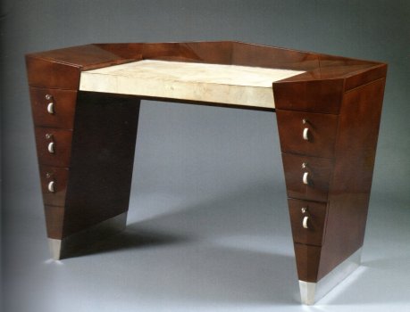
Ive is not just a designer. Ive is a person that lives and breathes design. He is a fan of the greatest designers. I wouldn't be surprised if most of the people in Apple's design department today have nothing more than Industrial Design 101 under their belt. They are nothing more than imitators.

The original:
Desk+by+French+furniture+designer+Léon+Jallot.jpg
The imitator:
Dressing_table_and_bench_-_after_Léon_Jallot_(38691620495).jpg
 
I looked at the new M2 MacBook Air in an Apple Store recently and came away thinking how thankful I was for going ahead with my purchase of the previous wedge-shaped MacBook Air. I was hoping the new MBA would look better in reality than the photos and videos I'd seen online, but it actually looked worse. The flat design is boring and already looks outdated, it was covered in smudges and fingerprints, and the notch and Touch ID button on the keyboard both stick out like a sore thumb. It just lacks that sleek perfection that the previous MBA design had, which actually looks more futuristic now than the new M2 MBA. I just don't understand why Apple is doing this, taking big backward steps with the look and feel of their products. They've already done this with the new iMac, and MacBook Pro, and now the new MacBook Air. Moreover, the new Apple Watch Ultra is the ugliest device they've created in years. Why are they doing this? The reason I loved Apple products in the first place was the sleek minimalism and beautiful aesthetics of their products but they are slowly eroding that approach to design. Is it because Jony Ive has left?
See others more detailed replies. Mine: no. But thanks for your opinion and hope to hear more.
 
I like the M2 Air. I think it looks cool. I also like the old Air. Both are very nice computers. Costco's selling the M1 Air right now for $799, so if you want one, get it while the getting is good.
 
I took my SO to Apple Store to hear her impression on the M2 MBA. She owns the M1 MBA.
She immediately assumed it was the MBP since the body was so thick.

I think removing the wedge design was a big big design. It really looks thicker now.
I’m afraid I have to pile on here—

Even though it’s technically thinner and lighter overall, it doesn’t feel that way. The taper of the wedge and the rounded edges of the M1 MBA make it feel thinner, even if it isn’t. That was the brilliance of that design, even if it has become a bit dated.

There is a simple solution to this that I will continue to harp on—

Bring back the 2017 MacBook 12” (the lightest/thinnest laptop Apple’s ever produced) with an M1 or M2 chip and call it the MacBook SE. Monetize that, Tim! 😆
 
When the old designer (Ive) left, obviously there will be new design language.
I manhandled both models at a retailer, and while technically the M2 is lighter, when hold, it felt bigger and heavier than the old M1 wedge design. Plus the feet are more pronounced in the new design, while the old wedge design had a smoother rounded feet.

The wedge design is simply iconic, and it has become the standard of literally majority of laptops in the market, aka nearly all ultrabooks are designed based on this classic MacBook Air wedge design.

I personally prefers the old wedge design. The tapered design made it feel thinner than it actually is.
 
I looked at the new M2 MacBook Air in an Apple Store recently and came away thinking how thankful I was for going ahead with my purchase of the previous wedge-shaped MacBook Air. I was hoping the new MBA would look better in reality than the photos and videos I'd seen online, but it actually looked worse. The flat design is boring and already looks outdated, it was covered in smudges and fingerprints, and the notch and Touch ID button on the keyboard both stick out like a sore thumb. It just lacks that sleek perfection that the previous MBA design had, which actually looks more futuristic now than the new M2 MBA. I just don't understand why Apple is doing this, taking big backward steps with the look and feel of their products. They've already done this with the new iMac, and MacBook Pro, and now the new MacBook Air. Moreover, the new Apple Watch Ultra is the ugliest device they've created in years. Why are they doing this? The reason I loved Apple products in the first place was the sleek minimalism and beautiful aesthetics of their products but they are slowly eroding that approach to design. Is it because Jony Ive has left?
Everyone is entitled to their opinions, and all of the points you've made here are subjective. In a more objective way, you could maybe complain about Apple raising the price of the M2 Air. I don't think there's anyone who would take the opposite stance and say, "No, I WANT to pay more money for my products."

But everything above is subjective, as I said. You like the wedge shape, which is fine, but plenty of people like the updated Air design. You mention smudges and fingerprints, so I assume you're talking about the Midnight color, but a lot of people like it and are happy with choosing that color. People are also torn on the notch, but most agree that once you use a MacBook with a notch it fades into the background. I'm not sure how a Touch ID button sticks out like a sore thumb...it's a black key and sits flush just like all the others.

You mention Jony Ive at the end. Recall that it was under his direction and fanatical desire for thin products that gave us the butterfly keyboard that created so many issues for so many people. Form over function. There's no point having a laptop that's 2mm thinner if it means you can't type on it reliably. It was also during his tenure that Apple got rid of a lot of I/O like MagSafe, HDMI, and card readers, but now he's gone and those things are back. I think most MBP owners would rather have HDMI and a card reader than use dongles.
 
The M2 Air is great. As someone who never liked the wedge, I'm very glad they put this fanless beast of a computer into a more practical body. And for those who want the wedge, the M1 is still there and still a great option.
 
My objection is to minimalism over function. I'd way rather have tons of ports than 1/8 inch thinner & 5 grams lighter. Maybe even a SuperDrive (kidding) or at least room for an extra SSD. And I miss the 17-inch MBP.
 
  • Like
Reactions: MajorFubar
IMO the wedge has always compromised the function and capability. Look at any wedged MacBook Air with the bottom cover off and see how much area is...empty and useless. They couldn't even make the 11" MacBook Air display any larger due to the constraints of the form factor and it was stuck with those MASSIVE cursed bezels.

The redesigned 13" MacBook Air comes along and does away with the super sharp taper and...wow! Suddenly you can fit 13" into the 11" MacBook Air form factor.

I came from an 11" MacBook Air to the M1 13" and as I suspected they both "feel" to be the same size overall. My 13" 2012 MacBook Air is massive in comparison. That was all thanks to that overly stylized look. It reminds me of the nauseatingly garish Cadillacs of the 50's. Insert puke emoji. The car was just shy of 20-feet yet had as much leg room as a Toyota Camry and an equally sized trunk. (This is not exaggeration).
 
Apple is likely to keep around the wedge design MacBook Air for years and bump up the SoC with each generation. Once the new Notch MacBook Air gets M3, the wedge Air will get M2. Apple knows the wedge is iconic, just like the Home/Touch ID button iPad and iPhone SE. I believe it was Greg Joswiak who said nothing is wrong with Touch ID.

So, I suspect you will still have new revs of the wedge based Air to upgrade to. Depending on how long you keep your Mac, you might be able to get one with a M5 in it years down the road. I was pleasantly surprised when they included an A15 in the iPhone SE 3rd gen.
 
The old MacBook Air was 0.63 inches at its thickest point.

The new MacBook Air is 0.44 inches at its thickest point.

OP calls new MBA "bulky" but this is somehow objective? 🤔
Well then the old design was so good you don’t feel it’s that thick.
Isn’t that what design is supposed to be?
 
They look outdated and anachronistic with that bulky, boxy design. The new MBP looks similar to my ancient Macbook Pro from 2006 and the colour options on the boring new iMacs are just silly. Go into any Apple Store or reseller and they just look out of place.
Now Apple will the Harley Davidson of computers :D Building nostalgic hardware! )
 
My objection is to minimalism over function. I'd way rather have tons of ports than 1/8 inch thinner & 5 grams lighter. Maybe even a SuperDrive (kidding) or at least room for an extra SSD. And I miss the 17-inch MBP.
I do feel a strange nostalgia for my old 17-inch MBP, too— I carried that thing around the world 🌎 believe it or not. Very happy with the 16 M1 Max MBP as a replacement, though.

IMHO, there’s room in Apple’s line up for true ultra-thin minimalism (think M1 MBA, MacBook 12” 2017 and iPhone 6) as well as robust functionality— they just have to iteratively get there. Hopefully, they will bring some of that slick Jony Ive ultra thin design back to laptops once the M chips are efficient enough.
 
I looked at the new M2 MacBook Air in an Apple Store recently and came away thinking how thankful I was for going ahead with my purchase of the previous wedge-shaped MacBook Air. I was hoping the new MBA would look better in reality than the photos and videos I'd seen online, but it actually looked worse. The flat design is boring and already looks outdated, it was covered in smudges and fingerprints, and the notch and Touch ID button on the keyboard both stick out like a sore thumb. It just lacks that sleek perfection that the previous MBA design had, which actually looks more futuristic now than the new M2 MBA. I just don't understand why Apple is doing this, taking big backward steps with the look and feel of their products. They've already done this with the new iMac, and MacBook Pro, and now the new MacBook Air. Moreover, the new Apple Watch Ultra is the ugliest device they've created in years. Why are they doing this? The reason I loved Apple products in the first place was the sleek minimalism and beautiful aesthetics of their products but they are slowly eroding that approach to design. Is it because Jony Ive has left?
By briefly implementing ancient design for a production cycle or two, then whatever they design next will feel incredibly futuristic compared to it.
 
  • Haha
Reactions: transpo1
This type of thread is so stupid.

My socks always gets holes i recommand everyone to go without socks because its a poor design.
Terrible analogy. Apple in this instance have released socks with holes as standard, hence why no one is buying them and the M1 airs are outselling the M2 airs 476-1
 
  • Like
Reactions: transpo1
I have yet to find one single author for a major publication that could pass a sixth-grade English grammar test

LOL! 6th grade grammar tests are incredibly simple and most authors in major publications (e.g., The New Yorker, The Atlantic, The New York Times, The Washington Post, The Guardian, etc.) could readily pass such a low bar. Their writing — in vocabulary, grammar, structure, and substance — routinely surpasses that of the average 6th grader!

Now, as to the topic at hand…

A strong case can be made the M1 MBA is *objectively* thinner than the M2 MBA.

Several have rejected that because the M2 MBA's height of .44“ is clearly less than the .63” of M1 MBA.

Well, that data is right, but cherry-picked. It uses the M1's greatest height! Instead, consider the other end, which is only .11”. That means the M1 MBA is only 1/4 the height of the M2! Clearly, by that measure, it's the thinner one. 😎

But that would be cherry-picking, too. Of greater relevance, consider this. The M2's height of .44” is *greater* than the average height of the M1 MBA, which is roughly .395”. (Half way between .16” and .63”.).

See https://www.apple.com/mac/compare/

Objectively, therefore, the M1 MBA is thinner. 👍🏼 💯

Another point. Bizarrely, we've also had this asserted, albeit not in this thread.

“Despite not having a tapered design, the new ‌MacBook Air‌ delivers a 25 percent volume reduction over the previous generation”​

Color me skeptical! How can that be true?

The M2 MBA is slightly *deeper* than the M1 (8.46” vs. 8.36”) and, as noted, has a greater average height across its chassis!

There is no way the M2 MBA could have 25% *less* volume. As they say in math classes:

”Show your work!” 😎​

Finally, there's this whole “modern” vs. “outdated” debate that keeps getting rehashed.

Describing the M2 MBA as “modern” is, at one level, laughable as it is a throwback to the classic, vintage MacBook Pro box shape. It looks generic and dated.

In contrast, for many people, the M1 MBA with its slanting wedge still looks futuristic. Of course, at another level, it's hard to describe the taper as “modern“ given how many years it's been around! 🙈

Still, I’d cast my vote with Ken's original blunt critique of the new design language, at least as to the MBA.

Yes, Jonny Ive made a fetish out of thinness and much was lost along the way because of it, but the tapered MBA was a breakthrough in design language. It combined form and function, was a delight to use, and retains a magic the rectangular box shape lacks.
 
Register on MacRumors! This sidebar will go away, and you'll see fewer ads.