I think the term skeuomorphic is either being misunderstood, or misused here. It seems that it's being used to describe a style that has depth and shading - which isn't it's meaning. It's meaning is to resemble the real world counterpart.
I agree there are some misunderstandings and mis-usings in this thread.
We need a new word (or new words) to differentiate between two things that unfairly get lumped in as "skeuomorphic" sometimes in these discussions. Both are appearance-based but there are subtle differences in that one is more about an overall form while the other is about showing certain specific functions via specific forms.
So for now in the absence of any better terminology, I'll call them Number 1) and Number 2).
Number 1): An interface design style that makes something on-screen look truly like the real-world counterpart. Example, the iOS6 (and prior) compass. A contacts app that looks like a rolodex. An iOS6 (and prior) Books app that shows physical pages and even a textured book cover/binding.
Number 2): Interface design prompts to highlight obviousness beyond a shadow of a doubt that something is actionable vs. info-only. They highlight clearly that something is "available and enacted" vs. "available and not yet enacted" vs. "info-only" vs. "a non-selectable option." Cues that help differentiate controls vs. content. Cues that make all available options/controls obvious and not rely so heavily on discoverability by hiding things off-screen and/or making things a bit too obscurable at times. These cues were honed over decades to be clear and efficient. They can include using certain "real-life-based" cues like a dial or switch appearance that help differentiate them from the background/other content, but therein lies the rub were these cues can fall victim to being lumped in with Number 1) and eradicated by the anti-pixel warriors. By definition, these aren't easily detailed in flat design.
Number 1) above was cute at first and now, in most cases, can seem kind of silly and over the top. Most instances of number 1) above were passionately obliterated with flat design, Metro, iOS7, Material Design, etc.
Number 2) above is vastly different than 1) but in too many instances got unfairly lumped in and wiped away with the zealous execution of Number 1) almost 10 years ago. In general, Number 1) is more about form while Number 2) is more about function. Number 1) was seen more in heavily-skeuomorphic interfaces while Number 2) is important and applicable and helpful in both heavily-skeumorphic (Number 1) above) interfaces and extremely-flat interfaces.
Number 1) is bell-bottom jeans and flower power: Via natural selection, they didn't stick with the passing of time. Number 2) is a tuxedo and little black dress: Classic, timeless, useful, and somehow stuck the passage of time. But too much of Number 2) was short-sightedly white-washed away with the witch hunt of 2012 against Number 1).
My inspiration for starting this thread was from the rabid obliteration and all the unnecessary plastic surgery of Number 2) during the war against Number 1) to the point that intuitiveness, efficiency, and even "a look of thoughtful quality" were sorely missed. Worse was when the interface suddenly started getting in the way...(when certain "new interfaces" were reduced away to something more confusing and less efficient to use than before, requiring re-learning how to do what used to be obvious and/or what was perfectly fine before).
We also should be moving away from these metaphors, as they're becoming irrelevant in the modern world. Which office still has filing cabinets with folders in them? With physical calculators on the desk? With a roller deck of contact cards? These are things which are largely gone from society, and the majority of people even in their 30s (those young kids) will never have dealt with them before. Making a metaphor for a thing which has never been used is completely pointless.
And I'm sorry to say this, but if you're the kind of person who has managed to not learn how these things work on a phone, despite interacting with them for over a decade, then you're untrainable. Because the kids now days (who are in their 30s) all grew up without these and understand it. And the younger generation who never even used iOS6 and below get along just fine. If you actually NEED a button to look like a physical thing you press to be able to understand how you interact with it, then unfortunately you're in the minority.
I‘m with you, we really don’t *need* as much Number 1). We don't need our contacts to look like a rolodex, or a Books or Kindle app book to look like actual pages in a book.
However, have you or anyone else ever wondered why the phone icon is still a handset that most of of have not used in 20+ years? Why is the e-mail app on any given phone still a paper envelope that few still write & send out. Why is the alarm notification in the top header area (and also the clock app icon) still a round-face-clock-with-bell-on-top that fewer of us put on walls and VERY FEW have on their nightstand table. The stopwatch icon is literally a stopwatch timer I’ve not seen in person in decades, the flashlight is a C- or D-cell battery-operated flashlight that I haven't owned or used in decades, and the camera app and “file save“ icons are represented by items my 11 year old son has never touched and may never touch. I could go on.
Why do those interface elements remain as representations of now-pretty-much-outdated objects? I assume it’s because people much smarter and more experienced than us have concluded that there are no better, simpler, more obvious options that would result in an appreciable functional (and/or aesthetic) benefit. And that it's really ok to keep using these "outdated metaphor" interface/icon elements because they're universally understood and about as simple as you can get. Otherwise, the change would likely seem like just a forced reworking of something’s that could just as easily be left alone.
Stepping away from skeumorphic metaphors of the Number 1) type, my issue was (and remains) the forced reworking of the Number 2) interface elements that went too flat, too buttonless, too homogonous...too simple for the sake of something "modern and clean-looking during the war against Number 1). Whether it's a button that looks more like a button (or slider, or toggle, or etc.) via a slight 3D look and/or drop shadows, or better use of colors and gridlines/borders to differentiate "zones," there's such higher ease of use to those types of interfaces vs. a very flat design.
It won't be the best comparison, but it feels to me similar to how the human retina is designed to see what's focused on in front and center with greater clarity, while the peripheral image zones don't need to pick up on all the focused detail. A good interface should provide more detail for "what's to be focused on" so it's differentiated from "the ancillary, background/supporting content." Our eyes are made to see the detail of what we're focusing on, and our nature is to focus on certain things designated with having more detail to draw our attention. So where exactly is the benefit of a flattened, low-contrast, monochromatic simplified interface? I'll never understand or know.
In this thread outside of MacRumors, the Logic Pro interface of 2010 had the perfect balance of non-chromatic intuitive design with enough good "Number 2)" elements such that the interface felt so much more engaging and efficient than that of today...more intuitive and easy to "take in instantly" what was actionable vs. info vs. controls...easier to navigate & use than the flat design of today where everything on-screen blends together as a monochromatic, low-contrast, "info-only-looking" interface. For some buttons and in the control/tool bar above each channel's audio line, there's a 3D contour shape that's made prominent by simulated light reflectivity. To some with not enough to worry about in life, that's taken as an affront to common sensibility and which must be eradicated and flattened since the world "doesn't need to see that." But to me that effect lends a certain mental acuity aid, to almost subconsciously help the eye/mind to focus on how to use the tool/screen in front of them. Just like how light switches or the volume button in a car extends out from its surface to signify "control this here," why can't the same effect/tool be appreciated in a screen interface? It just helps; I just don't get the devaluing.
Hi Today i opened Logic Pro 10.4.7 on Macbook Pro Catalina - and the whole interface looks like from the 90s. The graphics are reduced, no shadows, everything is flat and very light in color, grayish. I don't know what happened. Can somebody help me get the usual Pro Logic back? I didn't update a...

www.logicprohelp.com
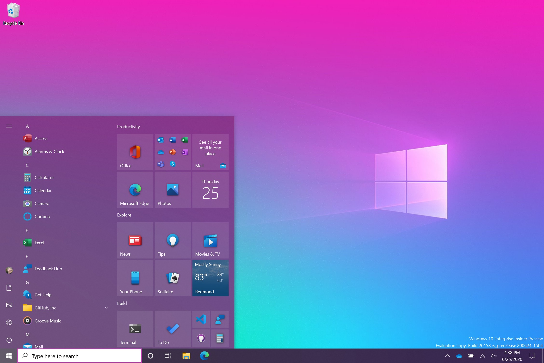
Current vague interface where flat/monochromatic form is prioritized:

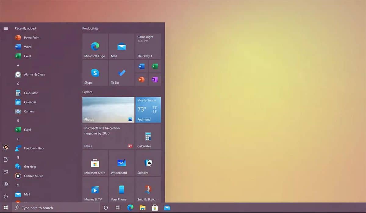
2010-era interface where function was put ahead of form:
It would be great if we could differentiate in this thread the difference between Number 1) which is more of a "form-based thing for the sake of style" thing (that some people may love/prefer) vs. Number 2) which is more of a "function-based interface element thing via certain targeted forms." That would be really helpful.
Number 1) is more "more" and flat design is more "less." Interfaces that are heavily-skeumorphic or heavily-flat design both need enough Number 2) to be intuitive, efficient, and even a joy to use. This thread I started is about not enough Number 2) starting around 10 years ago. Many seem to rebel against too much Number 1) (too much "more") but it's surprising how many seem Ok with so much of Number 2) thrown out with the Number 1) bathwater.


