Become a MacRumors Supporter for $50/year with no ads, ability to filter front page stories, and private forums.
Ya the new task bar is retarded. Its functionally useless compared to the old style task bar and quick launch. I'll be sticking with Vista until someone makes a hack to get a classic start button, quick launch and taskbar.


I have used a mac in the past and kept going back to Windows becuase the only thing I liked about Windows was being able to look at all my open windows at a glance in the taskbar.

With Windows 7, Microsoft changed the behaviour of the taskbar and now it is very similar to the dock.

So, essentially Microsoft took away the only feature that kept making me go back to Windows.

Well done MS.

P.S-Picked up a prev-gen MBP(Unibody) in the refurb store for $1349. Amazing deal. Thanks :apple:
 
Win7 was good enough that I decided to not buy a Macbook. I will probably get one when Snow Leopard is released or later though.

The new taskbar in Windows is wonderful, it simplifies window management a lot. It's no wonder Snow Leopard has very similar features for the Dock. I find it's faster to find the right window in Win7 than OSX.

Win7 also clearly shows what is lacking in OSX 10.5. On a 30" screen the lack of resolution independance is pretty annoying because text size can't be scaled universally, thus making it harder to read. Windows management isn't that great either, mouse acceleration works like ****, there's no clickthru and Finder is still crap compared to the Win7 Explorer.

OSX does still have upper hand in program visual uniformity, keyboard shortcuts and ease of program installation though. It would be nice if some day Windows apps would be just a single file rather than a directory filled with dlls and resource that are not relevant to the user.
 
I have used a mac in the past and kept going back to Windows becuase the only thing I liked about Windows was being able to look at all my open windows at a glance in the taskbar.

With Windows 7, Microsoft changed the behaviour of the taskbar and now it is very similar to the dock.

So, essentially Microsoft took away the only feature that kept making me go back to Windows.

Well done MS.

P.S-Picked up a prev-gen MBP(Unibody) in the refurb store for $1349. Amazing deal. Thanks :apple:

It's only a beta. Hadn't you wait until the real thing comes out?
 
Welcome! Yeah, I've always been a Windows zealot - Vista changed that, I hated it a lot then Windows 7, it's still based on the same framework as Vista.
So it's a turd and you can only polish a turd so much - smells less now but... yep, still a turd. :D

You should watch Mythbusters. They had an episode with some really nice looking polished turds.
 
I just updated my netbook to Windows 7 RC, jesus its good

it runs smoothly on my netbook with 1G ram, with all the bells and whistles. it even play my 98 era old games! HoMM3, MM8, oh great.

I also got my firefox themed to looks pretty

MAN is that ugly. Is it me, or does anyone else think Microsoft continues to go WAAAY overboard with the window transparency? I mean c'mon.....why do I want to see the window that is behind the window I'm working in? Just because they can?

Talk about clutter.

windows7-20081028-2.jpg


Windows 7 actually looks pretty good if you ask me. The new taskbar is a good move. That's not to say it isn't Windows. I've been playing around with the RC and two things really annoy me.

1. The heavy use of transparency (which begun in Vista of course) clutters the interface. The larger transparent taskbar makes it even worse.

2. Everything is a browser. Browser controls in Explorer and Internet Explorer makes sense. Apple does the same with the Finder and Safari, for example. What doesn't make sense is full browser controls, such as Refresh, in things like the Control Panel and Windows Media Player. Apple is only partially guilty of this (Back and Forward buttons in System Preferences - why?) but why would you ever need to refresh the Control Panel?

What it adds up to is extra noise in the UI, like the transparency in early Mac OS X versions and those horrible pinstripes. I hate it.

Agree with both #1 and #2. Although, I will give Microsoft credit, they seemed to clean up the Explorer interface a little bit.

I think the new Expose features in Snow Leopard are better than Windows 7 Aero Peek feature:
http://i.gizmodo.com/5285033/snow-leopards-new-expose-and-dock-explained

Still, at the end of the day I find myself being more productive on OS X. And Snow Leopard is going to make that even better.

I'll take Expose, Spaces and Time Machine over Windows any day!

-Kevin
 
MAN is that ugly. Is it me, or does anyone else think Microsoft continues to go WAAAY overboard with the window transparency? I mean c'mon.....why do I want to see the window that is behind the window I'm working in? Just because they can?

Talk about clutter.

windows7-20081028-2.jpg


Agree with both #1 and #2. Although, I will give Microsoft credit, they seemed to clean up the Explorer interface a little bit.

I think the new Expose features in Snow Leopard are better than Windows 7 Aero Peek feature:
http://i.gizmodo.com/5285033/snow-leopards-new-expose-and-dock-explained

Still, at the end of the day I find myself being more productive on OS X. And Snow Leopard is going to make that even better.

I'll take Expose, Spaces and Time Machine over Windows any day!

-Kevin

I work on Windows servers all day. I use RDP via my trusty MB. I've used Vista, and recently 7. Sorry, I just can't do it. At the end of the day, I still enjoy OS X soooo much more...
 
Windows 7 really shows OS X's shortcomings, and personally I was disappointed with Snow Leopard's introduction yesterday for that very reason.

This thread has people criticizing the transparency in Windows because it apparently looks cluttered, but what about the fact that my entire Mac's screen is one gray blob, with every app looking identical, thereby making it very easy to forget which Window is active? Windows transparency not only looks great (granted not in pictures, but when you use it it's very good) but it also is used to the fullest in Windows 7, as it's new Expose'-like system (which beats Expose, by the way) actually makes Aero more than just a pretty UI.

Also, why would Apple rewrite Finder but not add anything major to it? Windows Explorer is beyond superior to the Finder, if only because I can merge folders. Such simple functionality that Apple has yet to incorporate.

The only thing that still keeps me from switching 100% is that Apple has mastered all of the hardware in their notebooks, so I can get the thinnest and lightest notebook around that is optimized for their software, and can use a 15" laptop for 7 hours. Also, iChat and iTunes are much better than any Windows counterparts, and Time Machine is the easiest backup program ever.

Windows 7 is so good that it will sure make a lot of people switch back.
 
Windows 7 really shows OS X's shortcomings, and personally I was disappointed with Snow Leopard's introduction yesterday for that very reason.

This thread has people criticizing the transparency in Windows because it apparently looks cluttered, but what about the fact that my entire Mac's screen is one gray blob, with every app looking identical, thereby making it very easy to forget which Window is active? Windows transparency not only looks great (granted not in pictures, but when you use it it's very good) but it also is used to the fullest in Windows 7, as it's new Expose'-like system (which beats Expose, by the way) actually makes Aero more than just a pretty UI.

To each his own. I personally like the consistent look of OS X apps and don't find it difficult to see which window is active or not. My problem with Aero is I don't want to see a window behind the one I'm working in. To me it's fluff, fancy transparency to attract people buying PCs in the store with no constructive purpose for it.

If I want to see all the windows in my current application, I think Expose wins here. I think the new features of Expose are going to be cool and ease the ability to drag and drop files onto other apps windows. Right now you can drag and drop a file onto Mail's icon. It'll open a new mail message with that file attached. But there is no way (using the dock) to drop a file and select WHICH mail message to drop the file on.

I mean c'mon.....Windows 7 still doesn't have spring loaded folders? And try this, on OS X, open 2 finder windows. The one in front just slighty to the left of the one behind. Now, drag a file from the front window to the back window. What happens? The back window comes into focus. You can then use spring loaded folders to drop your file. In Windows, you can hover over that little bit of exposed window all day but it doesn't come into focus.


Also, why would Apple rewrite Finder but not add anything major to it? Windows Explorer is beyond superior to the Finder, if only because I can merge folders. Such simple functionality that Apple has yet to incorporate.

To improve performance and lay the foundation for additions and tweaks. No doubt the entire Snow Leopard project is pretty extensive. Basically a complete rewrite of the core of OS X and many of the core apps. I think Apple doesn't want a "Vista" on their hands where they let things get out of control and deliver something that is not polished.

Snow Leopard lays the foundation for major enhancements for years to come with OS X. Some things like the new Quicktime, Stacks and Expose tweaks are bonuses.

Apple is set to deliver a rock solid OS that is modernized to handle today's multi-core machines.....I'm excited.

-Kevin
 
fanboysim.

if you have less than 1GB ram, go use linux and stop making nonsensical argument.

How is that "fanboyism"? Not everyone wants to constantly shell out more money just to cope with an increasingly-bloated OS.

Look, the reason I'm not impressed with Windows 7 is simple:

After three years of development, Microsoft is releasing an OS that is (at best) a marginal improvement to Vista. Users are expected to shell out another couple hundred dollars for an OS, the major selling point of which is that it sucks less on machines with ~1GB of RAM.

Why are we supposed to be impressed? Because it runs acceptably on a 1.6Ghz processor with 1GB of RAM and several GB of disk? That's not exactly a major achievement. In fact, if that's the best they can do at creating a "sleek, lightweight" OS, they're in trouble. As recently as last year there were machines being sold with 512MB of RAM, and not everyone has the technical savvy and the financial resources to continually upgrade their hardware.

So what exactly does it bring to the table? Some advancements in GPU-assisted compositing, yes, but what else? Some minor UI tweaks and a slightly-less intrusive version of UAC. Oh, and para-virtualization for Windows XP compatibility.

When you get past the "OMG shiny!", there doesn't really appear to be all that much in Windows 7 to be impressed with.
 
To each his own. I personally like the consistent look of OS X apps and don't find it difficult to see which window is active or not. My problem with Aero is I don't want to see a window behind the one I'm working in. To me it's fluff, fancy transparency to attract people buying PCs in the store with no constructive purpose for it.

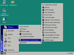
I find that while the transparency is mostly a visual effect, it also helps you to see the relationships of windows when you've got a bunch piled on top of each other. Personally I like the visual effect, it's not distracting. I'll never understand why some people want their computer to look like the first Windows NT but there are folks like that too.


If I want to see all the windows in my current application, I think Expose wins here. I think the new features of Expose are going to be cool and ease the ability to drag and drop files onto other apps windows. Right now you can drag and drop a file onto Mail's icon. It'll open a new mail message with that file attached. But there is no way (using the dock) to drop a file and select WHICH mail message to drop the file on.

I mean c'mon.....Windows 7 still doesn't have spring loaded folders? And try this, on OS X, open 2 finder windows. The one in front just slighty to the left of the one behind. Now, drag a file from the front window to the back window. What happens? The back window comes into focus. You can then use spring loaded folders to drop your file. In Windows, you can hover over that little bit of exposed window all day but it doesn't come into focus.

I feel that the Windows taskbar does better here. Windows are nicely tied to their icon so it's always easy to find the right window whereas with expose you sometimes have to look at them a bit more to pick the right one. It's no wonder the Win7 behavior has been essentially copied into Snow Leopard, it's simply not as a small preview like in Win7.

The drag&drop thing has mainly to do with the difference in OS paradigms. OSX doesn't support clickthru, which means that if I have a window that is not active, say a web browser, I can't click a link I see in it before clicking it once first to activate it. In Windows I can click the inactive window link the window plus the link are clicked straight away. Personally I find this very handy.

When it comes to drag&drop, the same behavior prevents you from having the window become active, which I agree is a drawback. A workaround is to drag the file to the taskbar icon, then on top of the preview window to active the other browser window. Inconvenient definitely. It's also a shame that you can't drop files into the breadcrumb trail in Windows to quickly move files into other directories. But since Windows has the cut feature, this isn't a big problem.

It amazes me that Apple folks were able to say "we love Finder" at the WWDC. When compared to something like Path Finder it's painfully obvious how crappy it is as a file browser. Windows Explorer was poor until Win7 too but now I rarely miss my beloved Directory Opus (great alternative filebrowser for Windows) because of the way WinExplorer has been improved.

For me Win7 is great because it adds many small usability improvements in areas where Windows has previously only had annoyances. By comparison Snow Leopard doesn't seem to have those in more than a few areas (dock, quicktime, expose and stacks). Hopefully once its released it'll have more.
 
How is that "fanboyism"? Not everyone wants to constantly shell out more money just to cope with an increasingly-bloated OS.

But Apple does the same thing. Granted, this year the cost dropped by $100 for Leopard users, but you still have to purchase it. I agree that the Microsoft fees are outrageous.

As recently as last year there were machines being sold with 512MB of RAM, and not everyone has the technical savvy and the financial resources to continually upgrade their hardware.

And many Apple fans were upset that they weren't including 1GB standard. Apple is and has been continuously behind the hardware curve and charging extra for things like the case or the screen.

So what exactly does it bring to the table? Some advancements in GPU-assisted compositing, yes, but what else? Some minor UI tweaks and a slightly-less intrusive version of UAC. Oh, and para-virtualization for Windows XP compatibility.

I'm not impressed with Windows in general either, but then again, I'm not impressed by Apple's current lineup and pricing either. I like OS X but don't want to pay for hardware that is way more than what is needed. I choose cheap hardware and deal with Windows/Linux.

The virtualization part is pretty nifty in Windows 7, something I never thought Microsoft would do.
 
I've been BETA testing 7, and recently updated to the RC, and I'm still not impressed. It is better than Vista, but then again, what isn't? I do think it'll take hold in business much sooner/easier than Vista.

(..)

For me, it's OS X all the way. The more I use it, and see what's coming up, it's a no brainer. OS X > 7 by far!

+1 No truer words posted. :)
 
I find that while the transparency is mostly a visual effect, it also helps you to see the relationships of windows when you've got a bunch piled on top of each other. Personally I like the visual effect, it's not distracting. I'll never understand why some people want their computer to look like the first Windows NT but there are folks like that too.

Maybe that's the main difference with me. Spaces in Leopard has completely changed the way I work. I have 8 spaces setup to handle all my apps. I couldn't live without it on a day to day basis for working.

I can definitely see where Apple and Microsoft differ here. Microsoft with no built in Spaces functionality is implementing things in Windows 7 to help manage tons of open windows on a single desktop (Aero Peek for example). While Apple has some cool ways of doing similar tasks (Expose), I think Spaces is a leap forward in productivity.

I wouldn't go as far as to say OS X looks like Windows NT though :eek:

-Kevin
 

Attachments

  • windows_nt_4.0_screenshot.gif
    windows_nt_4.0_screenshot.gif
    16 KB · Views: 63
I actually like having all my 'most used programs' tucked away behind the Start button in Windows. I think it keeps a clean, uncluttered desktop.

Is there a way to set up a Mac that way? Where the dock only appears when we click on a button (but is otherwise hidden)?
 
I actually like having all my 'most used programs' tucked away behind the Start button in Windows. I think it keeps a clean, uncluttered desktop.

Is there a way to set up a Mac that way? Where the dock only appears when we click on a button (but is otherwise hidden)?

You can setup the Dock to auto-hide. Then it will only show up when your mouse goes to the area.

Go into the Dock preferences and turn on Automatically Hide and Show the dock.

-Kevin
 
fanboysim.

if you have less than 1GB ram, go use linux and stop making nonsensical argument.

less capable? go run HoMM3 and MM8 on any mac, you just can't!

Um, if I had less than 1GM of RAM, then I still could run OSX.

Huh, I hate to burst your bubble PCBOY, but I could run those programs on my Mac probably. It's called Boot Camp, Parallels or VMware Fusion. It's not complicated. :rolleyes:
 
You can setup the Dock to auto-hide. Then it will only show up when your mouse goes to the area.
Right (thanks) but then it pops up every time you pass it. Can it be made to only pop up when we click on something -- so it's totally out of the way? Similar to the Start button in Windows?
 
Right (thanks) but then it pops up every time you pass it. Can it be made to only pop up when we click on something -- so it's totally out of the way? Similar to the Start button in Windows?
That isn't possible, at least with the tools Mac OS X gives you out of the box. There are third-party launchers and Finder replacements that can give you what you seek, though... and this is only as far as I am aware, I might be wrong.
 
That isn't possible, at least with the tools Mac OS X gives you out of the box. There are third-party launchers and Finder replacements that can give you what you seek, though... and this is only as far as I am aware, I might be wrong.
Okay... thanks!
 
To each his own. I personally like the consistent look of OS X apps and don't find it difficult to see which window is active or not. My problem with Aero is I don't want to see a window behind the one I'm working in.

Then turn it off! It's not compulsory :)

Windows give you the choice. If you want it opaque, the option is there.
 
Yeah, Windows 7 is great. If I can throw a gig of RAM at it, it can do almost everything that other OSs can!

Wait... uh... doesn't that mean I'm getting excited that an OS is only slightly less capable than other OSs and still requires a good deal of hardware just to run?

Oh. Um... well I suppose I am. But Jesus it's average!
I've ran windows 7 with 512mb of ram. It runs just peachy and its plenty speedy. Heck theres very little difference in speed between the two unless you run alot of programs. It even runs decent on 320mb pentium III I had. And these are more than 7 year old machines. Heck the pentium III is from the 90's.
 
I have used a mac in the past and kept going back to Windows becuase the only thing I liked about Windows was being able to look at all my open windows at a glance in the taskbar.

With Windows 7, Microsoft changed the behaviour of the taskbar and now it is very similar to the dock.

So, essentially Microsoft took away the only feature that kept making me go back to Windows.

Well done MS.

P.S-Picked up a prev-gen MBP(Unibody) in the refurb store for $1349. Amazing deal. Thanks :apple:

Fail. You can set it so it has the exact same behavior as previous taskbars fyi.

taskbar.jpg
 
Finally used Vista for two full days, and want to shoot myself, but only after throttling Ballmer for signing off on that drug-addled hallucination of an OS. If Win7 isn't a MASSIVE improvement (including the despicable UI), then MS is in for a long, ugly decline.

They can have XP back when they rip it from my cold, dead fingers. Compared to their latest efforts, it's sheer elegance.
 
Register on MacRumors! This sidebar will go away, and you'll see fewer ads.