http://news.com.com/2300-1016_3-5805994-1.html
Let the comparisons to OS X begin! Some of the ones I've noticed:
-Instead of folders named "My Documents" it's just "Documents" now
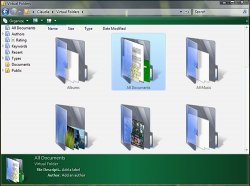
-Virtual Folders = Smart Folders
Let the comparisons to OS X begin! Some of the ones I've noticed:
-Instead of folders named "My Documents" it's just "Documents" now
-Virtual Folders = Smart Folders