Become a MacRumors Supporter for $50/year with no ads, ability to filter front page stories, and private forums.
floyde said:
Did anyone else notice that the magnifying glass icon on the search bar is exactly the same as finder's except the handle is tilted to the left? :confused:

Its a ****ing magnifying glass.

I use them in my programs to.

Im sorry I didnt know Apple patented the magnifying glass.
 
Heb1228 said:
Oh yeah, and the horrible use of screen real estate continues...

well thats a given, its windows, its minimize and maximize, you need to have your browser take up the whole screen for some reason, i just dont understand what that reason is just yet though
 
PlaceofDis said:
well thats a given, its windows, its minimize and maximize, you need to have your browser take up the whole screen for some reason, i just dont understand what that reason is just yet though

You're right. Its so funny when PC users sit down to use my computer to check email or something. I will usually have iTunes or iCal open in a window in the middle of the screen. The first thing they ask is, "What do you want me to do with this?"

?!?!?!?!?!?!?!?!?!?!?!?! Leave it there dang it! The browser window will open in front of it! Then you won't be able to see it anymore.

Its like they have to close all open programs to embark on this grand new advanture... a browser window
 
I just wish they would realize that making everything larger like that is not helpful. Whitespace is your friend. Everything just feels cluttered and makes me feel claustrophobic.
 
mrzeve said:
Its a ****ing magnifying glass.

I use them in my programs to.

Im sorry I didnt know Apple patented the magnifying glass.

They didn't patent the magnifying glass, but I'm pretty sure they secured the copyright for their entire UI (including the magnifying glass icons on finder and spotlight). There are many different ways to draw a magnifying glass, but it seems like Microsoft's UI people just went for the "flip horizontal" on photoshop. Anyway I was just trying to make conversation, I'm bored... ;)
 
kgarner said:
I just wish they would realize that making everything larger like that is not helpful. Whitespace is your friend. Everything just feels cluttered and makes me feel claustrophobic.
At least it looks like the forward/backward arrows in explorer are smaller, they look like safari's now
 
GeeYouEye said:
Other than some of the searching stuff, and probably Palladium, I'd tend to guess "not much." In order to get the thing shipping by CQ4 2006, they've had to strip out just about everything that was going to make it a worthwhile upgrade.

Actually quite a bit.
-Consider that the graphics engine of Windows is finally going to get at least close to what Quartz Extreme is.
Searching should be much more robust.
-Updates will be across the board for all of MS's apps along with 3rd party vendors to bundle their updates into the same system MS is using. So when you do a Windows Update it will download updates for Acrobat, Photoshop, Nero Burning ROM, Civ IV, etc all at once.
-Security is supposedly better what with the default user "supposedly" given only power user rights. (We'll see how well this works though.)

The biggest deal is security. If they can somehow get that mess somewhat cleaned up I would call it a good enough update. MS has always been about features. Face it features sell an OS. Security, like insurance, is something you, in the past, don't see. Well now you do what with the various worms and whatnot on Windows.
If they are dropping feature to focus on security I'm all-good with that. They can add features later. We will see though. The only way for MS to get security right is to break legacy apps to a certain extent. Something they have firmly stayed away from doing in the past. It’s going to be interesting to see if they draw a line in the sand or if they cave again. If they cave then it’s going to be Windows XP 2 if not. Again. It will be interesting.
 
Why does Microsoft insist on taking up half the screen for a start menu that doesn't do anything more than my hideaway dock?

The worst part about this whole thing is that its gonna get rave reviews only because XP sucks, and these people have never used a Mac.
 
PlaceofDis said:
well thats a given, its windows, its minimize and maximize, you need to have your browser take up the whole screen for some reason, i just dont understand what that reason is just yet though


Because not everyone is running 1024 x 768.
 
SiliconAddict said:
Because not everyone is running 1024 x 768.

Actually very few people run resolutions less than that anymore. The stats I get on my website say about 3% are running anything less than 1024x768. I realize that may not be completely reflective of everyone who uses a computer, but still, its pretty rare for anybody to be using 800x600.
 
Jay42 said:
Why does Microsoft insist on taking up half the screen for a start menu that doesn't do anything more than my hideaway dock?

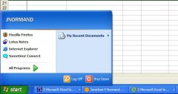
Is this small enough for you?

attachment.php


You can remove just about every item in that list. And even if it is taking up the entire screen. Who cares? Its not line its onscreen all the time. That is the difference between Apple and MS. Apple makes this great UI that its a PITA to change. MS makes a so so UI that is uber customizable to pretty much make it the way you want it. (well up to a point of course. That is where windowblinds come into play. :) )
 

Attachments

  • small.JPG
    small.JPG
    31.1 KB · Views: 687
SiliconAddict said:
Is this small enough for you?

attachment.php


You can remove just about every item in that list. And even if it is taking up the entire screen. Who cares? Its not line its onscreen all the time. That is the difference between Apple and MS. Apple makes this great UI that its a PITA to change. MS makes a so so UI that is uber customizable to pretty much make it the way you want it. (well up to a point of course. That is where windowblinds come into play. :) )
It's still bigger and more inconvenient and obnoxious than the dock, and it can't hold as much. :rolleyes:
 
Heb1228 said:
Actually very few people run resolutions less than that anymore. The stats I get on my website say about 3% are running anything less than 1024x768. I realize that may not be completely reflective of everyone who uses a computer, but still, its pretty rare for anybody to be using 800x600.


You obviously don't run in the LiveJournal crowd. I get bitched at all the time when I post images on my LJ above 800 x 600. Also a vast majority of the poeple in the office I work in are at 800 x 600. Why? Age. They don't like anything above that resolution.
 
dsharits said:
It's still bigger and more inconvenient and obnoxious than the dock, and it can't hold as much.

Can’t hold as much? What are you talking about? The programs submenu can hold several dozen program groups and listings before it starts getting crowded. Whatever. It’s a styles taste. Too each their own. I personally think the dock gets in the way and leaves access to core features for configuring the OS annoyingly absent, instead you have to go to a completely different menu in a different location to configure that. Also you have to manually add your programs to it instead of having the OS simply compile a list of apps in a menu. I’ve always trying to reconcile how that is easier then a start menu with a list of apps right there? Seriously. No jabs intended. How is it easier?
Two different OS styles. I still think both work. *shrugs*
 
Daveway said:
Remember. MS "says" that the new UI will not surface until Beta 2. But from what I see here, I don't have high hopes.
So we won't really know till about 2008 ;) :p
 
SiliconAddict said:
Can’t hold as much? What are you talking about? The programs submenu can hold several dozen program groups and listings before it starts getting crowded. Whatever. It’s a styles taste. Too each their own. I personally think the dock gets in the way and leaves access to core features for configuring the OS annoyingly absent, instead you have to go to a completely different menu in a different location to configure that. Also you have to manually add your programs to it instead of having the OS simply compile a list of apps in a menu. I’ve always trying to reconcile how that is easier then a start menu with a list of apps right there? Seriously. No jabs intended. How is it easier?
Two different OS styles. I still think both work. *shrugs*
If I wanted to see that many programs in OS X, I could open the Apps folder and see all of my apps better than the All Programs menu faster than you can bring up the All Programs menu in the start bar, in the same number of clicks. The Dock allows you to put only the apps that you want within easy reach, and it leaves them all in plain view, instead of having to click a button in the corner and having a panel open and consume a large porion of the screen while you pick what you want to launch. The Recent Items menu gives you a far bigger selection of recent apps than the Start Menu. Is it not frustrating when you are used to having a program in the short list, but on one out of the ordinary day, you happen to open a program or two more than usual, and the one that you like having in the short list disappears and you have to go and open it in the cluttered All Programs menu? Even more, what if you want to keep list of all of your programs open in the background? You can't do that with the Start Menu. Nor can you drag files onto an application's icon and have it open under that application. I'm sorry, but for someone who likes to move around the OS quickly and know exactly where everything is, the Start Menu just isn't the best solution.

As far as "access to core features for configuring the OS" being "annoyingly absent", what's wrong with using the System Preferences icon in the Dock? If the average user needs to do anything more than what's in System Preferences, he can simply put whatever other apps he needs in the dock.
 
cr2sh said:
It's uh... grey now.

Amazing!

Why didn't they steal dashboard?

0726start_500x462.jpg


Start-Menu.jpg

at least they made games easier to get to now i will do nothing all day, damn GIS software and powersuite software it is evil wont let me switch
 
i would not disgrace my computer with that. thats just horrible and copied. is it legal???
 
Oh well, I actually don't mind the Windows Start Menu. It's useful, and works well.

It's the DESIGN of it that I absolutely hate. What's up with the HUGE blue bar with your name in it? Can it get ANY bigger??? :rolleyes:

And the BIG arrow next to Programs... More flashy and ugly please! :rolleyes:

And quite a few other things that I don't like. But the concept and the purpose of the start menu is good IMO
 
Raven VII said:
Oh well, I actually don't mind the Windows Start Menu. It's useful, and works well.

It's the DESIGN of it that I absolutely hate. What's up with the HUGE blue bar with your name in it? Can it get ANY bigger??? :rolleyes:

And the BIG arrow next to Programs... More flashy and ugly please! :rolleyes:

And quite a few other things that I don't like. But the concept and the purpose of the start menu is good IMO


Well technically, you don't have to use the Windows Xp style start menu if you don't wan't to. You can switch the style to classic mode and have the start menu look like it did in windows 2000.
 
taeclee99 said:
Well technically, you don't have to use the Windows Xp style start menu if you don't wan't to. You can switch the style to classic mode and have the start menu look like it did in windows 2000.

No, I hate it even more in Windows 2000/Me/98/95. In THAT, functionality sucks. The redesigned one in XP is actually useful.
 
Vista appears to have pushed John Dvorak to write some nice things about OSX and poke fun at MS.

http://www.pcmag.com/article2/0,1895,1840479,00.asp

"I'm not saying that Microsoft is doomed as a company, but its reign as the OS dominator may end fast if things go the way I see them headed. The new OS is getting zero buzz. Zero. There has been nothing like this since Windows Me. And now the name Vista,along with the new Microsoft Vista logo, has made it worse. Could anything be less exciting?"
 
law guy said:
Vista appears to have pushed John Dvorak to write some nice things about OSX and poke fun at MS.

http://www.pcmag.com/article2/0,1895,1840479,00.asp

"I'm not saying that Microsoft is doomed as a company, but its reign as the OS dominator may end fast if things go the way I see them headed. The new OS is getting zero buzz. Zero. There has been nothing like this since Windows Me. And now the name Vista,along with the new Microsoft Vista logo, has made it worse. Could anything be less exciting?"

What is this world coming to??? Dvorak writing some nice things about the mac? Next thing you know, Ron Enderle will be praising the mac as well.
 
Register on MacRumors! This sidebar will go away, and you'll see fewer ads.