Oof that looked awful. So glad they got away from it.I'm excited! I am a big fan of visionOS' UI design, and dig the neumorphistic and glass aesthetic. I miss it from iOS 7 and Windows 7.
View attachment 2495736
Got a tip for us?
Let us know
Become a MacRumors Supporter for $50/year with no ads, ability to filter front page stories, and private forums.
WWDC 2025 Logo Hints at iOS 19's New Design
- Thread starter MacRumors
- Start date
- Sort by reaction score
You are using an out of date browser. It may not display this or other websites correctly.
You should upgrade or use an alternative browser.
You should upgrade or use an alternative browser.

Agreed. Going from that to Jony Ives retina scalding everything must be bright white and flat was hard to live with. Maybe we could have some balance for a change? 🤣 Less flat and buttons look like buttons?I'm big on skeuomorphism
Hello no what is thatI'm excited! I am a big fan of visionOS' UI design, and dig the neumorphistic and glass aesthetic. I miss it from iOS 7 and Windows 7.
View attachment 2495736
Since I saw this in 2018 I always hoped it would become the new iOS UI
And it looks far better than modern Windows. Windows 8 was a massive step backward.
Yes, definitely.Is it bad that I kinda liked that look?
As long as we get our “ripped paper” back in Notes, I’m happy!I'm big on skeuomorphism
Everyone saying “yikes, yuck”.
That’s how you know it’s gonna happen.
Same thing happened with aqua, everyone hated it until they didn’t.
Leopard too, Lion, iOS 7…
That’s how you know it’s gonna happen.
Same thing happened with aqua, everyone hated it until they didn’t.
Leopard too, Lion, iOS 7…
Me too!I miss it so much! Aged so well!
So much so that whenever I do happen to find a computer that is on Windows 7 I just revel at the solid look that they had for that and Vista
Once we shifted to a different design that's been employed since 8/8.1 and 10, it seems like all that has been thrown out the window and it's sad
Agreed. Windows went ‘flat, me too’ by following apples lead. They also made the OS clunky AF by making it touch friendly. The controls are clownishly oversized, include lots of wasted “white space”, and take up massive amounts of precious realestate on a laptop display.Me too!
So much so that whenever I do happen to find a computer that is on Windows 7 I just revel at the solid look that they had for that and Vista
Once we shifted to a different design that's been employed since 8/8.1 and 10, it seems like all that has been thrown out the window and it's sad
Clearly, it's cool to play couple of online games while having several doomscrolls in the background at different transparencies & speeds, kind of weird multiverse. But my aging parents prefer simpler, static and well-contrasted display, in fact "minimalist with frequent app list" would be perfect. I tried to find them a 0launcher equivalent for iOS, but couldn't find any, neither Apple nor third-part. Only lookalikes are paid apps emulating a minimalist screen with a huge widget not quite covering and not quite black (translucent to a point). Very depressing. Is there a neat solution in iPhone world?
Apple today announced that WWDC 2025 starts June 9, and the logo for the conference hints at iOS 19's rumored new design.
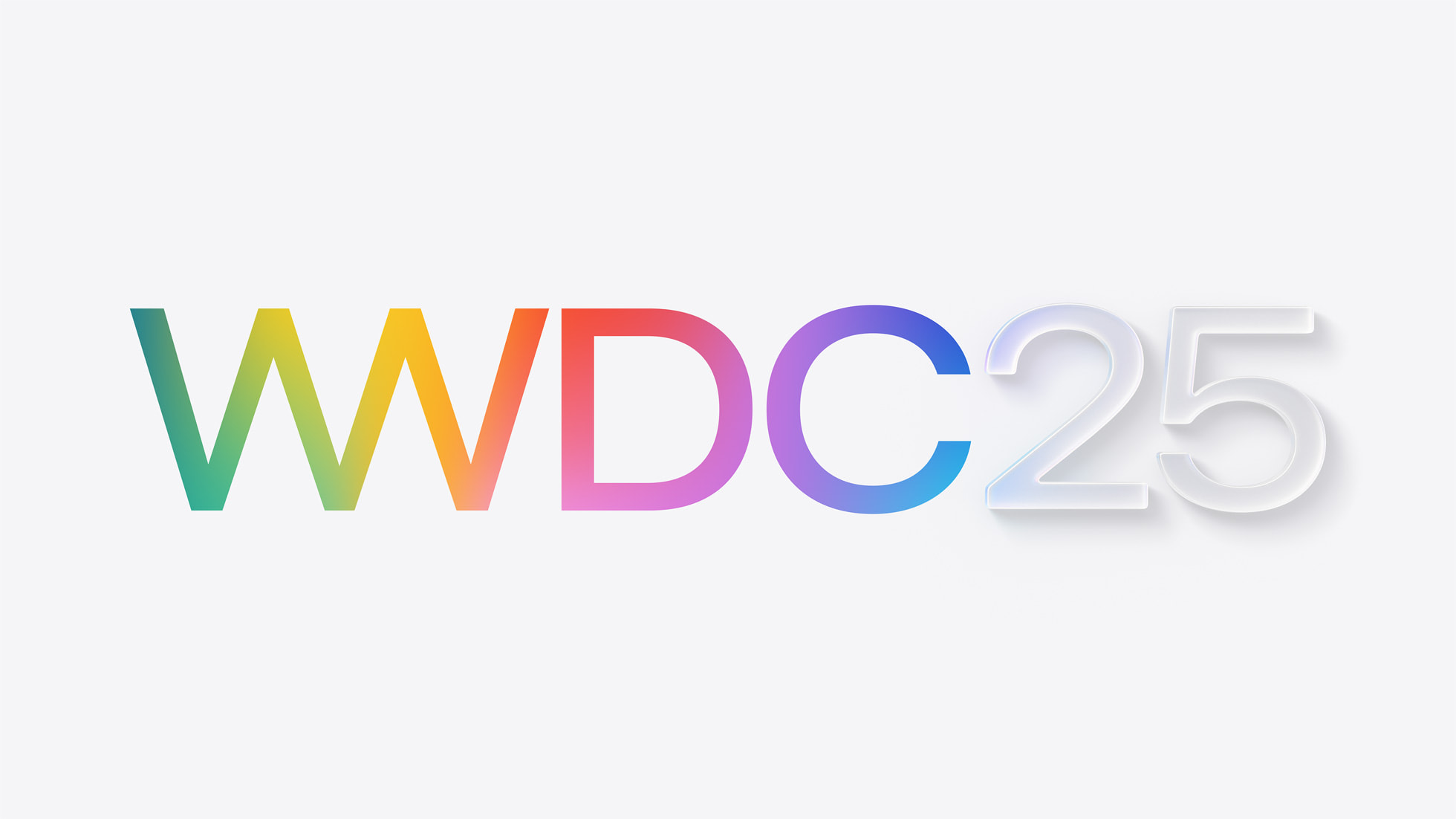
Multiple sources have claimed that iOS 19 will feature a new design that is inspired by visionOS, the software platform for Apple's Vision Pro headset. The new design is expected to include more translucent buttons and menus, with a glass-like appearance. The "25" in this year's WWDC logo also has a subtle visionOS-like appearance.
iPadOS 19 and macOS 16 are also expected to have visionOS-like designs, which would make Apple's software platforms look more uniform.
In January, the YouTube channel Front Page Tech shared a render of a redesigned Camera app that is allegedly planned for iOS 19.
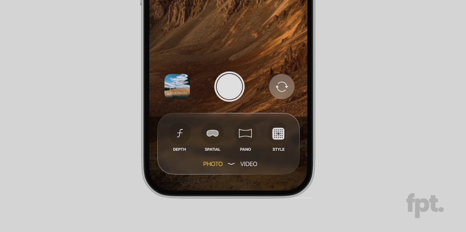
According to Front Page Tech host Jon Prosser, the Camera app will have more translucent buttons and menus, along with a larger viewfinder.
Earlier this month, Bloomberg's Mark Gurman said the visionOS-like design changes will extend to other interfaces on iOS 19, meaning that the new look with more transparency will likely extend to other Apple apps, notifications, and more.
Gurman believes that iOS 19 will have the most significant design changes since iOS 7.
Apple is expected to unveil iOS 19 during the WWDC 2025 keynote on June 9, so we should get an official look at the new design in a few more months.
Article Link: WWDC 2025 Logo Hints at iOS 19's New Design

Retro!! Nostalgic for a dumb phone with a 2007 MS Vista look, probably designed by Siri I bet Cook will be out before Siri gets less dumb - screwups are mounting up.I'm excited! I am a big fan of visionOS' UI design, and dig the neumorphistic and glass aesthetic. I miss it from iOS 7 and Windows 7.
View attachment 2495736
Microsoft tried to add some translucency back into Windows 10 with the first iteration of its "Fluent" design language but then later gave up. (The pre-Chromium Edge for example had a translucent title bar). That's part of Windows overall UI problem, it's a mishmash of interface elements and ideas from multiple generations of Windows at time.Me too!
So much so that whenever I do happen to find a computer that is on Windows 7 I just revel at the solid look that they had for that and Vista
Once we shifted to a different design that's been employed since 8/8.1 and 10, it seems like all that has been thrown out the window and it's sad
The Mica effect employed by Windows 11 is pleasant enough but it always bugs me that it shows the desktop background colors underneath even when layered over other windows.
Windows has had this problem for a very long time. Whereas the MacOS UI is usually pretty consistent even in lesser-used applications.Microsoft tried to add some translucency back into Windows 10 with the first iteration of its "Fluent" design language but then later gave up. (The pre-Chromium Edge for example had a translucent title bar). That's part of Windows overall UI problem, it's a mishmash of interface elements and ideas from multiple generations of Windows at time.
The Mica effect employed by Windows 11 is pleasant enough but it always bugs me that it shows the desktop background colors underneath even when layered over other windows.
This comes at a cost though. Apple has been replacing solid, reliable applications with unfinished versions just for the sake of UI modernization. I remember all the backlash at the new Disk Utility in El Capitan. More recently it was Passwords replacing Keychain Access, there's still stuff missing from Passwords that was present in Keychain Access as I discovered with something I was trying to do recently.
The 25 looks like a broken neon lamp. Grey and lifeless.
Also wonder if this logo was intentional, or if someone ran into a hard deadline and had to say "Here you go".
Also wonder if this logo was intentional, or if someone ran into a hard deadline and had to say "Here you go".
We are so back
The 25 looks like a broken neon lamp. Grey and lifeless.
Great point. macOS has historically had consistent UI, even in third party apps, because everyone used the same UI frameworks. The Mac hit its UI consistency heyday arguably in the Leopard to Catalina era, because almost all apps were built with Cocoa UI frameworks. Catalyst was the first divergence, allowing apps build for iPad to run (clunkily) on Macs. Big Sur flat out allowed iPad and iPhone apps to run, and SwiftUI is now spreading across the system, most notably with the System Settings app in Ventura. There's a huge difference in not just interface quality but the way app interfaces function between traditional Cocoa apps, SwiftUI apps, and Catalyst apps. That fragmentation of UI frameworks is exactly why Windows has such an inconsistent interface.Windows has had this problem for a very long time. Whereas the MacOS UI is usually pretty consistent even in lesser-used applications.
This comes at a cost though. Apple has been replacing solid, reliable applications with unfinished versions just for the sake of UI modernization. I remember all the backlash at the new Disk Utility in El Capitan. More recently it was Passwords replacing Keychain Access, there's still stuff missing from Passwords that was present in Keychain Access as I discovered with something I was trying to do recently.
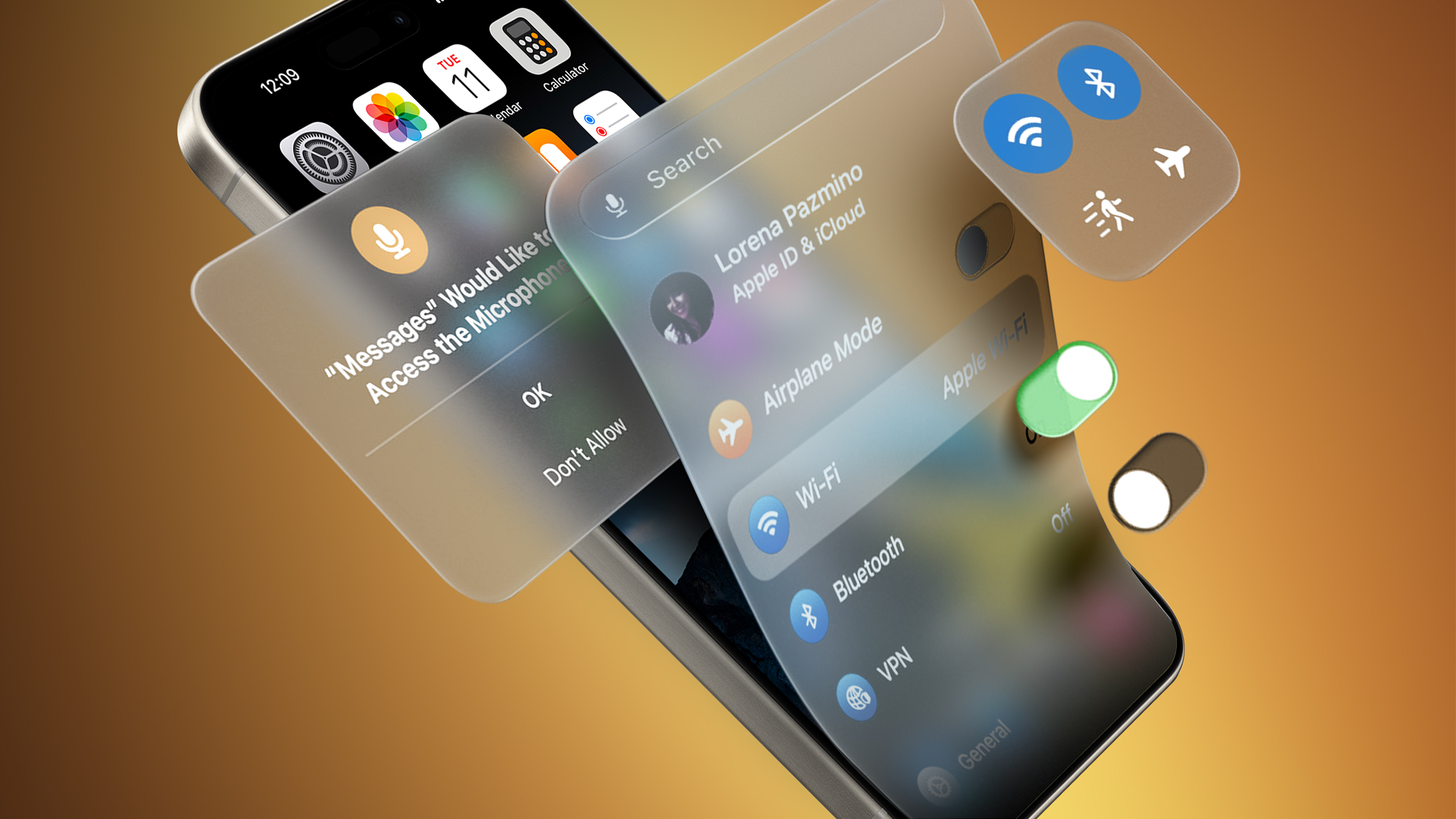
Here are a couple more examples:Haven't we been getting sneak peaks of this for a while already?
The '+' menu in Messages has a frosted look and is very inconsistent with the rest of iOS/iPadOS's UI design.
Some alerts have a frosted look.
It seems like there are a couple of other similar things I've run into, but can't recall what they are at the moment.
Register on MacRumors! This sidebar will go away, and you'll see fewer ads.