Become a MacRumors Supporter for $50/year with no ads, ability to filter front page stories, and private forums.

sundog925

macrumors 6502a
Original poster
Dec 19, 2011
958
1,029
Well here's the solution!

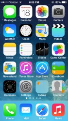
Settings>general>accessibility "bold text" -on!

Makes the entire OS easier on the eyes IMO.
posted just for those that didn't know! I saw there were a few of you in the other MR tips thread talking about it. Attached is a photo of the bold text look. A restart is required.
 

Attachments

  • image.jpg
    image.jpg
    236.3 KB · Views: 440
Giving this a try. WOW it reboots so much faster than iOS 6.

EDIT: Bold text is active and looks way better! Thanks for the tip!
 
Well here's the solution!

Settings>general>accessibility "bold text" -on!

Makes the entire OS easier on the eyes IMO.
posted just for those that didn't know! I saw there were a few of you in the other MR tips thread talking about it. Attached is a photo of the bold text look. A restart is required.

I like the bolder text.
 
Wow - that was a fast re-boot!

THANK YOU ts for bringing this to our attention, i was annoyed with the thin text!

Edit: I see it applies not only to the text under the icons but all text, mail, calendar, etc. Much easier to read now.
 
Wow - that was a fast re-boot!

THANK YOU ts for bringing this to our attention, i was annoyed with the thin text!

Edit: I see it applies not only to the text under the icons but all text, mail, calendar, etc. Much easier to read now.

Its nice thats its pretty much system wide bolding. should of been default like this lol.
 
Funny thing, I immediately set it to bold as well, but switched it back because the thin presents a cleaner look. Instead I upped the font size to a larger type, with the default apps it read much easier now without the need for bold.

The keyboard though... EPIC FAIL
 
Funny thing, I immediately set it to bold as well, but switched it back because the thin presents a cleaner look. Instead I upped the font size to a larger type, with the default apps it read much easier now without the need for bold.

The keyboard though... EPIC FAIL

I can see that. I just liked the eye strain less though. And on lighter backgrounds, it was almost unreadable.
 
I agree, "elegant" is nice but the thinness was pushing it a bit. Much easier to read now.

Did anyone else also switch on "high contrast" next to bold font?

I did but not sure I noticed a difference.
 
Bold definitely helped me, but it's still not enough for me though...

And, it doesn't seem to impact the status bar text...
 
I had been planning on doing this but kept forgetting about it. I saw your post and having my iPhone with me did it right away. I like it this way a lot better.

Thank you for reminding me to do it.
 
I feel like the keyboard could go a bit bolder, but the function keys, caps lock, delete return etc, could stay. add some nice dimension.
 
For anyone using the "Increase Contrast" switch it off, then swipe up the control center. Then switch it back on, and swipe up the control center again.

Notice the difference? Increasing the contrast disables the frost effect, which actually made the text HARDER to read, at least where the notification and control center were concerned. I haven't been able to discern a notable difference anywhere else, so I switched the increased contrast back off.

yeah i noticed that too. its not as a harsh change like color inversion.
 
Register on MacRumors! This sidebar will go away, and you'll see fewer ads.