Got a tip for us?
Let us know
Become a MacRumors Supporter for $50/year with no ads, ability to filter front page stories, and private forums.
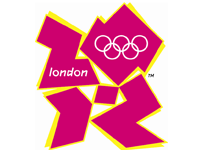
2012 Olympics Logo unveiled
- Thread starter AdeFowler
- Start date
- Sort by reaction score
You are using an out of date browser. It may not display this or other websites correctly.
You should upgrade or use an alternative browser.
You should upgrade or use an alternative browser.
From the article:
"Prime Minister Tony Blair said: "We want London 2012 not just to be about elite sporting success."
With that attitude and that symbol, they are well on their way! Looks like 2012 will be about something other than sporting success...
"Prime Minister Tony Blair said: "We want London 2012 not just to be about elite sporting success."
With that attitude and that symbol, they are well on their way! Looks like 2012 will be about something other than sporting success...
What the feck? 
What the hell does that have to do with London or the Olympics? Or anything for that matter?
Also can anyone else see a John Travolta like dancer? Head down facing right with one arm up and one arm down?
Saturday night fever baby!
What the hell does that have to do with London or the Olympics? Or anything for that matter?
Also can anyone else see a John Travolta like dancer? Head down facing right with one arm up and one arm down?
Saturday night fever baby!
I'm sure there must be something relevant in all that garbage imagery.
i think its supposed to be:
20
12
the press release says it will be "evolving in the years between now and 2012". Is that a euphemism for "we have five years to fix it"?

That is awful, bloody awful.
I wasn't that keen on the previous logo, as used on the bid but this new version makes that one look like a work of art. They didn't by any chance get a French designer to produce it, did they?
I wasn't that keen on the previous logo, as used on the bid but this new version makes that one look like a work of art. They didn't by any chance get a French designer to produce it, did they?
Actually I have just thought about it and something like this will be a 'design by comittee' project so we can't really blame the designer for this pile of crap. He/she will have had to adhere to all the wishes of stupid idiots with no concept of aesthetics. Basically the designer becomes a puppet with all the suits wanting there bit in the logo.
Suits "Do this, do that"
Designer "but it will look crap"
Suit 1 "I dont care, I want it to look like a child arranged some paper cuttings in the shape of John Travolta and then stuck them on some paper... oh and it needs to say London 2012. Oh and it needs to be pink because my neice likes pink"
Suit 2 "I want some yellow in there!"
Suit 1 "Ok so put some yellow in it too. Yellow and pink are good together right?"
Designer "er well, not re..."
Suit 3 "It also needs to have the olympics logo in it"
Designer "So you want a logo within a logo?"
Suit 3 "Yep"
Designer "You do realise that when you downsize the logo you arent going to be able to read the word London or see the olympics logo very well?"
Suit 4 "Well thats your job to sort it out. But the Olympics logo needs to be small, and London needs to be in Comic Sans"
Sorry Im bored
In a single word - GHASTLY. According to the news article the logo "comes in a series of shades of pink, blue, green and orange and will evolve in the run-up to the Games." - not sure it will look any better in any other colour and as for evolving? Will it turn into Mr Blobby?
I have a theory that when businesses are in trouble they re-brand. In UK for example Abbey National bank - losses in money and customers -> rebrand (naff pink, red, blue etc logos (maybe same person that has done the 2012!)) -> sold off -> rebrand (new logo now looks like a Mr Whippy icecream at the seaside) - future??? Others examples include Thames Water, Thames Valley University, BP, the UK government etc.
I have a theory that when businesses are in trouble they re-brand. In UK for example Abbey National bank - losses in money and customers -> rebrand (naff pink, red, blue etc logos (maybe same person that has done the 2012!)) -> sold off -> rebrand (new logo now looks like a Mr Whippy icecream at the seaside) - future??? Others examples include Thames Water, Thames Valley University, BP, the UK government etc.
****ing hideous inexcusable and incompetent great hulking pile of steaming festering crap.
Absolutely awful. There's no excuse... this city has world-class talent. I can just imagine what Neville Brody would say...
I could do a better job in about 20 minutes. The Boob's right, though. This has come about by committee.
Disgraceful.
Absolutely awful. There's no excuse... this city has world-class talent. I can just imagine what Neville Brody would say...
I could do a better job in about 20 minutes. The Boob's right, though. This has come about by committee.
Disgraceful.
L
Lau
Guest
I actually have an oppurtunity to go and see a talk by the head of the design agency who did this in a couple of weeks. I think it might be interesting to see what's said about it...
It took me around 5 seconds to read the 4 digits on that logo. It should only take me a split-second glance, no?
I may not be very smart, but I do consider myself to be literate. Apparently, I have been proven wrong.
When was the last time the Olympics was about sports?
I may not be very smart, but I do consider myself to be literate. Apparently, I have been proven wrong.
Looks like 2012 will be about something other than sporting success...
When was the last time the Olympics was about sports?
I can just imagine what Neville Brody would say...
It reminds me of his early stuff.
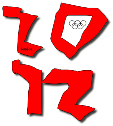
OK, here's a challenge. Using Word or similar create a logo in 5-10 minutes and see how it compares to the one that won. I am no designer and simply emulated the original to see how long a rough copy would take, but here's mine.
Paint
Attachments

I've just seen who it's by Wollf Ollins. I would have expected something better from an agency with their reputation, but there you go. I think the 'designed by committee' notion is spot on.I actually have an oppurtunity to go and see a talk by the head of the design agency who did this in a couple of weeks. I think it might be interesting to see what's said about it...
Register on MacRumors! This sidebar will go away, and you'll see fewer ads.