Become a MacRumors Supporter for $50/year with no ads, ability to filter front page stories, and private forums.
Because they've tried to over-theorise something that should've been kept simple. If you asked them what it meant, they're not likely to say "Oh, its just a bunch of pretty shapes".


No, of course they're not going to say that. There's a little more going on in there than just pretty shapes. And those pretty shapes — and parts of them — have to be applied to vast range of products and pieces in all sorts of situations and sizes... we'll see those over the following years.

Clients want to hear these things... and designing good logos and building brand identities is far harder than you can imagine.
 
if your point is that this particular identity is bad, well, that can be argued both ways and is ultimately going to be a personal aesthetic preference (and i am not necessarily disagreeing with you, either.)

if your argument that branding and identity in general is bad, then you are clueless. you are right, not everything has to be "reduced down to a brand essence," but in the case of the olympics, which take place across many venues, across a lot of distance, which have a global population attending hundreds of different events, with hundreds of thousands of people attending, working and competing, it most certainly does make sense and it most definitely not bad, it is needed.

Oh, I don't suggest that branding and identity is bad at all. In a world where someone is trying to sell us something everywhere we turn, branding is essential for any organisation that wants to succeed under circumstances of such competition. What I do object to is when it reaches such a level of abstraction and pretentiousness that it becomes meaningless and exclusive of those who its supposed to include. In the business world, this regulates itself as an organisation that screws up like this would pay. It's when it spreads to other sectors and it begins to, in absence of any constraints, get a wee bit self-indulgant that I find it a bit distasteful. This Olympics logo, for example, is clearly intended to mean something by those who designed it. However, its so abstract that 99% of those who see it all the way down here on Earth don't understand what its supposed to mean, and can't even fathom what in their own minds it may mean (myself included). It's just some (not so) pretty shapes and colours. The Olympics is meant to be the ultimate inclusive "I'd like to teach the world to sing in perfect harmony" sort of event, yet the designers have completely missed the point and produced something so specific to themselves (self-indulgant), and so demonstrative of how they are oh-so-clever, that they've excluded everyone that is supposed to engage with it.

I can live with this sort of stuff in the art world - because art is personal and if others want to participate in something I don't understand, then so be it. But this is different. This was task which the designers had a public duty upon their shoulders, and messed it up spectacuarly by trying to be too clever.
 
And I'll just add that it's not art, it's design — visual communication — it doesn't have to mean anything except for the brand it represents. It's a symbol.


chanel.gif


What does the Chanel logo mean? Nothing in of itself, two overlapping sections of a circle or the letter 'C'. Simple, effective; it speaks at an even simpler level than a road sign.

And like written language, precision and simplicity can be extremely difficult to sharpen to the point where it's just so.

So, while I'm not explicitly defending the results of this Olympic branding, I'll defend the processes involved, the integrity and aims of the design profession, and the scale of the entire work. And because I've had to — and am currently doing — a similar job at the moment, although not anywhere near the same scale. It's some of the most difficult work I've ever done.
 
No, of course they're not going to say that. There's a little more going on in there than just pretty shapes. And those pretty shapes — and parts of them — have to be applied to vast range of products and pieces in all sorts of situations and sizes... we'll see those over the following years.

Clients want to hear these things... and designing good logos and building brand identities is far harder than you can imagine.

Sorry, you're right. I imagine it is incredibly difficult to design a succusful logo and brand. And the way the Olympics logo was messed up just goes to prove how difficult it is ;) :p .

I'm honestly not poo-pooing your profession. Lots of people poo-poo my own intended profession (teaching/researching in legal and social philosophy) all the time and I dislike it. I just don't like it when people take huge amounts of public money for a shoddy piece of work which, on the face of it, appears to be more about the designers themselves than discharging the public duty they were supposed to.
 
What I have read and heard is not so much opposition to the design because it is "modern" "avante-garde" "challenging" etc…

People don't like it for a very primal gut reason: The 2012 Olympics logo designed by Wolff Olins is ugly.

For most people it is not ugly in a kind of "oh it will grow on you" kind of way. It remains ugly. The colours are truly awful. Edgy "Hello Kitty"? The actual shapes lend themselves to satire.

This is not a piece of art exhibited in the Tate that people can shake their heads at if they dislike it and walk away from. We are going to have to live with this day in day out for god knows how many years. That is making people upset.

I know Seb Coe was very derisive about people gardening in Polo shirts with the logo embroidered, but that is what is going to happen and boy the logo will fail. Imagine reproducing those tiny rings and tiny london?

The amount of money spent is not for me personally a bug bear (I have spent 25 years justifying myself to clients who think design is something not worth paying for). And that is a very narrow view to take in any case.

But it remains, IMHO, a truly terrible design — for what it is supposed to be.
 
I just don't like it when people take huge amounts of public money for a shoddy piece of work which, on the face of it, appears to be more about the designers themselves than discharging the public duty they were supposed to.


It's not about the designers, no-one has signed it. No designer is standing up and saying 'I did this'. Design can be a very anonymous career; I don't sign or plaster my own name all across my work.

And I doubt that discharging the public duty was part of the brief... I suggest you save your ire for the clients and committees that took this route and had their vision indulged. No designer can do anything without a brief, that's the nature of the profession... and a job's not done until the client approves it and signs it off.

It's probable that a number of design and branding firms pitched for the job. And the clients must have liked what they heard and saw from Wolff Olins.
 
Yes, but the problem is, it's still crap.

That may or may well not be the case, but it is at least challenging peoples preconceptions of what is by presenting what could be. Would we really want an identity that is so predictable in its form that any attempt at dialogue would prove to be entirely superfluous?

I'm quite intrigued by their comments that the identity will correspondingly develop and evolve in tandem with the build up to the games. I have to admit I find the idea of such a flexible and fluid identity that is constantly changing and evolving genuinely beguiling, conceptually at least. And especially on a project of this scale and scope.
 
These guys seem to have convinced themselves that it's actually quite good:

http://coudal.com/olympics.php

That's quite a feat.

It's unexpected. Chicago is bidding for the 2016 Olympics and the temporary logo is a perfectly decent design. It's attractive, memorable and generally liked. It even generated a fair amount of internet buzz. But those brushstrokes and gradients don't reproduce well, the narrow vertical orientation complicates usage and by 2016, the Sears Tower is likely to be Chicago's third-tallest building. More than anything, the London logo takes the Olympic logo to a new level of boldness, abstraction and simplicity. And we're a bit jealous.

As a Chicago boy, growing up and seeing the Sears Tower, and going up in it, the tower is a landmark.

I was in London for a European Vacation as a boy, I don't recall any randomly placed triangles in the city...:p
 
From the comments at BBC news:

30 years in advertising has taught me this:

1st rule in advertising: If it needs explaining it is very badly wrong.

2nd Rule: You can be the most talked about brand in the world, but if most of that talk is derision - sack the marketing company.

3rd rule: Never let the client realise how much we have just ripped them off by.

Oh dear, seems the new logo fits all three conditions!

the word LONDON and the olympic rings are two of the most recognised brands in the world - use them.

Joss Sanglier, Stony Stratford, United Kingdom

Ouch!
 
I hear a lot of people talking about the overall branding of the London 2012 logo, like it or not it is getting the desired buzz that its creators were intending.

From a pure asthetic POV the logo is god awful and purile in its design, but from a brand POV it is doing extremely well, but I can also remember other designs getting the same reaction and become landmarks in design history. Sydney's Opera House is a very good example that comes to mind when so called bad design become universally acknowledge as sheer brilliance (I'm not saying this will happen with the London 2012 logo).


Brand Channel is great site about branding philosophy check it out it might give some people an insight into what Wolff Olins was thinking (or drinking) when he came out with this frankenstien for the design world.

After all it's simple and very easily recognisable, from my graphic design training perspective that's what symbols and logos should encompass.... well shouldn't they :confused:
 
I'm easily going against the grain by saying that I think it's a great logo, although it is a bit Klaxons. Bright colours are in though, especially the hipster colonies of East London where the games are being held!

Watching it moving convinces you that there's something beyond Lisa Simpson giving someone a handshandy. The thing that is annoying me though is the 'my child could do it better'; what, your child could design an entire graphic identity putting into consideration the web, print and what PANTONE colours would be most suitable etc etc etc.

£400,000 is a bit steep, though, but again, the price is always splashed about by the tabloids and people who think that the logo is the identity alone.

Actual graphic designers are welcome to prove me wrong!
 
it's dangerous too

from a BBC report;

"...An animated version on a Web site was withdrawn after advocacy groups representing people with epilepsy said that flashing lights provoked more than 10 seizures among the estimated 23,000 people vulnerable to a photo-sensitive form of epilepsy...."
 
£400,000 is a bit steep, though, but again, the price is always splashed about by the tabloids and people who think that the logo is the identity alone.
And numbers look bigger when they're quoted in isolation. London has, what, 7 million people these days? That's 6p per capita. The "damage" could have been a lot worse.

After all it's simple and very easily recognisable, from my graphic design training perspective that's what symbols and logos should encompass.... well shouldn't they :confused:
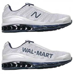
That's only one piece. It's also important that people make appropriate associations (much, not all, of this can be addressed through good marketing efforts), and appearance does matter. Which would you rather wear out in public?
wallyshoes.jpg

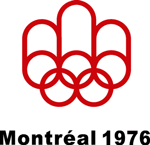
One Olympic logo that worked well was this one.
montreal.gif
This kind of device is dead simple to reproduce. It still looks modern over 30 years later, it (quite literally) builds atop the strong established Olympic identity, there's this tube illusion thing going on that begs to be animated (and the simple lines and circles will be compliant with all sorts of treatments), the shape suggests an M without being too overt, but also a kind of fountain or fireworks thing going on that can suggest a celebration. It pulls the maple leaf into its overall form without being too in-your-face about it. (The same people who see Lisa Simpson in the London logo may notice other things in the Montreal symbol, but these people will see similar things in any shape :p)
 
The logo is utter ***** - and you know what it makes me fear the most?

The opening ceremony.

I mean - what the hell's that going to be like if this is the best logo that they can come up with?

I never wanted us to get the Olympics - This country can not do any sort of large project without going over budget and coming out with a bland, uncreative, uninspiring festering pile of utter mediocrity (cough-dome-cough). I knew we would screw something up and make an embarassment of ourselves...I just didn't think it would be something so simple, and so soon.

Doug

Exactly. This country has turned into an absolute joke. I don't think I can remember anything thats been on budget and on time recently.
 
The Dome and Wembly may be examples of large projects that certainly have gone waaaaay over budget, but, I think what we were left with is actually very impressive and something to be proud of.

Yes, the logo is over priced and not all that great, but the logo isn't the be all and end all. Give it a chance. Everyone in this country seems far to quick to jump on the we suck, everything sucks bandwagon.

I wouldn't dismiss the Olympics just yet, it's early days. I'm confident we can pull it off, after all, what choice do we have. Course the cost is another matter...
 
Give it a chance. Everyone is this country seems far to quick to jump on the we suck, everything sucks bandwagon.

Indeed.

Jim Richardson of Sumo Design said:
A huge amount of research and development has been put into creating an identity. It is typical of our profession and our country to knock this logo before we have had a chance to see how it works.

Personally I think people need to keep a little perspective on this.

It could of course been far, far worse. Imagine... it could've been set in Myriad Pro, aquafied and finished off with a wet floor effect. ;)
 
I hear a lot of people talking about the overall branding of the London 2012 logo, like it or not it is getting the desired buzz that its creators were intending.

From a pure asthetic POV the logo is god awful and purile in its design, but from a brand POV it is doing extremely well

That maybe so, but you (general, not personal) can not use that as an excuse, or amendment.

Shock tactics for a logo to gain interest, especially in this instance, is just disguising the fact that there is a lack of any good design in the first place. You can create much better marketing from a logo/brand that is well designed and inherent with the country and context.

For all that's said, and (little) done - I'm left with a feeling that a self-proclaimed 'hip, in with it' dellusional old fart has commisioned this logo on the belief he knows how the cool youth of today like.

It makes me sick. Not just because of that, but also because as a Graphic Designer, I'm ashamed this is what our country produced to the world.
 
I can deal with the god-awful shapes, and the colors can morph into something more palatable. But what I find unforgivable is the use of the Olympic rings and the amateurish "london." They have been treated as an afterthought, and not as a core component of the logo. When this is reduced 50-75%, what will you be left with? Awkward shapes with a couple of knockout smudges. Absolutely no link to the Olympic legacy. Yes, you are "branding" London, but without the rings, you are not associating the brand with anything.

There is all this talk about how the audience this is intended for is younger. Did the focus groups include younger people? And is the younger audience also the paying consumer? Who do they think is going to buy all the promotional materials? Who's going to be able to afford getting into the venues and seeing the competition. I'd like to see the market analysis and find out who actually watches the games via television, at the venue, and who just doesn't care. Its foolish to alienate your current audience in order to try to appeal to a younger crowd.

Its sad that the Olympics have now been relegated to a marketing pitch and a branding exercise for the host city, instead of focusing on the spirit of the games and the athletes. Competition for the sake of excellence. And that is what this logo is missing, a sense of excellence, a sense of achievement.
 
The Dome .....actually very impressive and something to be proud of.

The building itself is not too bad - I like it's throw back to the out South Bank exhibition 'spike'. But did you visit it? It was a celebration of committee designed mediocrity - utter garbage. Appeasing and inoffensive to all and as a result pleasing to none. After it's wonderfull year where it welcomed a fraction of the expected visitor numbers - it's management was a complete sham. It sits there now as a reminder of just how badly it was all done. What we were left with was a giant upturned non-stick wok and a big hole in the government bank balance.

It stands as a testiment to the incompetance of central government and the bland, uncreative bile that is governement lead development projects.

Want to see what happens when it's done properly? Go see the Eden Project.

Doug
 
Register on MacRumors! This sidebar will go away, and you'll see fewer ads.