Become a MacRumors Supporter for $50/year with no ads, ability to filter front page stories, and private forums.
On WatchOS 9, if I scrolled down the list of apps and selected Workout, next time I pressed the crown button to bring up the list of apps, it went to the last app I selected. Now it starts at the top of the list and I have to scroll back down to Workout to select it again. Or I can choose it from the list of recent apps. Or I can program the button on the Ultra 2 to open Workout. But I’d appreciate it if they’d fix this.
 
uhhh, ive used the video feature on my watches since watchOS 3...you just have to change to video mode on the iPhone.
 
Who keeps misplacing their iPhone and watch?! I can't understand locating these items as a necessary function, so I must be doing something wrong that I don't misplace my Apple products.

you don't have young children that go in your bedroom and take the watch off the night stand while its charging and vice versa for the phone.
 
'Double click' the digital crown... oof. who designed this software.

Swiping up now brings up widgets - but i can add widgets to my watch face, and the rest is handled by notifications. The first widget is literally a clock. I'm swiping from my watch face to see a clock... whyyyyyyy?

The side button brings up control centre - which is something I almost never access. And I now have to double click the digital crown to access the thing that used to be assigned to a single press of the side button.

Swiping left or right do nothing. It's a simple and obvious gesture that meant i didn't have to double-click anything to access anything. I can't even assign the gesture to be something useful.

I imagine in watchOS 11 they move the widgets to the side button, the control centre to a double click of the crown, recent apps to a triple click of the crown, and notifications to 4 clicks of the crown. Then they can just get rid of the touch screen entirely because gestures like a side swipe aren't carbon neutral.
 
It's there on my iPhone 14 Pro iOS 17.0.1....

Settings -> ControlCenter -> add "Ping My Watch" -- and now it shows in control center.

Though finding my watch hasn't ever been an issue, remembering which room I left my phone in has been so I use the find-phone from my watch frequently.
Strange! It's there now for me (on 17.0.2 now).
 
Can everyone just stop saying this is the Dock, it isn't. The Dock was where you could put your favorited apps in, it wouldn't change unless you manually added or removed apps from it. The new App Switcher is recent apps, it will add any app you use, then you have to go in and manually remove them each and every time if you don't want them on your list. It also saves them in order from most recent, again different than the old Dock where you could change the order yourself.

The new changes and the complete deletion of the Dock are atrocious, but that's Apple's way of making things more complicated by making them more simple and taking away choices. I just found out today another Achilles heel to making widgets swipe up. Swipe up does not work inside of apps, at least it didn't work inside of my fitness app where I was trying to access my timer widgets while working out (since my old method of accessing both apps from my Dock is now gone). I'm not sure if this is something app makers have to implement, or if generally swipe up for widgets isn't meant to work inside apps.

Really hoping they bring back the proper Dock in an update before the end of the year. I was unsure about the new layout specifically because of this. I think the new controls are generally an improvement, but there was no reason to kill the Dock to do this. It could still work exactly like it used to, just activated by a different button press.
 
There is still sort of a small dock at the bottom of the widget list. It only supports 3 apps, but it's better than nothing I guess.

One "improvement" I don't really like is the use of the side button for control center. I don't think a dedicated button is really necessary, and it looks weird when control center comes up briefly when activating Apple Pay.

That's not a Dock, that's a complications widget. Still could be useful but it counts each complication against your widget stack. Seems to be a limit of about ten widgets.

I wish they would let us customize the controls. I tend to think the new control center activation method is an improvement since I activate it accidentally less frequently, though I do still swipe up and pause for a second wondering what happened to it before I remember. But I can definitely see how someone would prefer the opposite.
 
The first widget is literally a clock. I'm swiping from my watch face to see a clock... whyyyyyyy?

Yep, this is just comedic gold. It's even worse that clock isn't a widget, it's hard coded into the widgets bar and you can't unpin it. So I look at my watch face which has the time on it and swipe into a widget bar that....has the time on it.
 
Really hoping they bring back the proper Dock in an update before the end of the year. I was unsure about the new layout specifically because of this. I think the new controls are generally an improvement, but there was no reason to kill the Dock to do this. It could still work exactly like it used to, just activated by a different button press.

That's what is baffling to me, just not having any sort of favorites at all. I could maybe see if widgets were mandatory for all apps, but I actually don't see any of my apps having widgets. Maybe this will strongarm devs into making widgets for the apps, but all I want are favorited shortcuts. I think one good example of over engineering is the timers widgets, you can set different timers as separate widgets but they all just open the timers app instead of opening the specific timer. I spent a few minutes arranging all my timers into separate widgets before realizing this.
 
That's what is baffling to me, just not having any sort of favorites at all. I could maybe see if widgets were mandatory for all apps, but I actually don't see any of my apps having widgets. Maybe this will strongarm devs into making widgets for the apps, but all I want are favorited shortcuts. I think one good example of over engineering is the timers widgets, you can set different timers as separate widgets but they all just open the timers app instead of opening the specific timer. I spent a few minutes arranging all my timers into separate widgets before realizing this.

What they seem to have done is taken the apps that were in the Dock and placed them at the top of the new "honeycomb strip" app view. So it's mostly fine but I still don't see why they still couldn't have done that and left the Dock alone, just moving it to the new double tap shortcut and calling it a day.
 
What they seem to have done is taken the apps that were in the Dock and placed them at the top of the new "honeycomb strip" app view. So it's mostly fine but I still don't see why they still couldn't have done that and left the Dock alone, just moving it to the new double tap shortcut and calling it a day.

It's not fine to me, I can't think of a worse torture than wading through dozens of unlabeled, often ambiguous, app icons in a tiny little grid on a sub 2" screen. It does slightly help to put my most used at the top, but it's still a really far cry from having a dock.
 
Yep, this is just comedic gold. It's even worse that clock isn't a widget, it's hard coded into the widgets bar and you can't unpin it. So I look at my watch face which has the time on it and swipe into a widget bar that....has the time on it.

What's worse is that they could have justified it, by saying 'you can swipe up from an app to see the clock widget' which might be useful since most apps don't have a clock on them. But you can't access the widgets within an app - only from the home screen - which is a watch face.

The quality control around UX just isn't there at Apple anymore. Finewoven cases, clock widgets only accessible from watch faces, even buying Applecare+ is difficult now.

What I'd REALLY like to see is the ability to add a shortcut (ideally from my watch) to cap charging of my phone at 80% manually, and turn that off just as quickly. That would be useful for wired carplay, or just car charging generally when I don't want the battery at 100% for several hours, but I also want to stop charging 15 minutes before I reach my destination. Apple go so close with the ability to control it, but then buried it 3 layers deep in the menu with no shortcuts.
 
Using my AW today in the gym I realized you can get to the widgets screen by rotating the crown up, I'm really at a loss why this is the same exact thing as swipe up? If they just kept widgets on the crown rotate up then you could access widgets inside of apps, but for those who like the swipe up now you have the extra step of exiting the app. I also realized just what a pita using the crown was, both rotating which would often get snagged on my skin and double push which was often not easy if I had lifting straps on my wrists, or if the watch was too close to my hand.
 
  • Like
Reactions: jennyp
But my question with timers in general is, can someone please explain to me why timers (and Siri) work completely apart from Apple Watch and iOS? ie. if I put in a request to Siri on my Watch, Siri on my phone has no idea. If I set a timer on either device, I can't see it on the other. If I try to say "Hey Siri" to my watch and my phone is nearby, it's not easily understandable to know which device is going to respond. I'm sure there must be some technical reason for these things, such as "on-device" processing, but with features like continuity and Hand-Off, I'd really like things like this to work more seamlessly. Anybody have any insight on these things? Thanks in advance!
If I start a timer on my phone, when that timer is done, I get a notification on my watch. Not sure if it works the other way as I don't set timers on my watch.
 
After reading about all the issues with battery life, I'm avoiding 10 as much as possible.
There’s been the same sort of reports for pretty much every major watchOS version going back years. Some have issues, most don’t, it gets sorted and everyone forgets when the next version comes out.
 
There’s been the same sort of reports for pretty much every major watchOS version going back years. Some have issues, most don’t, it gets sorted and everyone forgets when the next version comes out.
I used to be one of the ones that updated every OS on the first day. Couldn't wait to have the latest and greatest. That seemed more important early on. Now, the changes seem minimal, so there's no rush. I also haven't forgotten that iOS8 bricked my (and many others) phone(s). From that point, I decided to let everyone else be the guinea pig.
 
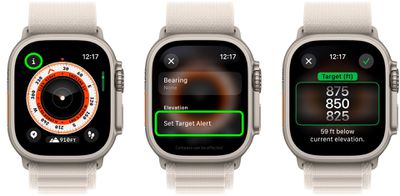
As someone who lives at 5,000 ft and rises 100-200 ft just taking my dogs out on a 5-10 minute walk, I find this image hilarious... "Better rest at that 850 ft above sea-level... Careful! Don't want to get altitude sickness!!!!"

set-target-elevation.jpg


The functionality is cool, but maybe only 7,000 ft onwards. If you can tell the difference between sea-level and 850 ft elevation, you better go to a hospital.
 
  • Like
Reactions: Baywatchboy
Register on MacRumors! This sidebar will go away, and you'll see fewer ads.