Become a MacRumors Supporter for $50/year with no ads, ability to filter front page stories, and private forums.
Native watch faces in my Samsung and Motorola watches were way better. The Samsung with the spinning face was actually quite nice.

Don’t get me wrong I still prefer the apple ecosystem to Android/Samsung but watch faces and customization are WAY better on the Samsung watches. Clockology helps some.

All they need are a handful of realistic watch faces, and one with a simple customized photo wallpaper with some default dials. Samsung had that 7 years ago. They don’t even have to open it up to everyone and their mother.
 
The glass/display is flat and inside the Ti frame - how do you think it is attached to the frame? What is the pressure at 40m depth? Let’s wait for the tear down pics…
Makes sense. One more reason for 53mm version next year.
 
The glass/display is flat and inside the Ti frame - how do you think it is attached to the frame? What is the pressure at 40m depth? Let’s wait for the tear down pics…


If the actual screen had no bezel offset from the side of the watch, it would be much less durable. There has to be room for a thickness of crystal before you get to the edge of the case. I think they could make it thinner but then it would more prone to side impact cracks and chips.

The same goes for the regular Apple Watch. That Bubble edge of crystal protects the screen. If you only had 2mm of Ti and you are into the screen I just don’t see it taking a licking and keepening on ticking!
 
  • Like
Reactions: akidokraja
Apple Watch faces have alway been pretty blah honestly.

1) All of the them should have 4-6 complication spots. Enough of the “exclusive artist crap”. They are all dumb to the point I’m trying to figure out how some of them actually got included. One of them looks like some old lady’s face. I mean really? The face they created for the S7 can only have 2 complications. Come on.

2) Apples product design is second to none. There could be a lot more thought put into apple branded watch faces. Look at what people have done in facet and Clockology. Some of them are brilliant.

3) They need a blank face offered with 6 complications on a couple of grid choices, and the ability to put an image behind it. It wouldn’t take much to have one watch face that is highly customizable. At this point there is not excuse for it.

4) The wayfinder face is pretty good, I still they they could put more effort into it. Clockology faces look like real watches. Why not? Why can’t they do this. Again why can’t the wayfinder look like a legit divers or chronograph face?

I kind of agree OP but this isn’t a new thing. I didn’t expect the ultra to have an mindblowing new faces. Personally I think 99% of the native faces are total garbage but that’s always been the case.
Not everyone wants a lot of complications. I prefer a simpler, more classic face — like the California one with one or two. Others prefer more busy faces with lots of complications. Best to cater to both audiences, and those in the middle, but not to assume that more is necessarily better so that “all” faces — as you say — should have 4-6 spots. I get it that one does not have to use every spot. But a face with lots of spots that are not used is probably not optimum.
 
If the actual screen had no bezel offset from the side of the watch, it would be much less durable. There has to be room for a thickness of crystal before you get to the edge of the case. I think they could make it thinner but then it would more prone to side impact cracks and chips.

The same goes for the regular Apple Watch. That Bubble edge of crystal protects the screen. If you only had 2mm of Ti and you are into the screen I just don’t see it taking a licking and keepening on ticking!
Read this, we’re not talking a “regular” watch, and yes , you are also correct for durability but multipliers of atmosphere requires more than a regular watch
 
Not everyone wants a lot of complications. I prefer a simpler, more classic face — like the California one with one or two. Others prefer more busy faces with lots of complications. Best to cater to both audiences, and those in the middle, but not to assume that more is necessarily better so that “all” faces — as you say — should have 4-6 spots. I get it that one does not have to use every spot. But a face with lots of spots that are not used is probably not optimum.


Why not have 4-6. You don’t actually have to turn them in. Then they aren’t there’s problem solved for both users.
 
Why not have 4-6. You don’t actually have to turn them in. Then they aren’t there’s problem solved for both users.
Because if you have spaces for complications that are unused, that can compromise the overall appearance — for example, a watch face that occupies too little of the screen because of the unused space for complications around circular edges. That is why it is best to have separate faces to cater for both preferences. I’m not saying that it is “better” to have fewer complications. My point is simply that having some faces designed for just one or two (or even none) is a good thing.
 
The glass/display is flat and inside the Ti frame - how do you think it is attached to the frame? What is the pressure at 40m depth? Let’s wait for the tear down pics…
This is a good point.
The hydrostatic pressure at 40m depth (131 ft) of seawater (density 64 lbs/cu.ft) is 8400 psf = 58 psi.
The width and height of the Ultra cover glass is 1.40" x 1.70" (per Apple drawings), giving a hydrostatic force on the cover glass of approximately 140 lbs (63 kgf), at 40m depth.
This force presumably needs to be resisted by the cover glass at its edges, assuming one wants to avoid the force pressing directly on the OLED panel.
So it makes sense there there has to be a space between the edge of the cover glass and the edge of the active OLED area, in order to support the hydrostatic force on the face. Right now, that space is 1.9 mm (per Apple drawings). I doubt they can shrink this down much.
 
Last edited:
Apple Watch faces have alway been pretty blah honestly.

1) All of the them should have 4-6 complication spots. Enough of the “exclusive artist crap”. They are all dumb to the point I’m trying to figure out how some of them actually got included. One of them looks like some old lady’s face. I mean really? The face they created for the S7 can only have 2 complications. Come on.

2) Apples product design is second to none. There could be a lot more thought put into apple branded watch faces. Look at what people have done in facet and Clockology. Some of them are brilliant.

3) They need a blank face offered with 6 complications on a couple of grid choices, and the ability to put an image behind it. It wouldn’t take much to have one watch face that is highly customizable. At this point there is not excuse for it.

4) The wayfinder face is pretty good, I still they they could put more effort into it. Clockology faces look like real watches. Why not? Why can’t they do this. Again why can’t the wayfinder look like a legit divers or chronograph face?

I kind of agree OP but this isn’t a new thing. I didn’t expect the ultra to have an mindblowing new faces. Personally I think 99% of the native faces are total garbage but that’s always been the case.
Are you seriously implying the watch faces in your photos are better than the standard ones? 😆
(I know taste and all that, but still...)
 
I'm with you on the lack of complications on many watch faces. I don't understand why this can't just be handled like the iPhone lock screen, just an overlay in the 4 corners of the display.
 
I am UltraWhelmed with my Ultra.

That’s how I feel about my Ultra, it’s because I use it for what it was designed for :)

And before anyone asks if I will climb Mount Everest with it, the answer is no :)

I also won’t be wearing it as a dress watch, prefer wearing Mechanical Watches.
 
I love the size of the Apple Watch ultra, but I can’t help but think Apple missed a major opportunity to really make the Watch unique. The watch faces are just larger versions of the old watch faces, and none of the new watch faces make much use of the additional space. The proposition of the old watch faces look a little weird being blown up in this way.

Anyone else agree with me?

Apple isn’t really about software at the moment.
 
Apple Watch faces have alway been pretty blah honestly.

1) All of the them should have 4-6 complication spots. Enough of the “exclusive artist crap”. They are all dumb to the point I’m trying to figure out how some of them actually got included. One of them looks like some old lady’s face. I mean really? The face they created for the S7 can only have 2 complications. Come on.

2) Apples product design is second to none. There could be a lot more thought put into apple branded watch faces. Look at what people have done in facet and Clockology. Some of them are brilliant.

3) They need a blank face offered with 6 complications on a couple of grid choices, and the ability to put an image behind it. It wouldn’t take much to have one watch face that is highly customizable. At this point there is not excuse for it.

4) The wayfinder face is pretty good, I still they they could put more effort into it. Clockology faces look like real watches. Why not? Why can’t they do this. Again why can’t the wayfinder look like a legit divers or chronograph face?

I kind of agree OP but this isn’t a new thing. I didn’t expect the ultra to have an mindblowing new faces. Personally I think 99% of the native faces are total garbage but that’s always been the case.
Your example watch faces show exactly why Apple doesn’t have a watch face store. All of three of them wouldn’t be allowed because they violate copyright…
 
Your example watch faces show exactly why Apple doesn’t have a watch face store. All of three of them wouldn’t be allowed because they violate copyright…
No that’s totally false. You could have luxury looking faces without branding. Take a look at what other platforms have.

Samsung platform has the ability to creat custom watch faces and change several aspects.

1) Background
2) hands
3) complicarions
4) analog vs digital information
4) locations of complications flexible though limited
5) it’s like layers of building your face and it worked perfectly.

Apple would need to do all that, they just need some faces that look like an actual watch and fill up the screen. Maybe an open gears type. Maybe one that looks like a typical luxury watch. They can’t even bother to create faces that really fill up the whole screen. They could do all that and not have copyright issues. Or they could work with a Rolex or Citizen for some official faces included or as a separated purchase . Lots and lots of options.
 
Let me throw in the fact that Apple is still unable to produce screens for the Apple Watch without the bubbles / folds on the screen below the glass.
My Ultra has a few too... 👎

Somehow the way Apple bin's the screens feels a little disrespectful to the customers.
Especially for a watch of 800+ bux.

Reference:


Last edited:
No that’s totally false. You could have luxury looking faces without branding. Take a look at what other platforms have.

Samsung platform has the ability to creat custom watch faces and change several aspects.

1) Background
2) hands
3) complicarions
4) analog vs digital information
4) locations of complications flexible though limited
5) it’s like layers of building your face and it worked perfectly.

Apple would need to do all that, they just need some faces that look like an actual watch and fill up the screen. Maybe an open gears type. Maybe one that looks like a typical luxury watch. They can’t even bother to create faces that really fill up the whole screen. They could do all that and not have copyright issues. Or they could work with a Rolex or Citizen for some official faces included or as a separated purchase . Lots and lots of options.
I was specifically talking about a third-party watch face store. Developers go to where the demand is and, as your examples show, the demand is for clones of famous timepieces.

I would like more customisation of watch face elements too but let’s not fool ourselves. If Apple setup a watch face store they would be rejecting the majority of submissions for copyright violations. I can understand why Apple doesn’t want that headache.
 
They don’t need to take submissions. They just need it have a handful of watch faces that don’t look like total crap, or the ability to make them not look like crap.
 
I love the size of the Apple Watch ultra, but I can’t help but think Apple missed a major opportunity to really make the Watch unique. The watch faces are just larger versions of the old watch faces, and none of the new watch faces make much use of the additional space. The proposition of the old watch faces look a little weird being blown up in this way.

Anyone else agree with me?
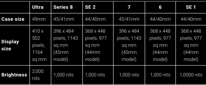
The reason is the ultra display is smaller than 45mm Apple made out it was bigger when it’s more rounded so text has to be cut off, they can’t make the icons or watch faces bigger because the real usage display is the same, Apple could put the way finder on the 45mm watches
 
Only it isn’t actually not smaller it’s bigger….
 

Attachments

  • 27C5B7F8-A0D9-4796-AC11-7DCE05D3C694.jpeg
    27C5B7F8-A0D9-4796-AC11-7DCE05D3C694.jpeg
    188.3 KB · Views: 74
I love the size of the Apple Watch ultra, but I can’t help but think Apple missed a major opportunity to really make the Watch unique. The watch faces are just larger versions of the old watch faces, and none of the new watch faces make much use of the additional space. The proposition of the old watch faces look a little weird being blown up in this way.

Anyone else agree with me?
Apple isn't about creating software to take advantage of marginal increases in screen size, e.g., iPad pro 12.9".
 
I don’t think Apple has really optimized the use of the Apple Watch screen since it’s first iteration.

They’ve had to make sacrifices because of battery life but I don’t think that’s the case necessarily anymore
 
Post pictures.

That actually doesn’t mean the screen is smaller either it just might have a different aspect ratio that isn’t quite optimized for certain apps. If that is the case, there is some fair criticism there that needs to get fixed assuming it’s a significant thing.
 
The reason is the ultra display is smaller than 45mm Apple made out it was bigger when it’s more rounded so text has to be cut off, they can’t make the icons or watch faces bigger because the real usage display is the same, Apple could put the way finder on the 45mm watches
Ultra: 1164 sq mm display
45mm Series 8: 1143 sq mm display.

The ultra has a larger screen.
 
  • Like
Reactions: jz0309
Register on MacRumors! This sidebar will go away, and you'll see fewer ads.