

Become a MacRumors Supporter for $50/year with no ads, ability to filter front page stories, and private forums.

MacRumors

macrumors bot
Original poster


When Liquid Glass launched in macOS Tahoe, Apple faced criticism over how the design looked on the Mac. Some people felt that Liquid Glass in macOS Tahoe was an afterthought with little impact from the design update, while others had issues with contrast, readability, rounded corners, and design consistency. There were long complaint threads on the MacRumors forums and on Reddit, and some people refused to update.
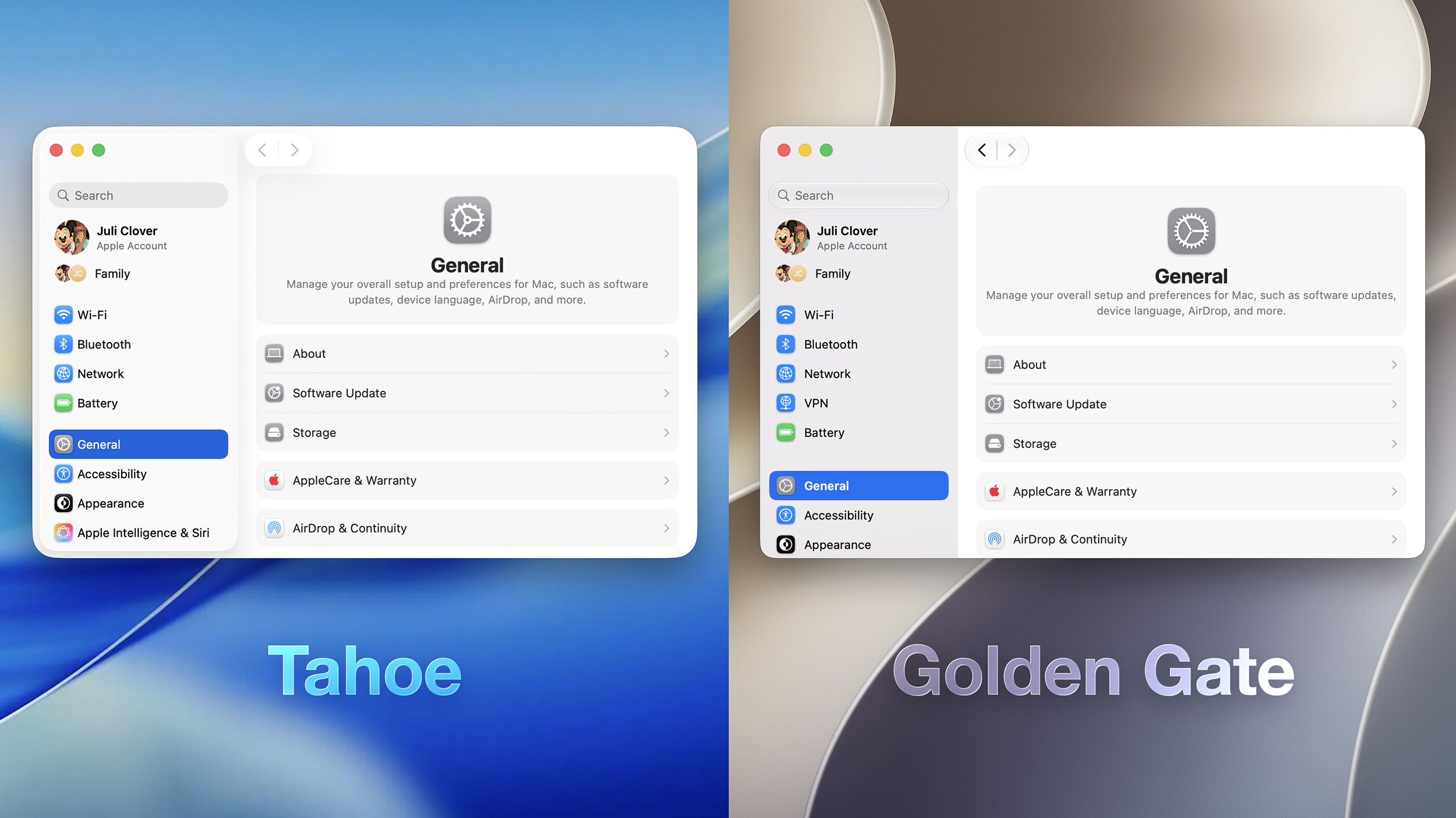
macOS-26-vs-27-Unified-Sidebar.jpg

Apple is making several changes to Liquid Glass and the overall macOS Golden Gate design, and while subtle, some of the changes could make Liquid Glass on Mac easier to digest.

Transparency and Diffusion

Apple added a full Liquid Glass slider under System Settings > Appearance. It changes the translucency of Liquid Glass elements, and users can choose a clear version of Liquid Glass that allows some of the background to show through, select a more opaque, tinted version that improves the legibility of text, or choose something in between.
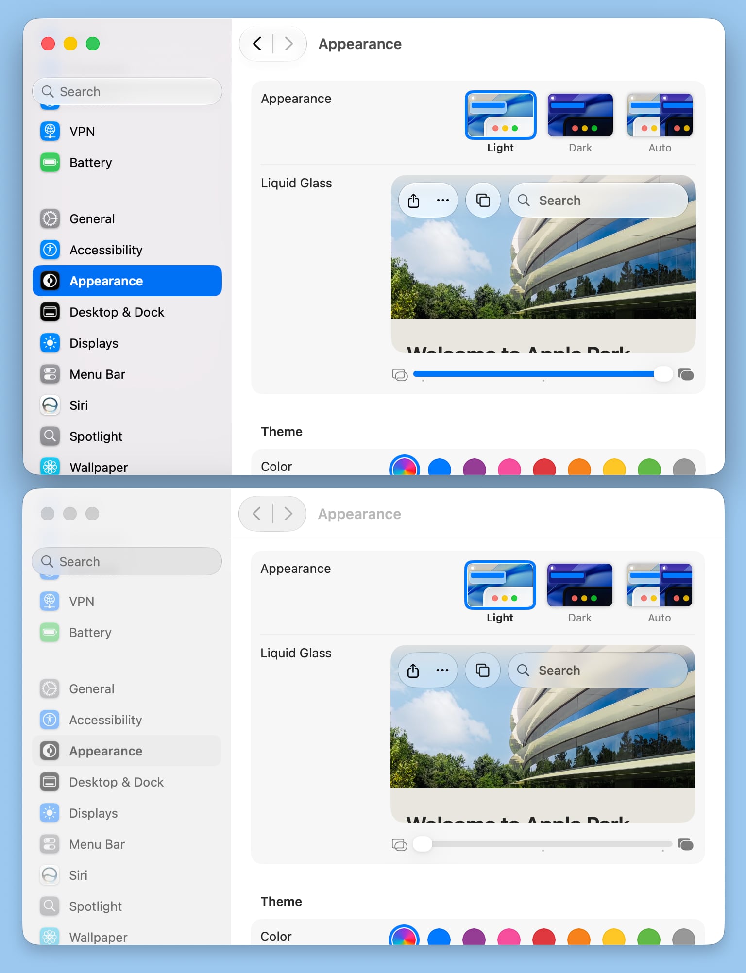
macos-27-liquid-glass-opacity.jpg

Unfortunately, there is no ultra-clear version of Liquid Glass available with the slider. Even the setting that's as clear as possible does not match the original version of Liquid Glass that Apple showed off at WWDC 2025.

Apple changed the overall Liquid Glass opacity, and it now diffuses complex content more effectively. Apple says a darkened edge and brighter specular highlights establish more depth and separation for the UI.

Toolbars and Window Shapes

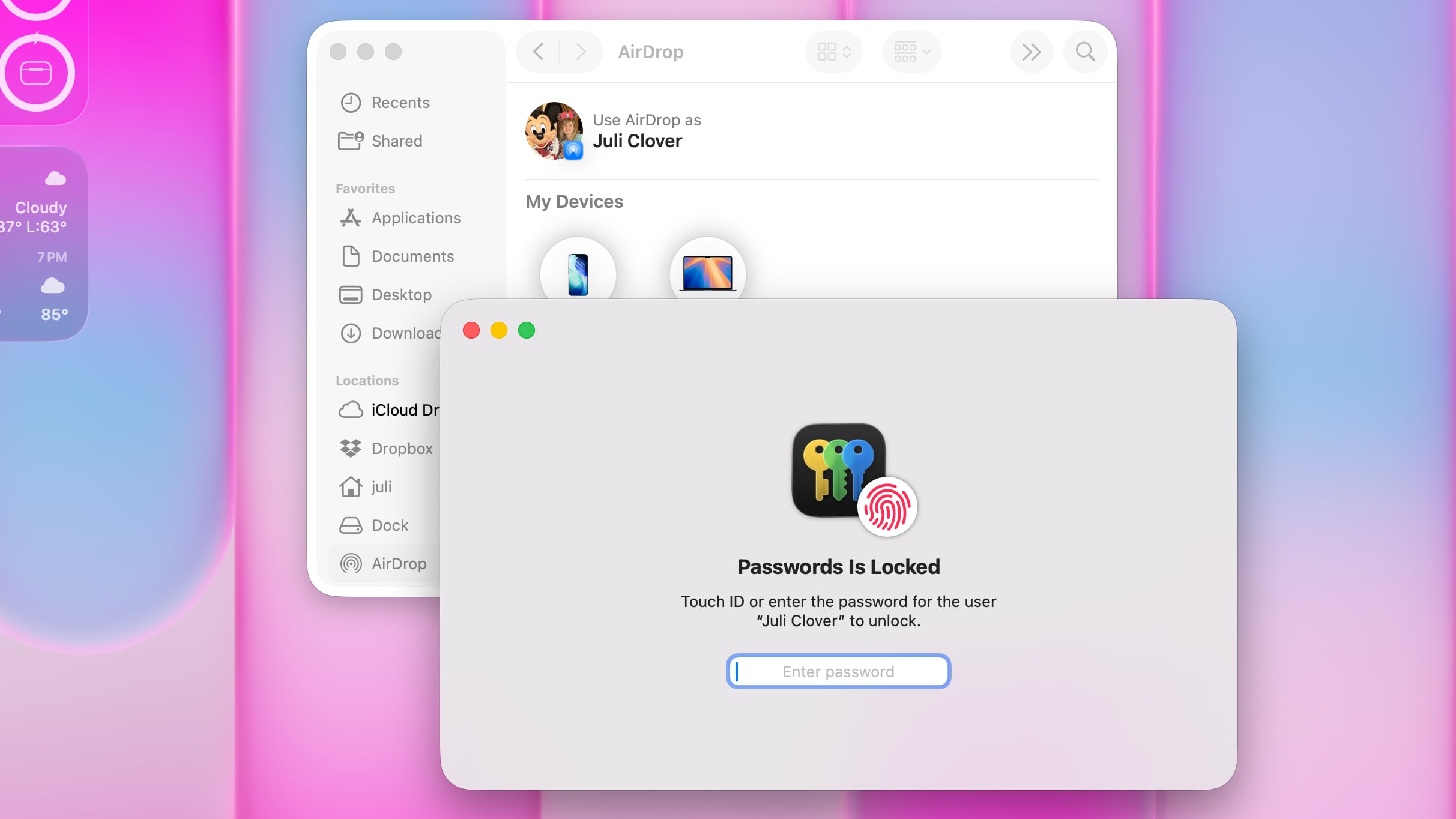
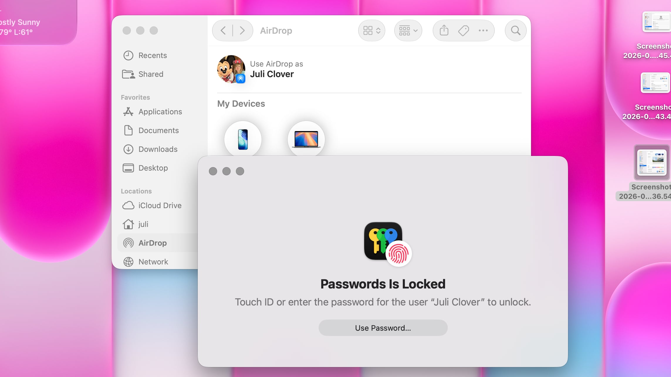
Apps have uniform toolbars to make text headings and groups of controls more legible. Windows also all have the same corner radius for more consistency between apps.
macos-tahoe-windows.jpg
macOS Tahoe

Corners of apps are not as dramatically rounded in macOS Golden Gate, and the difference is noticeable.
macos-golden-gate-windows.jpg
macOS Golden Gate

It's easier to tell when a window is active because of the sidebar design, the opacity update, and changes to window shadows.

Sidebars

Sidebars are no longer floating and are instead edge-to-edge. It's a design that's less distracting and more uniform because there's no unnecessary sidebar shadowing that just takes up space.
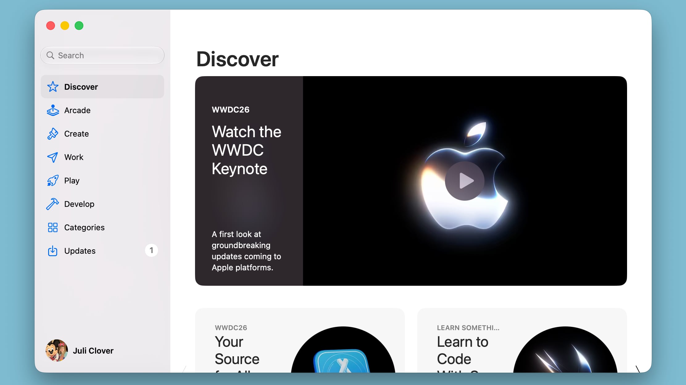
macos-golden-gate-side-bar.jpg

Sidebar icons have color again, which is something Apple removed in macOS Tahoe.

Icons

Apple didn't budge on requiring squircle Mac icons, but it did change icon design. Icons have more layers of Liquid Glass to improve detail and sharpness in light, dark, tinted, and clear icon modes.
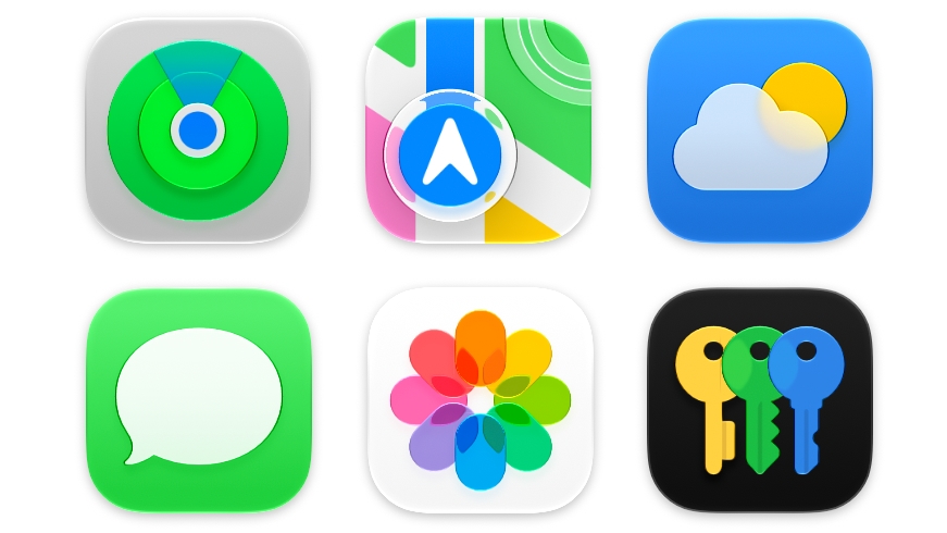
macos-golden-gate-icons.jpg

Apple is also using icons for some menu bar items to make it easier to find commonly used actions.

HDR

Apple is using HDR for depth and dimension in the macOS Golden Gate interface.

Launch Date

macOS Golden Gate also includes all of the new Siri AI features coming in iOS 27, along with performance improvements that make the Mac feel faster.

The update is limited to developers right now, but Apple plans to release a public beta in July. macOS Golden Gate will launch this fall.


Article Link: All the Liquid Glass Changes in macOS Golden Gate
 
All these are actually refining the design and making it better.

I still don't like the large corner radius but given that it's plausible that they want to add touch input (not that I understand why touch = big and round) I guess it's tolerable at 16pt, increasing from 12pt since ~Big Sur, which used to be 4pt since Mac OS X 10.0. I still like the tight 4pt radius corners better, though.
 
Golden Gate… it’s the first macOS name that sounds a bit weird to me, maybe because it is a bridge… OKAY, OKAY, IT’S AN AREA. MESSAGE RECEIVED.

By the way, the way Apple has backtracked with some UI elements is pleasant to see. And when I saw the mention to the windows corners radii, it was inevitable not to think about MR comments and forums lol

C’mon Apple, now bring us back launchpad!

EDIT: Wait a moment. The Liquid Glass slider has only three positions? And the most transparent is still frosted??
 
Last edited:
All these are actually refining the design and making it better.

I still don't like the large corner radius but given that it's plausible that they want to add touch input (not that I understand why touch = big and round) I guess it's tolerable at 16pt, increasing from 12pt since ~Big Sur, which used to be 4pt since Mac OS X 10.0. I still like the tight 4pt radius corners better, though.
Looking at the side-by-side image in the article, the corner radius seems to be smaller now.
 
  • Like
Reactions: NC12
This looks very promising but I need to see it for myself.

For Apple to basically respond to much of the trenchant criticism from ux pros shows that:

a) they were right
b) this really stung Apple
c) that lots of regular users complained
d) Apple listened and responded in what seems to be a thoughtful way.
 
Crossing my fingers (but not holding my breath) that they take all of the icons out of the menus!
I'm not a fan of the icons, but they don't bug me nearly as much as the rounded corners everywhere in menues. In Tahoe, the menu title (e.g., "File", "Edit"), the drop down menu, and the selected menu item all have four rounded corners, making them look like disconnected elements. I hope they bring back the previous appearance, where a menu title and its drop-down items appear connected.

1781033289512.png
1781033360789.png
 
Transparency and Diffusion

Apple added a full Liquid Glass slider under System Settings > Appearance. It changes the translucency of Liquid Glass elements, and users can choose a clear version of Liquid Glass that allows some of the background to show through, select a more opaque, tinted version that improves the legibility of text, or choose something in between.

macos-27-liquid-glass-opacity.jpg


Unfortunately, there is no ultra-clear version of Liquid Glass available with the slider. Even the setting that's as clear as possible does not match the original version of Liquid Glass that Apple showed off at WWDC 2025.

Apple changed the overall Liquid Glass opacity, and it now diffuses complex content more effectively. Apple says a darkened edge and brighter specular highlights establish more depth and separation for the UI.
The comparison here is confusing. I was looking at the controls in the upper left corner and wondering why it's so opaque despite it being set to be clear...then I realized the window doesn't have focus. Can the screenshot be redone so we have a better comparison? (Yes, I know there is the preview section, but I want to see real-world examples.)
 
I’ll reserve judgment until I see it for real but this sounds promising. I agree they need to rollback on the icons in the menus as well but overall if they’ve listened and acted on the negative feedback then they deserve credit for listening.

The main thing I’m excited about is all the big fixes. It’s not “exciting” in marketing terms but the last time they did this (Snow Leopard) it was a huge success. Interesting that both of these “big fix” updates were when Apple dropped support for an old architecture - PowerPC in the case of Snow Leopard and Intel in the case of Golden Gate.

I’m optimistic about the update!
 
The glassy search input is really odd to me (looks like a button when it should be an input?).

But overall, this is great and I'm sure things will be refined further in the betas. I've actually been pretty impressed by how responsive Apple has been in the last several years to user feedback. Definitely better than it used to be.
 
Excellent stuff

Fixing the sidebars seemed like totally low hanging fruit and it was a horrible idea how they have it in Tahoe.

It’s nice to see the corner radius situation getting addressed a little bit and unified also.

Most importantly, it’s clear to me that Apple does actually pay attention to feedback and conversations online about their software.

Anyone suggesting we should all just be quiet and accept however things are is incorrect.
 
Crossing my fingers (but not holding my breath) that they take all of the icons out of the menus!
We've been able to hide them in Tahoe with a command line. Still works in Golden Gate.

 
Register on MacRumors! This sidebar will go away, and you'll see fewer ads.