Become a MacRumors Supporter for $50/year with no ads, ability to filter front page stories, and private forums.
Apart from the new features, what I am long awaiting is the bug fix and tweaks on productivity functions.

Don’t spend effort on revamping UI, adding emoji or diversity.

Here are two I am long for which could greatly enhance the usability of the native apps:

1. Support POI in contact app which is overdue for an update. The contact app now supports only street addr, by which being clicked, it will direct to map app show the location. For now, while the map could show a POI, when directing from contact app for a POI, it fails.

Support Lang preference in Map app setting, just like the other apps. There is an option to turn on and off English labels. But the Lang setting for map is more the the map label but affecting the Lang for the nearby attractions to be shown for a searched locations.

Remove in-app for ads, in particular that in Map app, which is annoying. I don’t mind showing ads in App Store. However, given the higher price of Apple devices, I am given to understand i had pay the price not to see ads explicitly in the apps. Or, why not we switch to android devices?
 
  • Like
Reactions: sorgo †
Arguably that’s what Fitness+ is.
Not really. Apple Fitness+ is a service. The Health App is a central database for health information. Let's be honest here. Apple is not likely to charge for the Health App.
 
Last edited:
More and more places don't support NFC payment because surprise, surprise, it costs the merchant a fee every time a customer uses it whereas chip reading doesn't.
It does not. Banks pay a percentage off of card usage, which they justify due to increased card usage and reduced fraud.

The merchant does not get charged more over a tap-to-pay credit card or an insert.
 
The Wallet app has always looked like a half-baked placeholder app. Now it finally looks like a complete app.

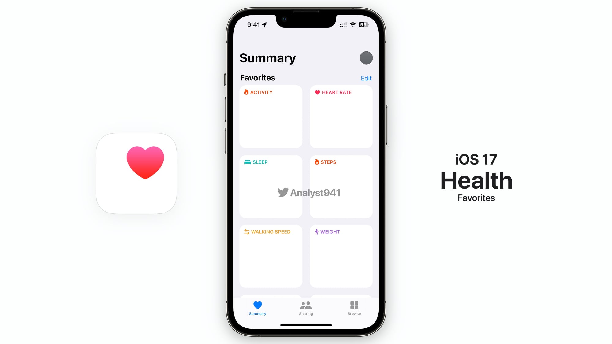
Health looks like an app already and the changes seem very small compared to Wallet’s. The only thing we can see here is that Summary has been improved with smaller tiles because instead of seeing just 3 categories on screen, it now shows 6 categories in the same amount of space.
I mean, this mockup is a confusing mess. Several taps to get to things which were very fast before, multiple ways to get to the same functionality, and arbitrary ontologies for people to have to search for cards within.

Health being written to use Swift Charts (the same framework the weather app uses) is somewhat expected. The challenge with the Health app is that it can potentially have tons of accurate data for trends - or a wide swath of spotty data in different categories at irregular times. It is harder to know to surface third party data, vs data collected by Apple Watch. That leads to what would be a more interesting improvement imho - a "Health Extension" framework to let third parties evaluate and surface trends within Health, while sandboxed from saving/leaking sensitive data.
 
  • Like
Reactions: fredrik9
Apple's Health App is the one thing they keep ignoring. We should be able to see what we want at a glance, trends, etc.
They have made improvements here in the sources and kinds of data it supports, but many trends are very hard to surface when you aren't also responsible for the sourcing of the data.

Also, they should add Food Tracking capabilities to their app as well (not using a third party app to do the logging)
I'd disagree. This is an area where people have wildly different needs and there has been lots of third party innovation (such as initial entry based on a photograph of the plate, or guidance toward the incredibly wide variety of dietary plans and things like allergy restrictions). Also, some people desire quick entry and persistent reminders that they haven't logged their food, while many others have no interest in the feature and would want to hide all of that.

I would hate for Apple to come in and destroy the third-party market there.
 
  • Disagree
Reactions: boston04and07
Finally. The health app is utter garbage. The original health app had the best design and was so easy to see your stats visually. Then Apple changed it to the awful app it is today.
 
Am I missing something, because I'm constantly having to switch between 2 cards that I use often and they are the same colour. It would be great to be able to tag each one some how or change the colour or image.
Are they the only two cards in your wallet app? If not, can you move one to the top of the stack and one to the bottom, with other cards in between?

I know it’s not a label or color distinguishing but at least it might help differentiate between the two?

Changing the image would rock since I have a special edition debit from my institution but the wallet app only displays the standard issued image.
 
Apple heathapp sucks

Doesn’t tell you anything how well you are recovering from a workout or how sleep will effect your workout or day.

Algorithms aren’t great for tracking health automatically. Everything about your health has to verified in a number of ways outside that. The things you asked for above are highly complex. How can a device or algo tell how well you are recovering from exercise when they can’t measure all the tiny micro tears in muscles? Only you can tell.
 
Finally. The health app is utter garbage. The original health app had the best design and was so easy to see your stats visually. Then Apple changed it to the awful app it is today.

It really is, hence why I just copy all my workouts into Strava and really pay zero attention to the health app.

I used fitbit back pre 2017 and the phone software side was pretty solid and easy to follow, so I know it's possible. There is zero reason it can't look better and at least be organized some other way than just line after line after line of data.

Another thing is that the health app is bugging me to re-login to a old healthcare provider from about four years ago in a state I no longer live in, that I linked and imported data from one time. I want to keep the data, but I don't want to stay permanently logged in/connected in forever.
 
Last edited by a moderator:
  • Like
Reactions: honglong1976
Real headline: Someone who can use Figma saw a previous MacRumors headline and made supporting mockups
 
  • Wow
Reactions: Jxdawg
If you want people to use some new piece of technology, you need to make it cheaper than the current version or free.
More and more places don't support NFC payment because surprise, surprise, it costs the merchant a fee every time a customer uses it whereas chip reading doesn't.
That's very surprising to hear. Do you have documentation of this? 🕷️
 
Real headline: Someone who can use Figma saw a previous MacRumors headline and made supporting mockups
They’re from the same leaker who said they’d be redesigned in the first place, based on screenshots he supposedly saw. All of which you’d know if you actually read the article.
 
I can reproduce this on iOS 15, so I doubt that it has anything to do with planned iOS 17 features.
I agree. This is exactly how the Photos info is currently shown on iPad. Even the snapping behaves the same, so it just seems to be showing it when not intended. The same double info pane behavior can be reproduced on iPad, too, when the app is iPhone size.
This floating window never leaves the Photos app, anyway.


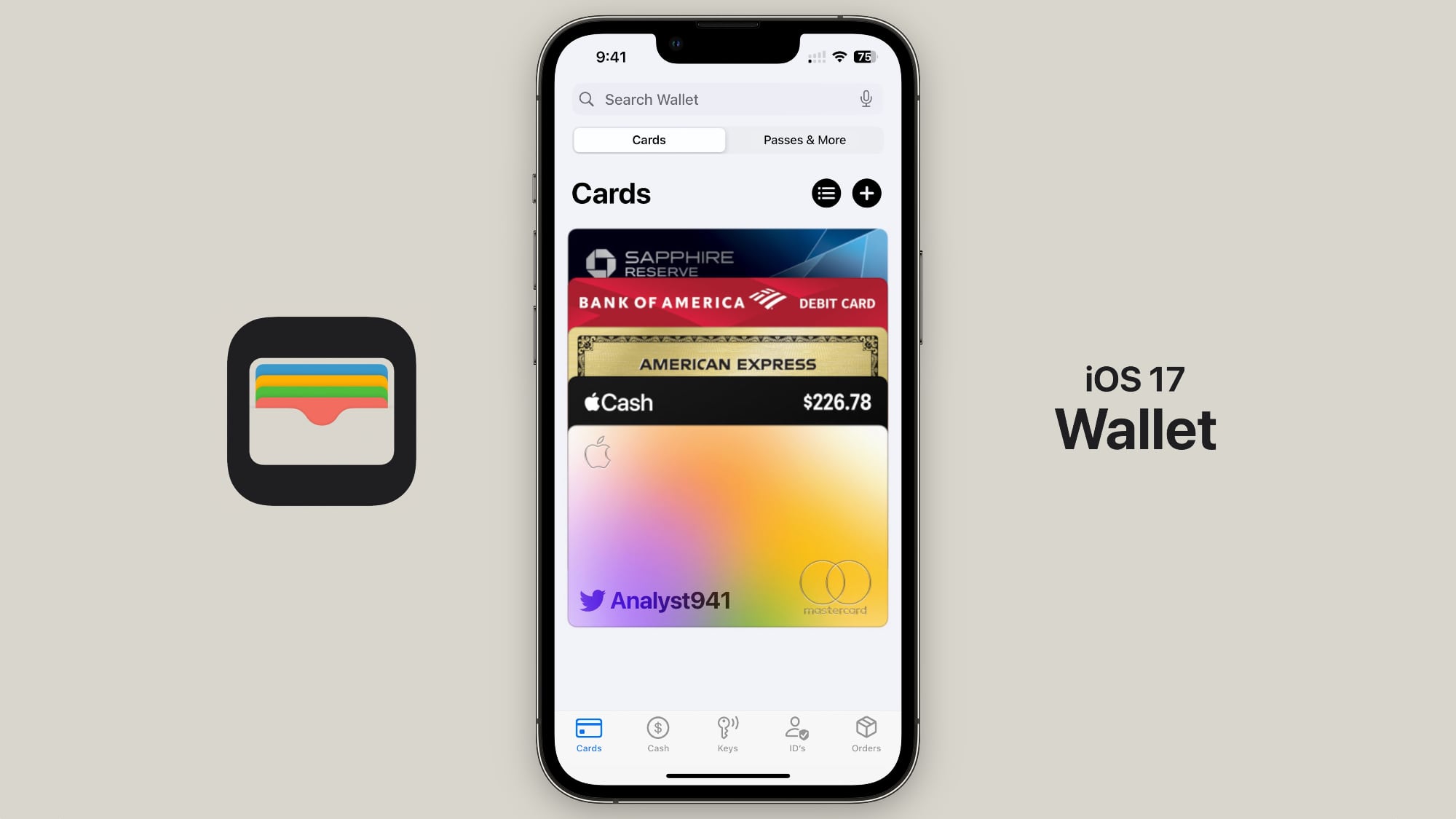
The Wallet and Health apps are rumored to be getting updates in iOS 17, and leaker @analyst941 today shared some mockups that allegedly represent the design changes that we can expect to see.

ios-17-wallet.jpg

In the Wallet app mockup, there's a navigation bar at the bottom that separates the different functions available in the app. Cards, Cash, Keys, IDs, and Orders are listed categories. Note that this is a mockup, so the "ID's" spelling is likely an oversight. There's also a "Passes & More" tab, and the leaker claims there are other features coming as well.

Users will reportedly be able to swipe down to access a search interface to find a specific card or pass, and there's a "Transactions" button. Compared to the current Wallet app design, this would be a functional improvement because it would make finding certain features like specific passes and order details simpler. It would not be a surprise to see a design like this given the many functions the Wallet app now serves in addition to storing credit and debit cards.

As for the Health app, Analyst941 claims that the "Favorites" section under "Summary" will see a redesign with a card-style interface. Each card will have "visual data" that includes "colored graphs," "tables," and other information. Since the Summary tab in the Health app also includes Trends and Highlights, it is not clear how the card design for Favorites would work with those sections.

ios-17-health-app.jpg

Analyst941 leaked accurate information about the iPhone 14 Pro's Dynamic Island ahead of its launch last year, but this leaker does not have a long-term track record as of yet and the information shared should be viewed with some skepticism in light of that.

Analyst941 has shared a number of rumors about features coming in iOS 17 in recent weeks, suggesting that there's a "special" version of iOS 17 in the works for a 14.1-inch iPad and that iPads will get iPhone-style Lock Screen customization, plus they have mentioned vague changes coming to Search, the Dynamic Island, Control Center, and more. They have also made claims about a new watchOS 10 Home Screen layout and have said that in the future, the Apple Watch will be able to pair with multiple devices, including the iPad and Mac.

It's worth noting that Bloomberg's Mark Gurman has expressed doubt about Analyst941's claims and believes that some of the information is inaccurate. We'll know more about Analyst941's accuracy in just over a month when Apple unveils iOS 17, watchOS 10, and other updates at the June 5 WWDC keynote.

Regardless of whether these mockups are accurate, there are other reliable rumors suggesting updates for the Health and Wallet apps. On the MacRumors podcast, Gurman confirmed that Apple is working on updates to the Wallet app, and he also recently said that Apple is working on new features for the Health app such as an expansion to the iPad and a mood tracking feature.

Article Link: Alleged iOS 17 Wallet and Health App Redesigns Shown Off in Mockups
Haven't updated to 16 yet but I'd like to be able to use the wallet app with a password instead of having to have a password on the entire phone. This seems like a no brainer considering you can have the option to pay with a passcode.
 
Algorithms aren’t great for tracking health automatically. Everything about your health has to verified in a number of ways outside that. The things you asked for above are highly complex. How can a device or algo tell how well you are recovering from exercise when they can’t measure all the tiny micro tears in muscles? Only you can tell.
That’s what garmin and whoop do
 
They’re from the same leaker who said they’d be redesigned in the first place, based on screenshots he supposedly saw. All of which you’d know if you actually read the article.
Makes no real difference to my opinion of these types of articles. Non-news page click bait.
 
I know Apple Fitness can barely get their trainers to use “me” vs “I” correctly, but hopefully someone will catch that stray ’ in ID’s.
 
Register on MacRumors! This sidebar will go away, and you'll see fewer ads.