Got a tip for us?
Let us know
Become a MacRumors Supporter for $50/year with no ads, ability to filter front page stories, and private forums.
Alternate Icons on iOS 7 Website Likely Old Marketing Material
- Thread starter MacRumors
- Start date
- Sort by reaction score
You are using an out of date browser. It may not display this or other websites correctly.
You should upgrade or use an alternative browser.
You should upgrade or use an alternative browser.
B4U
macrumors 601
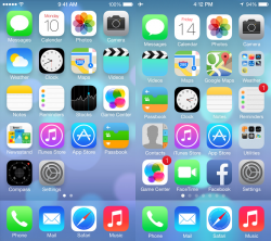
Why is Jony so obsessive with circles?
Game center is nowhere to be recognizable now.
Photo? That looks like a paint color palette.
And the signal strength? It is perfectly fine with bars.
Some of the older folks with less than perfect eyesight can see better with bars of increasing heights than same sized tiny dots sardine-packed together...
And the signal strength? It is perfectly fine with bars.
Agreed. Not to mention, it's almost a universal standard for bars to indicate cell signal strength. It's been that way on every cell phone I have owned.
I'm going to lament the loss of iOS6 and will probably stay with it as long as possible. Sad really, because I like a lot of what's happening under the hood of iOS7.
Why is Jony so obsessive with circles?
Game center is nowhere to be recognizable now.
Photo? That looks like a paint color palette.
And the signal strength? It is perfectly fine with bars.
Some of the older folks with less than perfect eyesight can see better with bars of increasing heights than same sized tiny dots sardine-packed together...
Game Center is based on playful circles, which makes sense. Photos is an abstract sunflower. The artwork looks much better and sharper on retina displays.
Four oF NINE
macrumors 68000
I'm not feeling this redesign in terms of icons and color palette.. these neon beach colors appear to be appealing to juveniles.
The warm rich current icons are preferable IMO.
The warm rich current icons are preferable IMO.
TMar
macrumors 68000
Why is Jony so obsessive with circles?
Game center is nowhere to be recognizable now.
Photo? That looks like a paint color palette.
And the signal strength? It is perfectly fine with bars.
Some of the older folks with less than perfect eyesight can see better with bars of increasing heights than same sized tiny dots sardine-packed together...
The colors and design makes it very juvenile looking. Looks like it would fit in well on a Leapfrog.
ipedro
macrumors 604
I'm confident that Apple will adjust things as they move closer to release. They're not submitting iOS7 to developers 3 months early so that they can ignore all their requests. Some app icons seem to have been universally rejected so they'll be getting a flood of feedback on them.
The camera app is one of them. If they're going to drop skeuomorphism, then don't take half measures. Get rid of the old camera metaphor and use one that better represents cameras today: a lens works well.
I like this one for the camera...

... and this one for Safari...

The camera app is one of them. If they're going to drop skeuomorphism, then don't take half measures. Get rid of the old camera metaphor and use one that better represents cameras today: a lens works well.
I like this one for the camera...
... and this one for Safari...
Last edited:
B4U
macrumors 601
Game Center is based on playful circles, which makes sense. Photos is an abstract sunflower. The artwork looks much better and sharper on retina displays.
I am sorry that I cannot see that as "playful" circles...
The old icon was better.
I will not complain if the "playful circles" are using actual ball patterns, meaning football (The real one, not handegg), basketball, baseball, etc.
That way, it is instantly recognizable.
Apple is good at making things intuitive, but this failed.
The sunflower, again, maybe I am just not good with art. I also cannot see this as sunflower. Sorry about that.🙁
nagromme
macrumors G5
Notice also the app shadows.
Also some screen shots give the apps black labels instead of white.
My guess is that black vs white will be chosen based on your current wallpaper?
As for GameCenter, sports are pre-computer and "old-fashioned" just like the old casino look. Yes, there will always be digital versions of ball sports, darts, card games and board games, but using them as the icon is too narrow and non-contemporary. I don't care either way about the new generic colored spheres, but at least they don't feel old or outdated like the images on the old one.
nagromme
macrumors G5
For me, the Photo's icon is meaningless and does not suggest intuitively, that it is a Photo App.
Neither did a sunflower. But we learned.
please change that hideous safari icon with a yucky white background! 🙁
I like the Safari icon. I suppose if I had a white background I wouldn't, but I don't. So I do.
arkmannj
macrumors 68000
biggest thing I would like to see is the ability to switch between two system theme's (Light theme (what we currently have) and Dark Theme)
For example, in the phone, instead of white buttons on a white background, let me have light buttons on a dark background. I like a little contrast, and I tend to prefer darker based themes.
For example, in the phone, instead of white buttons on a white background, let me have light buttons on a dark background. I like a little contrast, and I tend to prefer darker based themes.
sshhoott
macrumors 6502
Why is Jony so obsessive with circles?
Game center is nowhere to be recognizable now.
Photo? That looks like a paint color palette.
And the signal strength? It is perfectly fine with bars.
Some of the older folks with less than perfect eyesight can see better with bars of increasing heights than same sized tiny dots sardine-packed together...
Because the iPhone 6 will have a circular screen 😀
pubwvj
macrumors 68000
Bling. Flash. Waste of time and resources. I would like to see real improvements such as being able to use iOS apps and data on the MacOS and MacOS applications and data on the iOS devices. I just want to use my tools and data, no matter the device. While they're at it, add Windows, DOS, Classic and even Apple II and I support. The hardware is plenty powerful enough to do all that emulation with minimal burden. Heck, the old software will run faster on the new hardware than it ever did on the old. There are a tremendous number of users using old hardware because the software they depend on won't run on the new OS's and hardware. Apple could get virtually all of those people to upgrade if they provided legacy and cross platform support. I'm sure they could do it elegantly and seamlessly.
Neither did a sunflower. But we learned.
This sums up my feelings exactly. People are crying over these icons, not because they're bad, but because they unfamiliar. If Apple had launched the iPhone with these icons, and the 'current' icons were what we were being presented today as 'new'. Would the reaction be the same in reverse? Hell yeah, because it's human nature to cry out for change, yet reject it when it comes.
I would love to have a live weather icon. They could do some very low power things that wouldn't drain battery to get current weather.
They already do a check for the notification center widget. Why can't they be in sync??
Also some screen shots give the apps black labels instead of white.
My guess is that black vs white will be chosen based on your current wallpaper?
Seems so.
* * *
People often forget that technology is a bridge. If it doesn't connect us to real life objects, it has little or no use.
the only new icon I have an issue with and really don't like is the new safari icon - hopefully they will "improve" that before release considering its importance.
just saw the the post,above, with a suggested safari design...my friend you have hit it on the head with that one...its much better - hopefully apple agrees
like your camera icon better too, tbh
just saw the the post,above, with a suggested safari design...my friend you have hit it on the head with that one...its much better - hopefully apple agrees
like your camera icon better too, tbh
dragje
macrumors 6502a
please change that hideous safari icon with a yucky white background! 🙁
hear hear
I can't believe apple has approved this design to begin with. Not only does iOS7 feels inconsistent the transparent screens are responsible for one really ugly background.
Yes, there are "some" improvements, but I seldom saw so less improvement of an update in general terms. Despite the "it's so amazing" "wonderful" "unbelievable" "incredible" phrases you hear each 10 second when Apple is holding a conference.
I love Apple, I admire Sir Jonathan Ive for his work so far, but his hand in the iOS design is something I truly regret. It's a really poor looking design but more importantly it's a copy of several old features already been used in the past. Is this bad? Not necessarily, but it is bad, in my point of view, when the designs simply sucks and when Apple themselves have a mouth full towards others claiming them for being copy cats...
Seriously, some of those tiny looking icons are really badly designed. One of them is the Safari Icon.
Register on MacRumors! This sidebar will go away, and you'll see fewer ads.