I like the weather icon with up-to-date temperature status. But I also think the current one looks great too but isn't functional at all. What if Apple mashed both and made the cloud with sun icon be visible only to change into the current temperature status after say a few seconds each time you take a look at your home screen.
Got a tip for us?
Let us know
Become a MacRumors Supporter for $50/year with no ads, ability to filter front page stories, and private forums.
Alternate Icons on iOS 7 Website Likely Old Marketing Material
- Thread starter MacRumors
- Start date
- Sort by reaction score
You are using an out of date browser. It may not display this or other websites correctly.
You should upgrade or use an alternative browser.
You should upgrade or use an alternative browser.
First time I have ever been disgusted by an Apple product.I was expecting Apple to do away with the extreme skeumorphic stuff here and there, but this neonfest and ugly icons are horrible. I have a feeling all of this is in effort to gear up for the chineese market. As a european, It goes all the way against my taste.
Not quite sure why you think the Chinese market are into neon colors.
The top laptops sold in China are Lenovo, they are quite black and bland.
This sums up my feelings exactly. People are crying over these icons, not because they're bad, but because they unfamiliar. If Apple had launched the iPhone with these icons, and the 'current' icons were what we were being presented today as 'new'. Would the reaction be the same in reverse? Hell yeah, because it's human nature to cry out for change, yet reject it when it comes.
No, most people complain that they are ugly and old. Just like the old ones are ugly and old but not as high on acid ugly. Most people expect an "end to end redesign" to involve more than a reskin. I'm sure Apple can do better than icons in a grid which is very Windows 3.1 ish.
iOS has become very stale and 7 doesn't take a big enough step to something new. Too many stylized changes and not enough usability and feature add to make it a major update.
...
iOS has become very stale and 7 doesn't take a big enough step to something new. Too many stylized changes and not enough usability and feature add to make it a major update.
What are you smoking?
It's fine that not everyone likes the new design because everybody has a different taste.
But to say there isn't a big step to something new and features...........
If you ignore the design changes iOS 7 brings 100x more to the table than for example iOS 6 to iOS 5!
it is more likely that the icons are previous iOS 7 design iterations...
Excuses, excuses. Better be "previous"!
No, most people complain that they are ugly and old. Just like the old ones are ugly and old but not as high on acid ugly.
Are they ugly though? Or is that just a knee-jerk reaction because they're unexpected? I think for most people it is.
Also, if most people complain, why is it that most of the hundreds of polls (on this site alone!) show more people actually like iOS7 than dislike it?
Why is Jony so obsessive with circles?
Jony just likes to spin in circles.
Lol I had to
Lol.
"Apple has since updated the website, but the Weather, Passport, and Reminders apps looked notably different, with the Passport and Reminders apps displaying different colors and the Weather app displaying a temperature rather than the current cloud and sun design."
What the heck is passport...?
What the heck is passport...?
First time I have ever been disgusted by an Apple product.
As an european, I think we are just good at recognizing decadence.
After doing development for a few hours the other night under iOS 7. I was playing around with my iPad in bed. I felt like I was going to watch a close friend die. iOS 7 feels like the soul of iOS has been removed and replaced with stuffing.
Even the most iconic thing with the iPhone, the slide to unlock is gone. The first damn feature that was shown was gutted soon as there is new leadership.
Unless there is a very major shift in the skinning of iOS 7 before release. I can honestly say, this could be the start of the end for iOS.
Take an iOS 7 device, put it next to an Android or Windows Phone and there is no difference anymore. Apple is supposed to be the leader in design, not a follower.
The icons are only the surface of the problem.
I honestly prefer the old icon design.
They can get rid of the gloss... but I still like some gradient and depth.
The new flat icons look too cartoony.

They can get rid of the gloss... but I still like some gradient and depth.
The new flat icons look too cartoony.
I can't think of anyone alive better at running apple."Everything has been thought through. And through."
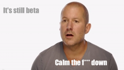
"But this is our work in progress, it is still beta" - just like that antenna design or Maps.
This is inexcusable for a company of that magnitude. People gotta get fired, starting with Tim.
They can go back to the old weather app icon once they make it able to display the temperature in real time.
I think having a live weather icon isn't worth it. It requires an Internet connection of some sort at all times, and is generally out of date unless it's updated a LOT. I wouldn't trust it to have the correct data, anyway. Apple are going about that the right way.
In thinking about the new Instagram camera mode, wouldn't food, teenager feet, or duckface make a more fitting photos icon than an abstract sunflower?
Honestly, although only slightly different, I like the older icons better. The only issue I take with iOS 7 are the icons (too simple) and too white (lowered brightness a lot yet still needs more contrast). Even my friends in Pixar and Cupertino had the same responses after using it for a few days. Otherwise, I'm loving it and it can only get better.
----------
^This, spot on. This is one of the few issues I have with iOS 7. Subtle nuance, gradient would be great.
----------
I honestly prefer the old icon design.
They can get rid of the gloss... but I still like some gradient and depth.
The new flat icons look too cartoony.
Image
^This, spot on. This is one of the few issues I have with iOS 7. Subtle nuance, gradient would be great.
Are they ugly though? Or is that just a knee-jerk reaction because they're unexpected? I think for most people it is.
Also, if most people complain, why is it that most of the hundreds of polls (on this site alone!) show more people actually like iOS7 than dislike it?
Hey, how about we stop trying to twist things to fit your argument?
I said the old are are ugly too, so am I having a ~6 year old knee-jerk reaction? The new one are just more ugly. Like I said they would look good on a Leapfrog.
People are crying over these icons
So you're saying all the people are crying over the icons, then you say most of the polls say more people like it. See I can twist words too. Let me reword it for you...
Most of the people that complain complain because they are ugly.
It's just silly.
Agreed. Not to mention, it's almost a universal standard for bars to indicate cell signal strength. It's been that way on every cell phone I have owned.
I think the circles for signal strength make perfect sense. It's the indication of battery strength on the Mac laptops and on my lawnmower. The bar graph is stupid and takes too much vertical space. It's not like it's graphing actual data. If it makes you feel better, the dots are bars that haven't been stretched to increasing heights artificially. Instead of 4 bars, you have 4 dots. Is it that hard?
Last edited:
I love this proposal from someone at The Verge forums. It's kind of a different view of the current design. The only icons which I don't like in the mockup below are the reminders icon, which I think is too vague. Also the App Store and iTunes Store icons which lack circles, which makes it harder to tell iTunes and Music apart.


Register on MacRumors! This sidebar will go away, and you'll see fewer ads.