Alternate Icons on iOS 7 Website Likely Old Marketing Material

junk

Icons for iOS 7, whether old or new, are wishy-washy crap.

Faded junk, no character. So the clock ticks, hurray.

Bring back skeuwhatsitsname. and send the Ive guy packing. He's had his day in the sun.

That's what happens when you have billions of dollars, and think you are intellectually, as well as financially, top of the heap.

Idiotic mistakes, just like "Mavericks".
 
I think having a live weather icon isn't worth it. It requires an Internet connection of some sort at all times, and is generally out of date unless it's updated a LOT. I wouldn't trust it to have the correct data, anyway. Apple are going about that the right way.

Why would anyone need a constant reminder of the current temp? Not worth the battery drain.
 
When I first saw pictures of the new UI of iOS 7 I also thought it was hideous, but I installed the Beta this morning on my 4S (and have already deinstalled because of many third party app crashes) it looks extremely well in action. I especially though that those circles for signal strength are bad, but they work really well on the live version.

I would suggest for everybody to calm down and judge for themselves with the final product.
 
I love this proposal from someone at The Verge forums. It's kind of a different view of the current design. The only icons which I don't like in the mockup below are the reminders icon, which I think is too vague. Also the App Store and iTunes Store icons which lack circles, which makes it harder to tell iTunes and Music apart.

Image
Image

I think those icons are TOO simplified and approaching the old "mystery meat navigation" category.
 
I love this proposal from someone at The Verge forums. It's kind of a different view of the current design. The only icons which I don't like in the mockup below are the reminders icon, which I think is too vague. Also the App Store and iTunes Store icons which lack circles, which makes it harder to tell iTunes and Music apart.

full_ui.jpg
Even though this is not a true flat design, these icons are far better than current iOS7 and iOS6 Apple icons. Good job, whoever did it has to be hired by Apple to fix all the crap.
 
Last edited:
I think the circles for signal strength make perfect sense. It's the indication of battery strength on the Mac laptops and on my lawnmower. The bar graph is stupid and takes too much vertical space.

Agreed. Much easier (for me) to see how many circles than bars anyway, due to the way the bars all blend together.

----------

Why would anyone need a constant reminder of the current temp? Not worth the battery drain.

Right. That's what I'm saying (among other things). :)
 
Very bad design.....

Why no one one is talking about settings(inside) and phone dial-pad????? Very bad design there.


Hahahahahaha...apple has just removed new icons also from their site,....which means, there are no new ios7 icons and old ios7 icons....something is going on :)

I stick to ios6 as long as i can
 
I may be in the minority here, but I think most of the iOS 7 icons are actually fine. It's few of the dogs that makes 'em seem worse than it is.

These icons changed only slightly from iOS 6:
  • Messages
  • Calendar
  • Clocks
  • Maps
  • Videos
  • iTunes Store
  • App Store
  • Settings
  • Phone
  • Mail
  • Music

Following icons changed more dramatically but not necessarily worse than iOS 6 (which I don't think was all that nice to begin with):
  • Weather
  • Passbook
  • Stocks
  • Newsstand
  • Compass
  • Contacts
  • Facetime (compared to iPad's icon)

And here are the infamous six:
  • Photos: To me, this is easily the worst. I am not sure what the icon is even supposed to suggest.
  • Camera: SLR seems dated (and I own one) and I dislike the gray background.
  • Notes: Bland and boring.
  • Reminders: Aside from being boring, it's hard to tell Reminders and Notes icons apart.
  • Game Center: Possibly worse than Photos but I don't use Game Center as much so I rank it second worst icon in iOS 7.
  • Safari: I don't know why exactly but the icon just fades into the background.
 
I think the circles for signal strength make perfect sense. It's the indication of battery strength on the Mac laptops and on my lawnmower. The bar graph is stupid and takes too much vertical space. It's not like it's graphing actual data. If it makes you feel better, the dots are bars that haven't been stretched to increasing heights artificially. Instead of 4 bars, you have 4 dots. Is it that hard?

The bars have been used for mobile devices forever. It is far faster of a visual indicator then 4 dots.
 
Well, we have a live clock app now so there's a possibility that a live weather app will come! know that it depends on an internet connection, but there's still hope! We're not at GM yet :D

Man, get a brain! Your poser-signature is as ridiculous as the hardware-spec-signatures in PC forums.
 
First time I have ever been disgusted by an Apple product.:mad: I was expecting Apple to do away with the extreme skeumorphic stuff here and there, but this neonfest and ugly icons are horrible. I have a feeling all of this is in effort to gear up for the chineese market. As a european, It goes all the way against my taste.

So you were quite happy with great inventions such as:

  • The Hockey Puck Mouse
  • MobileMe
  • Apple Maps
  • Ping
  • Everything made from 1991 to 1997

You were happy with THESE products and dissatisfied with these icons?

In the words of John Cleese acting as a Roman soldier in the Life of Brian when speaking to a man that would rather be crucified than stabbed,
"your weird". :)
 
Why is Jony so obsessive with circles?
Game center is nowhere to be recognizable now.
Photo? That looks like a paint color palette.
And the signal strength? It is perfectly fine with bars.
Some of the older folks with less than perfect eyesight can see better with bars of increasing heights than same sized tiny dots sardine-packed together...

hes trying hard to be the next Leonardo, too hard.

2v8fzw8.jpg
 
iOS 7 Icon:

I have been looking at the icons and I do agree the 'Safari' icon should be change. Just look at the 'Mail' icon - the blue is on the outer section of the icon and on the 'Safari' icon the blue is in the inside of it.

To make it more consistent they should switch the blue on the 'Safari' icon the way the 'Mail' icon is.:cool:

Other than that I am looking forward to iOS 7, loving the transparency.
 
the icons still need some work, but the overall direction is good...

... and this one for Safari...

Image

Great version of the Safari icon, well done! Hope Apple uses this instead.


The sunflower, again, maybe I am just not good with art. I also cannot see this as sunflower. Sorry about that.:(

It's somewhat subtle but the concept is there. I don't think it's a bad idea for an icon, just don't think it's the best possible "flat design" representation of an icon for a photo gallery.


I love this proposal from someone at The Verge forums. It's kind of a different view of the current design. The only icons which I don't like in the mockup below are the reminders icon, which I think is too vague. Also the App Store and iTunes Store icons which lack circles, which makes it harder to tell iTunes and Music apart.

Image
Image

This concept mockup is waaaaaaaay better than what Apple revealed at the WWDC; fingers crossed Apple takes note of these and incorporates some of them into the final non-beta design.


This sums up my feelings exactly. People are crying over these icons, not because they're bad, but because they unfamiliar. If Apple had launched the iPhone with these icons, and the 'current' icons were what we were being presented today as 'new'. Would the reaction be the same in reverse? Hell yeah, because it's human nature to cry out for change, yet reject it when it comes.

I only half agree. Although I do agree that change is hard for some to adjust too in general, I disagree with the people "are crying" sentiment. Some people really don't like the new app icons (myself included) and are simply voicing their dissatisfaction with it; and there are some reasonable concerns to be had regarding some of these new app icons. Remember how Tim Cook was saying at the WWDC keynote that Apple wants people to "feel" their products are touching their lives in a positive way? But if people aren't feeling that way (even if only through the interaction with their stock app icons) then Apple is falling short of their own goals in that regard don't you think? Yes, you can't please everyone, but 50% of the crowd being dissatisfied is too high of a number to overlook as well.


I may be in the minority here, but I think most of the iOS 7 icons are actually fine. It's few of the dogs that makes 'em seem worse than it is.

...

And here are the infamous six:
  • Photos: To me, this is easily the worst. I am not sure what the icon is even supposed to suggest.
  • Camera: SLR seems dated (and I own one) and I dislike the gray background.
  • Notes: Bland and boring.
  • Reminders: Aside from being boring, it's hard to tell Reminders and Notes icons apart.
  • Game Center: Possibly worse than Photos but I don't use Game Center as much so I rank it second worst icon in iOS 7.
  • Safari: I don't know why exactly but the icon just fades into the background.

I would add "newsstand" to that infamous list; the current iOS7 version for it looks horrendous.
 
Amazing how they took the icons and put a grid on it in the hopes of justifiying their work as being Class A professional mathematical artistic creation

And the worse is that a lot of people got fooled by the gimmick
 
Why is Jony so obsessive with circles?
Game center is nowhere to be recognizable now.
Photo? That looks like a paint color palette.
And the signal strength? It is perfectly fine with bars.
Some of the older folks with less than perfect eyesight can see better with bars of increasing heights than same sized tiny dots sardine-packed together...

If only the signal bars meant anything....
 
I am sorry that I cannot see that as "playful" circles...
The old icon was better.
I will not complain if the "playful circles" are using actual ball patterns, meaning football (The real one, not handegg), basketball, baseball, etc.
That way, it is instantly recognizable.
Apple is good at making things intuitive, but this failed.

The sunflower, again, maybe I am just not good with art. I also cannot see this as sunflower. Sorry about that.:(

It's in early beta, stop saying it's failed. It months from release and yet failed? :confused:
 
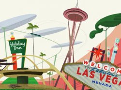
Using iOS 7 more, I can't help notice the resemblance to "Googie Architecture" from the ~1950's
 

Attachments

  • googie-architecture-image_350_090611113718.jpg
    googie-architecture-image_350_090611113718.jpg
    15 KB · Views: 1,514
  • 2999_image_1.jpg
    2999_image_1.jpg
    67.4 KB · Views: 158
  • LAFrog+SpaceAge2.jpg
    LAFrog+SpaceAge2.jpg
    107.2 KB · Views: 101
Register on MacRumors! This sidebar will go away, and you'll see fewer ads.
Back
Top