Sure it is.
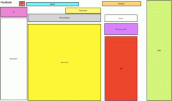
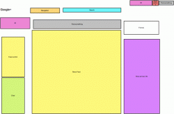
1) both have three columns, with a top row of menu-type stuff.
Like almost every other website around.
2) the left column of both includes contacts for chat,and the ability to navigate to different "feeds."
I only have a newsfeed on the left on facebook. My chat is on the bottom on facebook.
3) the center column of both has a "wall" (or "stream"). Just like facebook, each entry has a thumbnail photo on the top left, a top row listing the name of the person who posted, and underneath lists the actual feed. Facebook has links for "like - comment - share" and google has links for "+1 - comment - share," in each case on the bottom of the entry.
Just like real life, Google and Facebook have a button for showing someone support or that you agree with something or you think it's funny. It's like calling someone who laughs unoriginal because other people have done it before.
Google+ performs some of the same functions as facebook, but my opinion is that it's far better designed. The fact that some features overlap mean that layouts are going to be similar (of course you need some kind of feed, how else do you want it to show up? letters flying at you?) but it's all about how things are executed.
This is really ancillary to the point of the thread, but it does illustrate something important. Google+ definitely took some cues from facebook, just like facebook took cues from myspace. That's how technologies advance. Things are built upon. Just like Android built on things iPhone pioneered on mobile devices and iPhone built on things Android and Windows Mobile did.