It would help if you could make your posts more intelligible and less hysterical so we could have a better idea of what you mean.
Got a tip for us?
Let us know
Become a MacRumors Supporter for $50/year with no ads, ability to filter front page stories, and private forums.
anyone think that the new finder sucks?
- Thread starter andyjamesnelson
- Start date
- Sort by reaction score
You are using an out of date browser. It may not display this or other websites correctly.
You should upgrade or use an alternative browser.
You should upgrade or use an alternative browser.
Originally posted by Phil Of Mac
It would help if you could make your posts more intelligible and less hysterical so we could have a better idea of what you mean.
Could you be more specific as to what you do not understand?
Do you have Panther installed?
Have you tried getting around in the new finder's column view?
If so, there should be no question as to what I'm talking about.
Yes, I am frustrated!
I hated the 4-level-deep finder in Jaguar and have looked forward to Panther's Finder since the day I installed Jaguar. I am dissapointed
Thanx!

Save as consistent with Finder
What I like best so far about the Finder is that it matches with the Save dialogue boxes in apps. I've already used that quite a lot.
I do expect they'll be some updates, but so far I'm more than happy with it.
What I like best so far about the Finder is that it matches with the Save dialogue boxes in apps. I've already used that quite a lot.
I do expect they'll be some updates, but so far I'm more than happy with it.
I have Panther installed. I am using the column view. It works great! I don't know what your problem is.
Take a deep breath and try to explain a little bit better what your problems are.
I can scroll back and forth, up and down just fine in column view. I can use my arrow keys to navigate in any directory. Jobs never demoed or said your whole window would dynamically fit the content. The only thing I've seen do that is the icon sizes change in the left panel to fit the window size.
I can scroll back and forth, up and down just fine in column view. I can use my arrow keys to navigate in any directory. Jobs never demoed or said your whole window would dynamically fit the content. The only thing I've seen do that is the icon sizes change in the left panel to fit the window size.
1. Open a new finder window (Apple+N) or click on an item in your finder's sidebar.
(make sure this item has at least 2 or more sub-folders)
2. What do you see when you right-arrow key or click on the next sub-folder and the next and the next? How much empty finder window space is there?
3. Do the highlighted (colored) folder's or document's titles show completely? Are they completley visible and readable? In other words, Can you see the title of the folder you are actually navigating in?
4. USING the ARROW KEYS, can you navigate from the finder window into the sidebar and from the sidebar into the finder window?
What Happens when I use column view is that the highlighted item is never completely visible and I have to click the green window expand button every time in order to see where I am in my navigating.
When I do expand the window, the highlighted column and folder is never visible or at least completely visible at the same time as the highlighted items contents.
So I am searching through a folder of pictures titled VACATION and I am unable to read the word VACATION - Even though it is highlighted in color.
So each time I want to see what folder I am searching through, I have to manually resize the finder window to see both columns at once.
I have a big open Finder window on my screen and I can only see one or one and a half columns, all the rest of the columns to the right are empty.
Why doesn't the Finder place the columns that I am searching in complete view in the center of the window?
C'mon, surely there is someone that is reading this and saying, "YEAH, I CAN'T STAND THAT!"
If not, I give up.
1) OK
2) It's all empty space to the right until you dig through enough directories to take up the space. This is no different than in 10.2.
3) Yes. I can see the full names of the directory I'm in and the directory above it. For instance: Applications>AppleScript.
4) No, and I don't have a problem with that. Those are shortcuts to directories/drives, not part of the directory structure you are actually navigating in.
It sounds to me like you're having issues with the actual column size. Have you tried resizing them? In case you don't know how, click and drag the two vertical lines at the bottom of the column separators. You can even individually resize the columns now, where in Jaguar it was a global setting.
If I'm way off-base let me know and attach a screenshot so we can see what's going on.
You brought up another point:
The column view columns are now individually resizeable instead of global.
I'm not sure yet if this is an advantage or disadvantage.
But I do know that the default column width is way too wide for any title that I have on any document. Therefore I must resize the columns everytime in order to see 5, 4 and sometimes 3 levels at once.
Is there a preference setting to keep my columns at a predetermined width
(the width of the longest titled document would be the obvious solution)
instead of resizing them each time I want to see just the files and titles instead of 2 inched of whitespace to the right of each column?
I think the finder window should expand as you go deeper into your file tree instead of filling your desktop with empty columns.
It should also show at least both colums in which you are currently navigating instead of one or one and a half with an inordinate amount of empty space.
FOR EXAMPLE: When I arrow key or click on a folder in any column, the columns shift to the left and the new column appears with the previous items contents. The problem is that the left side of the finder window next the the sidebar halfway or fully obscures the previous folder selected instead of showing both at the same time. or all three or four at the same time.
This would make sense if I had just a small finder window open, but it happens even when the finder is the entire width of the screen.
I want to see my file PATH, not empty columns!
I am at work right now and unable to send pix.
Sorry.
Thanks for listening to my 'unintelligible' rants.
They are globally resizeable, if you hold down the option key while you're resizing.Originally posted by Galegao
The column view columns are now individually resizeable instead of global.
I'm not sure yet if this is an advantage or disadvantage.
Well, kinda.
In my attempts to follow your directions, I came across this odd behavior:
1. Opened a new finder window (defaults to my home directory. This does not show the upstream path to /, but I'm OK with that).
2. I always use column view.
3. I globally resized columns by option-clicking on the little bars at the bottom of the columns. I actually had a little trouble with this, as they jumped unnaturally a couple of times to really strange sizes. But I got it in the end.
4. Or so I thought. As I navigated through my home directory, I found that everything was fine -- until I got six levels deep. Things looked like this:
Music -> iTunes -> iTunes Music -> SCO_Sir Charles MacKerras -> Serenades No.1 And No.2
And to this point, every file name fit just perfectly. No ellipsis, everything's great. But the next level, instead of "Ser No.1 in D, Op.11_ V. Scher.mp3", all I can see is "Ser N...r.mp3"
Why at six levels does it suddenly drop to only an eleven-character wide column? I had to search a bit to find other places where I went that deep in my home folder, but navigating from the computer's root is pretty easy to get that deep.
[OK, I just tried something else -- I started at my computer's root, and re-sized the columns globally from as deep as I could get it. Problem seems to be solved, but it does seem like a work-around for a bug in the global-resize routine. Right?]
Re: lots of new things to get used to but
NICE setup..hehe!
So far, I like Panther, some of the animations however, stutter a bit, even on my 1.33 pb, overall though, so far, so good.
Originally posted by VicMacs
in the longrun it looks like this is going to be the most user freindly finder ever, and with expose working with multiple apps is just GRRRRRREAT ... try this expose setting...
1.System Prefs
2. Expose
3. Now arrange the corners like this
try it! i dont kow how i lived without this
NICE setup..hehe!
So far, I like Panther, some of the animations however, stutter a bit, even on my 1.33 pb, overall though, so far, so good.
I switched to column view and tried, but it seems to work perfectly for me. Perhaps you have a plist file that is screwed up or something? Did you do a clean install or an upgrade install?
As far as animations being choppy, I noticed that when iChat bounces with new IMs it seems to stutter a bit, along with the bouncing icons in the dock when they want your attention. Not sure what is up with that, but that seems to be the only instance of choppiness I have with the animations.
As far as animations being choppy, I noticed that when iChat bounces with new IMs it seems to stutter a bit, along with the bouncing icons in the dock when they want your attention. Not sure what is up with that, but that seems to be the only instance of choppiness I have with the animations.
My install was fresh and clean as a whistle. And everything's peachy now. I'm not complaining; I really like the improvements to the finder, and I'm quickly becoming accustomed to them. I think I'd have a hard time switching back.Originally posted by Powerbook G5
I switched to column view and tried, but it seems to work perfectly for me. Perhaps you have a plist file that is screwed up or something? Did you do a clean install or an upgrade install?
I just can't decide if my six-levels-deep behavior was a bug, or something with my setup. I think I"ll just submit it to Apple and let them figure it out.
If I can figure out where to submit it to Apple. Hmm....
Originally posted by Galegao
You brought up another point:
I think the finder window should expand as you go deeper into your file tree instead of filling your desktop with empty columns.
You've mentioned this several times so far. This is not a good idea and is bad UI design. A window should not decide for the user when to resize. Ever. In any program. The obvious problem is that every person will have a different idea of what the correct way to resize is, and the computer probably won't match up to each user's expectation. Second, your finder window would be jumping all over the place, resizing constantly every time you made a new selection. That would be horrible.
Global prefs would be a good idea for column width size and it's probably already in there even if there isn't a UI for it right now. Someone could probably find the plist file where the width is specified and change it...
While I agree that its somewhat ugly, brushed metal is the only thing that will really work for the design they are trying to achieve. The new finder needs stark separation of the file system and the menu on the left. Also, being able to drag from any metal surface is always good.
After using Panther for about 3 weeks full time, I find it a total pain to use the Finder in Jaguar on the Macs at school. Having my most used locations always on the left is great and much more intuitive than putting them on the toolbar. Overall the Finder in Panther saves a lot of time and frustration compared to Jaguar. While there may be some things Jaguar's Finder did better, there are many MORE things that Panther's does better.
After using Panther for about 3 weeks full time, I find it a total pain to use the Finder in Jaguar on the Macs at school. Having my most used locations always on the left is great and much more intuitive than putting them on the toolbar. Overall the Finder in Panther saves a lot of time and frustration compared to Jaguar. While there may be some things Jaguar's Finder did better, there are many MORE things that Panther's does better.
I only used Jaguar for a month before I got Panther, so I am not able to feel as upset about things missing from Jaguar, anyway. I love the brushed metal, but I am sure part of that is because it goes so well with my aluminum PowerBook that it looks good together. Perhaps it doesn't look as good on an all white iMac or eMac, though. One thing I noticed missing is the "Favorites" section, as far as I can see, it is completely gone. It's fine, though, since I made myself a "Games" folder and a "Utilities" folder so I can be even more organized. I love it to death, I spent a good while just customizing Finder to be unique, organized, sexy, and efficient. For the first 10 minutes I may have thought Jaguar was better, but once I started messing around with my file structure, I soon found out how great Panther has made Finder.
I like it quite a bit. Much easier to get to what I'm looking for. I like the brushed metal look, blends well with G5's and powerbooks. I do agree that the new finder might be a bit too big on the boarders, but all in all, a great improvement.
I think I see what the complaint about column view is all about.
When I go into column view, then click on an image file or something to see a preview, there's a lot of wasted space, i.e. the preview space is quite large, and the file names on the left get cut off.
Mildly annoying, but certainly not enough for me to revert back to Jaguar (but that's me personally. I almost never use column view.)
Am I correct? Was this the original complaint?
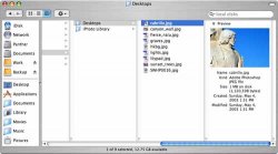
Sorry for the second post, thought an image might make things clearer.
I'm guessing this is the complaint? It looks like an oversight maybe, hope it's fixed in 10.3.1 (if there is one.)
p.s.- just noticed it doesn't do this in the dialog box used to choose the jpeg. strange..
I'm guessing this is the complaint? It looks like an oversight maybe, hope it's fixed in 10.3.1 (if there is one.)
p.s.- just noticed it doesn't do this in the dialog box used to choose the jpeg. strange..
Attachments

Originally posted by Phil Of Mac
You've got your column size set to "frickin huge", man. That's the problem.
oh..
heh heh.. I, uh.. I knew that..IIRC, the window borders were this thick in OS 8 through 9.2.2. I'm kinda glad they're back cause I can drag windows around from any side of them, not just the title bar.
As for the sidebar, if you don't like it, grab the handle between the sidebar and the folder view and drag it to the left. In effect, you hide the sidebar and get essentially a brushed-metal version of Jag's finder windows.
Just a couple things I'd like to pass on to the rest of you. I, for one, have no problem with the new interface. I find the sidebar to be very useful since I can jump straight to any of my home directory folders from anywhere. And, (slightly OT), I find that Fast User Switching makes an excellent "Lock Screen" feature, even if you only have one user on the machine. (in this case, I'm the only user on my TiBook.) Just pull up the login window. And you still get to see the rotating cube effect.
Basically, I love Panther. I don't know how I've lived without its new features.
Now I'm gonna do a permission repair and see if it'll speed things up any more.
Cheers!
-Z
Register on MacRumors! This sidebar will go away, and you'll see fewer ads.