I noticed a huge speed increase after doing a permission repair and rebooting. Panther royally screws them up, even with a clean install.
Got a tip for us?
Let us know
Become a MacRumors Supporter for $50/year with no ads, ability to filter front page stories, and private forums.
anyone think that the new finder sucks?
- Thread starter andyjamesnelson
- Start date
- Sort by reaction score
You are using an out of date browser. It may not display this or other websites correctly.
You should upgrade or use an alternative browser.
You should upgrade or use an alternative browser.
i have to say that at first i didn't like the way that there's all that brushed metal around the Finder windows. i just find it a bit overbearing, too much do look at for long periods. i definitely prefer the look of the window after you press the top right button...
and i forgot that you can navigate the whole computer in icon view using cmd+arrows, i was worrying too much about the oversized Finder windows.
the new Finder windows just look disproportionate to me. i mean look at the side borders... really slim, good size. then at the top and bottom of a window there's these comparatively massive borders. it does seem a bit inconsistent to me...
but i do love having all those shortcuts on the left, much better than on the top.
and nice to have built-in .dmg support, and i also just noticed that the Finder can preview Painter 8 documents and Photoshop documents. Jaguar could definitely not do that.
i'm sure i'll get used to it. maybe it's just because i'm cranky after installing the Panther upgrade (UtD CD's). i thought it was a full install, but after i'd partitioned my HD i find out you need a previous version of OS X to upgrade to Panther. not too happy about that...
and i forgot that you can navigate the whole computer in icon view using cmd+arrows, i was worrying too much about the oversized Finder windows.
the new Finder windows just look disproportionate to me. i mean look at the side borders... really slim, good size. then at the top and bottom of a window there's these comparatively massive borders. it does seem a bit inconsistent to me...
but i do love having all those shortcuts on the left, much better than on the top.
and nice to have built-in .dmg support, and i also just noticed that the Finder can preview Painter 8 documents and Photoshop documents. Jaguar could definitely not do that.
i'm sure i'll get used to it. maybe it's just because i'm cranky after installing the Panther upgrade (UtD CD's). i thought it was a full install, but after i'd partitioned my HD i find out you need a previous version of OS X to upgrade to Panther.
not too happy about that...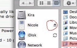
It's great. Its so much easier to drag a folder on to the left hand side instead of navigating through a ton of folders to find what your looking for.Most of the stuff like applications and documents is really all I usually navigate too any ways.My only gripe is having to resize that window each time.10.4 perhaps
OK. I still think it's clunky, but I found a setup that I may get use to. I am at work now, so I'll share a screenshot later if anybody is interested. I have a question though. In the new finder (in view as list mode) I can't cant draw a curser select box around files or folders any more. I have to shift-click or apple-click on them individually. What's up with that.? This is kind of lame. I just did a clean install too. Any ideas?
Originally posted by John_Greythorne
Not only does it have an integrated eject button, it also installs this folder as standard for every user.
Apple does listen to its customers after all.
really clever pic
Okay!! where's mine!! I looked all over and I can't find it!
Wht's your IP address and login info? I want to compare your directories against my own so I can find that folder
Wht's your IP address and login info? I want to compare your directories against my own so I can find that folder

really clever pic
Not my pic originally; 'twas Phil of Mac's.
It just goes to show that the next time you post a screenshot to demonstrate what you mean, make sure that your "specialised interest" folder is out of shot.
wow! i guess Apple really is making progress with the PornwerBook!! but i'm disappointed it only has a standard icon, it really needs something to make it 'stand out'.
but i'm disappointed it only has a standard icon, it really needs something to make it 'stand out'. Originally posted by cb911
wow! i guess Apple really is making progress with the PornwerBook!!
I'm willing to accept icon designs.
the new finder is alright, but i really hate the borders, it is a waste of space on my already small 1024x768 screens. i liked the jaguar style buttons on the toolbar, to acess home, applications etc.
but seeing as i use LaunchBar i dont use them much anyway.
I think the finder should have more customization options, but this is a general mac complaint on the whole, as we are a very fussy bunch
but seeing as i use LaunchBar i dont use them much anyway.
I think the finder should have more customization options, but this is a general mac complaint on the whole, as we are a very fussy bunch
Re: anyone think that the new finder sucks?
I think the new finder widow sucks, too. That sidebar thing on the left drives my crazy. I just end up closing it all the time.
Originally posted by andyjamesnelson
sorry is it me or does the new finder window suck? the way it looks is stupid and over sized.. and wtf.. why cannot you scroll through all the sections with the cursor keys? i mean you cannot scroll to another disk partion.. really annoying, bassically i fail to see why this is a better design interface for the finder window.. what do you think?
I think the new finder widow sucks, too. That sidebar thing on the left drives my crazy. I just end up closing it all the time.
Re: Re: anyone think that the new finder sucks?
Can't you just set it to close by default so you don't go crazy closing it all the time?
Originally posted by jywv8
I think the new finder widow sucks, too. That sidebar thing on the left drives my crazy. I just end up closing it all the time.
Can't you just set it to close by default so you don't go crazy closing it all the time?
finder difference in column view
So, besides LuckyJack, am I the only one who has often used the column view to move files from a folder by traversing backwards (upstream). This seems to be my only gripe with the finder so far. I want to be able to click on my home directory or any other folder I put in the sidebar and see where that folder is in hierarchy of things.
come to think of it, this really irks me.
Re: finder difference in column view
Why?
Originally posted by diesel machine
So, besides LuckyJack, am I the only one who has often used the column view to move files from a folder by traversing backwards (upstream). This seems to be my only gripe with the finder so far. I want to be able to click on my home directory or any other folder I put in the sidebar and see where that folder is in hierarchy of things.
come to think of it, this really irks me.
Why?
Re: finder difference in column view
Anything I put it in that sidebar is there because I use it constantly. I don't need to be told where it is.
If I do need more than the sidebar shows be, I just command click and use the new window. If you want to know the location in the hierarchy you can get it in two actions:
1) Command click the icon
2) Command click the title in the new finder window
Originally posted by diesel machine
I want to be able to click on my home directory or any other folder I put in the sidebar and see where that folder is in hierarchy of things.
come to think of it, this really irks me.
Anything I put it in that sidebar is there because I use it constantly. I don't need to be told where it is.
If I do need more than the sidebar shows be, I just command click and use the new window. If you want to know the location in the hierarchy you can get it in two actions:
1) Command click the icon
2) Command click the title in the new finder window
Re: Re: finder difference in column view
Just personal preference I guess. I've grown accustomed to moving files from one folder to another by dragging backwards up the tree. The lack of this function in 10.3 isn't a deal breaker, it is just something I miss in the new version and was curious if I was the only one accustomed to seeing my files that way.
Apparently I am one of a few.
Originally posted by Phil Of Mac
Why?
Just personal preference I guess. I've grown accustomed to moving files from one folder to another by dragging backwards up the tree. The lack of this function in 10.3 isn't a deal breaker, it is just something I miss in the new version and was curious if I was the only one accustomed to seeing my files that way.
Apparently I am one of a few.
Re: Re: finder difference in column view
Yeah I might have chosen a better example.
I am primarily a business user, and as a result I have lots of financial info, presentations, etc in different folders. I do loose track of where I am, especially if I am looking at a spreadsheet that is prepared monthly(, to detail gross profit, etc.)- am I looking at 2001 or 2002's March figures (an example)
Using the scrollbar at the bottom of the finder was an easy way for me to find my way to my next task. Clicking on a shortcut that I put at the top of the 10.2 finder would automatically show the hierarchy of everything above it. Now if I want to see that hierarchy, I have to start at the computer level and drill down to the files I want.
It may seem petty to you, but we all develop a certain way of doing things and this is mine.
Originally posted by stcanard
Anything I put it in that sidebar is there because I use it constantly. I don't need to be told where it is.
Yeah I might have chosen a better example.
I am primarily a business user, and as a result I have lots of financial info, presentations, etc in different folders. I do loose track of where I am, especially if I am looking at a spreadsheet that is prepared monthly(, to detail gross profit, etc.)- am I looking at 2001 or 2002's March figures (an example)
Using the scrollbar at the bottom of the finder was an easy way for me to find my way to my next task. Clicking on a shortcut that I put at the top of the 10.2 finder would automatically show the hierarchy of everything above it. Now if I want to see that hierarchy, I have to start at the computer level and drill down to the files I want.
It may seem petty to you, but we all develop a certain way of doing things and this is mine.
Re: Re: Re: finder difference in column view
I think if you try and adjust you'll come to like Panther better. Give it a fair shot before you start criticizing.
Besides, the files you work with should be in the Home directory or someplace like that and not scattered across your hard drive. If they are scattered, I think that's more of a problem for you.
Originally posted by diesel machine
Just personal preference I guess. I've grown accustomed to moving files from one folder to another by dragging backwards up the tree. The lack of this function in 10.3 isn't a deal breaker, it is just something I miss in the new version and was curious if I was the only one accustomed to seeing my files that way.
Apparently I am one of a few.
I think if you try and adjust you'll come to like Panther better. Give it a fair shot before you start criticizing.
Besides, the files you work with should be in the Home directory or someplace like that and not scattered across your hard drive. If they are scattered, I think that's more of a problem for you.
Re: Re: Re: finder difference in column view
This sounds more like an issue with the way you have your files and folders organized than the way Finder works. I'm sorry to be hard on you, but seriously, I have tons of files, presentations, papers, projects, etc, and I can easily find anything I want instantly because I organized everything and know where I put them. If you keep things scattered everywhere, then of course it will be difficult. It's like a library--if you keep it organized, you can find anything you are looking for, but if you keep it disorganized, then you will be there all day trying to find that one book you need.
Originally posted by diesel machine
Yeah I might have chosen a better example.
I am primarily a business user, and as a result I have lots of financial info, presentations, etc in different folders. I do loose track of where I am, especially if I am looking at a spreadsheet that is prepared monthly(, to detail gross profit, etc.)- am I looking at 2001 or 2002's March figures (an example)
Using the scrollbar at the bottom of the finder was an easy way for me to find my way to my next task. Clicking on a shortcut that I put at the top of the 10.2 finder would automatically show the hierarchy of everything above it. Now if I want to see that hierarchy, I have to start at the computer level and drill down to the files I want.
It may seem petty to you, but we all develop a certain way of doing things and this is mine.
This sounds more like an issue with the way you have your files and folders organized than the way Finder works. I'm sorry to be hard on you, but seriously, I have tons of files, presentations, papers, projects, etc, and I can easily find anything I want instantly because I organized everything and know where I put them. If you keep things scattered everywhere, then of course it will be difficult. It's like a library--if you keep it organized, you can find anything you are looking for, but if you keep it disorganized, then you will be there all day trying to find that one book you need.
Re: Re: Re: finder difference in column view
Any folder you are in, command-click the title bar and you will see the entire hierarchy. I find it by far the best way of seeing hierarchies I've found.
If you don't like that, add the "path" element to the toolbar. Then you have an easily available drop-down list.
I just realized looking at my work computer, command-up will take you to the enclosing folder, so there is an easy way to do that.
And if you want to drag files around, I see three great ways:
1) Using the column view
2) Using the list view
3) Taking advantage of the spring loaded folders, which even works on the icons on the sidebar.
I guess I'm just not quite understanding what you miss -- every way I look at it their are multiple ways of seeing where you are in the hierarchy. Is it just a force of habit you're trying to change? If so give it a week.
Originally posted by diesel machine
Now if I want to see that hierarchy, I have to start at the computer level and drill down to the files I want.
Any folder you are in, command-click the title bar and you will see the entire hierarchy. I find it by far the best way of seeing hierarchies I've found.
If you don't like that, add the "path" element to the toolbar. Then you have an easily available drop-down list.
I just realized looking at my work computer, command-up will take you to the enclosing folder, so there is an easy way to do that.
And if you want to drag files around, I see three great ways:
1) Using the column view
2) Using the list view
3) Taking advantage of the spring loaded folders, which even works on the icons on the sidebar.
I guess I'm just not quite understanding what you miss -- every way I look at it their are multiple ways of seeing where you are in the hierarchy. Is it just a force of habit you're trying to change? If so give it a week.
Re: Re: Re: Re: finder difference in column view
Most definately, and as i mentioned before it isn't a deal breaker, it just changed from 10.2 and I would have preferred that it didn't. Nothing more than a "If I was king for the day" wish.
Originally posted by stcanard
Is it just a force of habit you're trying to change?
Most definately, and as i mentioned before it isn't a deal breaker, it just changed from 10.2 and I would have preferred that it didn't. Nothing more than a "If I was king for the day" wish.
Register on MacRumors! This sidebar will go away, and you'll see fewer ads.