Become a MacRumors Supporter for $50/year with no ads, ability to filter front page stories, and private forums.
Also the og glass looked gorgeous
You will have your slider to make it nicely translucent to your heart’s content.
If apple listened to the complaints we would be using the original aqua design from the early 2000s
No - cause that was somewhat overwhelming and hard to read, too.
Which was why they quickly toned it down as adoption of Mac OS X increased.
 
Apple can't win for losing. They made a LOT of changes that everyone was complaining about. What is the new complaint? Wallpaper. Something most people will change anyways is the new target of your angst? I guess they nailed this update if THAT'S all you've got to complain about.
my favorite are the people absolutely hating the new OS before it even comes out. Apple forums never fail to entertain...
 
Still miss buttons which are rectangles with rounded corners, but I guess people aren't into these things anymore.
Same!

I wish Apple would also realize that there are people who use Macs to get their work done, not just as consumption machines. Those people, despite how hard Apple has been making it (come on, Spaces and Command-Tab have been broken since forever now!), still try to multi-task, and let me just say, making everything larger for the sake of going with the nonsensical trends of the "mobile-first Web" and to accomodate gimmicks like touchscreen MacBooks isn't helping.

Bring back the layout from before Big Sur, or at least add an option to make things comparably compact. I'd hate to be relying on scaled resolutions to be able to work with more than 2 windows at a time. Apple has historically kept macOS and iOS separate, going as far as requiring developers to design mobile UIs form scratch because iOS uses a different UI framework. Even Microsoft, who for the longest time was about unification, realized that using mobile layouts on desktop is a bad idea; Office always let you switch between "touch" and "compact". What happened to this?
 
Last edited:
Did they announce any changes to Music App? For some reasons, it is the worst app for me. Never functions properly and hangs. Nice to hear about OS updates but they all sound generic now 🥱
Almost like, first create a problem then find a solution. Now that solution is your update.
 
I only just upgraded my workstation from Sonoma to Sequoia, after Apple Compressor just refused to run on the latest Sonoma security update.

Looks like I'll be skipping Tahoe entirely, and while I won't be installing GG 27.0 on launch day, I will probably try it out on my secondary laptop by the end of the year.
 
  • Like
Reactions: apple2me
OMG – they’ve sorted out the issue with the liquid 💩, at least for some things like those awkward window corners. For the first time in my life, I’ve skipped a full macOS release cycle, and for the first time in Apple’s history, they’ve responded to customer complaints without waiting more than five years …
 
No - cause that was somewhat overwhelming and hard to read, too.
Which was why they quickly toned it down as adoption of Mac OS X increased.
Wrong. Did apple backtrack and change OS X 10.1 (The next version after 10.0 aqua was introduced) to look like more like Mac OS 9 ditching all the new glossy elements for the old gray elements of Mac OS 9? looking at screenshots it seems like OS X looked pretty much identical three years after aqua was introduced. And the later changes could be considered a normal evolution rather than backtracking using language elements from the previous design (Mac OS 9) which is what is happening right now.

Imagine if apple caved to the criticism in 2001 and went back to Mac OS 9. Eventually the aqua design grew on people and is now a very beloved era. We can’t have that right now with liquid glass because apple backtracks extremely quickly at the very first sight of criticism and complaining.
 
  • Like
Reactions: lotones
Yet in sequoia, I guess this will be the first time I'll go to install new macOS as soon as only 3 months after its realease since Catalina, skipping Tahoe
 
I sincerely hope Golden Gate's coding is more efficient like they say. And hopefully they finally got around to fixing the corespotlightd CPU overload issue that's been around since at least Sequoia. I ran into this a few days ago (M2 Max Mac Studio, 32GB ram, completely bogged down, unresponsive, overheating and restarting due to corespotlightd continuously using 142% and more of the CPU in the background...) and had to stop everything I was doing to deal with this... something that shouldn't still be an issue in 2026.
 
I love them. They make macOS look modern and fresh 😇
(re: "I loved the big rounded corners")

Yeah but what if you took rounded corners to the extreme in such a way that 100% of every display was filled with nothing but rounded, highly padded corners. With zero room for content: Not even a single radio button, or a single new Apple emoji? 100% corner + corner padding.

Would you love that? No, you would not.


Apple today announced that macOS 27 is named macOS Golden Gate.

macOS-Golden-Gate-Mac.jpg

Much like Mac OS X Snow Leopard in 2009, Apple said it focused on improving macOS's performance and dozens of underlying technologies this year.

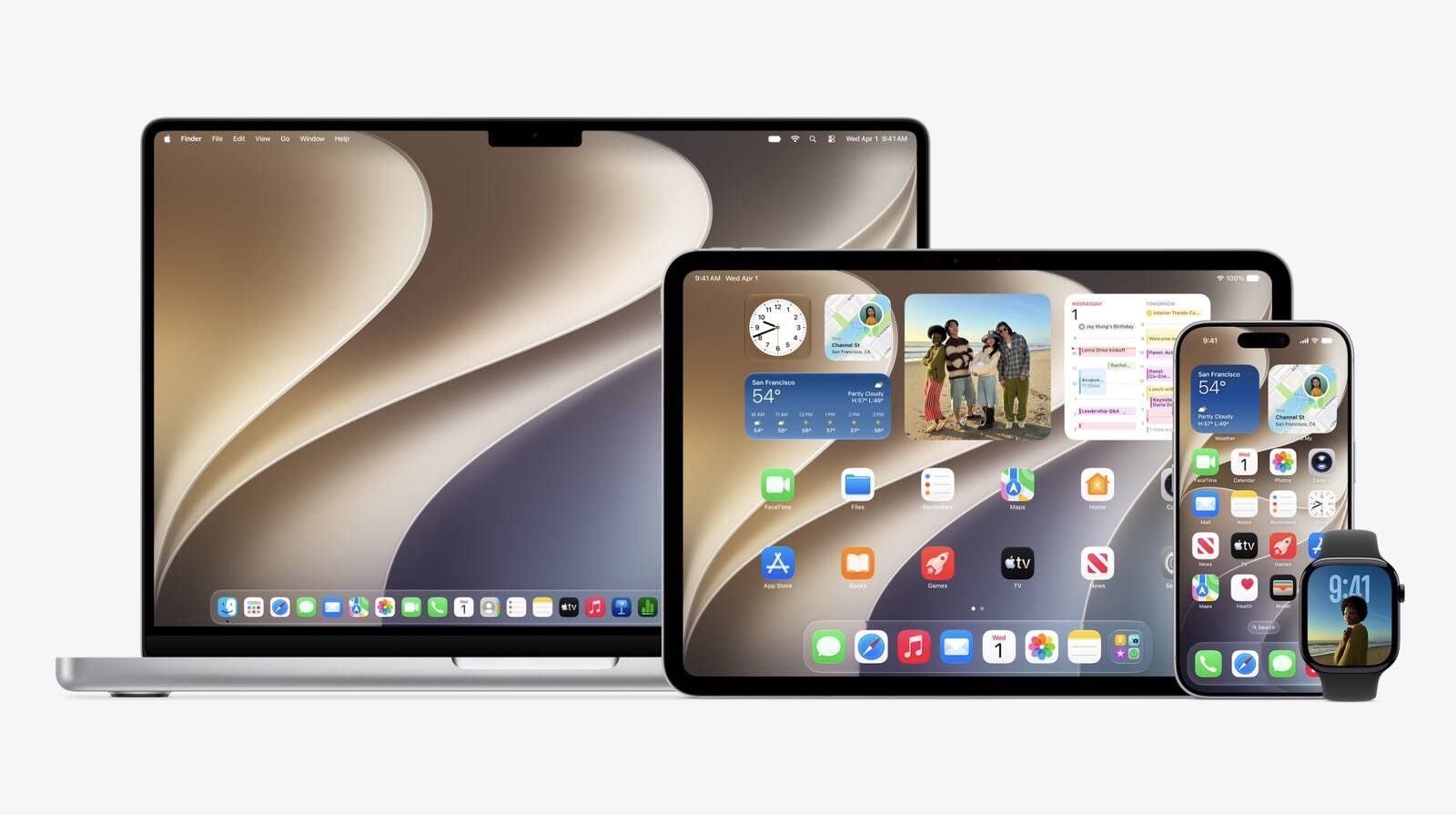
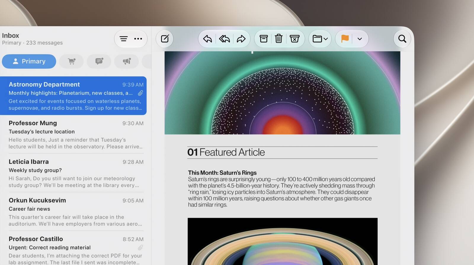
macOS Golden Gate has some Liquid Glass design changes. For example, apps now have a unified toolbar at the top, and the sidebar now expands to the edge of the window.

A new slider on macOS 27 lets you customize the opacity of Liquid Glass.

"Updates to Liquid Glass ensure exceptional readability with more uniform refraction and improved contrast," said Apple. "Uniform toolbars, edge-to-edge sidebars, and updated window shapes and menu bar icons deliver a more refined design. And a new slider lets you easily customize how Liquid Glass looks, from ultra-clear to fully tinted."

macOS-Golden-Gate-App-Toolbar.jpg

macOS Golden Gate is finally getting major promised Apple Intelligence and Siri upgrades, including personal context and on-screen awareness.

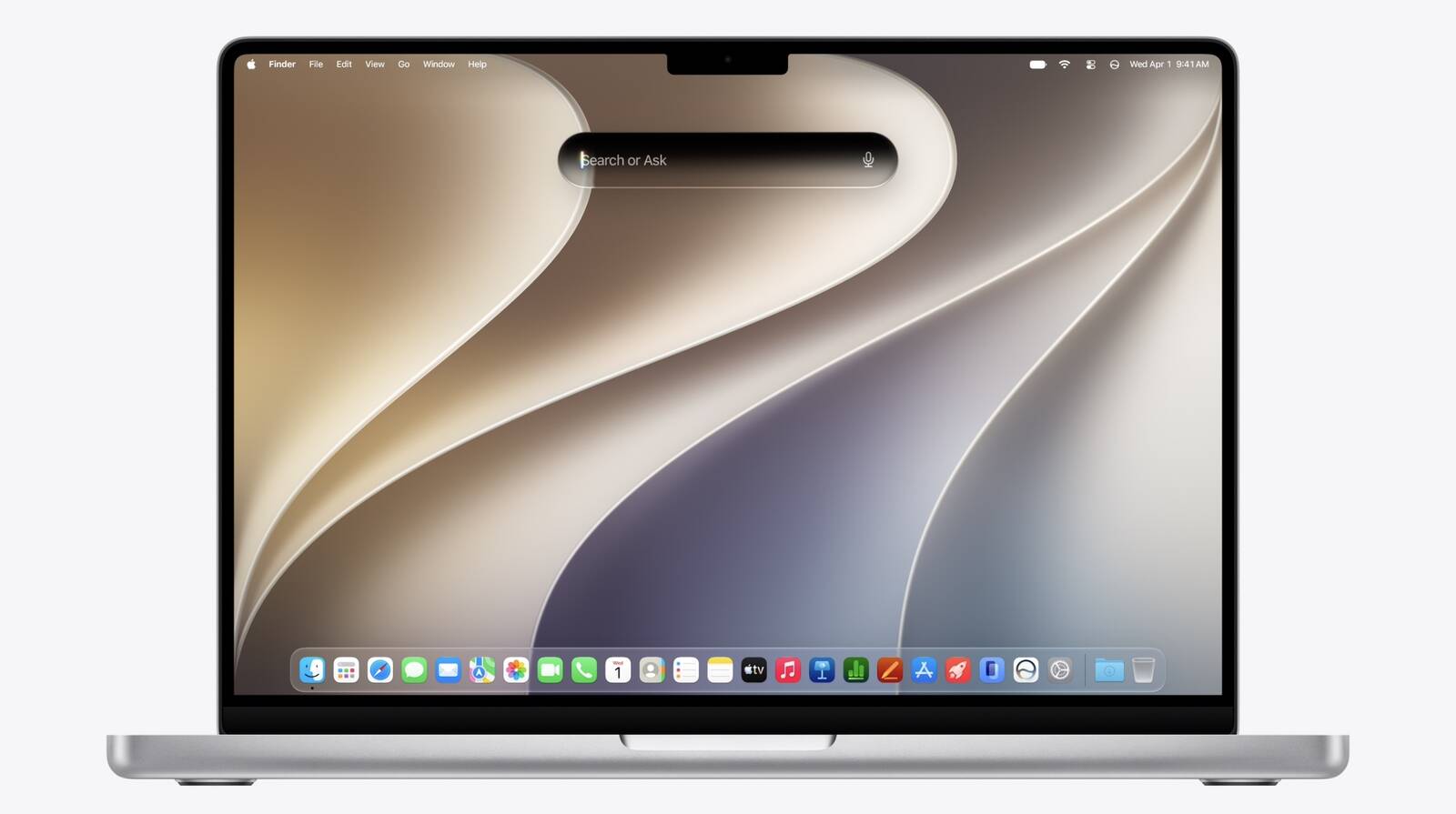
Spotlight has a new "Search or Ask" interface that is powered by the revamped version of Siri.

macOS-Golden-Gate-Search-or-Ask.jpg

Apple is revamping its child safety features across its platforms, including macOS Golden Gate.

Here are the Macs compatible with macOS Golden Gate, according to Apple:
  • MacBook Neo (2026)
  • MacBook Air with Apple silicon (2020 and later)
  • MacBook Pro with Apple silicon (2020 and later)
  • iMac with Apple silicon (2021 and later)
  • Mac mini with Apple silicon (2020 and later)
  • Mac Studio with Apple silicon (2022 and later)
  • Mac Pro with Apple silicon (2023 and later)
The first macOS 27 developer beta is available today, and the first public beta will follow in July. The update should be widely released in September, but Apple has yet to provide a specific release date.

Article Link: Apple Announces macOS Golden Gate
I might be alone on this, but I absolutely hate that Apple left the 2019 MacBook Pro stranded on macOS Tahoe. It’s an unstable mess that completely ruined the machine. I know the laptop is getting older, but when you drop over $5,000 on a pro-tier computer, you deserve better than to have its lifecycle end on such a terrible OS.

What makes it worse is looking at macOS Golden Gate, which seems to fix so many of the exact issues Tahoe introduced. And sure, I know I could technically downgrade to an older macOS, but I shouldn't have to deal with constant, un-dismissible update notifications begging me to reinstall the very OS that broke my Mac in the first place.

On my other M1 Mac Mini, this is going to be a welcome change.
 
(re: "I loved the big rounded corners")

Yeah but what if you took rounded corners to the extreme in such a way that 100% of every display was filled with nothing but rounded, highly padded corners. With zero room for content: Not even a single radio button, or a single new Apple emoji? 100% corner + corner padding.

Would you love that? No, you would not.
"OMG... my iPhone screen is filled with nothing but rounded, highly padded corners, with zero room for content! Not even a single radio button, or a single new Apple emoji!" ... said no one, ever.
 
  • Like
Reactions: rafark
Did apple backtrack and change OS X 10.1 (The next version after 10.0 aqua was introduced) to look like more like Mac OS 9 ditching all the new glossy elements for the old gray elements of Mac OS 9?
They did backtrack and tone down all the bubbly colourful gloss and pinstripes in OS X 10.3 (and later releases).
The OS (X) whose usage/user base actually overtook OS9.
 
  • Like
Reactions: johnalan
Although I thought the Aqua design was fine at the time, now when I look at it, the faux-3D bubble look strikes me as wholly unnecessary.

Displays are all 2D. Naturally 2D. You can put a 2D faux-3D graphical element onto this 2D display, but that faux-3D button is actually just 2D. So why not remain true to the 2D nature of the display and make all elements reflect their true 2D-ness.

Isn't honesty superior to fakeness?
 
Yes, it's snappy.™

I would rarely even think of installing a day one release dev beta on my primary machine but it could absolutely not get worse than Tahoe. I've been a very unhappy camper this last year, couldn't wait even a day to say good riddance to macOS 26.

Spoiler: it was worth it. So much faster, so many of the un-Mac-like Liquid Glass UI quirks have been corrected. This is the best hour on macOS I've had since September 2025.
 
  • Wow
Reactions: waz0wski
Although I thought the Aqua design was fine at the time, now when I look at it, the faux-3D bubble look strikes me as wholly unnecessary.

Displays are all 2D. Naturally 2D. You can put a 2D faux-3D graphical element onto this 2D display, but that faux-3D button is actually just 2D. So why not remain true to the 2D nature of the display and make all elements reflect their true 2D-ness.

Isn't honesty superior to fakeness?
Because humans are beings meant to interact with 3D world and having 3D cues helps even if they are fake.
 
Because humans are beings meant to interact with 3D world and having 3D cues helps even if they are fake.

What about in books. Shoud, for example, page numbers in a printed book be given a faux 3D appearance despite being actually 2D coz 3D book page numbers provide the human reader with 3D cues to guide interaction?

How about roadway stop signs? Should the "STOP" lettering be printed in faux-3D form on the 2D metal plate?
If you can’t get a nuance between a computer that is meant to be highly interactive and a book that only interaction you can do with is basically flipping pages, then I’m not sure we should discuss this any further.
 
Register on MacRumors! This sidebar will go away, and you'll see fewer ads.