Got a tip for us?
Let us know
Become a MacRumors Supporter for $50/year with no ads, ability to filter front page stories, and private forums.
Apple Announces WWDC 2015 Takes Place June 8-12 at Moscone West
- Thread starter MacRumors
- Start date
- Sort by reaction score
You are using an out of date browser. It may not display this or other websites correctly.
You should upgrade or use an alternative browser.
You should upgrade or use an alternative browser.
There's certainly a 5, which is hardly a hint or anything since essentially everyone knew it would be iPhone 5. The shape of the shadow is fairly typical, and of course after the fact you can read into it implying a longer iPhone, but realistically that wasn't necessarily what it was there for as it could have been (and likely was) just a shadow and not much more.
It still gave away something. Doesn't matter if there is 20 that don't, the post said any, and this is one.
Last edited:

The watch is technically (definitely) a rectangle though...
Or, they are adding a blu-ray drive!
or they are adding laser-disc!
The last few years have been very problematic for my Apple devices. Many many problems.
All I really want from OS X 10.11 and iOS 9 is STABILITY, OPTIMISATION & RELIABILITY... Things I used to count on when choosing Apple devices.
All I really want from OS X 10.11 and iOS 9 is STABILITY, OPTIMISATION & RELIABILITY... Things I used to count on when choosing Apple devices.
It didn't give away anything that wasn't known--the 5 was known, beyond that there's nothing more there unless you read things into it basically after the fact and assign them meaning.It still gave away something. Doesn't matter if there is 20 that don't, the post said any[\b], and this is one.
Someone else thinks they've figured out the clue of this:
It's the shape of a watch.
Sure, a watch with only 8 hours on it 12, 1, 2, 3, 4, 5, 6, 7.
Just looking at the September 2014 event invite makes me LOL.
That thread was hilarious with everyone trying to decipher that image.
Here we go. I think I found everything.
Image
Last year's September event I felt I was spot on so I'm introducing with that. I realized right away that that use of shadow was not like Apple. I then went on to a sundial calculator and found that that exact angle of the shadow is the same angle you would expect from a sundial at 10am in Cupertino. That confirmed to me that the event would be about time, or about the iWatch (as everyone thought it would be called).
Image
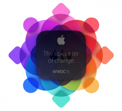
Starting with the outside shapes, you'll count 8 altogether; that simply refers to the 8th day of the month that the event takes place. I think the use of circles and squares along the outside refers to Apple Watch applications and iPhone applications coming together at WWDC for the first time.
The text "The epicenter of change." in conjunction with the shape under it is referring to a new Apple TV set top box. Often the living room is considered the center of the living room. Apple used the word "epicenter" instead to provide more emphasis and suggest that Apple TV is becoming the center of your entire home. This will become true with the addition of third party apps and Siri integration but even more so with the rumors of Apple TV becoming a Smart Home Hub. The addition of HomeKit to Apple TV last year was the first step towards that, and this WWDC will be the next (and biggest). The Apple TV will be the go to product for controlling all smart appliances and devices in your home.
If the previous conclusion is correct than I think it's safe to assume the large circles revolving around the "epicenter" symbolize the (third party) smart appliances and devices that Apple TV will become the center of.
Finally back to the outer shapes and their relation to the rest of the design. The way they overlap the overarching "home" of devices suggest that using Apple TV it'll become easier than ever to control your devices away from home. The fact that they aren't completely within that home signifies that the iPhone and Apple Watch are just as vital as part of that smart home environment as they are as part of the rest of your life.
...sorry, I went to art school.
Only time will tell mate
I seems the center square is, as most have said, hinting at a new Apple TV - so one more vote for that. I find it more interesting that the design is a flat but dimensional - a look which could carry over to iOS. But I think we are, like every year, looking way too much into it.
If it's a Snow Leopard type update but not too different from Yosemite, keep the snow meme and call it OS X Shasta?
I agree with everything you said except console like experience using iPhones as controllers. As an avid console gamer for decades, there is no way I could use a touchscreen for quality console (TV) gaming. I don't want to look at my hands when gaming. Hopefully they have partnered with Logitech or someone to make a high quality gaming controller that can compete with the dual shock 4 or Xbox one controllers.
There will be (and are already) clip on physical controls, the iPhone will be a secondary screen in addition to being the wireless power source to the controller.
Don't have time to read all these comments but does anyone else think that the iPhone could benefit from an OS design that resembles the Apple Watch's? Meaning: get rid of the app "pages" and swiping through them and making it more like almost "rolling" across them as one unified screen like the watch. I think this style with the pages is in need of an overhaul and is perhaps the most unchanged thing since the release of the iPhone or smart devices. I think this would be really cool if the layout of my apps were like this on my single home screen.
It didn't give away anything that wasn't known--the 5 was known, beyond that there's nothing more there unless you read things into it basically after the fact and assign them meaning.
That's your opinion, mine is different. Let's leave it at that.
It's the fun of the logos... They help us talk about the event, and when the event arrives, we all know what they were letting us on to.I seems the center square is, as most have said, hinting at a new Apple TV - so one more vote for that. I find it more interesting that the design is a flat but dimensional - a look which could carry over to iOS. But I think we are, like every year, looking way too much into it.
In many instances it doesn't really seem like they were really linked to anything. In other instances they were basically showing essentially already known/expected things (like '5' for iPhone 5 introduction or something like that).It's the fun of the logos... They help us talk about the event, and when the event arrives, we all know what they were letting us on to.
Clearly this WWDC will focus on the new Apple TV which could be cylindrical.
The current generation AppleTV fits perfectly in the middle square, so I'd say it's highly likely that a new AppleTV will be announced. Definitely more info on homekit since epicenter = hub and appletv is a hub for homekit.
Attachments
If as soon as I saw the square in the middle of the invitation I thought of the Apple TV, that must be what will steal the show.
Gotta be Apple TV
It's basically saying, in my opinion, that the Apple TV is going to be bigger tha. Watch. The center icon where it says it's the epicenter of change looks exactly like an Apple TV. A Mac mini is silver colored. I know. I have one. The icon is dark almost black. Definitely Apple TV. And if the rumors are correct, it'll be the epicenter of your home automation. Add an App Store for the home automation stuff and Siri for ease of use, it'll be bigger than Apple watch. Bam! Can't wait!
It's basically saying, in my opinion, that the Apple TV is going to be bigger tha. Watch. The center icon where it says it's the epicenter of change looks exactly like an Apple TV. A Mac mini is silver colored. I know. I have one. The icon is dark almost black. Definitely Apple TV. And if the rumors are correct, it'll be the epicenter of your home automation. Add an App Store for the home automation stuff and Siri for ease of use, it'll be bigger than Apple watch. Bam! Can't wait!
Register on MacRumors! This sidebar will go away, and you'll see fewer ads.