Become a MacRumors Supporter for $50/year with no ads, ability to filter front page stories, and private forums.

MacRumors

macrumors bot
Original poster
Apr 12, 2001
69,046
40,090


Apple is continuing to tweak the way that the Liquid Glass design looks ahead of the iOS 26 launch, and the latest beta makes a change to the Lock Screen.
ios-26-liquid-glass-lock-screen-beta-6.jpg

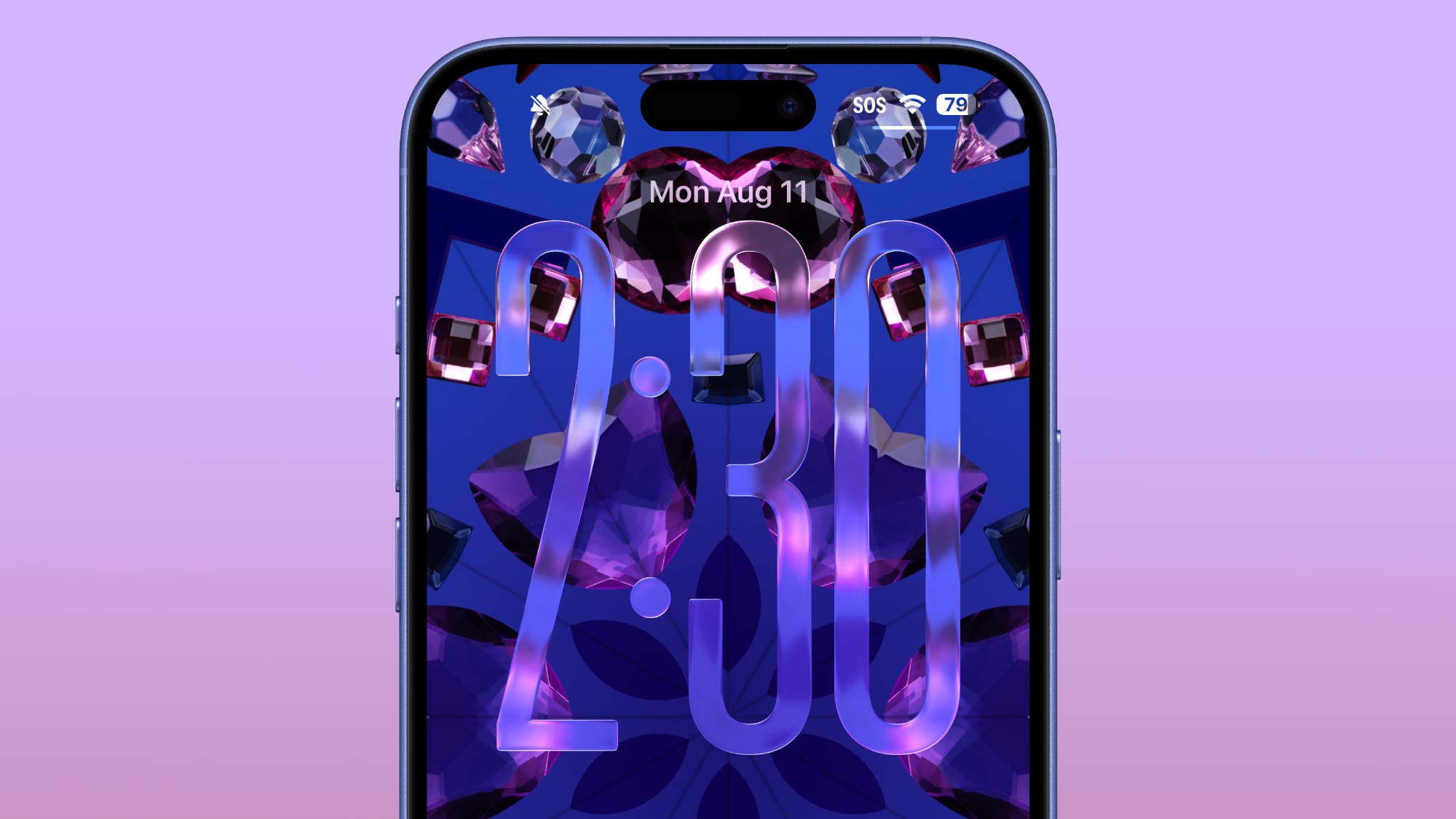
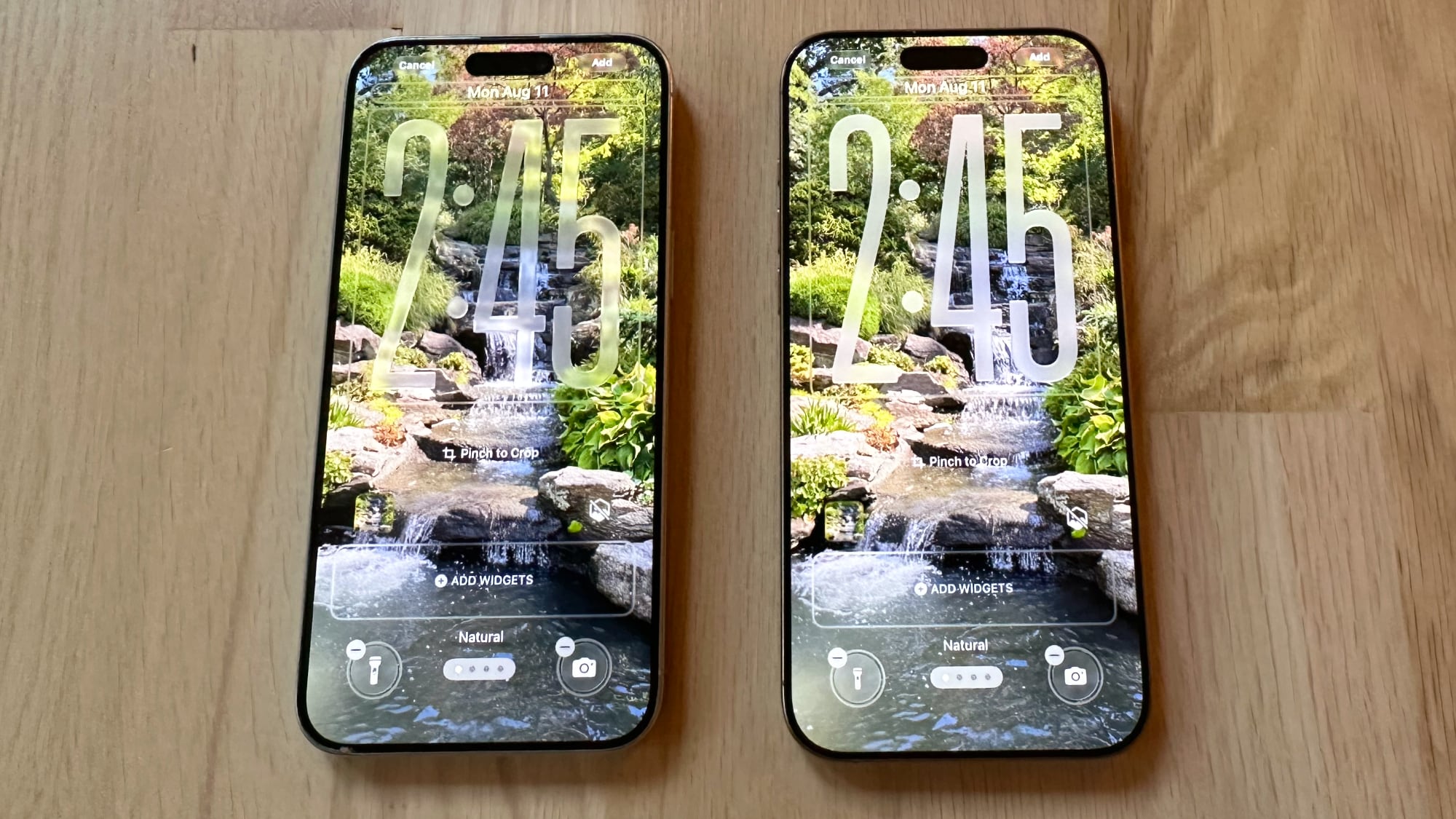
The Lock Screen clock has been updated with additional transparency, allowing more of the background to peek through.
ios-26-beta-6-liquid-glass-lock-screen.jpg
Beta 6 on left, beta 5 on right

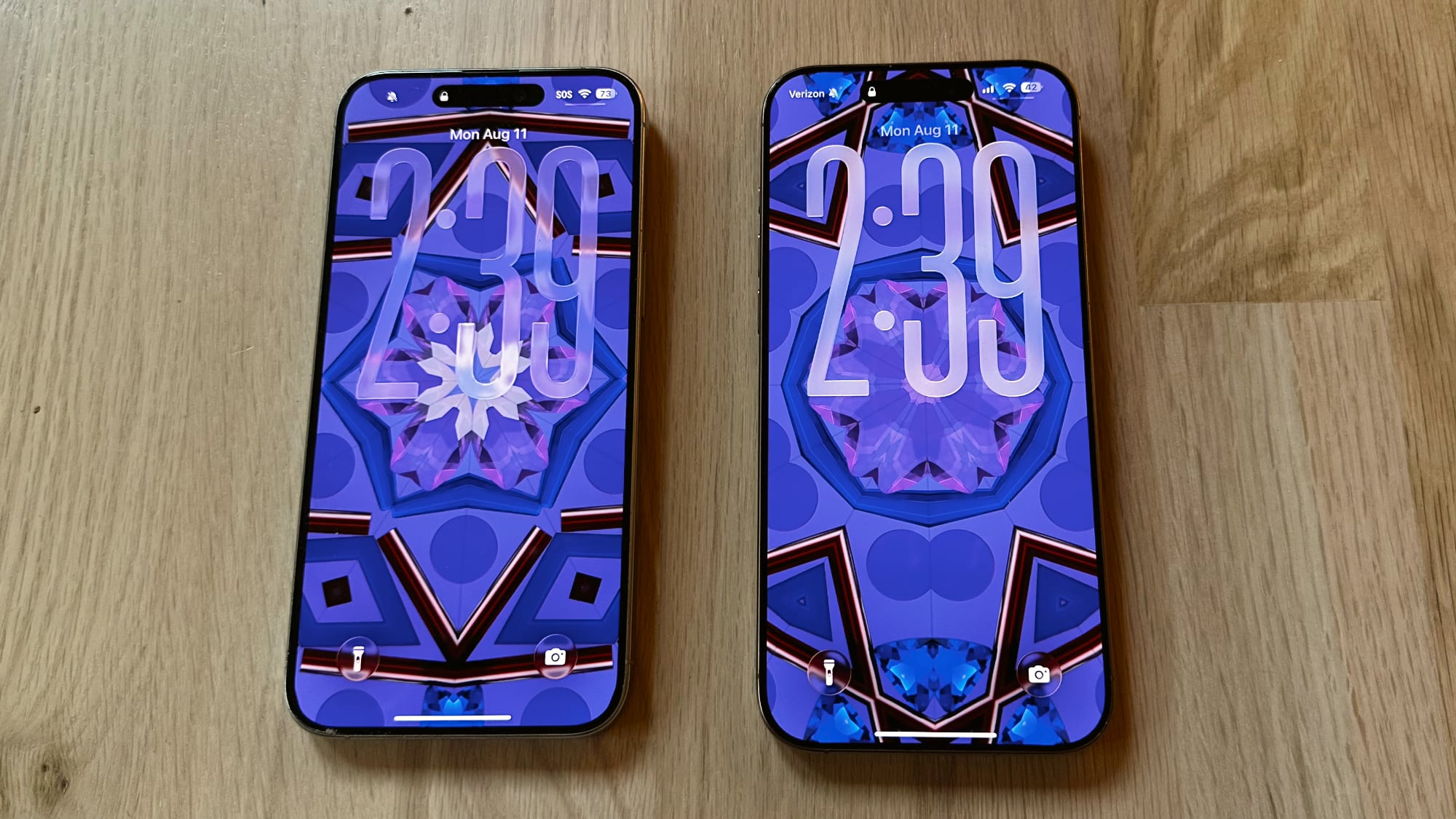
The clock also has more of a 3D, floating look, which is in line with the rest of the Liquid Glass design. Apple didn't change the Liquid Glass look of the control buttons, but the icons are larger. Lock Screen widgets haven't changed.
ios-26-liquid-glass-lock-screen-changes.jpg
Beta 6 on left, beta 5 on right

With the updated floating design and added translucency, the clock can be somewhat harder to see on certain darker backgrounds, but it is definitely more of a Liquid Glass aesthetic.

Apple has been tweaking different iOS 26 design elements throughout the beta testing process as it aims to perfect Liquid Glass before the iOS 26 debut in September.

Article Link: Apple Changes Liquid Glass Again in iOS 26 Beta 6
 
I'm sure there's some way to adjust this so all should be ok, but in these examples I have to take an extra second or so to really see the time and likely the other controls. But I know when they had it more opaque others didn't like it so clearly some control is needed.
 
I'm sure there's some way to adjust this so all should be ok, but in these examples I have to take an extra second or so to really see the time and likely the other controls. But I know when they had it more opaque others didn't like it so clearly some control is needed.
They’re probably settling on what will be the “default” and folks that have difficulty seeing will just go into accessibility. Transparency off, problem solved for them. While everyone else will just enjoy the view or edit their wallpaper images to fit the look they’re going for.
 
I fear this whole design is a failure and Apple is heading into a dead end. Much too complex to manage properly. As much as I love the idea, it might make sense in specific situations but not for the whole OS. Apple tried translucent UIs with Aqua (translucent menus) and quickly reverted back. Unreadable text and blurry UI just doesn't make sense.
 
If you don't like it.. turn off glass on the clock...

Maybe the default should be solid and glass an option for the clock. (for the complainers)
 
  • Like
Reactions: frankjur
Register on MacRumors! This sidebar will go away, and you'll see fewer ads.