Got a tip for us?
Let us know
Become a MacRumors Supporter for $50/year with no ads, ability to filter front page stories, and private forums.
Apple Changes Liquid Glass Again in iOS 26 Beta 6
- Thread starter MacRumors
- Start date
- Sort by reaction score
You are using an out of date browser. It may not display this or other websites correctly.
You should upgrade or use an alternative browser.
You should upgrade or use an alternative browser.

cjsuk
macrumors 68020
lol people complaining about liquid glass. I understand the concern, but aren’t we all surrounded by glass everywhere? In our cars, our homes, etc. In real-world situations, I wonder how some people don’t have their cars tinted when it’s bright and sunny outside and sometimes hard to see the traffic light, but here we are complaining about an upcoming glassy software update🥴 I know people are gonna say it’s two different scenarios, but the point is we are surrounded by glass everywhere.
Stupid user interface designs are outlined in Hitchikers Guide to the Galaxy, which I will paraphrase here:
“It’s the wild colour scheme that freaks me,” said Zaphod whose love affair with this ship had lasted almost three minutes into the flight, “Every time you try to operate on of these weird glass controls that are labelled in glass on a glass background, a little glass light lights up glass to let you know you’ve done it.”
maxoakland
macrumors 68000
I don't think Jony should be catching strays for a design he has nothing to do with. If he hired Alan Dye, I change my mind. That's the guy responsible for this messRegression in usability for sure.
Feels like Jony Ive influence on the design team. Aesthetics over usability.
Unregistered 4U
macrumors G5
In any given year, there are more people that don’t buy Apple devices than do. So, people hating what Apple’s making, I expect that. Out of 8 billion people in the world, they only have to sell somewhere north of 200 million iPhones. If things are like an average year, half of the people buying a new iPhone will be upgrading from a phone 2-10 years old (with 3 billion out there, just 100 million upgrades, likely not difficult). That leaves them needing to sell 100 million iPhones to folks that own no smartphone or own an Android phone. For someone already considering leaving Android, it’s a cool UI. For those that don’t own any smartphone, still, cool UI. Even if 4 billion people hate it, Apple’s only got to sell 100 million and they can say “good year”.Some people will like it, but some people will hate it. Nonetheless, you can't have a polarizing UI, and they're going to have to error on the side of more opaque/muddy.
omenatarhuri
macrumors 65816
Looks like it can either look cool or... visible. Noticed same when tried tinkering with similar effects for an app a few years ago. Makes me feel better that even Apple doesn't seem to have secret sauce that would do otherwise.
Innovati0n
Suspended
krakenrelease
macrumors 6502
Can we just get a dedicated bug hunter team to get rid of bugs still lingering from 5 years ago?
Wayyy Better now
Apple is continuing to tweak the way that the Liquid Glass design looks ahead of the iOS 26 launch, and the latest beta makes a change to the Lock Screen.
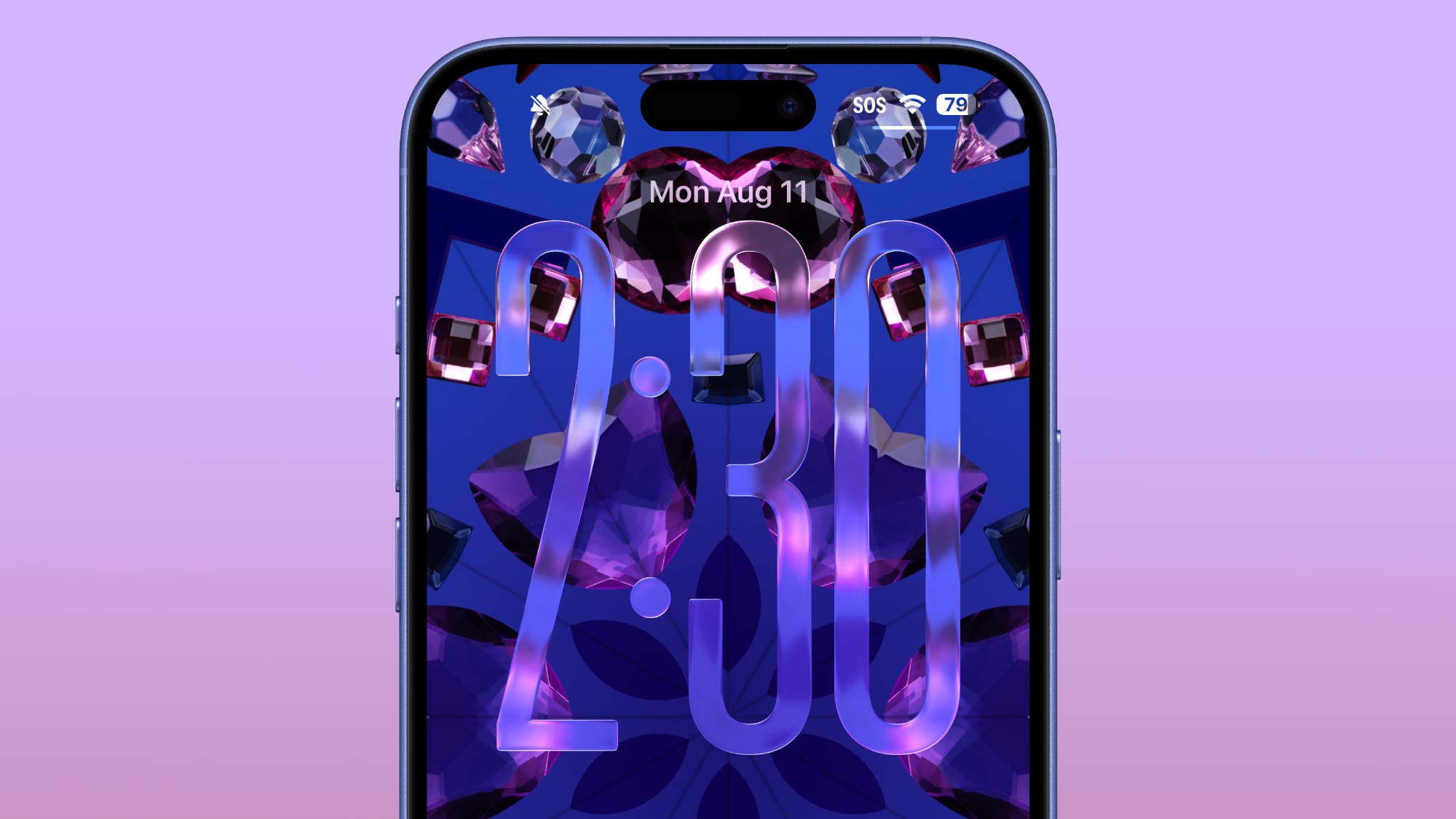
The Lock Screen clock has been updated with additional transparency, allowing more of the background to peek through.
Beta 6 on left, beta 5 on right
The clock also has more of a 3D, floating look, which is in line with the rest of the Liquid Glass design. Apple didn't change the Liquid Glass look of the control buttons, but the icons are larger. Lock Screen widgets haven't changed.
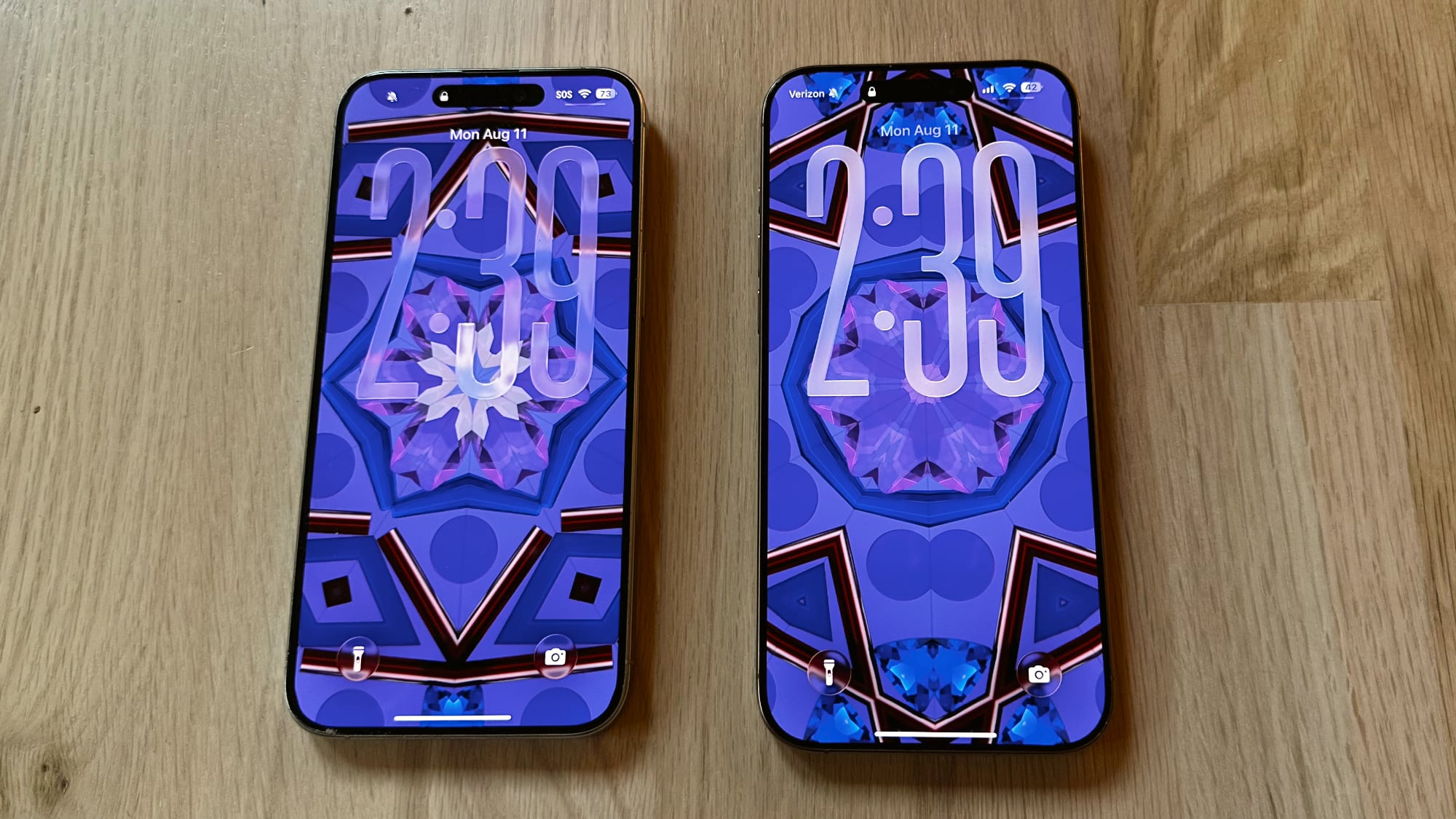
Beta 6 on left, beta 5 on right
With the updated floating design and added translucency, the clock can be somewhat harder to see on certain darker backgrounds, but it is definitely more of a Liquid Glass aesthetic.
Apple has been tweaking different iOS 26 design elements throughout the beta testing process as it aims to perfect Liquid Glass before the iOS 26 debut in September.
Article Link: Apple Changes Liquid Glass Again in iOS 26 Beta 6

Very pretty. They should just remove the clock, though, since it's not readable anyway.
TJFDenver
macrumors 6502
Predator V … the liquid glass series … they’ll never see you coming
smoker68x
macrumors member
Just put a slider in display settings letting us choose how opaque we want it and be done with it.
lazyrighteye
Contributor
Bingo.cool now make it consistent across apps and operating systems
Another inconsistency that's been bugging me: the way the bubble slider works in Camera (when selecting different camera types) is different (read: opposite) to how it functions in Safari (when moving between Tabs).
Did I see where there was a fix/setting that addressed this inconsistency?
Absolutely horrible. No contrast, worse readability and overall step back. I can't help but feel that this won't be pretty.
lazyrighteye
Contributor
Haha I would love if they showed previous on left an update on right.I'm really not sure why this needs to keep being reiterated, but here we go again: the BEFORE image always goes on the LEFT, the AFTER goes on the RIGHT. Just like how we read english text, from left to right. Understand?
Robert.Walter
macrumors 68040
I’m hoping somebody was tasked with improving iOS curser and text highlighting when in dark mode. In many instances it literally impossible for me to see the blue against the charcoal taupe background. Should be orange.Regression in usability for sure.
Feels like Jony Ive influence on the design team. Aesthetics over usability.
Just upgraded to beta 5 over the weekend, now I’m on beta 6. And you know what?
Damn you Tim Cook, I DO love it, just as you thought I was going to!
Are you feeling OK? You're not supposed to say anything positive about Apple here.
Robert.Walter
macrumors 68040
Robert.Walter
macrumors 68040
Seriously. Apple never quite finishes implementing the last big thing before tolling out the next.cool now make it consistent across apps and operating systems
ghostface147
macrumors 601
tomtad
macrumors 68040
I love the new open/minimize App animation too.
Apple nailed it in terms of UI this year. Finally somebody made a transparent interface really work!
Someone told Tim we're doing it if you like it or not.
And I'm all for it
turbineseaplane
macrumors Penryn
This will all get fixed over the next ... (checks calendar) ... "4 weeks", right?
It's really something to watch them vacillate around, beta to beta, screwing the pooch, in real time.
It's really something to watch them vacillate around, beta to beta, screwing the pooch, in real time.
Why would you make it harder to read the most-used information on the screen? My bigger complaint is it's not always on top! Sorry, I can't tell you what time it is, my phone decided this picture is better than the time, so you don't get to see it.
klasma
macrumors G4
The more translucent it is, the harder it becomes to apprehend the time at a glance, or in bad lighting (in the sun for example), or from an angle, or when not wearing your glasses, or...When folks here say it's less readable, do you really have trouble reading it?
There’s a wide range between “perfectly readable at first glance under all conditions” and “hardly readable at all”. The present change from beta 5 to 6 moves it further down in that range.
klasma
macrumors G4
Brushed Titanium… for those who miss it.This is all temporary. Introducing iOS 27's new UI... Brushed Metal.