I have personally seen this be a problem for the average user who uses macOS.
Apple needs to stop being so reliant on the menu bar for apps created from Mac Catalyst technology and other stock macOS apps. Inconsistency between the iPadOS and macOS versions of the same apps makes them harder to use and confusing for users. This could be fixed by having the actions in both places, the menu bar AND inside the app. The menu bar should mainly be reserved for pro apps. This would make macOS more user-friendly for former iPadOS, and Windows users, and average macOS users.
Apple needs to stop being so reliant on the menu bar for apps created from Mac Catalyst technology and other stock macOS apps. Inconsistency between the iPadOS and macOS versions of the same apps makes them harder to use and confusing for users. This could be fixed by having the actions in both places, the menu bar AND inside the app. The menu bar should mainly be reserved for pro apps. This would make macOS more user-friendly for former iPadOS, and Windows users, and average macOS users.
Apple needs to stop being so reliant on the menu bar.
HEAR ME OUT.
The Menu Bar should be relied on for Pro apps, like Word, Pages, Keynote, Final Cut, Logic, but it should not be incorporated for apps made from iPadOS. It makes things a lot less consistent and Harder to use.A lot of apps that also appear on iPhone and iPad (Messages, Safari, Weather, Freeform) (Which don't have a Menu Bar) are very easy to use. Apple moving these to the menu bar is a pretty bad move and makes macOS less user friendly than iPadOS.
Example 1 - Freeform:
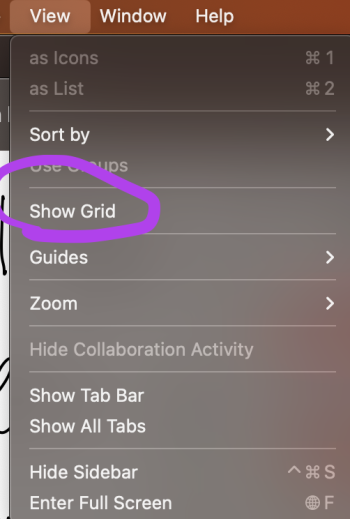
I use Freeform a lot on my iPad, and I have the grid off,The way you turn that off is you have to click on the name, then press "Hide Grid"
Now let's look at macOS:
Clicking on the name only renames it.
The other options are hidden somewhere else:
THE MENU BAR.
Freeform (a brand new app) that uses the Mac Catalyst technology should not suffer from this inconsistency. It is based on an iPad app, and changing stuff to use the Menu Bar rather than its original location may make users think that the feature does not exist if they first used the app on their iPad or iPhone.
Now I am not saying that Apple should remove the Menu Bar, but they can keep the actions in the menu bar AND have the actions where they are on iPadOS. That is what would make the most sense.
Example 2 - Weather:
Weather is also based on Mac Catlyst technology and suffers from the same inconsistency and relying on the Menu Bar on the macOS version.You can see that on iPadOS, there is a ... button to change from Celcius to Fahrenheit.
On macOS, you need to go to the menu bar to change from Celcius to Fahrenheit.
It would make a lot more sense to use the iPad layout along with the Menu Bar to make apps a lot more user-friendly for the average user.
Example 3 - Music:
Well, it gets even worse with apps not based on Mac Catalyst.The music app on iPadOS to get to the full-screen player requires 1 tap
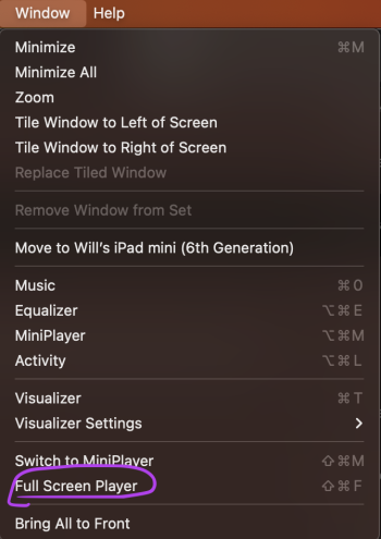
On macOS, I used to think that the full-screen player was nonexistent on macOS until I discovered it was in the Menu Bar. (Window > Full Screen Player)
This gets even worse for Windows users who use the Apple Music web client, and switches to macOS.
On the web client, you have a full-screen button right there, and it is super easy to enter the full screen player from there:
On macOS, this button just isn't present despite the Apple Music web player trying to imitate the macOS version:
But what if a new macOS user (used to this web app and also iOS/iPadOS) looks for the full-screen player on macOS?
By the way, this is what I am talking about by Full Screen player:
Well, they may think it is nonexistent until they look at the menu bar.
I personally think the web client is a better EXPERIENCE than the native macOS app.
Same with Spotify, Spotify is a great example of using both the menu bar and inside the app.
What do I want Apple to do?
Well, I want Apple to make the apps mentioned above identical to the iPadOS version to fix consistency. The new apps that are based off the iPad version should not be this different...
Now I am not saying Apple should completely ditch the menu bar obviously because this would cause a lot of compatibility issues for apps, and for pro apps, the menu bar makes sense.
I just want macOS to be a lot more accessible for iPadOS and Windows users.
I also know a lot of average macOS users who never TOUCH the Menu bar. This would make macOS easier to use.
The menu bar should be reserved for pro-apps, the stock macOS apps that you would see on iPhone doesn't make sense for the menu bar to be used.
Bonus example - Safari:
Just imagine if this was the default view in Safari, and had to use the Menu bar to make a new tab.Let me know what you think about this inconsistency.
Attachments
Last edited:


