Become a MacRumors Supporter for $50/year with no ads, ability to filter front page stories, and private forums.
The mouse has to stop at the top of the menu bar, and not go into this void above the menu bar. The whole idea of the menu bar at the top of the screen is that it is an infinitely deep target for the mouse. You don't need to hit the menu exactly, rather you can fling the mouse to the top and it stops on it's own so you can click a menu.

This was a well-known interface and GUI design feature back in 1984 when the Mac was born.
 
How will this work with external displays? Clamshell mode? If there will be important information in this new screen space, it will need to be reflected on external displays. Its just asking for bugs with the software.

Much like there's no Touch Bar when in clamshell mode, there's no notched menu bar either. You just get the old menu bar.
 
  • Like
Reactions: ZZ9pluralZalpha
This is absolutely horrible.
And let's be clear about this, all they're looking for is being recognized in movies and from quick glances at coffee shops.
They're just looking for an identity.
With Apple money is ALWAYS the bottom line.
 
  • Like
Reactions: jon9091
Worse then the notch are the rounded corners!! i cant watch movies with rounded corners nor edit my photos with rounded corners!!
 
Last edited:
  • Like
Reactions: Tozovac
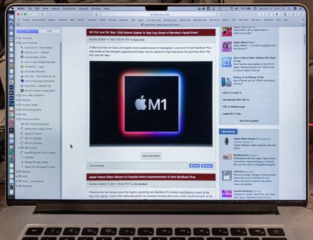
Here's a quick and dirty shop of how I think they are going to implement the notch. So instead of a big top bezel that does nothing but house the webcam, they are going to use that space to free up the menu bar and provide additional information, maybe allow apps to use it. So I don't think the notch is even going to be visible, everything under the notch area stays the same, we just get one more row of info on top of the existing interface. Win-win if you ask me.

View attachment 1868385

This is a damn Good Photoshop edit.
 
  • Like
Reactions: mixy
I'm looking at the menu bar on my MacBook Pro 15" and there is 4" of clear, blank space in the center. Hell, they could put a dozen notches into that area without interfering with a damn thing. So I’m not sure why people are so adverse to a little notch sitting inside a barren desert of menu bar space. I don't like the noch on my iPhone because it does take up valuable space, but it won't take up anything of value on the macOS menu bar.
 
It could happen, but I doubt it. The notch solved a specific problem on something as small as a phone. On a laptop, the camera and scanner can just be put in a bezel. Apple has to know that many people don’t love the notch, and I can’t see them adding it to a big, beautiful screen on a laptop or desktop.
 
  • Like
Reactions: Mr Todhunter
Much like there's no Touch Bar when in clamshell mode, there's no notched menu bar either. You just get the old menu bar.
But they are putting important information in the "Notch Bar". How will that work with extra displays? Again, its just asking for buggy messy software.
 
But they are putting important information in the "Notch Bar". How will that work with extra displays? Again, its just asking for buggy messy software.

They're putting the menu bar in the notch row. That, or only the status item/menu extra portion of the menu bar. There isn't much more to it.
 
They're putting the menu bar in the notch row. That, or only the status item/menu extra portion of the menu bar. There isn't much more to it.
And what happens when there are a lot of menus for some software. There will be a space between Menu X and Menu Y now. Will my mouse jump to the right 200+ pixels? That will just lead to confusion. All of this is completely unnecessary.
 
  • Like
Reactions: jon9091
I'm looking at the menu bar on my MacBook Pro 15" and there is 4" of clear, blank space in the center. Hell, they could put a dozen notches into that area without interfering with a damn thing. So I’m not sure why people are so adverse to a little notch sitting inside a barren desert of menu bar space. I don't like the noch on my iPhone because it does take up valuable space, but it won't take up anything of value on the macOS menu bar.
Because that's dependent on the use case. Anyone doing full screen video editing or photo editing will be dealing with hidden content areas. Not to mention many app menu bars can easily use that space. I just switched to IntelliJ on my 13" and the menu bar goes right past the camera. I tried some apps in full screen mode yesterday and actual controls and toolbars would end up in the notch area.

IMHO, without handling the hidden space in MacOS, it doesn't seem like Apple would go this way. Blanking out the area but using it for notifications and status icons like the patent explains makes more sense.
 
I hope they at least make it the same height as the menu bar and make the menubar completely black so you can't really even see the notch and then make an option to put a black bar across the top of the screen when viewing full screen content so it looks like you have a small bezel at the top instead of cutting into your content. That would be acceptable.
 
1634485106129.png

I am just here to watch people lose their minds about a notch on the Macbook lineup..... 🤣
 
  • Haha
  • Like
Reactions: SactoGuy18 and SqB
Here's a quick and dirty shop of how I think they are going to implement the notch. So instead of a big top bezel that does nothing but house the webcam, they are going to use that space to free up the menu bar and provide additional information, maybe allow apps to use it. So I don't think the notch is even going to be visible, everything under the notch area stays the same, we just get one more row of info on top of the existing interface. Win-win if you ask me.

View attachment 1868385

that doesn’t really make any sense

most people have the menu bar at the top of the screen with nothing in the centre where the notch would be anyway

this just makes the menu bar intrude even further down the display leaving even less screen real estate

much more sensible to just put the notch in the middle of the menu bar
 
  • Like
Reactions: ZZ9pluralZalpha
Top notch. That is probably my greatest wish.
I am sure it will make sense when I see it though, but after a few days, it will not make sense any more.
 
This seems strange to me, but I suppose if they want to follow the current obsession with erasing bezels it's the only way to go. Though what they're describing sounds less like a "notch" and more like a way to allow the bezel to be more useful—i.e., if it's going to display icons/text on a black background, then it's pretty much a bezel, in the sense that it's not an accessible part of the UI. It might actually be kinda cool if it could display some of Activity Monitor's info.
 
I really don't think a notch in the MacBook Pro screen would be bad. See my mockup.
It is definitely noticeable but it doesn’t bother me. To some people it may. As long new 💻 has no bezel notch is a good compromise. Now if we have to deal with the bezels and there’s a notch… yeah there’s a problem. Apple will be roasting Apple all year long until design changes.
 
Last edited:
Register on MacRumors! This sidebar will go away, and you'll see fewer ads.