Become a MacRumors Supporter for $50/year with no ads, ability to filter front page stories, and private forums.
So far I really like the update, everything runs pretty smooth considering it's the first beta for ios 7. The only complaint I'm having is imessage isn't working for me. Iv'e seen other with the same issue. Any known fixes?:confused:

I had the same problem. I fixed it by selecting General->Reset->Erase All Content and Settings and then restoring from a backup.

Note: Make sure you have a backup first ;)

----------

btw, I wasn't too impressed with 7 to begin with, but after a day of using it I am starting to fall in love.

Just fix those stupid icons for Settings and Safari and I'll be a happy man.

And for the love of all that's good tell me that you aren't going to use the same stupid method of selecting a new tab on the iPad version. i.e. please stick with the current tab setup rather than a solution that requires multiple presses and screen changes to select a different tab.
 
i just signed up as an iOS developer for $99 in order to download the iOS 7 beta. for some reason, when i click on the download link, it leads me to a page saying that "your session has expired." does anyone know what's going on? i am pretty sure i am logged in and have added my iphone 5 to the devices list.

Are cookies enabled in the browser?
 
I'm going to ask a really stupid question but here goes.

If I download the new Beta which is a .dmg file will I be able to update my iPhone on my Windows PC or do I have to wait to us my Mac at home?
 
I was originally going to install it on my iPhone 5 for testing, but think I will use my iPhone 4s device to test it for a bit.

I am nervous about the fact you can't roll it back :D

You should be able to. Apple is still signing iOS 6 so it shouldn't be a problem to downgrade. Don't take my word for it though, I haven't even upgraded yet.

----------

a1428 - gsm
a1429 - cdma

I have a GSM A1429.
 
I think this is where the whole new UI seems confused - so you're going with a flat theme then try to make this multi-layered looking Settings icon, surely just a simple cog would work better in context?

That's a gear with six cogs on it :)
 
Music.app no longer allows you to shuffle all songs from all albums from an artist, nor create playlists. WTF?

Edit: But Safari is crazy fast, though. It's almost ridiculous.
 
Has the option to download all songs from a playlist using iCloud/iTunes Match gone? I can't seem to find it anywhere!
 
For everyone that says you can't roll back to iOS6, you can

First impressions, I love it. Just a shame some apps don't work, notably Skype, but that's to be expected obviously. That's why release days are not the same as announcement days.

As for bugs, this is one of the tightest iOS Betas iv installed I think. Really great work
 
Music.app no longer allows you to shuffle all songs from all albums from an artist, nor create playlists. WTF?

Edit: But Safari is crazy fast, though. It's almost ridiculous.


I thought that it was not allowed to use Fast and Safari in one sentence anymore in these forums. :eek:
 
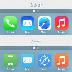
My attempt at making the icons less hideous.
 

Attachments

  • new_icons.jpg
    new_icons.jpg
    97.9 KB · Views: 155
  • Like
Reactions: na1577
I like those better, I think that it's the gradient that throws them off, and safari's white border.

Yes it's definitely the gradients, and the day-glow colours look cheesy. Your mind also expects the lighter part of a gradient to be at the top, as that's how light normally falls on things. It just looks wrong the other way around.

It's also important to have at least a subtle shadow or highlight, otherwise the icons just blend into the background, when it's a similar tone.
 
Feminine iOS

iOS 7 was designed to attract female clients. Nothing else. Everything about iOS 7 says I am feminine.

1. The bright color scheme, full spectrum of colors and soft pascal look instead of the darker, solid tone of the previous theme.
2. The sexy look of the new theme and women love sexy look.
3. The thinness of the number 7 (women want to be thin)
4. The constant beautiful women expression throughout the presentation.


It makes logical sense. Go after the women.

They know apple fans will not switch. And they know that they have a pretty good portion of the men that will stay with iPhone based on the satisfaction surveys. And most men want big fatty phones, and another segment of geeky men want the ability to tweak and have widgets and customization.
So, no reason to continue to create a phone to impress those men when they're not going to switch.

But if you create a UI that is feminine to attract females from the competition, and those women are married, their men will not have no choice but to buy an iPhone because of the family pack deals. And we all know when decisions have to be made between the husband and wife, the wife always comes out the winner.

Apple wins in the end! Interesting! :rolleyes:
 
Yeah Microsoft...I mean Apple...

So...no to be a troll as I love my 27inch iMac and iPhone 4S to death...

BUT

Does this new OS look like the ZUNE OS or what? For serious. It seems like a step back to 6-8 years ago where Microsoft got buried. Please tell me the functionality will make up for the Zune font and cheezy icons?
 
Personally I'm torn over the look.

The new video player with the frosted glass look to expand the video over all boundaries, yet displaying easily identifiable controls is just awesome. You have the cake while eating it.

The new Photos app looks great and I love how they use the JPEG metadata to "automagically" order the photos into moments. Moments that become more detailed as you zoom in. It's easy to use, yet elegant design.

However, I think the icons look garish, especially those that others brought up. Safari, Settings, Newsstand, ... I do hope they're still working on the icons. I hope they're about to make the gradients more subtle, and the icons more monochrome. It's silly how some icons in the interface uses white-on-color, yet others use flashy-colors-on-gradients. Downpour's revision above is pretty much exactly what I've had in mind. I'm not sure if Apple is worried they'll intrude on Metro territory or what. They shouldn't be. The home screen would still look nothning like the tile-based Metro interface.
 
P.S. IOS 7 Beta 1 runs just fine on my 16 GB Sprint PCS Apple IPhone 5, however it is now more difficult to KILL OPEN PROGRAMS, so use CAUTION before installing it on an 8 GB IPhone 4 AND/OR IPhone 4S. Just FYI.

I actually find it so much easier to kill open programs. It's just like WebOS now. You just flick away the card. Much easier than holding down the icon, then hitting x. My dad actually understands the concept now.
 
Just installed with 100% battery and after about 15 mins of "playing" I'm down to 90%! Seems excessive! Usually I take the phone off charge at 6am and end the day with 70% or so, will see how this holds up once I'm back to using the phone normally.

Overall most things seem very nice, corrected the time but the clock icon hasn't changed despite closing apps etc, when you back out of an app in a folder it takes you to the folder rather than home screen (which I don't remember it doing) and a few things a little slow but overall very good for a Beta.
 
I found under accessibility "Enhance Text Legibility" that made a huge diff with reading text.
 
Register on MacRumors! This sidebar will go away, and you'll see fewer ads.