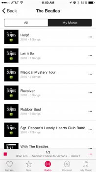
Don't get why they are still hiding stars behind the song title on the Plus. There's so much space between the controls. I though they'd gotten rid of it in favor of favorites, like with iPhoto.
Also I'm not sure if I'm a fan of moving the artwork to the top. Some album artwork has text all the way up there (e.g "Original Motion Picture Soundtrack) and it makes the clock illegible.
Already loving Up Next, though they should swap out that stupid share button on the home screen and put the Up Next button there instead.


